- | 1:00 pm
Here’s what it looks like when an office is designed for its remote workers
Fivetran’s new office design brings the offsite meeting vibe in-house.
Before the pandemic, the data integration startup Fivetran did what a lot of its fellow Bay Area startups did to stay competitive in the marketplace for tech talent. It held what the company calls Camp Fivetran, an annual weeklong offsite gathering where its global workforce would come together for team-building and leisurely getaway time in destinations like Cancun or Wyoming. But during the pandemic, the offsite was just one of many parts of office culture that went on hiatus.
In the meantime, the company’s workforce grew to seven times its pre-pandemic size, to more than 1,000 employees. Almost everyone was working remotely, and many were far flung from Fivetran’s Bay Area headquarters. So in late 2020, when Fivetran’s leadership began thinking about the eventual return to the office, it was clear they’d need a bigger space. What that space should look like was an open question. So they did what a data-focused company would: they surveyed workers and analyzed the data.
“It was this moment to reevaluate from first principles whether and how to have an office,” says Fivetran CEO George Fraser. “It was pretty clear that we were not going to go back to going in every day.” For most employees the physical office would be a place visited only rarely, almost like that annual offsite gathering.
Working with the global architecture firm Gensler, Fivetran used this notion to plan the interior of the new 85,000 square foot headquarters it was opening in downtown Oakland. The spaces inside Fivetran’s new offices, which opened in June 2022, are designed to host what Gensler’s global technology/design leader Brian Stromquist calls “onsite offsites”—collaborative meetings, community events and periodic fly-ins for dispersed workers. Instead of designing around the diminishing number of employees making day-to-day use of the office, the new space is oriented more towards the non-daily reasons employees want or need to be there.
Fraser sees the $8.1 million buildout as a reinvention of the way the company works. While the pandemic was a moment for some companies to trim the fat, well-funded companies like Fivetran have been able to reimagine and invest in new ways of working. LinkedIn, for example, designed its new headquarters using a matrix for all the different postures workers would have in a hybrid-first office. The venture capital fund Inspired Capital used residential design as the basis for its redesign. Fivetran is betting that a flexible design that accommodates different types of gatherings will make the most sense in the hybrid work era.
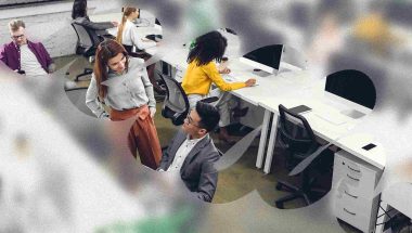
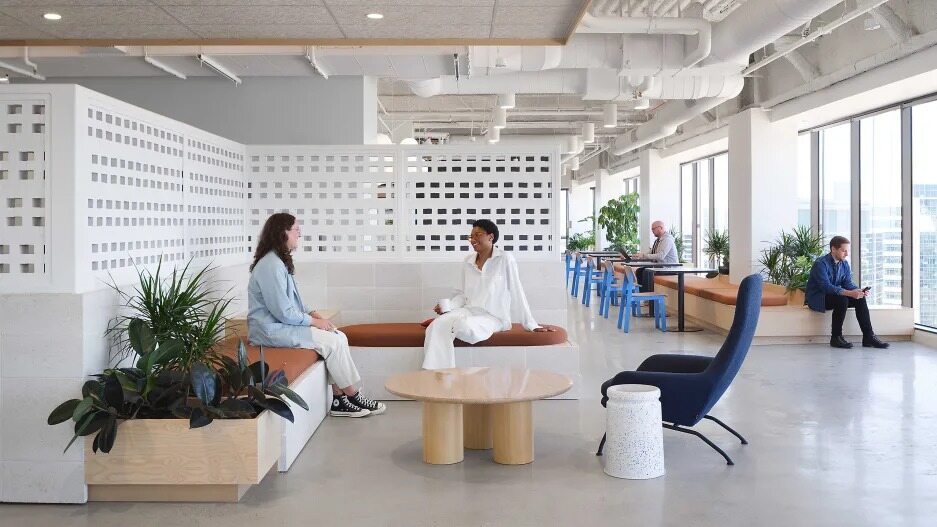
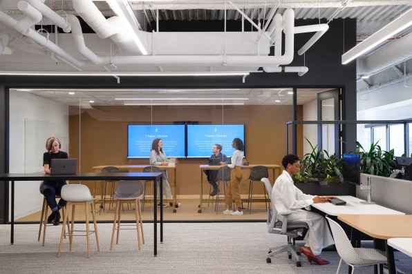
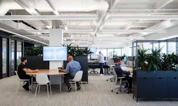
That design approach has put a big emphasis on creating a variety of meeting spaces, from large and tech-rich conference rooms to informal areas for whiteboard brainstorming to more lounge-like areas. There are also individual offices and workstations, and booth-like single occupancy quiet spaces where workers can disappear for some focus.
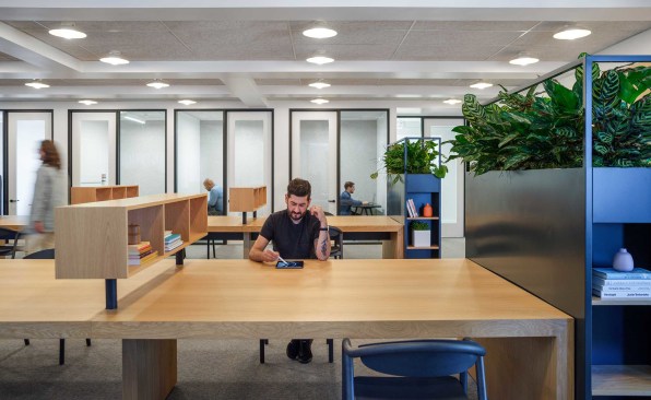
“It kind of looks like a college library,” says Fraser. “It serves that same function, like when you need to get out of your dorm room and you go the library. And I think there’s definitely people who use it that way at Fivetran.”
Fraser says the design has opened up different ways of working for his international team. “They kind of use it almost as a mini conference center,” he says. “It’s a place to go when they’re sick of being at home, and a place for more program-driven things, where an entire team will choose to get together for a few days. We’ve seen a lot of that, even across international boundaries.”
Stromquist says the design team put most of its energy into the amenity spaces in the office, like its corner spaces with nice views of the Bay Area, its library-inspired work and meeting areas, and the versatile lounge-like areas that can host social and community events. “There was an intentionality as to where the design investment went,” he says. “Not only did we maximize the size of these things but we made them pop, through color and materiality. They’re some of the most vibrant spaces in the office.”
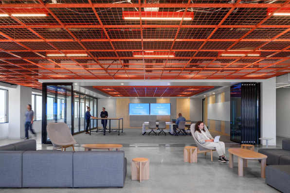
And because the design focuses so much on the more engaging non-daily parts of work, the office tends to be a bit more lively than the typical heads-down cubicle farms of the past.
“The nice aspect of that is it almost guarantees a consistent buzz in the office,” Stromquist says. So even though most workers may only physically come to the office every once in a while, there’s still enough activity to prove that the office still is part of doing business.


