- | 8:00 am
Nintendo experimented its way to a brilliant logo
Today, Nintendo’s logo is iconic. A century ago, you wouldn’t have recognized it.
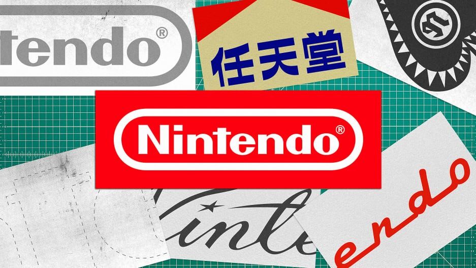
The Nintendo logo is a mark fueled by nostalgia, regardless of whether you were around for the launch of the brand’s first landmark console in the 1980s or grew up wielding Wiimotes in the aughts. It has survived intact in an industry known for amorphous identities—and that’s perhaps part of the brand’s magic.
Nintendo’s logo has graced blockbuster consoles and tragic, expensive failures alike (hello, Virtual Boy!). In the process, it has become the visual stalwart that unifies Nintendo’s many experiments. Whether the company was asking you to sit at a table and stick your face into an oddly smelling red headset, swing a motion-sensing remote to play a round of golf on your TV, or break the controller into two pieces and back again, the logo lets consumers know that, Yes, this idea might seem batshit crazy at first—but trust us. We brought you Mario, remember?
THE ORIGINS OF NINTENDO’S LOGO
If you thought Nintendo’s logo legacy kicked off with the groundbreaking launch of the the Nintendo Entertainment System (NES), you’d be off by about 100 years. But you’d be right about the whole gaming part: In 1889 the enterprising Fusajiro Yamauchi debuted a line of hanafuda playing cards in Kyoto. Fusajiro’s original logo features an admittedly Marlboro-looking red canopy and the kanji characters nin, ten, and do.

Today, people are split on what, exactly, the name means. While interpretations vary, a trademark notice published in The New York Times in 1955 notes that the characters are difficult to translate: “They constitute a fanciful expression having no precise dictionary meaning either in Japanese or English, but the application gives them the approximate sense of ‘a corporation whose fortune or prosperity be left to the mercy of heaven.’”
The gods apparently approved of the venture. Nintendo prospered, becoming Japan’s biggest card manufacturer. As the company expanded its offerings and reach, it needed an international identity. In true Nintendo spirit, the early ideas for the logo were wild, and prone to surprise and delight.
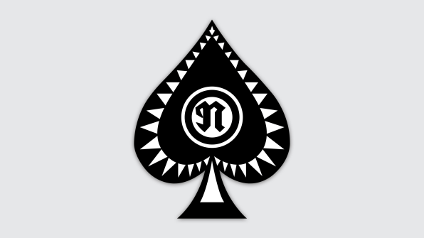
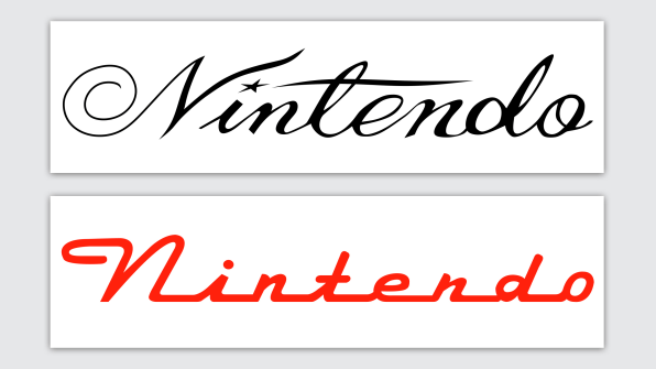
The first Nintendo logo iteration in 1950 was a more straightforward playing card insignia of a spade (whose spikes just might remind gamers of a Piranha Plant . . . ). This was followed by an elegant hand-lettered logo in the ’60s, complete with a star as the superscript dot of the ‘i’; a script version mirroring automobile typography of the era; and even a stark but curious sans-serif variant.
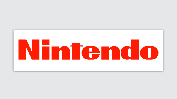
As Nintendo attempted to find its design footing, modern Japan was simultaneously pulling the rug out from under it. Cards were becoming old hat. So Nintendo did what it would eventually master: It innovated. At first, modestly, with games and toys bearing the identities above. One such product: the Ultra Machine. Released in 1967, it’s a toy that pitches small balls for users to hit with a bat. It’s notable not for launching a generation of tiny baseball stars, but rather for what appeared on the packaging: a red logo, consisting of what appears to be a modified version of Helvetica Black Condensed, with a trademark flattened ‘t’.
NINTENDO FINDS ITS FOREVER LOGO
In the wake of its wild experimental days, Nintendo had stumbled upon the mark that would eventually define the brand for the next six decades, with only minor alterations. With its soon-to-be-iconic square tittle (an unfortunate technical term in typography), it was a logo perfectly suited to ride the wave of the coming consumer pixel era.
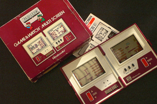
To that end, the company launched its electronic beam gun series in 1970 (paving the way for Duck Hunt), which, according to Nintendo, marked the first time electronic tech merged with toys in Japan. More advances followed: Game & Watch (don’t sleep on that Avant Garde Gothic), the Donkey Kong arcade game, and the holy grail: the Nintendo Entertainment System (NES) home console in 1985. All of it appeared under that logo, cementing it into the minds of consumers. Despite its retro vibes today, it’s easy to forget how new it looked at the time.
The only meaningful addition to the mark to speak of: While Mario Kart might have seemed the more ideal fit, Nintendo formally added its signature “racetrack” border to the logo of NES games with the release of Mike Tyson’s Punch-Out!!
Though plenty of companies have made plenty of logo missteps throughout their history, Nintendo has only one to speak of: In 2004, the logo went gray. It was perhaps an attempt to modernize, to stay current with the lifeless design trends of the era—but it was a move that seemed the antithesis of the playful, perpetually inventive company that it represented. (Nintendo even made the curmudgeonly move of asking media outlets to, please, get rid of the red.)

Luckily, on the eve of the launch of the kaleidoscopic Nintendo Switch, in 2016, the company reversed course and went all-in on red—and here we are today.
Will Nintendo ever overhaul the logo like Playstation and Xbox before them?
At this point, it feels unlikely. But hey, as a master of reinvention, Nintendo is probably one of the few companies that could actually pull it off.
After all: They brought us Mario, remember?


