- | 8:00 am
Apple is no longer a design-led company
The launch the Vision Pro AR headset comes at an inflection point for Apple.
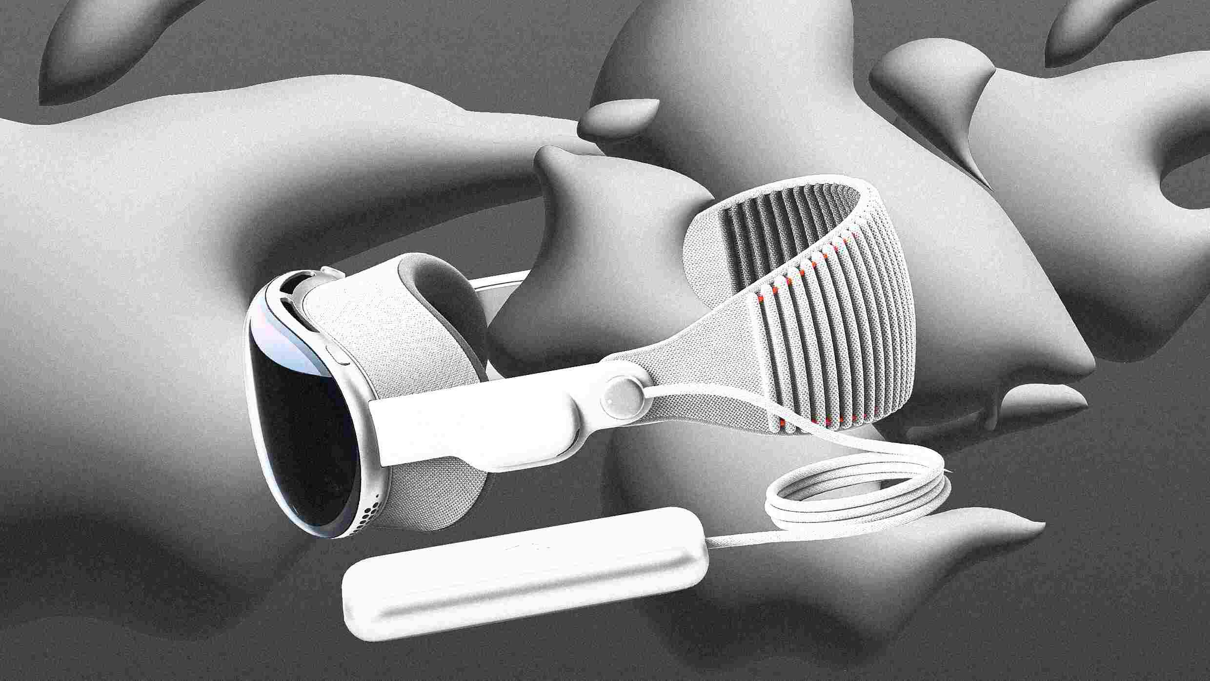
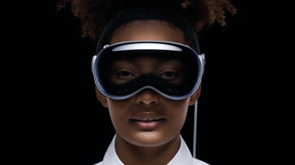
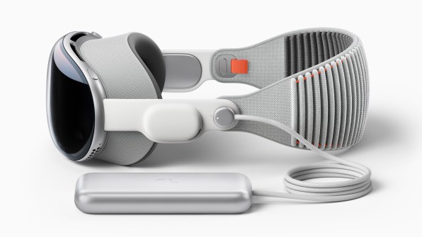
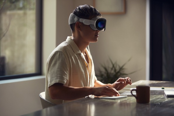
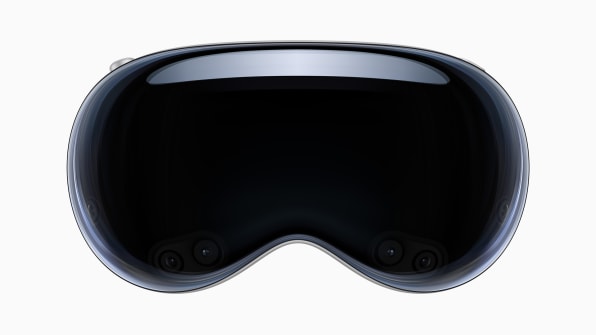
After nearly 20 years of work, Apple has revealed its AR/VR headset, the $3,500 Vision Pro. It’s impressive in many of the ways you might expect. The industrial design is refined—the front is a single curved piece of glass, and touches like a digital crown allow the user to seamlessly transition from VR to AR. Thanks to 12 cameras, 5 sensors, and 6 mics, you can control the system with your eyes, voice, and hand flicks, and the UI lives in your space, where apps reflect like tangible objects catching real light. Even people walking by will fade into your view when you’re immersed in media—and the headset will reveal your eyes to show when you’re looking back.
For many at Apple, it’s a day for celebration. But following conversations with several people with knowledge of the situation, I’m left with a different impression. The product we’re seeing today is not the best it could have been, I’m hearing, as it suffered from infighting between Apple executives and its own design leadership.
Many in the know are in a state of mourning for design at Apple. Even as Apple continues to employ an unparalleled roster of design talent, those talents have less and less say in company strategy, which is eroding its design dominance. As one person put it to me, bluntly: “Apple is no longer a design-led company.”
WHAT WENT WRONG?
Apple became the company it is today because it made products that people fundamentally desired—things people felt like they needed, even if they couldn’t afford them. That was the result of a crystal-clear product strategy that reimagined what was possible when design and technology fused into a single entity, not what other companies were doing or what Wall Street wanted next.
The Vision Pro is a bellwether for a new era at Apple, one led more by engineering and operations than design. The breadcrumbs of Apple’s design descent aren’t difficult to follow. It’s something of an open secret that Tim Cook and Jony Ive clashed, leading Ive to leave Apple in 2019. Evans Hankey—a two-decade veteran at Apple who worked in that tight-knit design team—stepped into the VP of industrial design role to oversee product design at Apple. But she left in 2022, replaced by COO Jeff Williams. He wasn’t a designer, but an operations expert with a pedigree closer to Tim Cook.
Under Cook, Apple has been operating with a different strategy than it did under Jobs: To leverage the sheer size of Apple to launch perhaps not half-baked products, but certainly products with a gooey center that will require years of more design iteration and technical achievement to solidify.
With the launch of the iPhone, Apple solved the core UX problems of smartphones as we knew them. Iteration made this platform better over time in a thousand little ways—ranging from increasing thinness to keyboard haptics to waterproofness to the App Store—but we didn’t need iteration to prove the earth-rattling value of something that was so decidedly different in its approach. Apple was late to smartphones, and even still, it completely redefined the category. The iPhone launched three generations ahead of its competitors who would take years to catch up. I simply don’t see this same lead with Vision Pro, and I think that comes down to Apple’s lack of design leadership.
According to The Information, Ive always imagined the headset as a stand-alone consumer product, while Mike Rockwell, the Apple vice president in charge of Apple AR/VR, wanted it to operate from a base station (more akin to an early Oculus Rift) to offer higher-fidelity graphics and be something creative professionals might use. Even here, you can see the push and pull between approaches at Apple—Ive focusing on experience, and Rockwell prioritizing pixels. Every successful Apple product you know has done the former rather than the latter.
No one has succeeded in AR/VR yet, despite the fact that all the great superpowers of tech have built superb tech demos themselves. Building AR headsets, in particular, is hard; and I can’t help but remember Carl Ledbetter, the partner director of design at Microsoft, who led development of the Hololens 2, detailing tolerances of picometer—a trillionth of a meter—on its projection system that separated a user feeling awe and feeling like they needed to puke.
Microsoft, knowing the Hololens’ expense and bulk, aimed the headset at the enterprise market but ultimately found its largest customer in the military (which is finding the technology isn’t quite ready for soldiers yet). Meanwhile, Facebook bet the company on VR/AR headsets, rebranded itself Meta, and built a world no one wants to inhabit. Not to mention Magic Leap, which is now pitching itself for the specific use of healthcare; or Google, which just gave up on selling its Google Glass AR platform to enterprise customers.
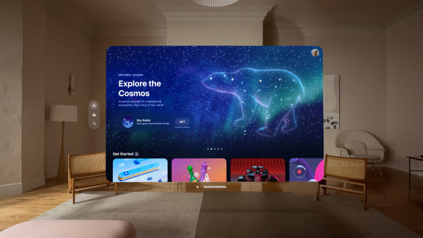
With AR/VR, Apple seems to have surpassed the competition, but it is playing the same game as everyone else. We’re seeing a similar sports-bar-style UI, with countless little windows planted around your room, that’s been in this space for years. A cord tethers your headset to a belt pack because even Apple can’t break the laws of physics around weight and power sitting on your head.
Reports say that Apple is still struggling with the device overheating. The incredible cameras, sensors, processing, displays, and energy management that need to unite in this technology still feels out of reach. No matter how you slice it, the Vision Pro is not quite a consumer product yet. It feels a lot like the thing Apple might have released before the thing it released.
APPLE WAS ABOUT BEING MORE THAN JUST BETTER
This is not to say Apple is incapable of succeeding where others have failed; the company has certainly done it before. But based upon what they showed today, Apple hasn’t fundamentally reimagined the category like it has computers, media players, or smartphones.
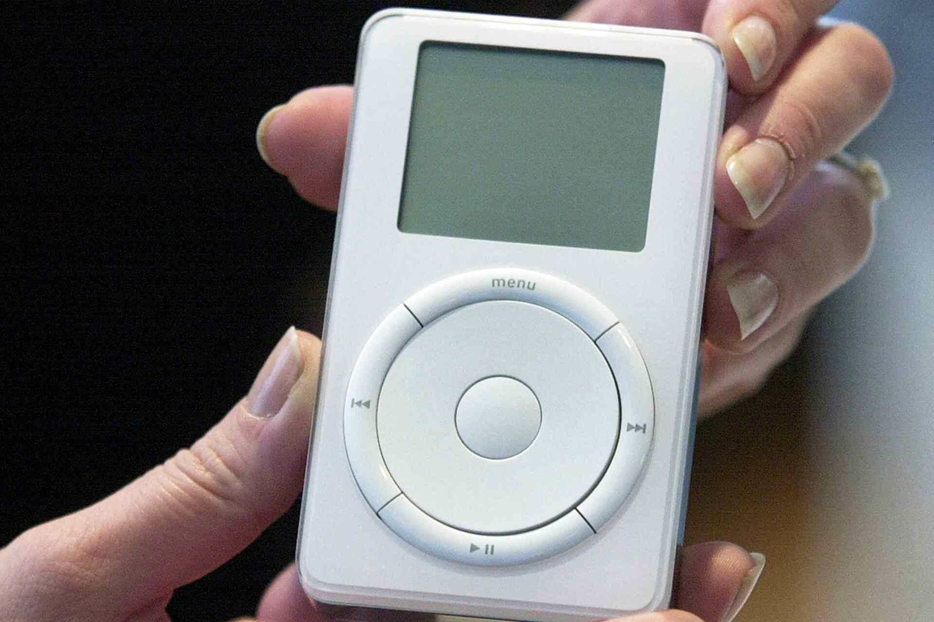
It’s easy to forget now, but when the iPhone was announced, IT professionals didn’t want to touch Apple for corporate products. Blackberries and Microsoft devices were the status quo. But by winning over consumers—or perhaps, winning over the CEO, not as a CEO, but as a consumer—Apple forced its way in. Apple won through the sheer perfection of its design. Like it did the Mac. Like it did with multiple generations of iMacs, iPods, and iPhones. Even like it did with Airpods, which are perhaps the sneakiest AR product (with 3D soundscapes and audio passthrough) the world has experienced yet.
Instead, the rollout of Vision Pro feels more similar to the Apple Watch, a product launched with sluggish sales and without a cemented purpose. Over time as technologies improved, its offerings snowballed to include new health features and a more articulated interface. Keep in mind: At launch, its screen couldn’t even display a watch face all day. The most expressive device most people wore was in a perpetual state of off.
But its industrial design proved to be a solid platform for iteration; and now, the Apple Watch is a serious business for Apple and holds incredible potential as a computer dedicated to our long-term health. (Plus, connected yoga with the Apple Watch and Fitness is quite good!) It’s no wonder that Apple’s leadership team is hoping this play works again on the Vision Pro.
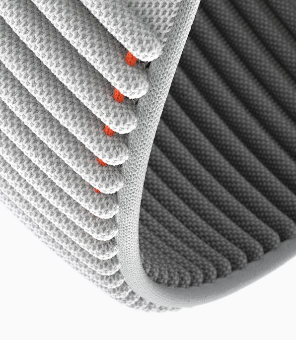
Apple’s Vision Pro looks better than anything its competitors have released, yes. Magnetic lenses and a knitted head strap look like significant ergonomic improvements in headset design. And the headset is attacking serious UX problems like, how we can talk to one another with a giant computer on our face through (the somewhat creepy?) feature EyeSight or its group FaceTime.
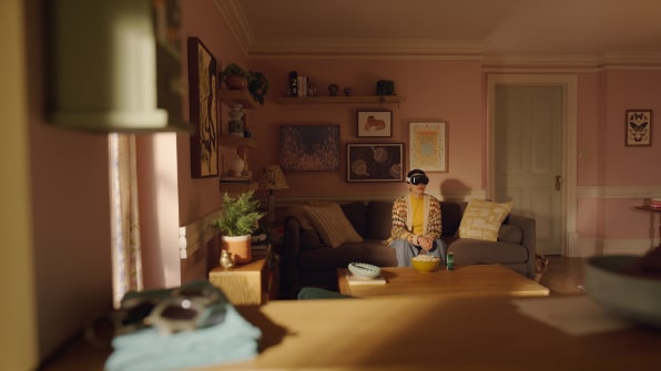
But that’s never been the bar for Apple to beat the competition at its own game with a slightly better version of the same thing. Today, after watching a 2-hour presentation revealing “Apple’s first spatial computer,” as execs called it, I’m still not sure why Apple had to make this computer, and I’m still not sure why anyone needs to buy it.
Apple is at its best when it presents a product that feels impossible to be made any other way, enabling life to be lived in a new way, through a design that’s refined, that is completely obvious in retrospect. And that’s because Apple has traditionally been a design-led company, in true competition with a single entity only: itself.


