- | 8:00 am
What designers can learn from Apple’s latest accessibility features
Five innovative additions that aim to tackle challenges faced by individuals with disabilities and improve accessibility for all users.
Apple’s recent Worldwide Developer Conference (WWDC) unveiled an array of groundbreaking features, headlined by the much-anticipated Vision Pro device.
However, beyond the buzz of its flagship product, Apple’s commitment to accessibility and inclusivity shines through in a collection of lesser-known features that cater to the disability community.
In this article, we’ll explore five innovative additions that aim to tackle challenges faced by individuals with disabilities and improve accessibility for all users.
AUTOFILL IN PDFS: ASSISTING COGNITION AND FINE-MOTOR SKILLS
What challenges does this feature aim to address?
Filling out PDF documents can be a daunting task, particularly for individuals with disabilities. Those with limited cognitive abilities may struggle to understand the purpose of form fields or what information to input.
For people with fine-motor challenges, the physical act of writing or using touch interfaces can be difficult and fatiguing. Traditional PDF completion methods can exacerbate these challenges, creating barriers to accessing important documents and information.
How does this feature improve accessibility?
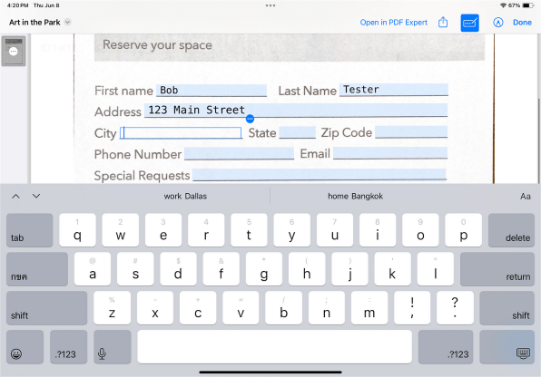
AutoFill in PDFs leverages Apple’s AI technology to address these challenges head-on. By automatically detecting form fields and suggesting relevant information, the feature greatly reduces the cognitive load for users. They no longer need to decipher the purpose of each field, which makes the process more straightforward and efficient.
Additionally, for individuals with fine motor challenges, eliminating manual writing or signature requirements is a game changer. The system’s AI-driven assistance enables users to tap and interact with the interface instead of performing physically demanding writing tasks, making the entire process accessible to a broader audience.
What can designers learn from this feature?
Designers can learn that incorporating AI-driven automation can significantly enhance accessibility for users with diverse needs. Understanding the specific challenges faced by disabled individuals can guide the development of more inclusive features.
By prioritizing accessibility and streamlining complex tasks, designers can create interfaces that cater to a broader range of users, ensuring that no one is left behind.
LIVE VOICEMAIL: A GAME CHANGER FOR THE DEAF AND HARD-OF-HEARING
What challenges does this feature aim to address?
Listening to voice-mail messages can be a challenge, especially for individuals who are Deaf or hard of hearing. Oftentimes, a voice mail can be difficult to understand if the person leaving the message does not speak clearly enough.
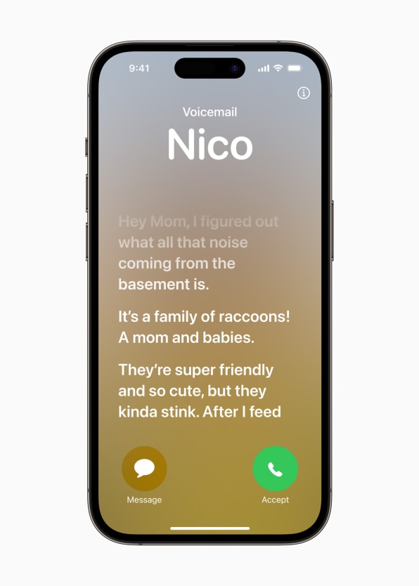
Live Voicemail enables users to access voice-mail messages without struggling to hear or rely solely on loud volume or hearing aids.
How does this feature improve accessibility?
This feature transcribes voice mails in real time, allowing users to read them as they come in. The convenience of accessing voice mails directly from the Lock Screen is invaluable, reducing barriers and providing an efficient communication alternative to the traditional method.
What can designers learn from this feature?
Designers can learn from this example by incorporating text-based communication options to enhance accessibility. By providing an alternative way to access voice mails, Apple enhances accessibility for the Deaf and hard-of-hearing communities.
NAMEDROP: STREAMLINING CONTACT SHARING
What challenges does this feature aim to address?
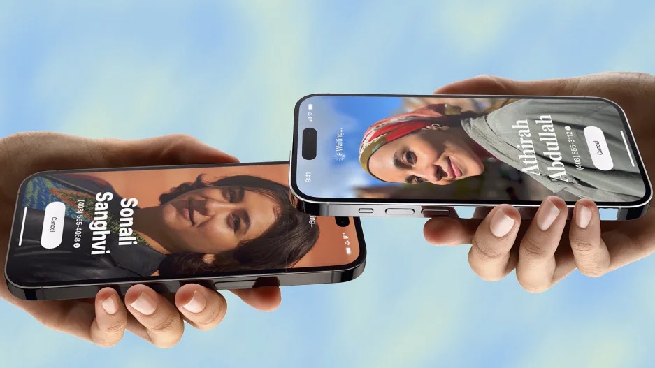
NameDrop, a novel contact-sharing feature, expedites the process of transferring contact data between devices. Contact sharing between devices can be a cumbersome process, involving multiple steps and interactions.
For users with visual or motor impairments, this task can become even more challenging, leading to frustration and fatigue.
How does this feature improve accessibility?
NameDrop offers a streamlined contact-sharing solution, leveraging AirDrop technology for seamless data transfer. By bringing two devices close together, users can exchange contact information with minimal effort.
This reduction in visual and motor complexity greatly benefits individuals with disabilities, making contact swapping more accessible and user-friendly.
What can designers learn from this feature?
Designers can learn the importance of simplifying complex tasks to improve accessibility. By consolidating multiple interactions into one seamless process, designers can create interfaces that are more inclusive and user-friendly for individuals with diverse needs.
Prioritizing accessibility in communication features ensures that all users can engage effectively, regardless of visual or motor limitations.
FACETIME ON APPLE TV: AMPLIFYING VISUAL AND EMOTIONAL CUES
What challenges does this feature aim to address?
Traditional video calls on smaller screens may present challenges for Deaf and hard-of-hearing individuals. Smaller displays can limit the visibility of sign language and visual cues, impacting effective communication.
How does this feature improve accessibility?
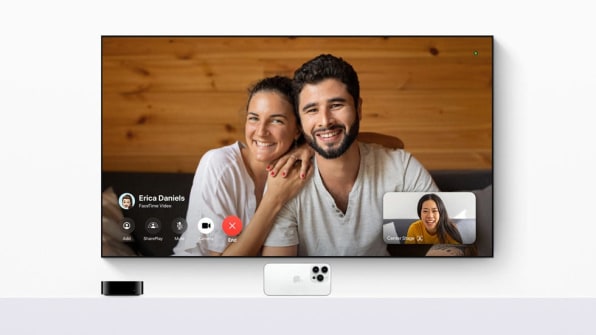
Bringing FaceTime to Apple TV introduces a larger display for video calls, which enhances visual and emotional cues. For individuals who rely on sign language and visual cues for communication, the bigger screen offers more real estate for conveying and interpreting messages effectively.
By catering to the needs of Deaf and hard-of-hearing users, Apple emphasizes the importance of considering specific accessibility requirements to enhance the overall usability of a feature.
What can designers learn from this feature?
Designers can learn the significance of catering to specific accessibility needs when designing communication tools. Larger displays and clear visual elements can improve communication experiences for individuals who rely on nonverbal cues.
Embracing such inclusive design principles ensures that users of all abilities can fully participate and engage in meaningful interactions.
MENTAL HEALTH TRACKING ON IOS AND WATCHOS: FOSTERING EMOTIONAL WELL-BEING
What challenges does this feature aim to address?
Mental health is an essential aspect of overall well-being, but tracking and managing emotional states can be challenging. For individuals facing mental health struggles, it can be challenging to monitor and share how they’re feeling with healthcare providers or therapists.
How does this feature improve accessibility?
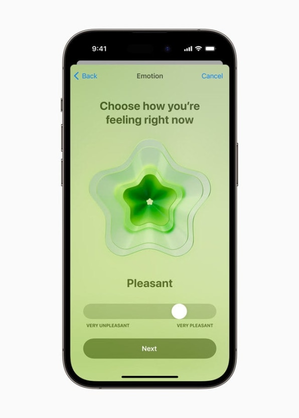
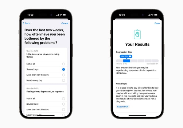
Apple’s integration of mental health tracking into iOS 17 and watchOS 10 offers a significant step forward in addressing this challenge. Users can readily track their emotional states and complete wellness assessments directly from their devices. This data can be shared with healthcare professionals, promoting better awareness and management of emotional well-being.
For users with disabilities, this feature becomes more accessible through the use of built-in accessibility software like VoiceOver and Dynamic Type. By leveraging these tools, users can navigate and complete wellness assessments more effectively, ensuring better mental health management.
What can designers learn from this feature?
Designers can learn that addressing mental health concerns with technology is essential, and creating interfaces that facilitate easy tracking and sharing of emotional well-being can empower users to take better care of their mental health. Prioritizing accessibility features within mental health tracking applications ensures that users with diverse needs can benefit from these valuable tools.
ACCESSIBILITY IS FOR EVERYONE
Apple’s commitment to accessibility is evident throughout the thoughtful designs of its latest features. By addressing specific challenges faced by individuals with disabilities, Apple demonstrates its dedication to inclusivity and user-centric design.
Accessibility needs come in a variety of forms. Recognizing that each person has unique abilities supports the fact that accessibility is not a fixed concept but rather a spectrum.
Even a tiny 1% improvement in products and experiences can make a significant impact on accessibility, bringing us closer to achieving equal access for everyone.
This article originally appeared in UX Collective on Medium and is reprinted with permission.


