- | 8:00 am
Slack is getting a simpler interface, much to the delight of office workers everywhere
The Salesforce-owned platform is getting a redesign to make your messages—and new features that go beyond chat—easier to find.
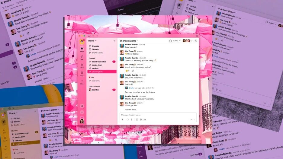
Slack’s interface is getting a facelift.
A new redesign of the work chat tool, announced Wednesday, seeks to make conversations, notifications, and newer additions like Slack Huddles easier to find. It’s a moment of recognition by the company after years of incorporating features like Workspaces, Threads, Channels—additions that, while useful, have also made the app feel cluttered and at times unnavigable.
The fresh interface comes as remote work and distributed teams turn Slack and platforms like it into the closest thing many people have to a shared office environment—a combined inbox, conference room, file cabinet, and water cooler for the work-from-home world. The new design looks to give users the space they need to effectively chat, collaborate, and have quick video calls—and, thanks to a new feature that lets users set aside messages to respond to later, space to catch their breath and plan what to do next.

“We’re very conscious of the fact that people usually start and end their day in our product,” says Noah Weiss, Slack’s chief product officer. “The average Slack user—they spend 10 hours a week actively in Slack, and that’s a tremendous responsibility.
The new Slack design’s left-hand navigation bar features a button explicitly built for direct messages, and an “Activity” button that highlights ongoing threads, recent channel buzz, and mentions, with tabs to focus on just one of those categories. It’s an interface design that feels familiar from social media platforms like Facebook and Instagram.
A Home button takes users to something like the current main Slack view, with a list of channels, direct messages, and integrated apps. Users of Slack’s premium Enterprise Grid service, designed to organize large companies into smaller workspaces, will be able to see more relevant activity without needing to click from workspace to workspace. And Slack users in general will be able to tag non-urgent messages for review at another time, accessible through a Later button on the navigation menu.
The new interface will begin to roll out this week to new teams and users of Slack’s free plans, expanding to other users (paying) through the fall, presumably once some early bugs have been sorted out.
Ethan Eismann, SVP of product design at Slack, compares the redesign to transforming a gym: What was once a large open area chaotically strewn with exercise equipment and workout stations, is now a set of more focused rooms.

“What we’re trying to do here with the new design is actually take that gymnasium and put it into a series of organized rooms, each of which have had a clear purpose,” he says. “And they give you a sense of calm when you’re in the room—you know what you’re supposed to do when you’re in the room.”
A single Create button, marked by a plus sign, will let users send a new message or launch a new chat channel. It’s also the place to start an audio or video Huddle, or open a new Canvas—Slack’s recently launched interface for shared note-taking and document creation—”these things that are not Channels, but are becoming first class parts of the Slack experience,” says Slack CPO Weiss.
It’s a logical way to streamline a tool with a growing number of features, some of which are likely still unfamiliar to many users—does everyone know, for instance, that tapping the headphone icon launches a Huddle? It’s also a way to highlight Slack’s capabilities beyond traditional chat, at a time when companies are experimenting with a variety of tools from Coda to Canva for sharing information between workers who might seldom set foot in the same room.

Slack famously got its start at a video game startup led by cofounder Stewart Butterfield, who expanded and released the chat tool when their game failed to gain traction. The platform, launched in 2013, became a go-to work communications tool for businesses large and small, gradually introducing features like threads and emoji reactions. And when offices closed at the start of the coronavirus pandemic, Slack became a vital tool for many companies looking to keep suddenly dispersed workers on the same page. When Salesforce announced in late 2020 it would buy Slack for $27.7 billion in cash and stock, CEO Marc Benioff pointed to the companies’ combined value “in the all-digital, work-from-anywhere world.”
“There’s obviously a huge surge from the market in terms of demand for Slack, but also expectations from our customers going up pretty dramatically,” says Weiss. “Because all of a sudden, a lot of the value that we’re getting out of their physical office, they were now expecting from Slack.”
Many companies rolled out software designed to keep workers connected in a distributed world, from video game-style simulated offices to click-to-talk video chat systems. From Slack came tools like Huddles, designed for quick and informal calls, Clips, which enables sharing of short audio and video messages like announcements and updates.
Huddles sprang from a desire to bring informal quick conversations, common in office settings but harder to accommodate in a world of remote work and scheduled Zoom meetings, into Slack, says Ali Rayl, the company’s SVP of product.
“That spin around in your chair, tap somebody on your shoulder and say, ‘hey, do you have a minute,’” she says. “We’ve kind of brought that back into people’s workdays.” Now, as companies continue to search for ways to work efficiently without having everyone in the same place, Slack has a powerful advantage in the number of people already using it for day-to-day communications.
Canvas, for instance, Rayl argues, is a more natural way to gather and share information already found in Slack channels than other document-sharing tools, since they make it easy to embed existing messages and are already automatically shared with Channel members. Slack’s advantage may be especially strong if it can unobtrusively introduce new features to existing users while keeping its interface easy to use.
“The only place that they do go every day is Slack,” says Weiss. “And that’s the both responsibility and opportunity that we have.”


