- | 8:00 am
Billions of users are still coming online. Here’s how to design for them
Building technology for everyone requires more than just airlifting products that have worked in the West.
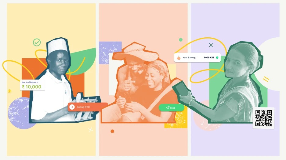
In a small town in India, Swati runs a popcorn and peanuts kiosk. She doesn’t trust banks, so she saves cash and buys supplies on credit. Every week, she makes a hefty interest payment to her suppliers without knowing how much of that loan she still has to pay off. She tried using smartphones to allow customers to pay her via QR code, but her uncertainty about the process and a few cases of fraud scared her off. Like many aspiring to a more prosperous future for their families, Swati dreams of expanding her shop and opening a factory. But due to limited formal banking history and lack of confidence navigating digital financial services, people in Swati’s position find their options limited.
And her story is the story of a billion others living in emerging markets.
Every week, around the world, millions come online for the first time. Of all the experiences these new users face, financial services are among the most complex and high-risk.
Pulling hard-earned wages out from under the mattress and putting them into an abstract financial app or virtual wallet is a daunting task for the 1.4 billion unbanked adults globally at the last mile of financial access. Mobile phones and data connectivity are reaching more of the poorest people, but a lack of digital financial confidence continues to hold them back.
“Last mile” refers to physically remote communities as well as traditionally excluded users who lack access to the digital economy, due to lack of internet and formal bank accounts. There’s a lot that can go wrong in trying to adapt services to reach and serve people at the last mile. To solve for the needs of last-mile users like Swati, who make up about 30 percent of adults around the world, we need to redesign our financial services to be not just accessible but also inclusive, valuable, and equitable for everyone.
But building for everyone means more than just airlifting in products that have worked in the West. Here are some key factors in designing products that help build financial confidence for everyone.
PLAIN LANGUAGE, NOT PERCENTAGES
In India, rural women often struggle with formal banking. Yet, the same women deftly manage family resources to ensure there’s money for weekly expenses as well as future goals. Ask one of these women how, and she might say, “I earn 50 Rupees for every 1,000 Rupees I put in my savings group. By the end of the year I’ll have enough to buy a TV.” Banking terms have never been in their vocabulary, but they’re experts of their finances in concrete terms.
Financial communication at the last mile needs to work differently, building on intuitive mental models people are used to, rather than expecting them to adopt new ones.
In Pakistan, the startup Finja offers credit in the plainest language possible: It shows credit terms in absolute numbers and the lending rate as a fee. Knowing some are skeptical, the startup offers a calculator to try out different terms. Finja illustrates how small shifts can make a complex financial product more aligned with people’s mental models and easier to trust: In its first year, 25,000 merchants signed up for Finja’s app, which served 16 million customers.
TYPE SHORTCUTS
For new digital users, smartphones can be intimidating: Screens are small, text is tough to read, and on-screen keyboards are hard to use. The fear of a typo in a financial transaction can stop them in their tracks.
Last-mile users have a range of textual and digital literacy, and products need to offer multiple ways for users to engage, based on their comfort and capability.
NOW, a digital-first bank in UAE, breaks the text-only interaction model for its low-income users who send money back home to their families, by offering data input via voice, 11 in-app languages and photos of receipts, reducing time and errors, to help users send remittances confidently and securely.
HANDS-ON HELP
Many last-mile users need help using their accounts. Assistance often comes in the form of agents—local merchants who provide services from banks, startups, and other organizations. These agents also provide strategic guidance as trusted proxies to formal financial services.
Yet, most financial apps are designed for one user and one device only. What happens when a user needs to share their password with their agent because they forget their PIN? Or when a husband needs to review a financial decision with his wife? We need to design high-tech with high-touch moments of human support to truly include last-mile users.
In India, Haqdarshak made hands-on help a core feature. Knowing many were already sharing passwords and handing over their phones to strangers just to access emergency relief, Haqdarshak introduced a secure network of agents. They explain government benefits, run eligibility screenings, and help people make informed decisions. These agents opened up access to government benefits to millions of people through a hands-on, assisted experience, where a single-user experience would have failed.
BUILT-IN PAUSES
For last mile-users, speed can be the enemy of comprehension. App performance is often measured in the fewest taps in the fewest seconds to complete a task—making it easy to lose money or sign up for a product a user isn’t ready for.
For users with limited income, one wrong move can feel like a slip on a tightrope. Financial products need to give users moments of pause that help them regain balance when things start to feel shaky, and safety nets when a misstep does occur.
bKash and FiMoney are proving that slower is better. Their apps use “swipe to confirm” and “press and hold” to give users more control as they confirm a big financial decision. A few extra fractions of a second greatly increase a user’s sense of control in a new financial experience. For bKash, designing for financial confidence helped it grow into one of the largest mobile-money operators in the world, with 70 million users.
NO DARK PATTERNS
In Deceptive Patterns, Harry Brignull identifies the “dark patterns” that interlace today’s digital products, sometimes leading users to decisions they never meant to make.
Products with dark patterns can harm vulnerable users even when they are built with good intentions overall. Offering multiple credit options to unbanked people, for example, can land them in a vicious credit cycle that they are unable to maintain. But thoughtful design can help users explore the benefits and risks of new financial options, make informed decisions, and slowly build their financial capacity.
In Uganda, the startup Opareta has created a responsible loan-ladder model: it makes the first loan small in size, rewards payments made on-time (or early), and enables users who demonstrate responsible behavior to apply for bigger loans. Opareta embeds education along the way and helps customers understand the why behind each credit decision. This prevents users from taking on too much risk and Opareta from over-leveraging. Opareta trades short-term gains for long-term relationships with customers and paves the way for building financial literacy and confidence, one step at a time.
Connecting last-mile users to digital financial services takes many hands, so we put together a Financial Confidence Playbook to help any organization design products for this demographic. As for Swati, with the help of her local bank agent, and the right financial tools, she was able to double her sales and set up food stalls. She even bought her own phone, which she now uses with confidence. Actualizing her dream of a better future for her family no longer feels out of reach.


