- | 3:37 pm
Apple, please bring back your mesmerizing, clear computers
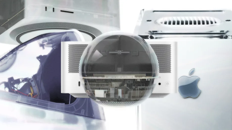
Another Apple event is over. But amid a slew of new products—all available in candy colors (of course)—I just wished they’d stripped it all away.
As the company revealed two of its most exciting products of the day—a new Mac Mini and a beefier, faster Mac Mini dubbed the Mac Studio—I didn’t find myself hoping their silver aluminum bodies were available in more colors. Instead, I pored over Apple’s carefully created animations, which revealed the internal hardware in these machines—complete with giant fans that harken back to an ’80s tape deck.
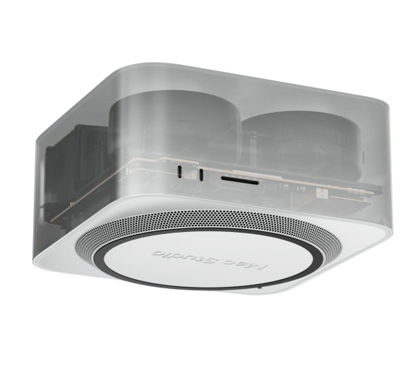
[Image: Apple]
And that’s when I realized, maybe these machines shouldn’t be wrapped in anonymous aluminum. Or colorful candy shells. Maybe Apple should use this moment to bring back an old idea—an idea from 2000—and make them clear. Maybe Apple should celebrate the maximalist hardware lurking inside these machines, rather than hiding it away.
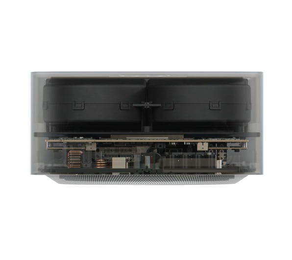
[Image: Apple]
Back in 2000, Apple released a quirky computer it dubbed the G4 Cube. During a time when desktop “towers” were all the rage, it was an aluminum block wrapped in plastic that sat on your desk like a trophy. Just as interesting was the big CRT monitor. It happened to be the last CRT monitor Apple made before it transitioned to flat panel LCD that went with the Cube. Its rear case was completely transparent, much like a ’90s telephone. (A few years later, Harmon Kardon released a set of speakers and a subwoofer with Apple, which featured a clear design, too. Apparently a version is still on sale today.)
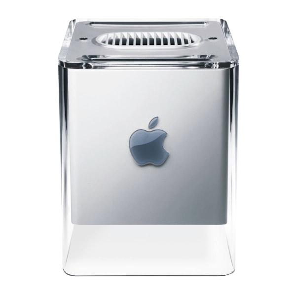
[Photo: Apple/Getty Images]
Unfortunately, the Cube was actually a terribly flawed design, prone to overheating. Apple pulled the Cube from production in 2001 and never brought it back. But the Cube’s presentation was right for the moment. It gleamed with the Y2K Era’s techno optimism. It was a computer that didn’t apologize for what it was and hide below your desk. And the accompanying monitor’s clear case pushed that idea further. Its outer shell was Apple’s beloved design, as seen in the iMac. But unlike most Apple design, it acknowledged the engines inside powering it. The monitor was Apple’s version of Dom’s Charger from The Fast and the Furious. The engine poking out of the body is a tease of the power inside.
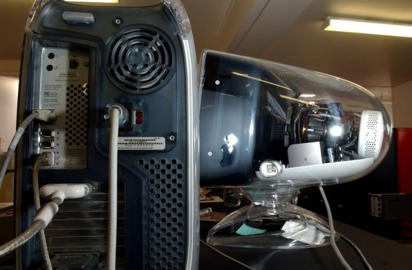
A G4 tower (foreground) with G4 monitor (background). [Photo: Dean Purcell/Getty Images]
Now, two decades later, Y2K design is back in full swing. And the maximalist aesthetics of PC gaming have taken over much of technology, with gaudy rainbow LED lighting effects and other ostentatious designs that Apple would, reasonably, never touch. This is the backdrop as Apple reveals two new computers, each of which promises immense processing power in a tiny footprint. But the problem is, these devices aren’t impressive for their size alone anymore! Our (much smaller) phones and tablets are stupidly fast, too. So a sandwich-sized computer simply doesn’t have the wow factor it used to, even if it can technically render a 3D animation faster than a phone can.
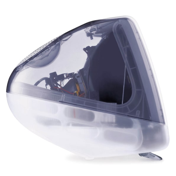
A transparent iMac, ca. 1999. [Photo: Getty Images]
Apple’s opportunity now is to peel back the curtain and use transparent casing to give us a peek inside their machines again, and to celebrate the maximalist technology underpinning the simple experience.
“But plastic is terrible!” you say. “Aluminum is easy to recycle!” According to Gadi Amit, founder of NewDealDesign and the industrial designer behind products like the original FitBit, plastic and aluminum can be relatively interchangeable in terms of environmental footprint, depending on the specific treatments with coating and milling. And while he muses that Apple’s devices get a slight cooling benefit from aluminum, which is a good conductor so it pulls heat away from the internal electronics, he doesn’t imagine that using plastic would be impossible. It could work.
Is the idea of bringing back transparent electronics cheesy? OK, maybe. It’s certainly a nostalgic play for an aging millennial like myself. But it’s also earnest. We’ve seen the shoe industry champion transparency of materials. It’s why you can see ground up Nikes in the soles of new Nike sneakers, and why Adidas is comfortable with a shoe being off-white to save dye.
Apple has waxed poetic about its earnest use of aluminum, sure, but that aluminum is a facade for what’s really inside. And as for what’s inside? Frankly, it just looks extraordinary, all on its own.


