- | 8:00 am
A design great shares 3 tips for navigating tricky client situations
Designer Sagi Haviv on how to make sure clients—and designers—end up happy during a big rebrand project.


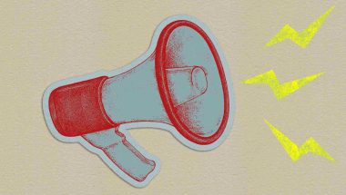
Branding is one of the most stressful disciplines for a designer—there’s a lot of money involved, and the company’s image is on the line. How do you convince your client that that inventive idea is the one, and what’s your play when they aren’t buying your pitch?
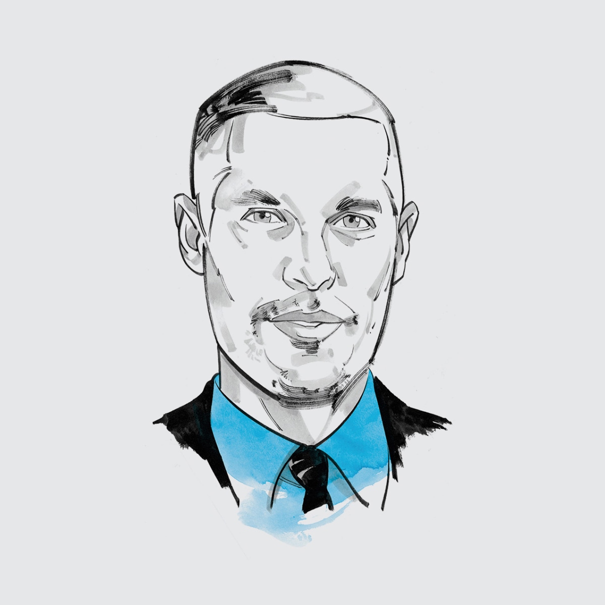
To get the answers for my new book, Creative Endurance, I spoke with one of the best in branding: Sagi Haviv. A partner at Chermayeff & Geismar & Haviv, he’s rebranded a variety of companies, including the U.S. Open, Conservation International, and ClearMotion. Below, I share some of his strategies for responding to chaotic client situations with Zen-like grace, gleaning universal advice that is applicable for anyone in a client-facing creative profession—including students who want to wow their professors. Let’s hit the books.
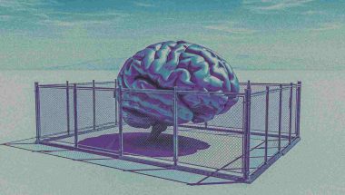
1. GIVE HONEST FEEDBACK
The stakes are high for the world’s most attended annual sporting event. Six thousand ideas for the U.S. Open logo are scribbled on everything from utility bills to bank statements and even an airline menu.
Haviv, the graphic designer responsible for this logo, is determined to arrive at the perfect solution. But despite his hours of effort, only one logo will make the final cut. The path to a great product is paved by honest feedback.
As a leader, that can be difficult—you may not want to hurt your colleague’s feelings—especially if you’re newly appointed to your position. Don’t sugarcoat it. Express what isn’t working, and explain exactly why. With murky feedback, you only waste time and belabor the creative process.
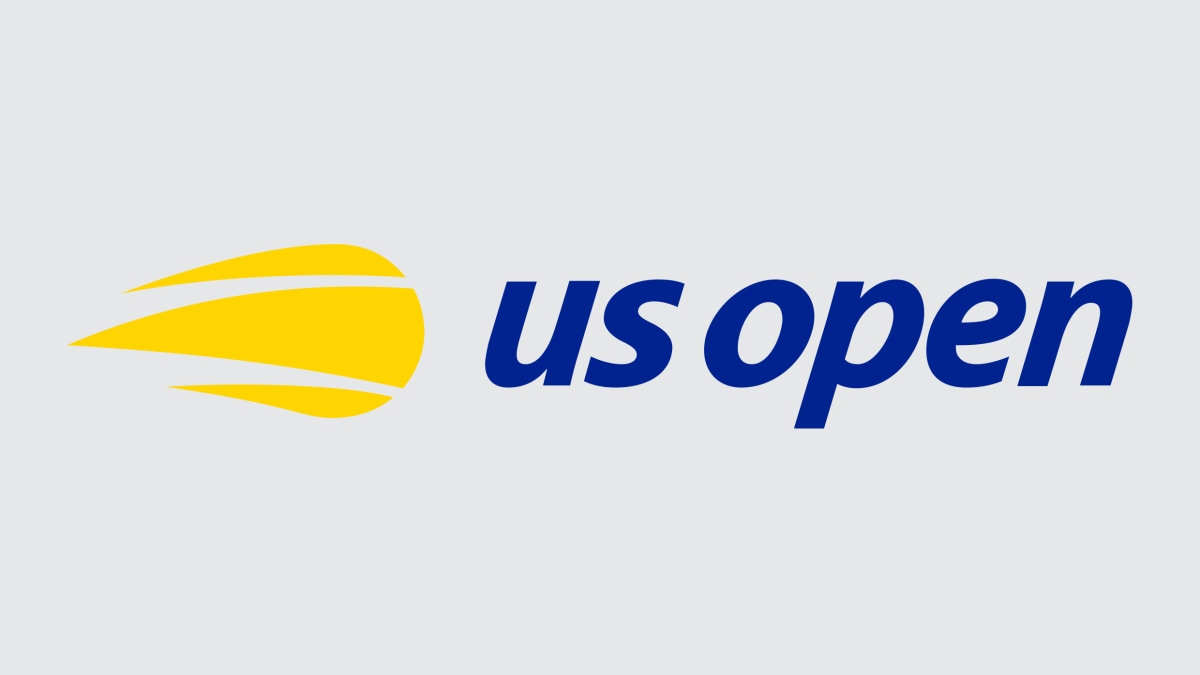
Haviv demands excellence and needs decisiveness from his team—not someone to tell him “the logos are all good because you worked so hard,” he says. The winner? A reduction of the original U.S. Open flaming ball symbol. While more drastic changes were explored, and many looked great, “you need to keep your feelings out of it and focus on what’s best for the client,” says Haviv. As a leader, remember: Your team looks to you for guidance and direction. Lead them to create great work, and they’ll respect you for your honest feedback. They might even invite you to happy hour.
2. MAKE A CASE FOR YOUR WORK
Chermayeff & Geismar & Haviv never would’ve guessed a monkey could assist them with a logo redesign for Conservation International. The organization wanted a new mark to represent their change in mission from environmental protection to world protection. Their original logo was a hand-painted logo of a jungle scene, complete with a beloved monkey hanging from a tree.
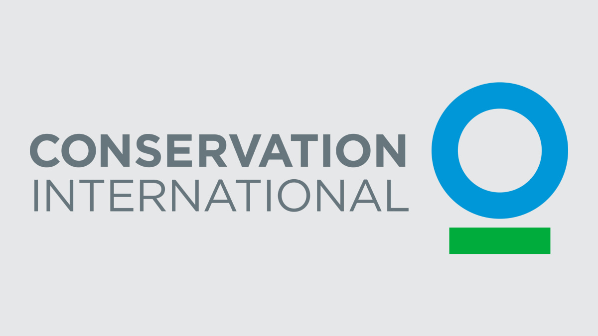
The client asks Haviv to add a human into the existing logo, but he presents a different vision: a modernist archetype of a blue circle with a green line underneath, symbolizing a blue planet on a green sustainable path. While the client is lukewarm on the new modernist approach, they agree to sit with the proposed logo. Six months later, Haviv receives a call. “People want the logo to have movement,” says the client. “A wave in the green line. Maybe a gradient? An arrow?”
The client tries her hardest to retain the simplicity of the modernist logo. And then, Haviv brings that monkey back. The rational case of the modernist logo didn’t work, so Haviv presents an emotional case. He places his favorite version of the logo onto videos that feature a monkey on a tree. That monkey.
They said yes. “It was magic,” Haviv says. Client isn’t sold? Go full Law & Order, and make your case. Provide a logical and emotional rationale, and you’ll reach a solution that satisfies everyone.
3. THE CLIENT ISN’T ALWAYS WRONG
“It was excellent. But can we talk about it?” The type of email that creatives dread.
Huh? Tom Geismar and Haviv are confused. They literally just presented the new ClearMotion branding to founders Shakeel Avadhany and Zack Anderson and thought it went great. What happened? Avadhany and Anderson loved one slide of the presentation, where the logo is a pin on a person’s jacket. The ovals are outlined instead of solid. But that wasn’t Haviv’s original intention for the design.
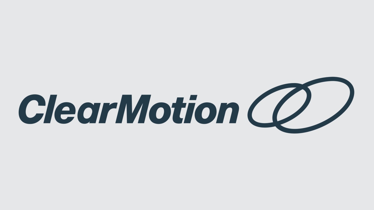
Haviv was initially taken back by this email, as he’d spent a lot of time pondering the form of this logo. ClearMotion, used by companies like Audi and Tesla, is a piece of software that reduces vibrations in a car through the scientific concept of laminar fluidity. Haviv distilled this confounding idea into an elegant visual solution of two solid interconnected ovals of different sizes, with negative space where they overlap. They’re telling us what the best version is?! Haviv thinks.

But then, he realizes the client is right. “The original logo had problems in small sizes,” says Haviv. “We changed it, and suddenly it works even better.” As creatives, it’s easy for us to take personal offense to feedback—our projects are like our babies. But if the client’s suggestion improves the project, then go for it. Because in the end, you just want it to be kick-ass and amazing. Right?
Excerpted with permission from Creative Endurance by Mike Schnaidt (Rockport Publishers, an imprint of the Quarto Group, 2024). Creative Endurance is available on Amazon and wherever fine books are sold.
Featured Videos
Today's Top Stories:
More Top Stories:


FROM OUR PARTNERS