- | 8:00 am
The team behind ‘The Acolyte’ reveals how they created the show’s gritty, fantastical sets
The new ‘Star Wars’ prequel used physical sets and props to bring the sci-fi story to life.
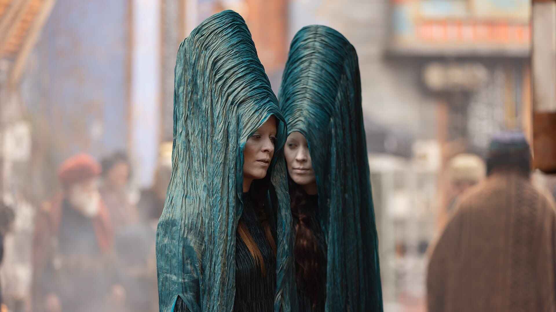
Crafting any story in a beloved universe like Star Wars is always a monumental task. Setting it a century before The Phantom Menace, the movie that started the beloved-by-some and hated-by-others prequel trilogy, is even more challenging. For The Acolyte, the latest Star Wars series, production designer Kevin Jenkins and costume designer Jennifer Bryan embraced the challenge, aiming to create a tangible world that felt ancient yet fresh.
The series does a great job digging deep into the lore of the Star Wars universe to introduce a new aesthetic that feels different from the originals and everything that came before. And while Andor was a triumphal exercise in world building, deeply anchored in the original ‘70s aesthetic of the Star Wars’ trilogy, The Acolyte’s is quite different, resulting in a fantastic, almost medieval universe.
Its nature is a logical product of its premise. The Acolyte set is in a time of relative peace in which the Jedi Order polices the galaxy in full force, a century before the rise of the Sith and the turmoil that led to the Galactic Empire. The series follows a Jedi Master (Master Sol) and a former Padawan (Osha) investigating a series of crimes to finally uncover the Padawan’s twin sister (Mae) as the assassin who follows the commands of a sinister force with a secret master plan.
GOING MEDIEVAL
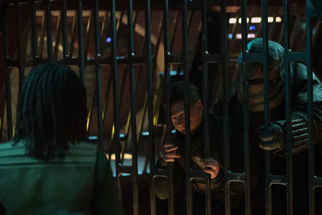
The Acolyte’s creator and director Leslye Headland—who was the cocreator of Russian Doll—collaborated with Jenkins and Bryan to shape the series’ unique look. Early discussions focused on integrating Headland’s passion for the prequels with Jenkins’ sensibilities from the sequels. “Leslye wanted a real, used version of the prequels,” Jenkins tells me in a video interview. This involved blending the clean aesthetics of the prequels with the gritty, practical realism of the original trilogy—the need to create a visual bridge between different eras of the Star Wars universe. “A world from over 100 years ago always feels dirtier, darker, and grimmer than what comes after it,” he says. This starting point allowed Jenkins and Bryan to explore new design possibilities while keeping an eye on the Star Wars legacy.
Jenkins likened the design approach to imagining the pre-Roman Empire era. A faux historical perspective permeated the series’ visual direction, making it look raw and grounded. The production team used real locations, physical sets, and practical effects rather than the blue screens and shiny digital 3D sets that George Lucas defaulted to on the prequels.
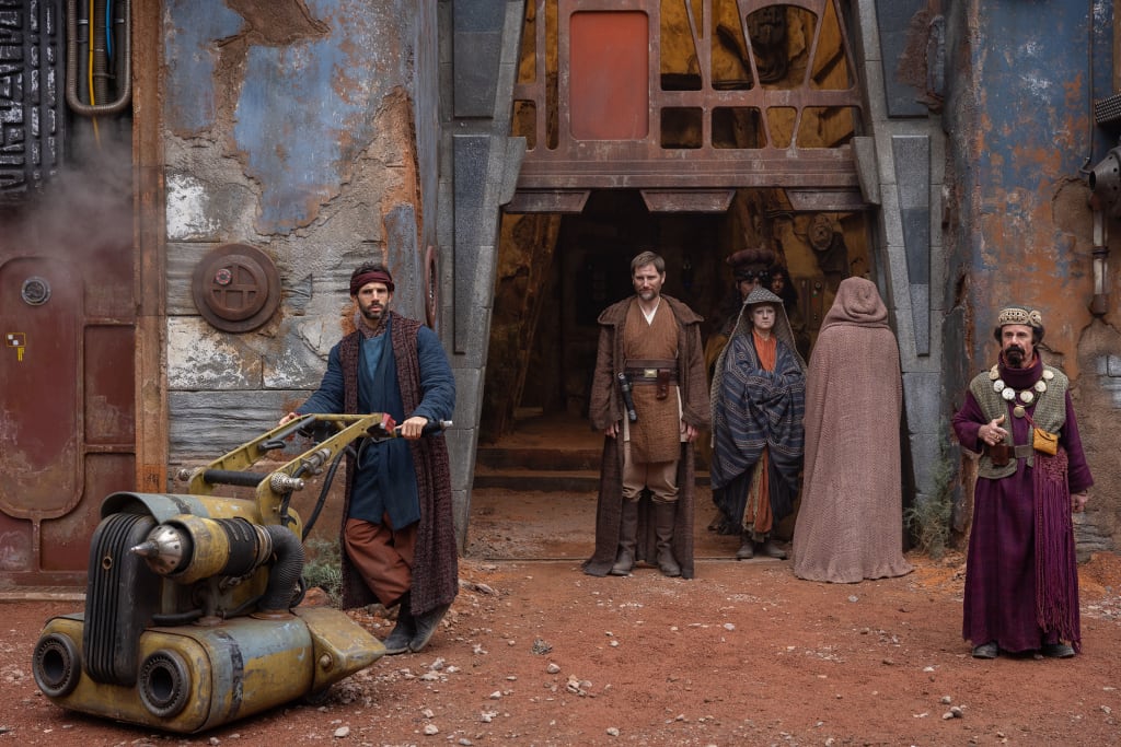
Bryan tells me over videoconference from Albuquerque—where she’s filming Vince Gilligan’s latest project—that building a past for a mythical universe we all know led her to look at various historical periods here on Earth. “I drew inspiration from medieval, Japanese, and Byzantine cultures,” she says, explaining that it was important for her to create a visually rich and diverse world. One clear example of this is Mae’s costume, which combines a medieval element like a chain-mail shirt under a samurai’s armor made of dark metal and bamboo, all partially covered in a thick purple cloak with that Byzantine influence.
Bryan also made subtle but powerful visual changes to well-known Star Wars elements. She introduced new colors like turmeric and mustard to the Jedi’s costumes “to reflect a time of peace.” Bryan wanted to use color to communicate messages to the audience—it’s a trademark of her design philosophy and can be seen in her masterful work in Better Call Saul. “Color is one of my strong points,” she says. “I use it as much as I can to bring depth and emotion to the characters.”
But there were other more mundane challenges in costuming The Acolyte. Bryan had to adhere to some of Lucas’ original edicts for Star Wars costumes, including that there could be no visible zippers and Velcro in costumes, which forced her and her team to get creative with closures and fastenings in a way she hadn’t experienced before.
A WORLD WITHOUT BATTLESHIPS AND STORMTROOPERS
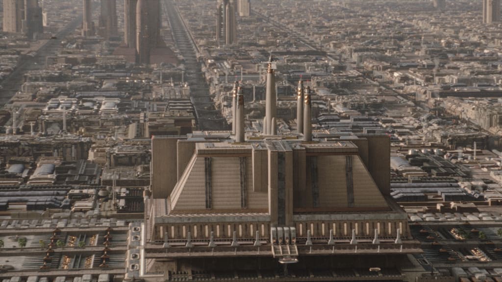
Jenkins, who known for his work on the Star Wars sequels, faced the unique task of designing a Star Wars world without its iconic elements such as battleships, stormtroopers, and familiar droids. “I had to reverse-engineer the Star Wars aesthetic,” Jenkins says. This required embracing architectural themes and heavy aging techniques to instill a sense of historical depth and continuity within the universe.
The goal was to depict a world that, while familiar, felt significantly different due to its temporal setting. “It’s almost like a heavily aged prequel meets a new look,” Jenkins says. This involved a meticulous process of designing sets that felt lived-in and worn. “We went 250% on the aging of sets, in fact,” he points out. One example: The narrative needed to depict the Jedi in a more relatable and less idealized light. This led Jenkins’ team to show another side of the Jedi Temple that, rather than feeling grandiose and palatial like in the prequels, was more reminiscent of a bustling, worn-down police station.
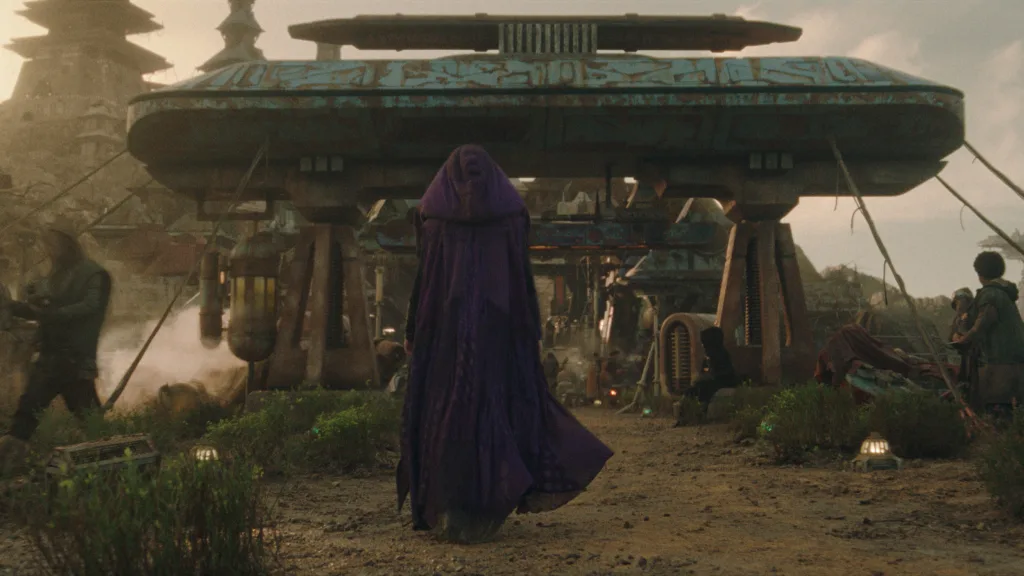
The Acolyte makes extensive use of practical sets and real locations. The series was shot in locations like the mountains of Wales and the island of Madeira. “These real locations added a tangible, immersive quality to the series,” Jenkins explains. The use of practical sets allowed for greater flexibility in production, enabling quick adjustments and multiple uses of the same set pieces, something that would have been impractical with production devices like The Volume, the giant LED soundstage that is used in The Mandalorian and other series, which requires 3D manipulation. With real sets “we could turn around any existing set into something new and different in half a day,” Jenkins says.
This approach also extended to the design of the series’ technology and machinery. Jenkins and his team deliberately designed technology to appear more rudimentary and less advanced than what audiences are used to in later Star Wars media. “We decided to make everything a bit more crude and basic,” Jenkins says.
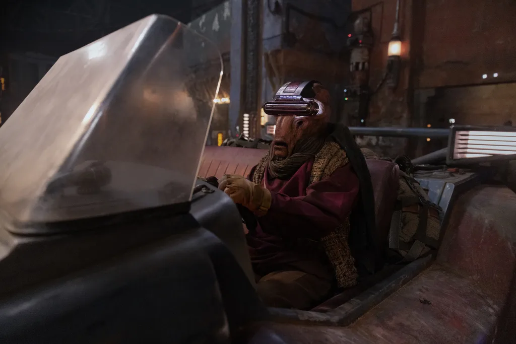
The series did use digital technology, but only where strictly necessary, like enhancing the sets to push up their scale or visualizing flying spaceships. Jenkins and his team worked closely with the visual effects department to ensure that the digital elements integrated seamlessly with the practical sets.
The mostly physical sets were a boon to the production’s timeline. “On a movie, you’re doing two hours of entertainment over a shooting timeframe,” Jenkins says. “On a large-format production with multiple episodes, you have the same amount of time to shoot, but you’re doing six or eight times the content.” This meant that the production team had to move quickly and efficiently, balancing the need for high production values with the practicalities of a fast-paced shooting schedule. It may feel counterintuitive but, in a world where 3D and AI seem to reign supreme, physical sets and locations were the best route to achieve their creative and budget objectives.


