- | 8:00 am
ILM’s chief creative officer reveals the secrets of building the Star Wars universe
In an extended Q&A with ILM and Lucasfilm creative lead Rob Brewdow, the industry veteran talks about everything from how to design a good droid to the impact AI will have on the special effects industry.
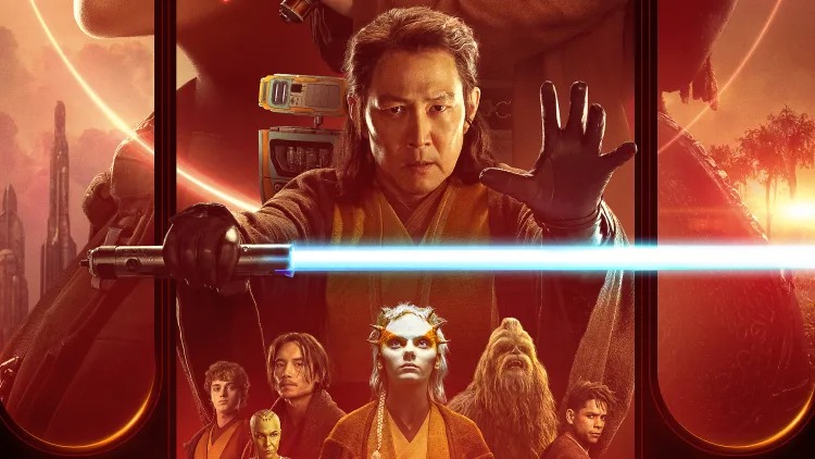
I don’t know the last time I went so deep on the topic of hallways. But in Star Wars, a hallway is more than a hallway; it’s a portal to a whole cinematic universe.

It’s one of many things I learn in an hour-long conversation with Rob Bredow, who wears the hats of both SVP of creative innovation for Lucasfilm and chief creative officer of ILM (aka the Jedi masters behind all things Star Wars).
Bredow is a visual effects guru who cut his teeth in the early days of computer generating graphics in film, working on classics like Independence Day, Cast Away, and Ready Player One—before making his way to Star Wars projects including Solo: A Star Wars Story and the new Disney+ show The Acolyte, both of which he co-produced. That makes him one of a handful of creatives steering the $65 billion sci-fi franchise into its future amid the vast transformation of generative AI—what must feel like light years from his early memories of the SIGGRAPH computer graphics convention, where he saw ILM showing digitally drawn dinosaurs for the first time.
You’ve been in the industry a while—you started your career working on Independence Day!
Being at the intersection of the technical and the artistic has always been my passion. As soon as I realized, like, you used computers to help make movies and TV shows, that’s all I wanted to do.
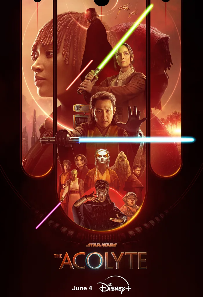
Now I wear a few hats at ILM and Lucasfilm, and most recently got to be producer on The Acolyte—worked really hard on that for the last couple of years with showrunner Leslye Headland. There’s a bunch of us who wear a number of hats, sometimes in production, sometimes in an executive role, kind of keeping all these plates spinning. It’s a little less structured than other big companies I’ve been at, but it’s also been delightful in terms of the kind of opportunity that affords.
Let’s start with Star Wars. You’ve worked on a number of properties in the universe at this juncture. How do you define the Star Wars aesthetic?
Fortunately, we get to work with people like Doug Chiang, who have been in the art department at Lucasfilm for many, many years, and who help understand the design aesthetic so that it can feel like it belongs in Star Wars, but you have to be able to reinvent it. We’re making a lot of Star Wars, and . . . you know, it’s easy to just put pillbox lights in a hallway and go like, “yep, we’re in an imperial hallway.”
On The Acolyte, Kevin Jenkins (Jurassic World: Dominion, Star Wars Episode IX) was our production designer. There were a number of times we were trying to figure out, what was the story behind the place? And then the question was, how much Star Wars gak do we need? [Ed note: Gak is the equipment/props decorating the background of scenes.] How little Star Wars gak can we get away with that makes it feel like we know we’re in Star Wars?
Some of my favorite kind of Star Wars design is where you just realize, there’s only one light on that entire wall. We’ve got thousands of square feet of surface; there’s just one little control box that tells you, “Oh, yeah, Star Wars.” And that’s actually all you need to know which universe you’re in, which is actually really clever and satisfying.
So you’re saying, now, the challenge is peppering in some of the lightest motifs to get you to Star Wars, to sort of bridge you into that universe?
When you think of George [Lucas]’s Star Wars, and the amount of variety that there was, you know, we’ve got Cloud City, which is this ultra modern design, and you’ve got Yoda’s visit to Dagobah. Dagobah is a completely, completely naturalistic environment, except for the few things that Luke brings that have all the Star Wars gak on them. They make you realize immediately, “Oh, with those buttons and those sounds coming out of that piece of electronics, I know what universe I’m in.”
After years of being awash in CG, I feel like we’ve really started to see this return to physical sets, practical effects, and grit—in Star Wars especially.
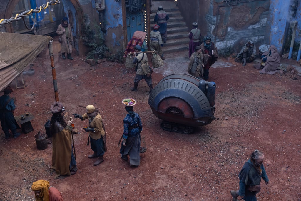
The Acolyte is a very practical-based show: We went to real locations, we spent a lot of time outdoors, we shot at Shinfield Studios, which is west of London. Both for logistics reasons, and also for what the story was calling for, building big sets was actually very, very satisfying. And then the whole team really worked hand in hand, because when you’re making shows with a lot of spectacle, it can be easy to bid, build big sets, but then shoot off of them and enhance them with CG. (And of course, we did that when it was necessary.) But we also worked really hard to design sets we can shoot in and finish the shots and finish the sequences all within the set. So then we could save our visual effects resources for those moments where we really needed to blow the doors off.
It’s a refreshingly old-fashioned way of doing it, right? Create a convincing set, and the set does so much of the work.
That’s so much of the heavy lifting. When we use technology, like the ILM Stagecraft technology, it’s great because you walk [onto set], and you feel like you’re really there, which also achieves some of that same illusion. But there’s definitely more than one tool in the tool belt, and finding the right one for the job, I mean, that’s part of my job, to help work with people like showrunner Leslye Headland to make sure that’s what she’s looking for, we can execute it, and then come up with the most efficient way to get that on the screen, so she has as many resources as possible for the other tricks we want to pull.
This is part of a larger trend that I feel like where I’ve seen. The Avengers films pushed visual effects to a place I think beyond what George Lucas ever did in that they really felt like they broke the fourth wall. The special effects were like watching an animated film more than watching humans. Does feel like the industry is sort of righting from that extreme?
I think the best balance is really a balance. If somebody’s doing a magic trick for you, if they do the same one over and over again, even if it’s a great trick, you still get tired of it because you’re like, “Okay, I know how they’re doing that trick.” So when shows use only one technique—”I’m going to use CG for this . . . and this!”—that’s the one technique you use throughout, you can kind of get used to that. You can start seeing the seams and it’s not as believable.
What [visual effects artist] Dennis Muren would almost always say was, “Do the unexpected trick.” Like, if you can get a component practically—one that people think that you would have had to get with CG—get it practically. Then do CG for the stuff they wouldn’t even think about. The illusion will be completely seamless. Because your mind will just be tricked by the techniques that were being used.
We did this a few times on this show, where you’re like, “Oh, that’s definitely a puppet.” But this puppet also has CG enhancements that you may not realize. And that seamless work between our visual effects team [and] our creatures, that is what gets you the most on screen. And when you look at it, you’re like, “Man, if that’s a puppet, how is he blinking that way?” But you only think of that subconsciously. Your mind just kind of gives up trying to figure it out. And the magic trick works, I think.
I feel like the magic trick no longer mattered for a long time. I think we’ve been able to look at things and say, “That is a special effect. That’s where the money went. And it’s clearly not real.” And that’s why I’m wondering, do you feel like there is a sort of return right now to the special effect as that magic trick that you don’t know necessarily existed?
I mean, that’s my favorite kind of project—when you want people to buy into the world as believable. And that’s what something like Star Wars does really well. You feel like that’s a worn, lived-in world. I love the way Andor treats the sets.
Speaking of puppets, what makes a good Star Wars droid? I know you had a recent contest with Autodesk on this topic. And obviously, Pip is a mascot of The Acolyte.
Personality is really what makes a great Star Wars droid. And that doesn’t mean likeness. In fact, it almost always means simplicity, rather than complexity. Like you think of your favorite Star Wars droids, whether that’s R2—or Pip!—they’re simple. Pip is almost more tool than droid, but because he has all this personality, and he kind of talks back and he’s got all these surprising tools, people are interested in what his capabilities are. His or her? I’m not sure which gender it is.
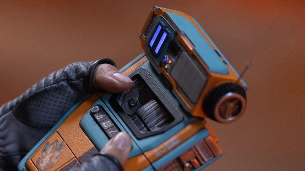
The design of Pip reminds me a lot of this Yves Béhar robot called ElliQ. This little robot for seniors that sits with a tablet. It just has one articulating point of the head. And mechanically it just very subtle hints at anthropomorphism.
That’s right. Neil Scanlan runs the creature effects team and ran it on The Acolyte. And his team had a bunch of different drawings and designs for Pip, many of which they mocked up at scale and 3D printed. I remember one meeting where Leslye walked into a room, there were probably 20 droids around of different kinds and different shapes. And there were even completely different concepts that had been worked out where Pip could fly.
Pip went through a huge amount of iterations. And some of it was to address exactly that question, which was how anthropomorphized that does Pip need to be? And how little can you get away with anthropomorphizing him and still get a personality? Because like, reducing his eye, which is that white glowing bar, to the simplest possible thing. Does he need two eyes? Well, that gets a little cartoony. So just the one. What’s the color? How much expressively do we need to have in there? What sort of communication are they going to do with just the simplest components?
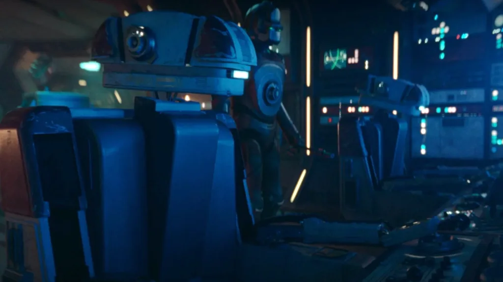
I think the most surprising robot I’ve seen on the show is the chair droid. It’s a droid shaped like a chair that mechanically transforms into a humanoid to autopilot a ship. That’s a UX moment you do not see in the Star Wars universe very often!
They’re so much fun.
By comparison, R2D2 is a cylinder that was built to allow somebody inside it and drive. That was the real inspiration of the design. The chair droid is really the first time I could think of world ergonomics being considered in Star Wars.
As our approaches have gotten more sophisticated in how we can create these droids, it really has opened up a new canvas for those kinds of things. I was working on Solo—what was that five or six years ago—and L3 37 is played by Phoebe Waller-Bridge. She was actually in the L3 suit, and then we painted her out, and then put in all the digital gaks, but there were big negative spaces designed in that droid, that maybe George would have wanted to do that for C3PO but it would have been impractical at the time. So he just had to find a thin person and put those black tights on to kind of give the illusion of some negative space when there couldn’t really be. And now that the visual effects technology and the artists are able to get in there, paint her out, and then replace her with seamless CG that fills in the inside of the droid opens up whole new design opportunities.
Now let’s talk about ships. What makes a Star Wars ship and what makes a good Star Wars ship?
We were talking earlier about kind of the utility of a world and the the idea of a world feeling lived in—
—which, when you talk to any great production designer, that’s the anchor for what you see on screen, for those for all of their fundamental decisions.
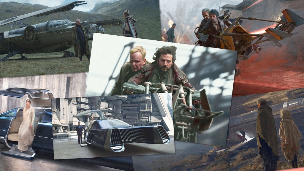
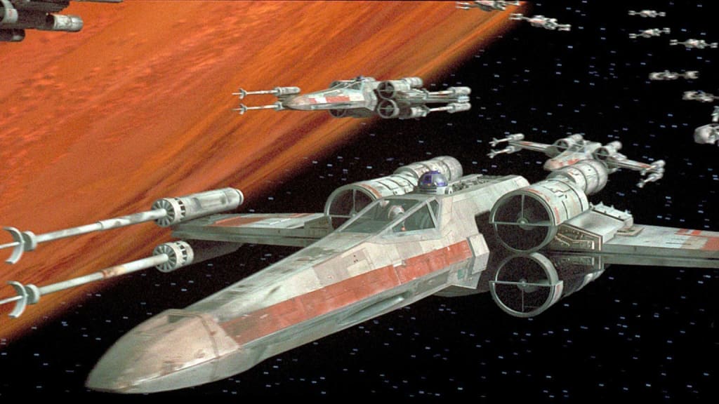
One hundred percent. Kevin Jenkins, who was the production designer, he did a lot of the design on the ships himself because of the importance and how much the ships communicate. And one of the thresholds we were using on this show was, do I want to buy the toy? [We wanted to make] something has that sort of universal appeal, like we think of when we think of an X Wing or Millennium Falcon. But it also has to feel like it is from a different era. On The Acolyte, we’re talking about a hundred years before the prequel.
So this is a new era of ships. There’s the utility component of it: In The Acolyte, we presume that the hyperdrives are actually a little bit bigger than they are a couple hundred years later. So there’s a handful of shots in the show that show you the hyperdrive ring, dismounting from the smaller ships. So when they’re flying between planets, they’ve actually got a hyperdrive ring that they bolt on, and then they go take off to larger distances.
They’re almost throwaway moments when you see them in the film. They’re not necessarily core plot points, but they’re leaning into that utility of the world.
You mentioned there’s a lot of Star Wars properties. I know you wanted to expand the aesthetic of the universe. But how do you approach the concern of sameness and giving the viewer too much monotony where they say, “Oh, another Star Wars thing”?
We’re so fortunate to have somebody like Doug Chiang running the Lucasfilm art department. And he participates in a really hands-on way on some of the shows. But he also has this overall responsibility to look at all the shows, and try to inject that right amount of freshness . . . but also, [decide] where it’s not worth reinventing.
We have the original drawings from the prequels, and he knows the stories, because, actually, Doug worked on the prequels. He knows the stories behind why those decisions were made. And he can use that to help inform what we’re doing with these spaces. People have cared about this universe for a large number of years. And some of those really talented people are here, guiding those decisions, figuring out where to break new ground, where it’s great to kind of try something fresh, and where we want to lean into the design aesthetic that was created 40, 50 years ago, where that’s actually the right tool for the job.
I would say in general, there’s a lot of freedom by the filmmakers. And then it’s informed freedom, where people like Doug say, “This is why we did that. Are you sure you want to change that color? Because here’s what this meant.” And sometimes the filmmaker is like, “Yeah, actually, I need it to be this because this is what we’re doing story wise.” When you understand the broader context or the original logic, it really resonates, and then it can inform the story in a healthy way.
Over the arc of your career, how have you seen the visual effects industry change? Fundamentally, what do you think the biggest shifts have been?
When I first started working, you know, movies like Jurassic Park had not yet been done. And we imagined having computer graphics as a tool that would be able to take us to these places. But it really wasn’t possible. When ILM got asked to do Jurassic, they didn’t get asked to put dinosaurs into the shots! They got asked to take stop motion dinosaurs and add blur so it wouldn’t look shaky. And there were tests going along that route when the CG division kind of went on their own and did a test of the T Rex . . . to try to prove that it might be possible [to CG a dinosaur] for the first time ever.
To see us going from pre the dinosaur age, to now where there’s no question we can do anything, including the hardest possible thing, which is a full human likeness. Changing the age of an actor like Harrison Ford in Indiana Jones—now it’s just a question of how to finesse. How much of that initial personality of that actor can we ensure transfers through that digital double?
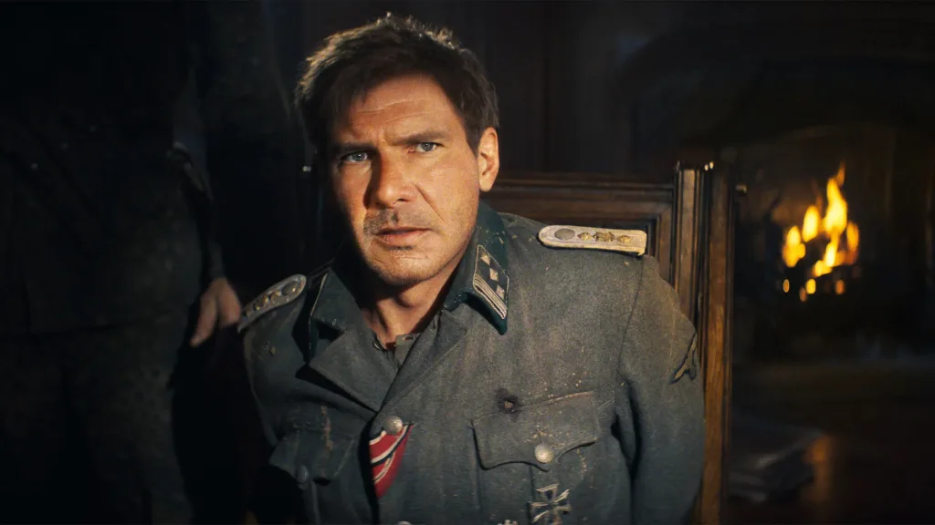
How much do you feel like those capabilities change stories or don’t?
I remember first reading the script for Indiana Jones and the Dial of Destiny and thinking, there’s no way anyone would have had the guts, even 10 years ago, or certainly not 20, to write a 20 minutes opening of an Indiana Jones movie where you know that performance is going to need that kind of level of digital enhancement on top of an actor like Harrison Ford. And the amazing thing about that is, it was the right time to make that bet, I think. Harrison himself talked about the artistry that went into that. The way we trained [AI] on his old movies, using both machine learning and an incredible, actual CG, digital double of him to make all those shots work. You know, he’s saying, “It’s actually me in those scenes. It’s my performance.” And he’s 100% right. Like, we do stunt double shots all the time, where a stunt double, those are shot, and they replace the face. And that’s great when you see them incidentally. But on this, if it wasn’t him driving the performance, you could feel it like. The best artists in the world are not going to be able to duplicate a Harrison Ford performance.
Are there things you want to do that you can’t yet? And there tools you dream of having that don’t exist yet?
The answer is yes, for sure. Today, the amount of manual effort . . . let’s say you have a relatively straightforward shot to imagine: Hulk coming through this wall behind me.
Yes, a straightforward Hulk bursting through a wall.
A shot we’ve seen before! [laughs]. The amount of effort that it takes to do those components, like, how this wall is going to break apart, which parts are drywall, which parts are going to 2x4s, or they’re going to be made of metal or wood because the construction that we’re in? Right now, that’s all still mostly done manually by really talented artists who model every polygon, or use various primitives to model and texture each of those pieces. And then more artists come along and manually destroy those pieces or pre-score them, so when Hulk comes breaking through, it’ll be in the right size chunks. And then we art direct that until it looks believable.
The part that I can imagine being so much better is if we’ve made these walls hundreds of times in our movies. And of course, we have stock bits that we can use and reuse. And we have some components that we can play with. You know, when we’re blowing up a spaceship, we don’t have to do it from scratch each time. But one could imagine assistant tools that come along with our artists and support them so that they don’t have to paint every bit of woodgrain on every piece of wood, or get the wear on this wall exactly right to achieve that believable effect. And then those same artists can spend more time finessing the art direction part and telling the visual storytelling. I think we’re actually at a really key point right now for the tools to get one more level more sophisticated. So it’s higher levels of control for the artists rather than every polygon and every bit of texture.
You’re really saying coloring in the details, handling the finite details of a shot, takes a lot of time now and you imagine that time could be reduced?
If you have a parameter-based or parametrically-based system for making, say, a wall, and you can say, “metal 2x4s, just run that simulation with metal.” And you’re like, “Oh, that doesn’t look very good. Let’s try it wood 2x4s.” They do really well. And you’re like, “Oh, that’s a lot more interesting. I love the way this is going. Why don’t we move this one so it hits him right at the shoulder in the right spot?” Right now, each of those iterations would be weeks of work, probably.
You’re doing 80% of the work again.
Exactly, how much more powerful would it be to give artists higher level tools so that they’re their entire level parameters and trying the shot again, and seeing what sort of results they get?
What you say sounds a lot like AI to me. And that you, you know, you would be talking to a system and saying, “No, I want that in metal.”
I always imagined these tools to be rules-based systems that you would program. You’re going to make the program that knows how to make an office. And then we’ve got all the different parameters that artists set. We’ve had procedural tools like this for a long time. We work with Autodesk tools; there’s bunch of them that let us rerun simulations by changing parameters. I had always imagined that was going to be the solution. In the last few years, we’ve seen a lot more of these tools come along where we don’t have to manually program every scenario—we can train machines by looking at our data about how these things might exist. So I do see a path forward with some combination of the algorithmic tools that we’ve had and some machine learning-based tools that we either already have or can imagine developing, that are really going to help accelerate artist workflows.
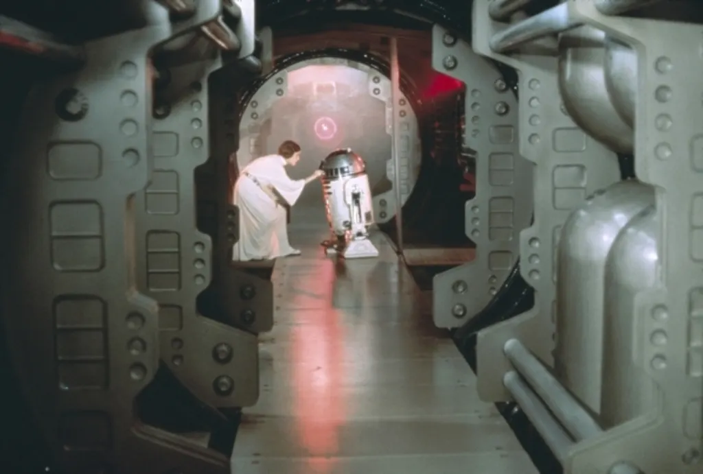
It does feel like too, when you get into an aesthetic, like a Star Wars, you kind of want some of the repeatability of motifs. And so where you could, you could train an AI to lower the lift on sort of the execution in a big way.
We joke about Star Wars hallways, just because every show has them. And it’s not the place you want to spend all of your effort. But actually, hallways are very tricky! And getting them the right size and making sure they feel Star Wars enough and are from the right era, [that] they have the right amount of wear. There’s actually quite a lot of really focused design effort that goes into the hallways! We’ve kind of joked that that’s the first thing that we can help streamline: Star Wars hallway building.
I will just say across the world of sci-fi, the space hallway is probably the most important anchor to a large subset of science fiction! The characters are wearing T-shirts and jeans, but if they’re in sci-fi hallway—that signals they’re 500 years in the future or whatever.
What’s really interesting is when you imagine these big open spaces like Star Wars, where you walk into these giant opening bays . . . until you have the narrow hallway to define what small is, none of those things look big. If you make everything big, nothing looks big. So you need the hallway, you need the tall, narrow canyon to trap your heroes in, to get them from point A to point B, so that when you finally get this stuff that you want to feel big and expansive, you have the contrast there.
In Star Wars you’re always in settings of extreme juxtaposition, the desert or swamp or a metal building. Little in-between. It’s like the extremes of our biosystems.
In Star Wars, each [biome] gets its own planet. That’s just how it works.


