- | 10:00 am
Inside the tradition-bucking branding of the Paris 2024 Olympics
The team behind the Paris 2024 branding explains the visual world of this year’s Olympics.
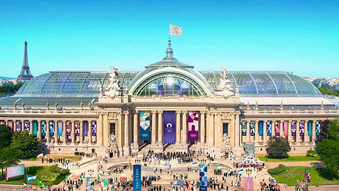
“I’m in love with Paris, but it’s really uptight, in a way.”
That’s Anaïs Guillemané Mootoosamy. Parisian, designer, and Strategy Director at Conran Design Group—the firm that created the branding for the Paris 2024 Olympic and Paralympic Games.
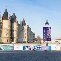
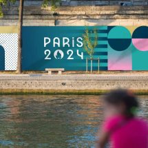
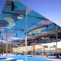
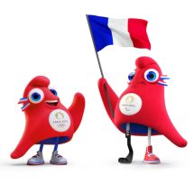
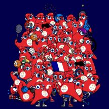
While Conran didn’t create the Paris 2024 logo, it built everything else you’ll see at the Games. The work includes everything from the colorful backdrops of events, to banners displayed across the city, to the red cap mascots “the Phryges.” Rallying under the mantra “Games Wide Open,” the brand’s intent is to bring a sense of play to the city, while creating a sense of inclusion at the Games.
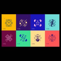
The Olympics branding bucks tradition by depicting sports outside the silhouette of the human body, unifying the depiction of Olympic and Paralympic events for the first time. “Paris is a bit old school, maybe [seen as] looking down on the world a bit,” says Mootoosamy. “We wanted to shift the perception; we wanted to make sure that these games were the most inclusive games ever.”
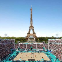
[Image: courtesy Conran Design Group]
OLYMPICS BRANDING INSPIRED BY FRENCH HISTORY
The 2024 Games is the first Olympics that Paris has hosted in 100 years. This led the team to build a brand foundation by looking at the trends from a century ago. That led them to orphism, a Parisian art movement from the early 20th century that spun out of cubism. While cubists depicted real scenes from several angles at the same time, orphism celebrated the abstraction inherent to this kaleidoscopic technique. It embraced a more expressionist approach to light and color meant to inspire the viewer.
[Image: courtesy Conran Design Group]
[Image: courtesy Conran Design Group]
[Image: courtesy Conran Design Group]
[Image: courtesy Conran Design Group]
[Image: courtesy Conran Design Group]
UNIFYING OLYMPIANS AND PARALYMPIANS
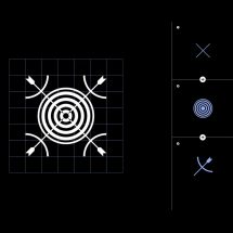
Since Tokyo first introduced the idea at the 1964 Olympics, pictograms have depicted each sporting event. The icons served as a universal language to navigate international visitors to the right events, while celebrating the human body in motion. Each Olympics now includes its rendition of dozens of unique pictograms for the Olympics, and then a whole other set for the Paralympics. But Conran argues that this accessible design system is less inclusive than it might appear.

[Image: courtesy Conran Design Group]

[Image: courtesy Conran Design Group]
[Image: courtesy Conran Design Group]
[Image: courtesy Conran Design Group]
“Displaying a disability can be something where people are keen to ask, ‘are parents going to buy it, or are they going to pick the ones that is with no disability?’” says Mootoosamy. “And we were really happy to see that the first [Phryge] that sold out was one with the prosthetic leg.”


