- | 8:00 am
The best—and worst—Olympic mascots of all time
From Munich’s adorable dachshund to London’s terrifying ‘Wenlock,’ these are the Olympic mascots that some of the best designers love (and hate).
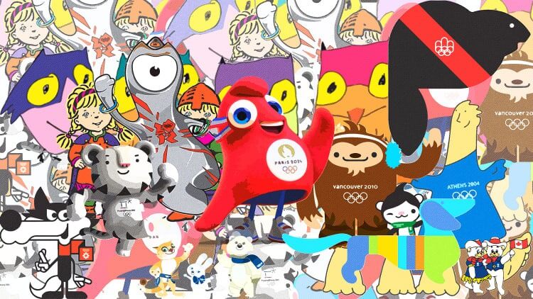
Regardless of whether you’re watching volleyball, table tennis, swimming, or sailing, one thing unites every event at the Olympic Games: its official mascot.
This year, you’ve probably seen some curious bird-like blobs bounding around the Games and its branding. They’re actually the Phryges, a pair of mascots based on the phrygian cap, a memetic symbol of freedom in France. With ties to everything from the French Revolution to the construction of the Eiffel Tower, the cap is a symbol with deep history—and ultimately, that anthropomorphic headwear comes from a long tradition in the Olympics itself.

The first Olympic mascot, albeit an unofficial one, debuted on various tchotchkes during the 1968 Winter Olympics in Grenoble, France: Shuss, a big-headed character on a lightning-bolt body attached to a pair of skis, created by illustrator and designer Aline Lafargue. Perhaps realizing the marketing gold in the mascot concept, the Olympics debuted its first official mascot, the (charming!) dachshund Waldi, at the 1972 Munich Games.
Every Olympics cycle, the host city’s organizing committee oversees the development of the mascot. They’ve been commissioned, they’ve been chosen from competitions—and they’ve even inspired some fanatical schoolyard voting, not to mention a scandalous live TV reveal in Russia.
With the world currently in full competition mode, we wondered: Which is the best mascot of them all?
We asked an esteemed panel of designers and illustrators to choose their top three—the veritable gold, silver, and bronze—alongside their least favorite.
Zipeng Zhu, art director and designer
Gold: Amik, Montreal 1976

“Black mascots are quite rare, especially ones as simple and graphic as Amik. I admire how Amik, a beaver, is represented in such an abstract way. In my opinion, this mascot stands out as exceptionally good compared to the others on the list.”
Silver: Soohorang, PyeongChang 2018

“Somehow I missed this incredibly adorable mascot, Soohorang, and I’m captivated by it! I appreciate the story behind the white tiger, and the character design is just wonderful. Soohorang exudes cuteness and energy without appearing silly or childish. The black-and-white color scheme is also uncommon for mascots, but it works really well and adds to the character.”
Bronze: Phevos and Athena, Athens 2004

“When I first saw Phevos and Athena as a teenager, I didn’t like the design at all. However, over the years, these mascots have really grown on me. Maybe this is a sign of growth, as the abstraction and simplicity of the design, which I once couldn’t understand, now strike me as completely adorable and charming.”
Last place: Bing Dwen Dwen, Beijing 2022

“Bing Dwen Dwen is supposed to be a panda covered in a layer of ice; but honestly, how am I supposed to see a panda wrapped in plastic as an ice ‘shell’ instead? I just don’t understand why it had to be a frozen panda for the Winter Olympics in China. As a born-and-raised Chinese person, I would like to see a day when we don’t use pandas (or dragons) as an easy way out when it comes to mascots. Out of the three mascots mentioned above, I think some abstraction and simplicity are important. I appreciate that Bing Dwen Dwen was selected from 58,000 submissions, but we just had a panda as one of the mascots from the 2008 Beijing Olympics, and we can’t even try to tell a different story? It feels like a cop-out and, most importantly, it’s poorly executed.”
Olimpia Zagnoli, illustrator and multidisciplinary artist
Gold: Shuss, Grenoble 1968

“I just love it! It’s simple, it’s cute, it has a cool name, it was designed by a fellow illustrator who only had one night to create it. Sometimes, a tight deadline and a good dose of desperation can take you places.”
Silver: Waldi, Munich 1972

“Who doesn’t love a graphic and striped version of a dog that’s already the quintessential designers’ dog?”
Bronze: Amik, Montreal 1976

“My favorite version of this mascot is the multicolored one. I love that this bulky and vaguely graceless stylized beaver is wrapped in a beautiful rainbow ribbon. It gives queer prom vibes!”
Last place: Wenlock, London 2012

“It looks like a bad cell phone from 2001, but I’m actually more annoyed by the dull lukewarmness of Syd, Olly, and Millie from Sydney 2000.”
Natasha Jen, partner, Pentagram
Gold: Bing Dwen Dwen, Beijing 2022

“I’m approaching this topic from the perspective of ‘baby schema’ or ‘kindchenschema’—physical features that we perceive as ‘cute’ (e.g., large head relative to body size, round face, widely spaced eyes, small nose, and chubbiness). Who doesn’t like a panda in an egg shape? Double cuteness.”
Silver: Soohorang, PyeongChang 2018

“Soohorang nails the cuteness trifecta: big eyes, chubby face, playful pose. Pure charm.”
Bronze: Quatchi and Miga, Vancouver 2010

“Quatchi’s big forehead and round face, plus Miga’s cuteness, make this duo unbeatable.”
Last place: Wenlock, London 2012

“It’s a cyclops and a surveillance camera.”
Debbie Millman, artist, designer, educator
Gold: Waldi, Munich 1972

“Many of the Olympic mascots are derivative of other beloved (but weird, when you really analyze them) brand or entertainment characters. Most of them are wildly unoriginal, which is shocking. The mascots I appreciate most have some semblance of adherence to the home country and likely (but not definitely) could be identified by the iconography of the location. [My first choice is Waldi.] Waldi is brightly colored, with a palette of the Olympic rings. He is really wonderful.”
Silver: Haakon and Kristin, Lillehammer 1994

“What I like most about Haakon and Kristin is how telegraphic they are and how well they adhere to the visual language of Norway.”
Bronze: Sukki, Nokki, Lekki, and Tsukki, Nagano 1998

“The Snowlets of Nagano combine the anime the country is known for as well as the more philosophical ideas they represent; respectively fire (Sukki), air (Nokki), earth (Lekki), and water (Tsukki). Well done, Landor.”
Last place:

“It’s easier to share what my least favorite mascots are:
Vučko, Sarajevo 1984: Whose nameless mascot looks like the love child of Wile E. Coyote and the Big Bad Wolf from Little Red Riding Hood
Hodori, Seoul 1988: Hodori is a sorry, rather out-of-shape replica of Tony the Tiger.Wenlock, London 2012: Originally I assumed that Wenlock was a clever riff on the London Eye, but apparently not. I appreciated the visual language of the country’s 2012 Olympic identity, and how it was so wonderfully challenging and disruptive. This is not that.”
Fe Amarante, founder and principal, Experimenta
Gold: Waldi, Munich 1972

“This dachshund created for Munich has the shape of the Olympic marathon route for that year, which makes it so unique to that specific event. Waldi is simplistic and brilliant! Brava, Elena Winschermann!”
Silver: Phevos and Athena, Athens 2004

“I grew up devouring the Greek mythology books my parents had in our living room, so this is pretty much the perfect marriage between whimsical shapes and interesting storytelling. The two figures symbolize equality and brother/sisterhood, in the shape of clay dolls typical of Ancient Greece.”
Bronze: Sukki, Nokki, Lekki, and Tsukki, Nagano 1998

“What can I say? I just love them! I wasn’t super into the winter games, but they make me smile as the four baby (or just young) owls, with the wisdom of the owl playing in the creation of these friendly, sweet-looking, and somewhat ready-to-throw-a-snow-party buddies.
Last place: The Hare, the Polar Bear, and the Leopard, Sochi 2014

“I would’ve loved for it to be one cohesive story, not disparate characters. It diluted the story.”


