- | 9:00 am
How ‘Dopamine Design’ took over your TikTok feed—and then moved to store shelves
Bright colors, bold fonts, and eye-popping patterns are psychological triggers, engineered to light up your brain’s pleasure centers like a well-timed notification.
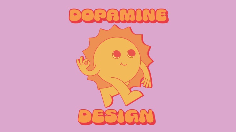
There’s a seismic semiotic shift happening in the grocery aisle. It’s bold, bright, and impossible to ignore. This is Dopamine Design, a packaging aesthetic that’s equally at home in the thumb stopping, scrolling, swiping world of TikTok as it is in your kitchen cupboard. The playbook here borrows the rules of social too; the aim is to create a brand that at a glance evokes fun and instant gratification.
Goodles, Omsom, Fly by Jing—these are the brands embracing Dopamine Design. Their packaging is bold, playful, and immediate. It creates an instant emotional connection, ensuring that in the split second you pass by, your brain is already on board.
The reason this design works so well lies in its relationship with dopamine. Just as your brain lights up when you get a new like or swipe through a stream of engaging content, bright colors and bold shapes trigger the brain’s reward system. You see something exciting, and before you even process what’s happening, your brain is releasing dopamine, a chemical associated with pleasure and motivation.
This design language is all about instant connection. It doesn’t court or assist logic; it bypasses it completely by aiming straight for the brain’s reptilian reward center.
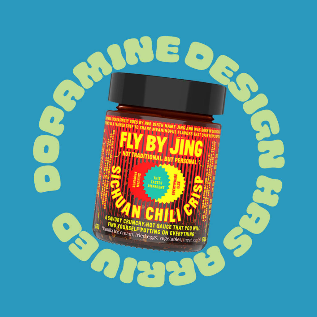
The rise of Dopamine Design
Dopamine Design is a big departure from the homogenized whimsy that has dominated store shelves for the last decade or so, an aesthetic best exemplified by the organic-cafe-bookshop chic of Chobani.
Chobani wasn’t just yogurt, it was a prepackaged signifier of authenticity. When Chobani launched its rebrand in 2018, it led to a wave of consumer packaged goods mimicking its look. Soon, natural tones, hand-drawn illustrations, and clean fonts dominated store shelves. These were products that were good for you, and good for the planet, too. Soothing, comfy, approachable—these brands evoked folksy craft with all the rough edges sanded off. They were the perfect products to accompany the stomp-clap “hey” of a Mumford and Sons fairy light firepit gathering.
Unlike minimalism, something equally as informed by digital UX, which is all about removing friction to help you find clarity, Dopamine Design is about making the decision for you. It’s not about slow, thoughtful engagement or signaling authenticity. The TikTok-ification of packaging means brands have milliseconds to grab your attention and make you feel something. Bright colors, bold fonts, and eye-popping patterns aren’t just aesthetic choices—they’re psychological triggers, engineered to light up your brain’s pleasure centers like a well-timed notification.
It’s shouting, “Hey, this looks fun, this looks easy, go ahead and buy it.” It’s a fast-paced, visual shortcut designed to make consumption as quick and joyful as possible.
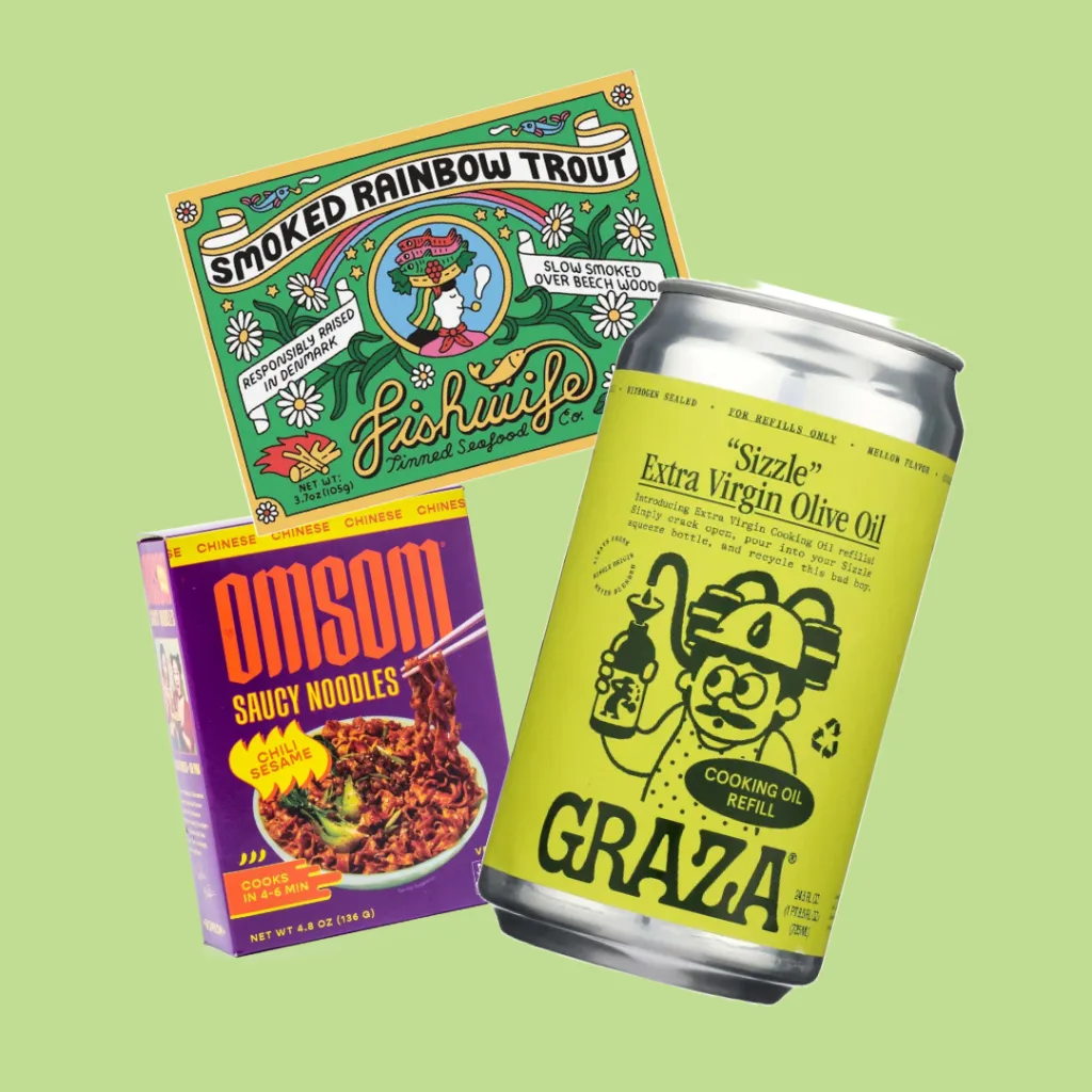
What consumers want
What’s driving this shift? A change in consumer values, for starters. Millennials wanted products that felt real, connected to a larger mission. They wanted to know where things came from, how they were made, and if they were responsibly sourced. Packaging was a way to communicate authenticity.
But today’s young consumers are bombarded with choices. Now, attention spans are shorter, and the decision-making process needs to be fast and fun. In the past, packaging was about telling a story, asking consumers to connect with the brand’s values and make an informed choice. Dopamine Design is a direct response to how we consume in a swipe-driven world. Whereas UX minimalism made things smooth, and millennial authenticity made them trustworthy, Dopamine Design makes things entertaining and effortless. It’s a visual answer to decision fatigue, creating packaging that’s not just eye-catching but emotionally engaging.
So, where does this leave us? As attention spans continue to shrink, Dopamine Design is only going to evolve further. Consumers will demand even more immediacy, more visual excitement, and brands will have to respond by making packaging an experience in itself. The days of minimalist designs quietly asking for your trust are fading. Now, the game is about hitting hard, fast, and joyfully.
In a world that moves at the speed of a swipe, the future belongs to the brands that can make you feel good instantly. And Dopamine Design is leading the way, turning packaging into an emotional experience that’s as fun as it is fast.


