- | 9:00 am
Apple’s Liquid Glass: The liquid works, but the glass is broken
Apple believes Liquid Glass is the UX to usher us into the next decade. Experts warn that it’s leaving people behind.


This week, Apple launched its biggest design update in years: Liquid Glass. It’s a new approach to the software design behind the iPhone, iPad, Mac, and Apple Watch.
Liquid Glass is making appearances on everything from Apple’s marketing materials to the 24-carat trophy that Tim Cook gifted to Donald Trump. Apple is betting that it’s going to redefine the visual language of its user experience as it enters the AI era. But at least for now, half a dozen UX experts agree that it’s anywhere from mildly disappointing to outright broken, due to an aesthetic-first approach that could leave many users behind.
If prior Apple releases have taught us anything, it’s that it will take anywhere from months to years for Apple to solve Liquid Glass’s core issues, and even then, it could be left wrestling with its own flawed metaphor.
The burden of scale
With 1.5 billion active iPhones, Apple shoulders an incredible burden of scale. For every magical interaction, there can be an equally devastating reaction. Take its groundbreaking smartphone, for example, which enabled you to map your way anywhere in the world but also pinpoint users in mass surveillance capitalism. Then there’s the AirTag, which can find your lost keys but, as we warned, has enabled stalking and led to a class action lawsuit.
When I met Apple reps around the time of the announcement of Liquid Glass in June, I was left with the impression that the team very much feels the weight of Middle America atop all of its decisions. Liquid Glass, at launch, would be a first step toward new modalities that a transforming, transparent interface could create in a world that feels manifest-destined to land at augmented and virtual realities.
Still, Apple knows that people rely on their iPhones for everything, and they can’t wholesale change the way people use the most important device in their lives. That’s why Liquid Glass is less a deconstruction of iOS than a luxe reskin—replacing chunks of iOS piece by piece rather than revolutionizing it, for now.
It’s a toe-dipping sensibility that I appreciate. Moving fast and breaking things is crucial for fundraising and devastating for real life. Apple may serve its customers better by being careful, adjusting its designs little by little, more like a car company than a tech startup.
Unfortunately, Apple still didn’t nail Liquid Glass out of the gate. And it doesn’t help that, rumor has it, the company put a tight deadline on itself, only developing Liquid Glass for six months before its announcement.
While Liquid Glass is full of interesting ideas and some truly gorgeous animation work from Apple’s still-unparalleled technicians, experts I spoke to pointed out that it was inconsistently implemented, and they believe it will make life worse for a lot of its users. They say its cognitive load is higher across the board than its previous UX. Specifically, its low contrast design—which often blurs the distinction between the phone’s background and its messages in the foreground—will prove difficult for older adults, especially, to read.
“I think the worst problems will not be for [people with disabilities] . . . who will probably just turn it off and/or use screen readers in the first place,” Jakob Nielsen, a four-decade usability expert, told me. “But low-vision users and people with various forms of slight cognitive impairments [that is, not even serious enough that they consider themselves disabled] will suffer.”
UX experts I spoke to for this story aren’t just mindless Apple haters; many generally appreciate the ethos of what Apple is doing—specifically, trying to move interface design somewhere new. But they’re worried about the unintended consequences of Liquid Glass, which is presented as an opt-out feature on iOS 26.
“I can see that my father is going to really struggle,” says Sonja Radovancevic, creative director at Metalab. “He’s going to be, like, ‘Oh my god, I’m definitely going to go back to Samsung.’”
Apple is trying to head off the worst of these criticisms through iteration. It has been fine-tuning certain features of Liquid Glass, like the level of transparency (during beta testing), and will continue to do so. But to get Liquid Glass to where it needs to be from a usability perspective, Apple might end up undercutting its own metaphor.
The Liquid Works
If one core idea has promise inside Liquid Glass, it’s that Apple is introducing stretchable, reshapable buttons and new animations, which can break out of the more static menu bars we’ve known for so long.
Basically, it’s what you could call the “liquid” half of “Liquid Glass.”
Apple has been building toward this more fluid interface for some time. Andy Allen, a lauded digital designer who created the Paper app before founding his own Not Boring apps, points out that developers have been envious of Apple’s Dynamic Island for years. That little black pill hiding the camera on the top of your screen continues to mature, stretching and morphing into a do-anything bit of UI that can grow and split to scan your mug for Face ID, control music playback, and split notifications side by side.
Liquid Glass shares some of these possibilities with developers, allowing them to build more flexibility into their own app UIs. Floating atop the app, buttons can now stretch to reveal toolbars or merge to group controls. Ideally, these updates don’t just lead to a prettier UI, but one that can hide clutter away until right when you need it.
The white space that a morphable UI creates is exciting to many in the field, even if we’ve seen bits of this idea before from Google’s Material Design. Instead of providing rigid systems, Liquid Glass could, theoretically, reshape into just about anything.
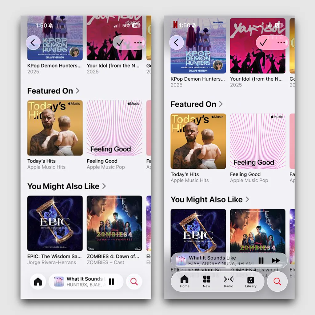
Right now, though, those floating, morphable interfaces feel different from app to app. You don’t know if they’ll reshape in front of your eyes (as they do in Music) or pop you to another screen (as they do in Messages . . . and sometimes also in Music!).
“I do feel like there is always promise in trying to move toward something, as opposed to just being stuck in our ways,” Radovancevic says. She makes the point that liquidity offers a path for Apple to melt away extraneous information—and to prepare itself for AI-led interfaces. “Ultimately, we can imagine that in the future, there will be way less interface on the screen anyway.”
Some of the best work on Liquid Glass is in Apple’s tiniest details. One of the small, great updates in iOS 26 is what Allen calls Apple’s “whiter than white” animations. The interface takes HDR contrasts to new heights, creating a glow that developers can use in their software. Some buttons appear to light up beyond what’s white on your screen.
Allen found this particularly useful for his Camera app, where the focus controls can glow white even on a white backdrop. I find the effect a bit too intense while texting in a dark room—each time I send a message, my chat bubble flashes with an iridescent burst, so brightly that I look away from the screen.
The Glass is broken
Liquid UIs don’t work consistently yet, but in theory, they make a lot of sense. Perhaps more problematic for Apple is the “glass” part. At launch, critics pointed out two issues. The first was that it failed to add new functionality to the phone. The second was more ironic: Glass’s fatal flaw is the clarity with which it depicts information.
Legibility is still of concern to every UX specialist I talked to for this piece. They flagged that Liquid Glass presents a significant challenge to cognitive load and creates accessibility issues where there were none in the OS before. In some spots, like the beautiful magnifier tool that helps you highlight words, the glass distortion effects are simply joyful. In many others, they muddle information and make it harder to understand what you’re looking at.
Charles Mauro, a human factors researcher and consultant for 40 years, says the glass is creating the most significant human factors issues with iOS 26.
Mauro points to Liquid Glass’s core conceit as making everything you see tricky to parse. The glass buttons that float above your library in Music blur with your albums. In your Control Center, they almost disappear into the background. He notes that text sizes and colors shift across the interface, ever-changing the information density on a page. And he points out that the automated accessibility tests we have today can’t examine complex transparencies like this to highlight human factors issues.
You might think that only people with disabilities will be affected, but Mauro insists that Apple Glass will increase the mental burden on everyone. He says this is largely due to the fact that Apple is creating minimal contrast between the glass information on top that’s vying for your attention and everything below it. (This balance is known as “figure-ground” contrast.)
If black type on white paper presents the most idyllic contrast for your eyes, clear glass that diffuses the shapes and colors below it verges on the opposite. Contrast represents the very core of our visual processing, possibly due to limbic parts of our brains that evolved to recognize faces by shadows and predators by movement.
When you reach a desktop-style interface—like on our phones and PCs—contrast isn’t just about text on a page, but about discerning a stack of the background stuff from what’s above it. The most pertinent information floats to the top to grab our focus, and for good reason. A UX principle known as Hick’s law dictates that the more choices someone has, the more difficult and time-consuming the decision becomes. All of this means that a low-contrast pile of media is just a lot for our brains to juggle.
“It seems like [Apple] has sort of put this forward without having the amount of time to almost challenge, ‘Should these things be floating?’ Or ‘What is exactly the quality of this blur that’s happening inside of the glass?’” Radovancevic says. “Maybe it does feel a little bit impulsive in some way . . . but a lot of this may be interaction problems that have to be solved.”
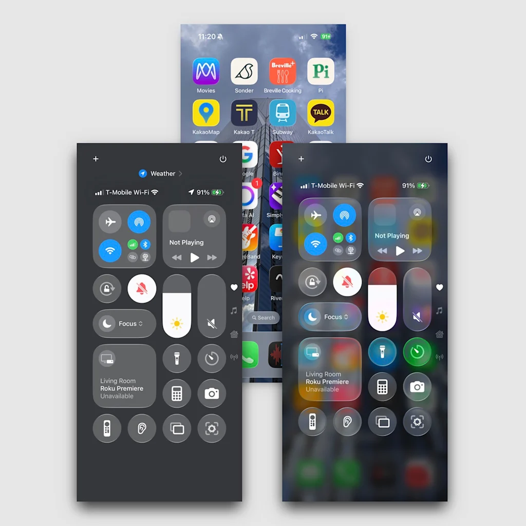
Compare this to Google, whose release of Android 16 took the opposite approach of Liquid Glass. During our call, when Glass was still in beta, I had Radovancevic pull up Google’s Control Center menu side by side with an iOS 26 beta Control Center featuring Liquid Glass. On Apple’s interface, the simple flashlight, calculator, and Wi-Fi buttons on this screen became illegibly blended. Whereas Google’s buttons—brighter buttons atop a darker background—represent a more legible foreground/background relationship.
“They’re using a lot of solid color, so it’s automatically going to [work],” she says, before concluding that “neither of them is necessarily the answer.”
Striking a compromise
Apple has since adjusted its approach to the Control Center. In fact, Apple has been constantly fine-tuning Glass, in what appear to be experiments to fix legibility. In beta releases, it reduced Glass’s opacity—frosting it and adjusting the blur effects—before tuning it more transparently again. In the final release, they’ve landed on a significant compromise.
The Control Center is far more legible now than in those earlier glass experiments—it’s now quite similar to Google’s version. Apple increased the opacity of the glass, and to help further, it darkens and blurs your wallpaper. Today, you no longer really see the wallpaper through a glass interface. Apple traded continuity of interface for legibility. Operationally, it was the right decision for users, but it does appear as an inelegant solution to Apple’s glass problem.
Meanwhile, the moments of that hypnotic, optically distorting glass are few and far between. The most prominent permutation I see is in the icon for nested groups of apps, which appear framed in something like a squared-off water droplet. This bit of interface almost feels anachronistic as it has entered a more accessible context.
For developers to figure out where to maximize versus minimize implementations of glass, they are largely on their own. Apple has offered minimal guidelines around the best use of Liquid Glass within app interfaces, frustrating some developers, but it does offer them the option to tune opacity and blur in their own apps.
“We tried to implement Liquid Glass and found it didn’t work in a lot of cases, in terms of readability, or aesthetically it clashed, so we ended up pairing it back quite a bit,” says Allen, who later notes: “I bet there’s not a person on the Apple design team who doesn’t wish they had another six months or year to polish it up more.”
While Apple views Liquid Glass as the foundational design language of its future interfaces, some in the industry question whether it pushes things far enough. Allen’s greater criticism is less about legibility than the limitations of the foundational technologies behind Liquid Glass effects. He’s built his Not Boring software collection as rich, experiential products with true 3D interfaces that leverage the powerful graphics processing of these supercomputers in our pockets. The aesthetic-first approach of Liquid Glass pulls on his heartstrings, but he points out that it’s not actually 3D—some future-proof interface that can take us into the next decade. The glistening, “specular highlight” effects you see on elements like app icons are actually 2D shaders.
“If you’re someone like me who lives and breathes 3D, we were hoping to see a lot more 3D: true 3D icons, true 3D interfaces,” Allen says. He admits that extra processing might be more taxing on an iPhone battery. But he also thinks that to move the interface forward, UX designers need to be thinking in the third dimension. And why build layers of transparent glass interface if not to explore 3D?
Apple can fix glass, but it’s worth asking why
No doubt, Apple will continue to refine the design language, much as it has done in the past. Apple’s “Aqua” design language in OSX, announced in 2000, struggled with legibility around its transparent water effects, and took about a year to repair, and a few more to run smoothly. When Apple launched iOS 7, introducing a flat design and sleek sans serif fonts to the iPhone in 2013, it struggled with legibility again. In less than a year, Apple made rapid adjustments and laid much of the foundation for what we’re still using today.
“I suspect a similar timeline. In another year or two, this will feel a lot more intentional and polished,” Allen says. “They’ll have a better understanding . . . [of] how to use it themselves.”
For the last week, Apple critics have dunked on the company for all sorts of superficial reasons. The logo on the iPhone 17 Pro is in the wrong place for its case. The curvature of the iPhone Air’s camera doesn’t match the radius of its case. These issues demonstrate a certain carelessness, perhaps. But, like a thin new iPhone that’s not perceptually much thinner than an iPhone 6 (2014), they also don’t really matter. They don’t affect how well you can read and communicate.
For anyone with vision impairments, in particular, UX experts warn that Liquid Glass could continue to be hard to use in many contexts. Given the commonality of macular degeneration, it will impact older adults in particular. But Apple’s challenging information architecture will impact everyone, including people with mental disabilities like ADHD.
Apple’s own designers aren’t ignorant of such issues: In fact, I hear the design team is split on the direction of Liquid Glass. It wasn’t an inevitable evolution for Apple. Its transparency was introduced in Vision Pro as a practical way that people could see floating screens but not be cut off from the world around them. Of course, those same challenges don’t exist on the iPhone, so the benefits to transparency aren’t the same.
Notably, you can disable Liquid Glass’s worst offenses in the Accessibility settings. (It’s not labeled Liquid Glass—check “Display and Text Size.”) You can reduce the window transparency while increasing the contrast. Doing so frosts over the glass effect and flattens the background. You lose the most beautiful animations that seem to break the very laws of physics of your phone, but you can also read things a lot more easily.
These compromises feel like the only way to fix Liquid Glass, and so it’s unsurprising that Apple has ultimately worked its accessibility options into instances of the main interface. The fix negates the most egregious issues. It also negates the core concept behind Liquid Glass.