- | 10:00 am
Technology killed waiting online. Designers want to bring it back
We are living in an age of instant information. But deep down, our brains just want to pause.


Beep, beep, beep, beep, beep, beep, beep. Short screech. Long screech. Static. More beeps.
On September 30, one of the most memorable—if not infuriating—waiting experiences since the dawn of the internet went the way of the dodo. AOL finally discontinued its dial-up service.
If you grew up in the ’90s, you knew that sound by heart. Some of you also knew to bring a newspaper while waiting for a single web page to load. AOL’s iconic 30-second symphony of screeches and static wasn’t just the sound of connection. It was the sound of anticipation, of mandatory patience in an increasingly impatient world.
Today, that pause is all but extinct. Pages load more or less instantly, apps respond in milliseconds, and information moves faster than we can formulate a complete thought. Technological advances have virtually eliminated the wait, but waiting isn’t wasted time. Studies have shown that simple pauses can help strengthen our self-control, and savoring the anticipation of an event can help us prolong pleasure. Our overstimulated brains might find the wait to be frustrating, but underneath all the noise, we just want a quiet moment of pause.
Waiting gives us a chance to rest and reflect. This is as true of the real world as it is online. That’s why designers are sneaking the wait back into modern digital experiences.
The Return of the Pause
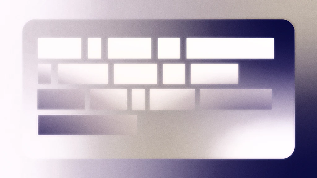
On a recent afternoon, I had to call my medical provider to ask a question. When someone picked up—predictably, a voice bot—I provided my name and date of birth. Then something interesting happened. Instead of processing my information in digital silence, or to the sound of hold music, the bot pretended to type it into a keyboard. I heard a click, clack, click, clack.
The built-in typing may not have been totally for show—perhaps the software genuinely needed the processing time. But it was designed to humanize my interaction, to mimic what psychologists call “conversational rhythm,” in which pauses signal thought, consideration, and care.
The concept translates to digital experiences, too. Take OpenAI’s GPT-5. While previous versions typed out answers slowly, like a typewriter, the early version of GPT-5 dumped the full answer in one go. Some users found it hard to engage; others found it boring. “It just slammed a wall of text at me,” Marcel McVay, director of UX and digital solutions at Octo, tells me. “It was so much information at the same time, that it was off-putting.”
What users were missing is called sequencing, otherwise known as the deliberate pacing of information delivery. When your car dashboard lights up one indicator at a time rather than all at once, that’s sequencing. When ChatGPT, Claude, or Perplexity type out responses like a vintage typewriter rather than “slamming” the complete answer instantly, that’s sequencing, too.
With large language models (LLMs), information delivery was slowed down to mimic the pauses that occur in natural conversation, and to help people process information like they are used to. “If someone doesn’t pause to think about what you just said, did they even hear you?” McVay says.
He is currently working on a dementia care app, called Plans4Care, that aims to help support and guide people dealing with degenerative brain diseases. He says the app, which is currently being tested in clinical trials, doesn’t require a lot of processing time to load. But his team still built in a loading screen that shows the brand’s logo plus a rolling selection of comforting quotes and accompanying images. While technically unnecessary, the loading screen serves to pace the user’s experience. “It’s a place where we remind you, we’re Plans4Care, and we’re here to support you,” McVay says.
Making the Wait Worthwhile
Sometimes, of course, wait time remains necessary, and companies have learned to transform these delays into brand opportunities. The Calm app invites you to “take a deep breath” while it loads meditation content. Duolingo’s mascot Duo gives you quirky language facts during brief loading screens. Expedia calls to your wanderlust with a loading spinner in the shape of a traveling plane.
These moments aren’t just distractions—they’re what Clinton Gorham, brand consultant and founder of the Gorham Agency, calls “movie trailers,” or brief moments that set the mood and manage expectations. “Smart brands treat that sliver of time as a mini canvas to make an impression,” he says.
The strategy isn’t exactly new. In the 1950s, office building tenants in a Manhattan high-rise complained about slow elevators. Rather than installing faster machinery—an expensive solution—building managers installed mirrors in elevator lobbies. Suddenly, complaints plummeted. The wait time hadn’t changed, but the mirrors had transformed dead time into useful time, and people were too busy checking their appearance to notice the delay.
David H. Maister, an authority on service management and the psychology of waiting in line (or a queue, as they say in the U.K.), calls this phenomenon the “occupied time principle.” The British-born former Harvard professor has stated that occupied time (spent on any activity) feels shorter than unoccupied time (free from activity). User experience designers today are using the same trick.
Some years ago, UX designer Tej Kalianda was working on ShareConnect, an iPad app that allows users to securely connect to and control their computers from anywhere in the world. The app’s complex authentication and secure connection setup processes meant that it took users 35 seconds to connect. It also meant they consistently dropped out. “They thought the app was broken,” says Kalianda, who now works at Google but spoke to me in a personal capacity.
The engineering team couldn’t reduce the wait time, so Kalianda decided to keep users busy while they waited. She created random, visually engaging loading screens that changed every time someone connected. “Instead of fighting the delay, I embraced it,” she explains. And her efforts paid off. The company’s Net Promoter Score jumped from 40 to 45, and she says user feedback shifted from “This thing doesn’t work” to “I love how smooth the connection feels.”
Like with the elevators, the wait time never improved—only the perception of it. Yet users were measurably happier because they were engaged and entertained.
The aesthetics of waiting
A ’90s kid would barely recognize the internet today. We have gone from screechy dial-up connections and songs that took 20 minutes to download to TikTok trends that circle the globe in seconds. But it’s not just speed that’s changed—the entire aesthetic of waiting has evolved along with it.
Back then, waiting looked like a progress bar crawling across a gray dialogue box, or “loading . . .” text blinking in a browser. The internet felt mechanical, utilitarian. But over the next few decades, companies developed their own visual language of waiting. Some, like Microsoft, took the literal approach with sand falling through an hourglass. Others, like Apple, embraced abstraction with a colorful beach ball that spun cheerfully while our computer screens froze.
More recently, Slack turned waiting into a fun distraction with messages like “reticulating splines” (a callback to loading screens from games like SimCity). Meanwhile, Perplexity narrates its “thought process,” and Uber loads a grayed-out “skeleton” of its layout, helping you visualize what’s to come.
In a world that never stops scrolling, these pauses—engineered or not—are a welcome reminder that anticipation can be a feature, not a bug. I never thought I’d say this, but watching an app load is starting to feel like a simple, grounding moment that makes us feel a little more human.
Featured Videos
Today's Top Stories:
More Top Stories:


FROM OUR PARTNERS