- | 9:32 am
Adidas’s jaw-dropping new office sets an audacious standard for the future of work
New graphic-rich offices for the apparel giant were influenced by everything from shoes to stadiums.
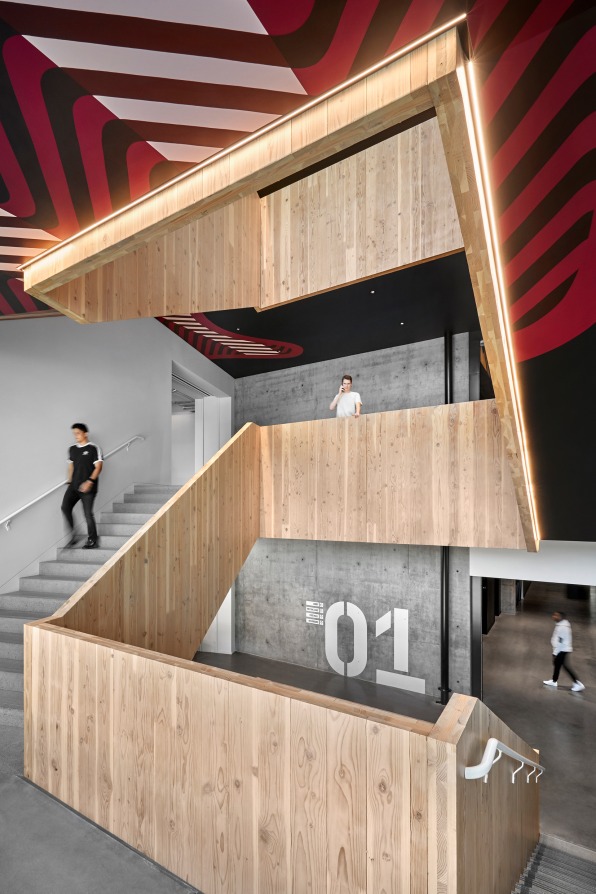
Walking the stairs in one of the new buildings on Adidas’s corporate campus in Portland, Oregon, one can’t help but look up. Plastered on the undersides of the staircase are brightly colored supergraphics of patterned lines and shapes. Appearing at first to be abstract art, the images quickly trigger the mind to recall a familiar, if under-appreciated, design: the sole of a sneaker.
[Photo: Garrett Rowland/courtesy Studio O +A]
The sole patterns are just one element of the graphic-heavy design approach behind two new buildings on the Adidas campus: one a collaboration-focused office space for designers, the other a boutique fitness center. Designed by San Francisco-based Studio O+A with LEVER Architecture, the two buildings use the apparel brand’s designs and materials, plus a subtle dose of sport-centric imagery, to celebrate the ubiquitous but perhaps overlooked design flourishes that abound in the company’s sports gear and apparel.
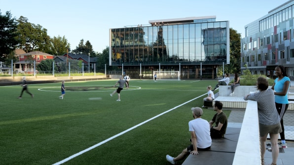
Adding to a campus with seven preexisting buildings, these two new buildings and a soccer field between them act as a social hub for the company’s North American headquarters. At a time when going to the office is far from a given, these projects suggest ways that corporate buildings themselves can still project a brand’s vision and identity even when most of its workers are advancing that vision and identity from home.
[Photo: Jeremy Bittermann/courtesy Lever Architecture]
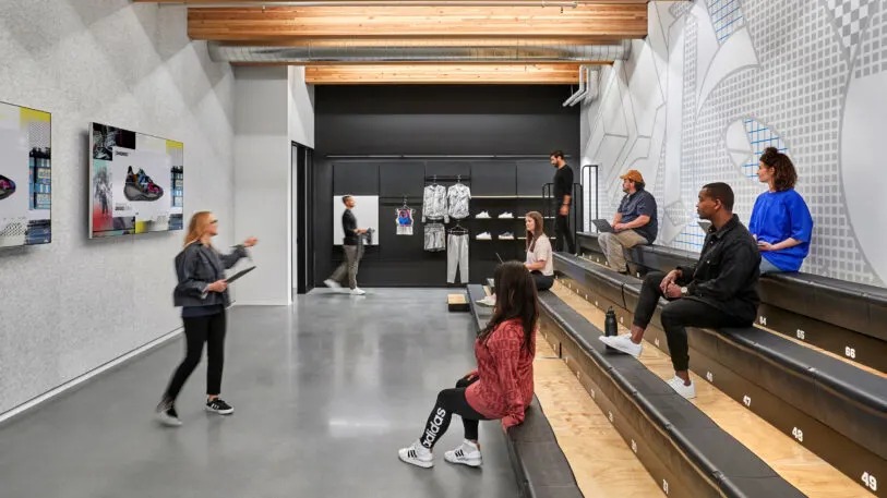
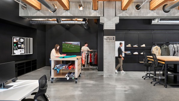
The office building is a six-story, glass-walled space. Combining precast concrete and mass timber, the building leaves its unique structure on display in raw and open studio spaces. It’s a work environment aimed at collaboration, with a variety of workstations, including library-style tables, couches, and wheeled “creator tables” covered in bolts of fabric or prototype running shoes. Nearly every piece of furniture is mobile, and the rooms are regularly reconfigured.
[Photo: Garrett Rowland/courtesy Studio O +A]
Across the soccer field is a building that’s on-brand in another way. Called the Performance Zone, the space is focused on health, wellness, and fitness for Adidas employees, with two levels dedicated to gym space and exercise studios and a third that includes a juice bar and co-working space. A rooftop lounge overlooks the field below.
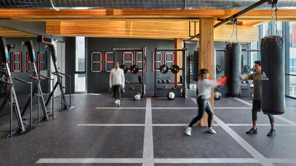
[Photo: Garrett Rowland/courtesy Studio O +A]
Like the office building, the Performance Zone features strong visuals, like stadium-style supergraphics identifying bathroom entrances and numbered stairs to quantify a vertical workout. Pegboard is used for directional signage, enabling the company to reorient the space and move departments and workstations around as projects demand.The design of this project started about four years ago, but flexibility was always a guiding concept, even before the pandemic. The architects worked to ensure spaces could be easily reconfigured by staff, without the need for a contractor to come tear down a wall or subdivide an office. The space has already been reconfigured in response to a pandemic-related increase in remote work, with individual desks being taken out of some areas and replaced with more collaborative workspaces. “While we maybe didn’t have the foresight to understand what would be driving the need for that change, we did understand that there would be a need for change,” Studio O+A design director Mindi Weichman says.
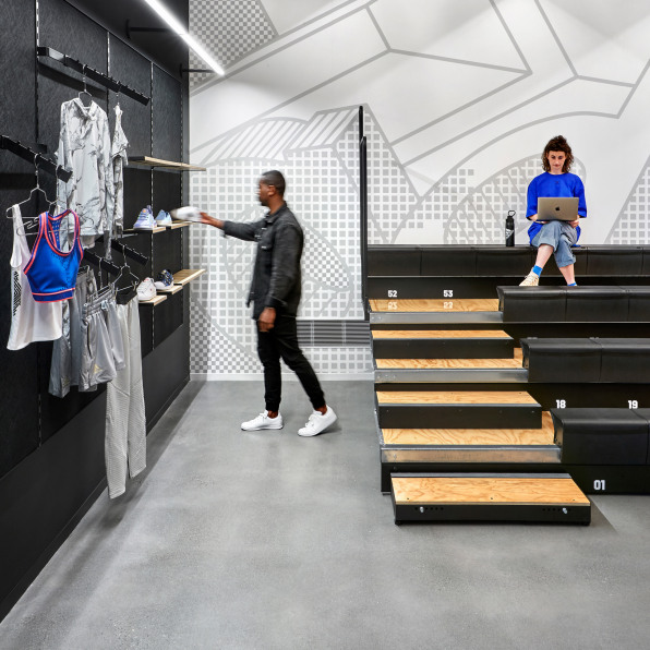
[Photo: Garrett Rowland/courtesy Studio O +A]
Though the Adidas brand may be well known for its three-stripe motif, that familiar logo was tapped sparingly, according to Weichman. “When you are in the space, you get a general feeling that you are immersed with the brand, but you don’t necessarily need to have logos or very apparent components of the brand in your face to understand that,” she says.
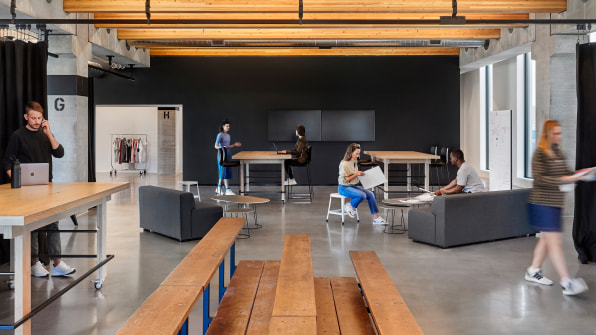
[Photo: Garrett Rowland/courtesy Studio O +A]
Other elements that made the jump from the world of sports include Adidas fabrics that were integrated into acoustic panels in the office building and signage inspired by that in sports stadiums.
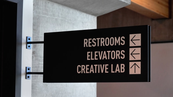
[Photo: Garrett Rowland/courtesy Studio O +A]
But the graphic treatments in the building–on the bottom of the stair case, in the wayfinding, in bathroom signage–are the primary design move. The staircase in particular was intended to be a highlight, with the graphics visible to those walking up and down, but also through the large windows on the building’s front façade, which frame the staircase as the central artery of the building to people in a nearby courtyard and on the soccer field below.
“We looked at doing abstractions of field lines or working with the Olympic rings and the colors. But at the end of the day, it came about from looking at what’s in our own environment, and looking at the beauty and the detail and the geometry that’s on the bottom of a shoe,” says Studio O+A brand director Elizabeth Vereker. “It’s a reminder that design is all around and design is fused into everything that Adidas does.”


