- | 8:00 am
There’s a new Gmail. But can it ever really change?
A redesigned Gmail may have already arrived in your inbox. No, it’s not all that different. But what would you say if it were?
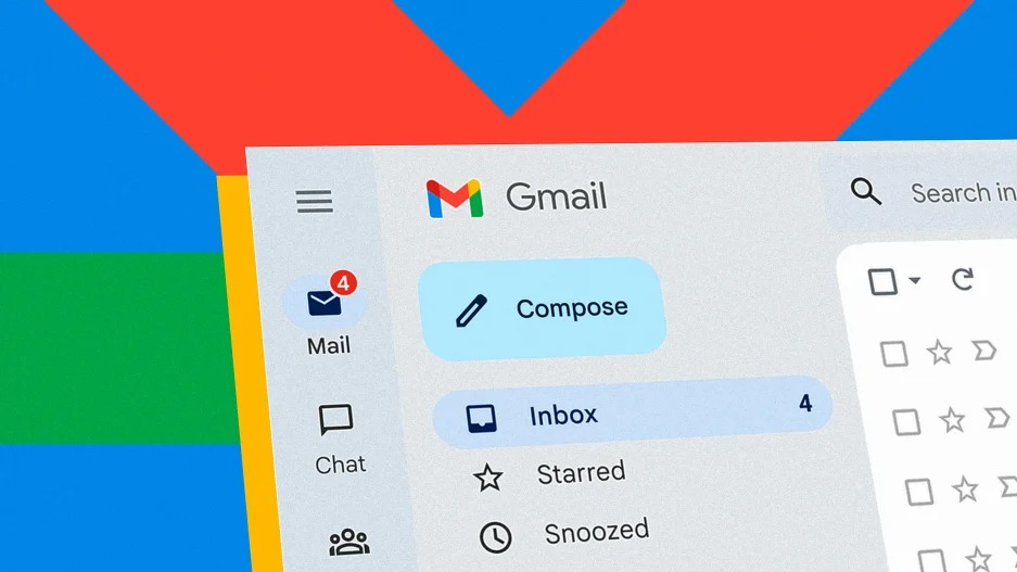
Over the last week, Google has started its soft rollout of a newly designed Gmail—meaning it’s likely that your Gmail already looks a little different, or it will soon.
Aside from the unmissable new font—Google Sans Text, which is inspired by basic geometries like circles—the biggest update is to its very left column. What was once a vertical mashup of your email directories, Chat, Spaces, and Meet, is now an app switcher. You can tap on any of these icons, but instead of getting a bit larger in that left pane, they’ll now take over your whole window. It means you can do much the same non-email-related things in Gmail that you could before, albeit with a more expansive view. (Read: Google wants you using its apps other than Gmail.)
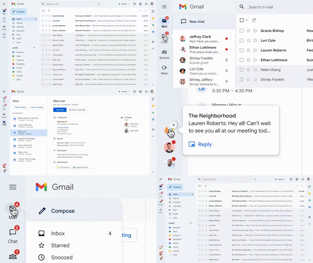
The other big updates are to search—the platform now lets you use Google’s toggling “search chips” to better filter emails for images and attachments—as well as a new fit and finish across the interface. Inspired by the company’s new Material You design language, Gmail’s drop shadows are gone, with new curves and buttons that remind me of the tabs inside an organizational binder.First launched in 2021, Material You is the new design system behind Android. Its big idea is that the user interface of a phone is inspired by its user: You. The most clear way that plays out is in how Google uses AI to create novel color palettes from your own photos, ensuring that the Google interface itself complements your wallpaper. However, I’m actually more intrigued by Google’s deeper plans for Material You, in which its engine will be able to customize every individual interface element you see to your taste or need. Instead of designing one perfect interface to rule them all, Google is working on a system that less prescriptively molds to us, like a design consultant sleeping in the code.
But the new Gmail barely embraces the design philosophy of Material You. In desktop mode, there’s no color customization or option to change the appearance of buttons. There are all sorts of reasonable technical explanations as to why Google can’t work the same mojo in a desktop browser as in its own smartphone, of course. And I’m not terribly concerned about the Gmail interface being matchy-matchy with my desktop (though, wow, Google really embraced the blue in this redesign!). Still, I’d love Google to serve as that “coded design consultant” it teases in Material You, albeit fully focused on my email needs. Track how I use Gmail over time. Do I always constantly consult my calendar? Do I never use its chat? Then reshape the interface for me around those practices, instead of cramming ’em all in front of my eyeballs in the interest of a guess or a business plan. Let my own hand imprint itself into the tool, like fingers can work their way into the wooden handle of a hammer. (And by that, no, I don’t mean offer five fundamental layouts to customize Gmail that are all a similar onslaught of services, windows, and text, as the new Gmail does today.)
This sort of personally adaptive UI sounds like sci-fi—but in fact, it already lives within Gmail! Priority Inbox (which launched back in 2010) is a feature that uses AI to learn who your most important contacts are over time, and floats their messages to the top. I’ve used it for over a decade, and thankfully, it still works inside the new redesign. The AI has never gotten perfect; despite how many messages I’ve marked as priority, or not, to train the system, spam still slips by. If a family member writes from another email address, it might not make its way to the top. I’d equate the accuracy of Priority Inbox to that of a decent intern. But that’s okay because I know what to expect from that poor schlub I’ve freely employed for a dozen years. And for Gmail, knowing what to expect is my singular concern above all others.
That singular concern is a paradox for Gmail’s ongoing design strategy. On one hand, it could shape Gmail to our individual needs, with more features like Priority Inbox and design direction from Material You. On the other hand, improving efficiency or workflow is a collective risk amplified across the 3 billion people who use Google’s Workspaces—which includes its apps like Gmail and Google Docs. These users need Google services to be reliable and predictable more than they need any new button style. May I be the first human to admit, I’d be terrified if Google made any truly significant functional or design changes to Workspaces—even if Google had some data proving it might save me five minutes a day!
These platforms are so integral to my work that learning a new system isn’t just jarring; since it’s unproven, it’s hardly worth the professional roll of the dice. I’m reminded of a discussion I had years ago with Gordon Beckham, former infielder for the Chicago White Sox. He’d just broken his wrist because of the precise way he hit a ball with his bat—a common accident among professional baseball players. When I asked if he’d considered using a new $100 offset bat that was designed specifically to avoid the injury, he admitted he’d tried it, but he’d never make the switch in a real game. It was a fine bat, he explained, but players simply didn’t like changing equipment once they reached the majors. We consider oily old gloves to be a piece of baseball’s nostalgia—or perhaps even superstition. But Beckham reframed them as an important part of every player’s proven formula: If you’ve reached the majors, don’t mess with the equation that got you there. Much like Beckham preferring to use a bat that might break his wrist in the interest of supporting his career, so too would I rather use a dependable, known Gmail than experiment with one that might offer some theoretical efficiency benefit.
I realize this mentality seems defensive, and at odds with Silicon Valley’s mantra of moving fast and breaking things. I realize, too, that we are all looking at the new Gmail redesign and scratching our heads as to why it’s not more of whatever each of us wants it to be. Without sounding too defeatist, I’m going to admit: I need Gmail to be pretty much what it’s always been. But maybe made a little better, somehow, without making big changes? And it seems Google knows this, too.
Which is why the new design has one last option I haven’t mentioned thus far: A button to revert back to your old Gmail.


