
- | 8:00 am
BMW’s new rebrand is so quiet you might miss it
BMW is looking to keep the heritage but bring more precision.


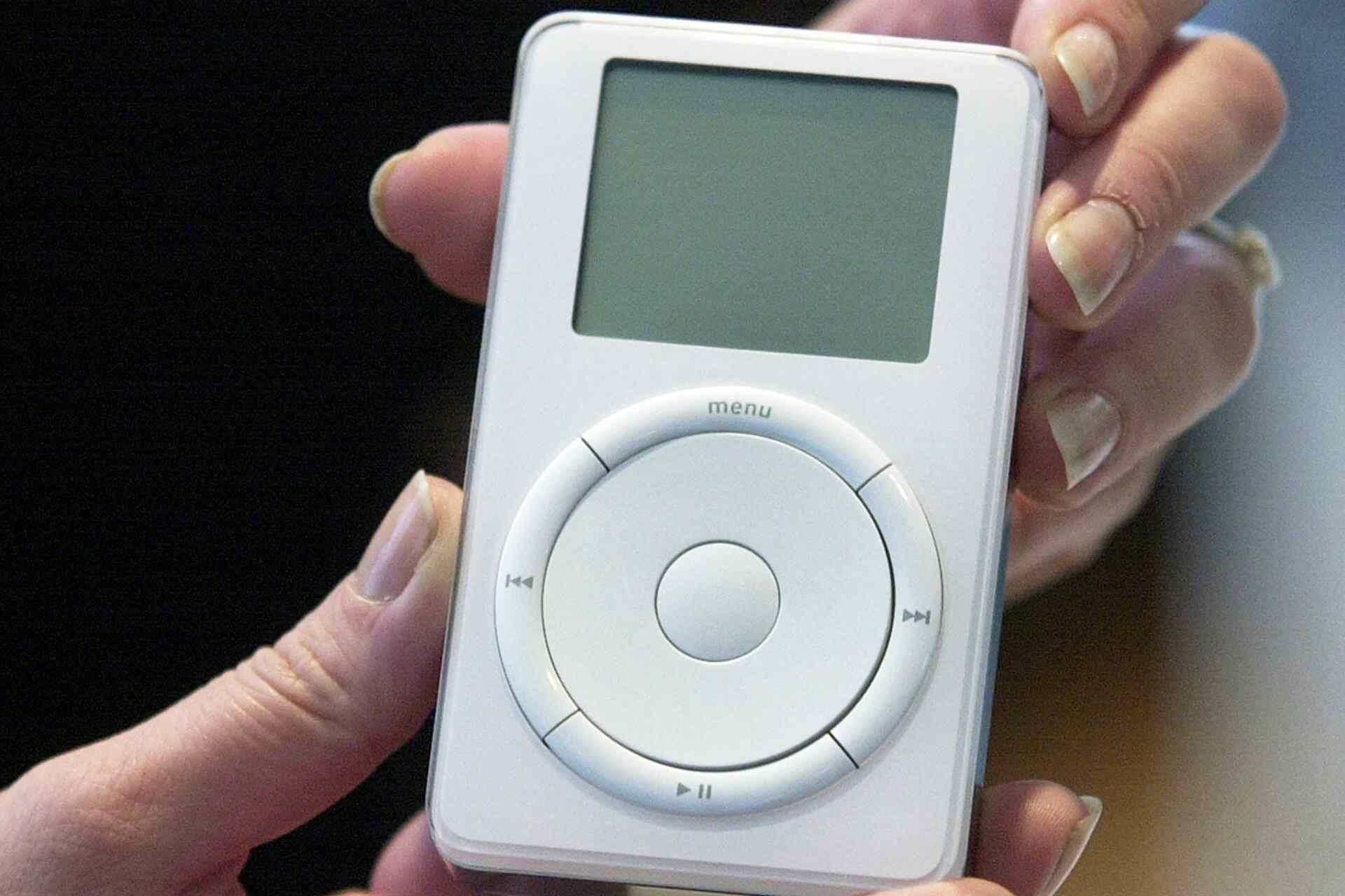
BMW just made a subtle change to the logo on its latest car. The German automaker simplified the roundel on its new, fully electric BMW iX3 by removing the inner outlines of the logo. Most people won’t even notice. So why bother?
As luxury automakers adapt to an electric future, they’re updating their branding too, and different companies have taken different approaches. Jaguar went for a big change ahead of a new product launch in 2026 with a new mark that’s lighter, rounded, and lowercase as compared to its old all-caps logo mark. Ranger Rover, meanwhile, split the difference, introducing a new secondary mark that gives the brand more flexibility. Newer EV companies often use a stenciling effect to give their brand names a sci-fi look, while General Motors’ rebranded 2021 mark also went shifted to a rounded lowercase.
In broad strokes, the new logo on the iX3, the first in BMW’s next generation Neue Klasse family of electric cars, isn’t all that different from BMW’s very first logo in 1917. They’re both circular and use a blue-and-white quadrant, and though the company updates it occasionally to reflect changing design trends, the basics remain the same. The Munich, Germany-based company keeps the general idea, but updates it for the times.
In 1953, BMW swapped out a gold logo outline for white. In 1963, it changed the logo’s font from serif to sans-serif. A 1997 version used shading and gradients to create a chrome, metallic effect, and in 2020, BMW added minimalist, open version for communications only.
Though BMW’s logo is believed by some to be a propeller, the circular badge shape actually comes from the logo of Rapp Motorenwerke, the aircraft engine manufacturer that became BMW. The white-and-blue quadrant pattern is actually a reference to the state colors of Bavaria.
The company says the propeller myth has become self-perpetuating, but Fred Jakobs, archive director of BMW Group Classic says it also “has acquired a certain justification.”
For the new version on the roundel of the iX3, Oliver Hailer the head of BMW Design, told BMWBLOG, “We wanted to keep the heritage, but bring more precision to the logo.” If it’s not broke, don’t fix it. Just spruce it up. The details matter, but sometimes a rebrand doesn’t have to be dramatic.

Featured Videos
Today's Top Stories:
More Top Stories:


FROM OUR PARTNERS