- | 8:00 am
Google’s new Nest thermostat is a stunning, floating remake of the original
Thirteen years after Nest first launched, the smart thermostat is getting a modern makeover with smarter AI and a sleek new look.
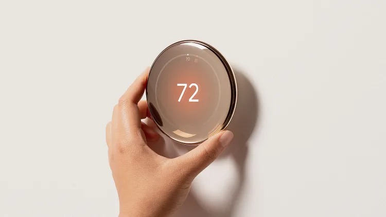
It’s hard to contextualize just how revolutionary the Nest thermostat was when it launched in 2011. Designed by Tony Fadell, a key figure behind the iPod, its simple silver ring and black screen bucked decades of plastic, white-boxed convention to become the closest thing the smart home has to an icon.
Now, 13 years later, Google is giving Nest its biggest makeover in history (available today for $280). It’s now made from recycled materials. It has improved AI that knows, for instance, if it’s sunny outside it should take that into account for heating. And yes, like any good gadget update, the display is now 60% larger. But the Nest doesn’t look like another TV on your wall. Instead, it appears to be a piece of floating glass with a curvature reminiscent of the Pixel Watch (which is itself inspired by the surface tension of water).
“Not that people [are comparing these products] but there’s a design ethos that’s . . . coherent, that gets me personally very excited,” says Ivy Ross, Chief Design Officer of Consumer Devices at Google.
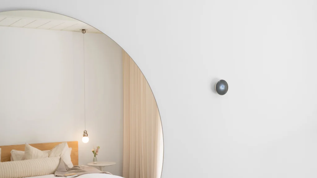
Inside the floating glass design
That glass is really the hero of the device. Capturing the spirit of some of the most contemporary international design—I squint and see the work of Sabine Marcelis—each is glazed in multiple coatings to match its silver, black, and gold colorways. “[They] aren’t only beautiful, but help eliminate the visual bezels,” says Isabelle Olsson, Senior Design Director for Nest and Wearables portfolio. “The reason that’s important to us is this is a product people keep in their home for 10 years or more . . . and one of the first tells of a device if it’s outdated is the bezel.”
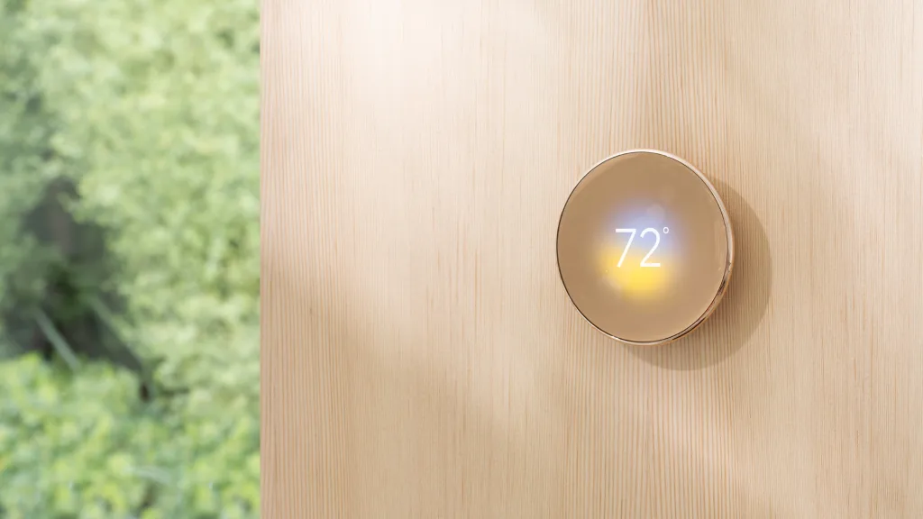
To create the floating effect, Google didn’t rely on some new breakthrough in miniaturization or other technology. And like any good magic trick, it’s almost head-slappingly obvious when you realize how it works. While the user sees the glass floating from the wall, a base with a smaller diameter tethers it there in the shadows, much like the stem of a mushroom.
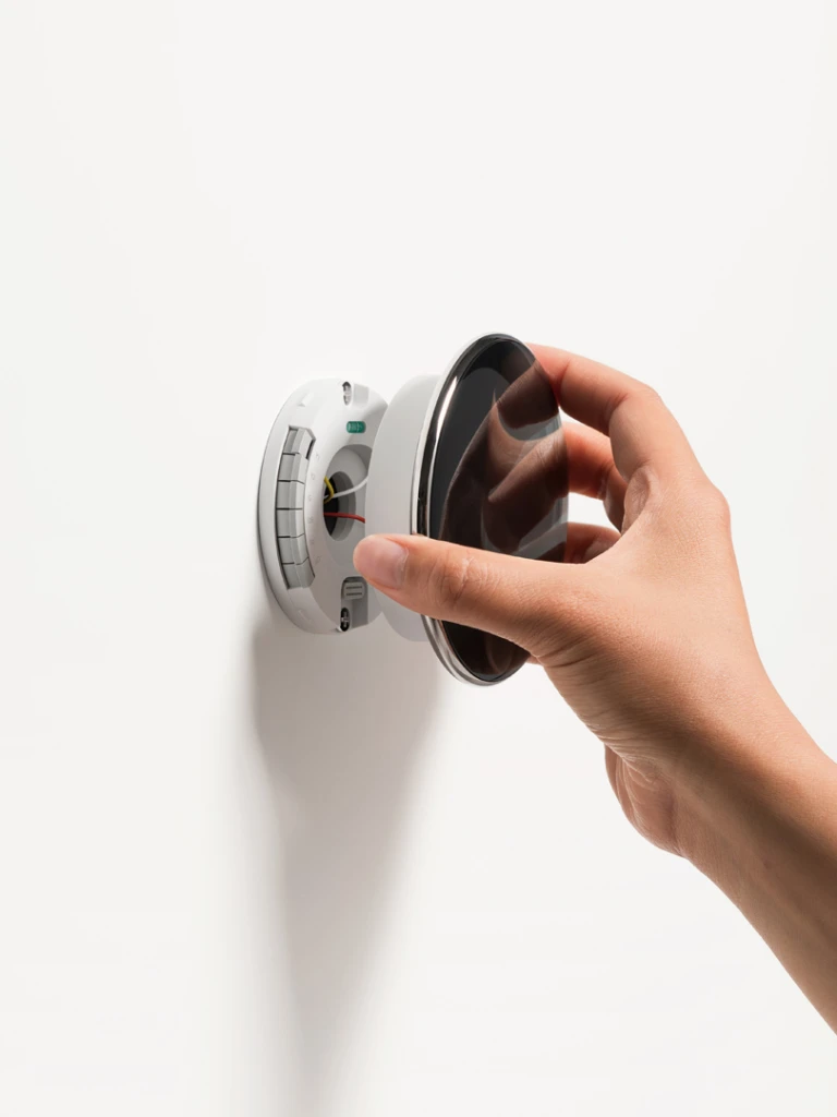
“There wasn’t a ton of reduction we can make regarding depth,” says Olsson of the hardware trick. “But looking at wall sconces, it’s not a too-uncommon gesture in the furniture industry. So that made us confident to start exploring it . . . from most angles, you get the magical effect.” The Nest team tested many versions of the form to get it right. At one point, Google designers descended upon Olsson’s home with 20 early prototypes, placing them on different walls to see how they fit into a lived environment.
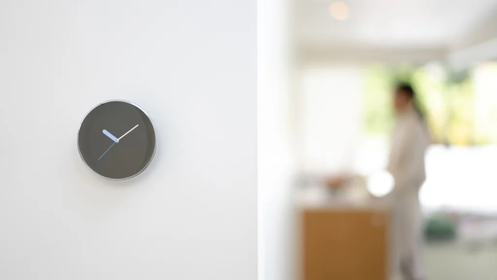
The new adaptive UX of the Nest Thermostat
Alongside the new hardware, the Nest thermostat will be getting significant updates to both its UX and the automated AI that promises to more efficiently warm and cool your house. The most striking difference is its new Dynamic Farsight display that displays different information depending on your proximity— an idea Google has been experimenting with for some time and continues to be bullish on.
“It has some hints of what’s to come,” says Ross of the UX. “I think it represents a thoroughly modern piece that tips its hands to the future.”
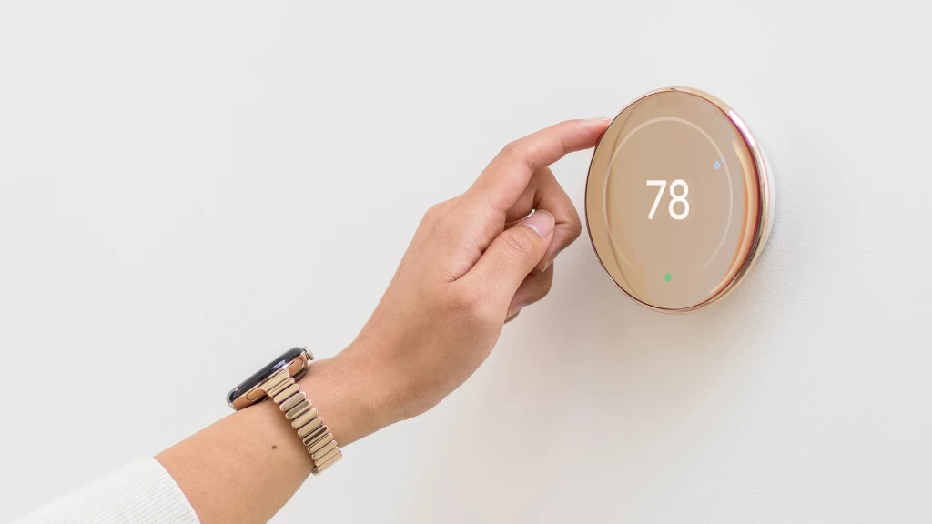
From a distance, users can customize the screen much like the face of a smartwatch, to display the temperature or time in digital and analog presentations. As you move closer, the Nest screen glows just a bit to acknowledge your presence, before displaying a denser layer of information. Whereas you might see temperature from far away, at a closer level, you’ll also see the weather through the day. The deepest level of the interface, which appears only when you touch the device, is the densest, and it isn’t customizable, but that’s because it’s the core UI of the product necessary to its operations.
Without testing the product yet, it’s hard to know if these animations—which will include new weather effects like lightning—will be a welcome acknowledgement or a distraction. But the overall goal of the new Nest is that it should ask less of your attention (thanks to ever-improving AI).
“One of the bigger pieces of evolution is the integration of AI, and living up to the premise of smartness,” says Olsson. “In my experience, I’ve had to interface with it less.”


