- | 8:00 am
How Comic Sans became the Crocs of fonts
After 30 years of abuse, Comic Sans is ready for its redemption.
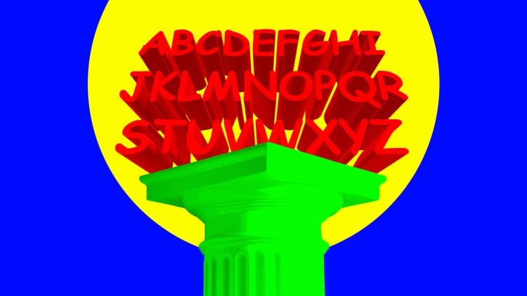
Comic Sans has turned 30, and it’s done being your punch line.
For three whole decades, Comic Sans cowered at your reproaches and winced at your jokes. It barely flinched when Google’s practical joke made sure that searching for “Helvetica” would render all results in Comic Sans. Or when CERN, the European Organization for Nuclear Research, made it the butt of an April Fool’s joke three years later. It even sat quietly while people gathered signatures for its demise. But Comic Sans has just hit the big 3-0—and it’s ready for its second act.
Don’t take it from us. Take it from various studies that have been done on the subject of “turning 30.” And from the three experts who contributed to this story and said that turning 30 marks a period of introspection and change. “Comic Sans, much like a person, has likely reached a better level of self-awareness,” says Riani Kenyon, an anthropologist and behavioral analyst at the British insights agency Canvas8. “It understands its strengths (being playful, informal) and its weaknesses (not for professional use—ever), and just like a person who becomes comfortable with their quirks at 30, Comic Sans can now step into a more refined role.”
Or as organizational psychologist Etty Burk put it: “Comic Sans asks the big question: ‘Who am I, really? What’s my purpose in this huge design world?‘”
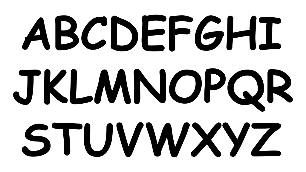
Who is Comic Sans?
For starters, Comic Sans wants you to know it wasn’t ever meant to be taken seriously. Vincent Connare, who was then a typographic engineer working at Microsoft, created the typeface in 1994. Most of us were blissfully offline back then, so Microsoft had devised a program called Microsoft Bob to teach people how to use computers. An animated dog named Rover would pop up and give you helpful tips encased in speech bubbles. But what kind of dog talks in the same typeface as your employment contract?
Comic Sans was inspired by the comic books Connare had lying around in his office. With its round letters and uneven spacing, it was meant to look friendly and imperfect. “It sticks out. Everything else looks like something traditional that you see in books,” Connare told The Guardian in 2014. But while Microsoft Bob was discontinued soon after launching, the font was bundled with Microsoft 95 a year later and, well, all hell broke loose. Comic Sans appeared on restaurant menus, funeral announcements, official government letters, bumper stickers, business signs—so many places, in fact, that there’s a popular subreddit on the topic. Even the Vatican used it in 2013 to commemorate Pope Benedict XVI.
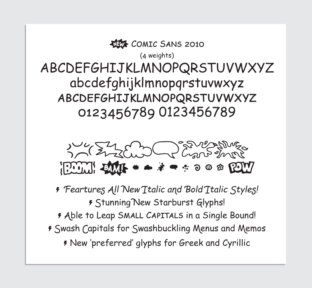
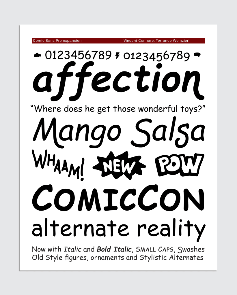
The boom continued well into the early aughts, at which point Microsoft released a licensed version of Comic Sans in 2010. The extended typeface family, which came with italics, plus extras like swashes, small capitals, ornaments, and dingbats, made the font commercially available to anyone willing to pay $120 for it. It was released widely in 2011—on April Fool’s Day—and renamed Comic Sans Pro. “It was real, but it was in on the joke,” said Terrance Weinzierl, now creative type director at Monotype, who created the extended font at the time.
Over the next few years, Comic Sans became a victim of its own popularity and drew in a few enemies. In 2011, graphic designers Holly and David Combs—a couple from Indianapolis who bonded over their hatred of the font—issued a long manifesto “to ban the use of the font Comic Sans and preserve the quality and traditions of typography.” That same year, the website Comic Sans Criminal was born to help “rehabilitate” typography criminals.
A coming-of-age story
But redemption is on the horizon. To this day, if you Google “Comic Sans,” the results will be displayed in Comic Sans. But David Combs has since changed his mind and renamed his Facebook Group “Use Comic Sans,” noting to The New York Times a few years ago, “It’s gotten to be so bad that it’s almost cool again.”
In 2018, San Francisco publishing company McSweeney’s published a colorful rant singing the font’s many praises. “Listen up,” the monologue reads, “I know the shit you’ve been saying behind my back. You think I’m stupid. You think I’m immature. You think I’m a malformed, pathetic excuse for a font. Well think again, nerdhole, because I’m Comic Sans, and I’m the best thing to happen to typography since Johannes fucking Gutenberg.” Naturally, the whole thing was rendered in Comic Sans.
All of a sudden, Comic Sans had groupies. Over the past few years, the font has become a favorite among people with dyslexia because “the letters can appear less crowded” and “it uses few repeated shapes, creating distinct letters.” The typeface also has been embraced by anti-elitists and people with a sense of humor. Neil Mullarkey, a British comedian who has taught “the improv mindset” to the likes of Google, Unilever, and Vodafone, says he experimented with typefaces a lot.
“Geneva was my gateway drug to the darker side of Verdana. Then I had to write a book. I had to sober up. Times New Roman, double-spaced, font size 12. But illicitly, in emails, I was high on Rockwell,” he says. Then he and his wife used Comic Sans for their wedding invites. “It cuts a dash,” he explains, noting that the word sans means “without” in French. In other words: “without all the airs and graces that spelling-phobic graphic designers love.”
Weinzierl says he hasn’t really thought about the font since he contributed to the extended version, noting, “It hasn’t come up, but I wouldn’t be afraid to use it.” To him, we are past peak criticism. Like the Eiffel Tower (which drew a slew of protests while it was still in construction), or that Mariah Carey Christmas album, the typeface has become nothing short of iconic. (Though we can agree to disagree on the Mariah front.)
Today, Comic Sans is the Crocs of fonts. First we hated it, then we loved to hate it, now we kinda, maybe love it because we’re experiencing it through a different lens. “In the way that ’90s clothing is back in style,” Weinzierl says. Case in point: Gen Z pop star Chappell Roan used a sparkly Comic Sans in her vintage-oozing lyric video for “Good Luck, Babe!”
All of this is to say, Comic Sans has matured, and 30 years in, it knows where it belongs. So, maybe next time you feel like throwing shade, consider this: Comic Sans has come of age. You should, too.


