- | 12:00 pm
How Instagram’s logo became iconic
Here’s the story of how the ubiquitous app’s logo evolved from skeuomorphic camera to gradient icon.
The original Instagram logo should have gotten its founders sued—and, well, it might have if Apple and a photographer with 45 minutes on his hands hadn’t saved the day.
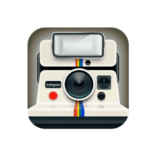
In 2010, Kevin Systrom and Mike Krieger released their photo-sharing app to the world. The issue was, Systrom had designed its logo himself—and it didn’t just mimic the look of a vintage Polaroid OneStep SX-70 camera, it wholesale copied it, right down to the signature rainbow stripe and, paradoxically, the chunk of a flash attachment that made it decidedly awkward for a square icon.
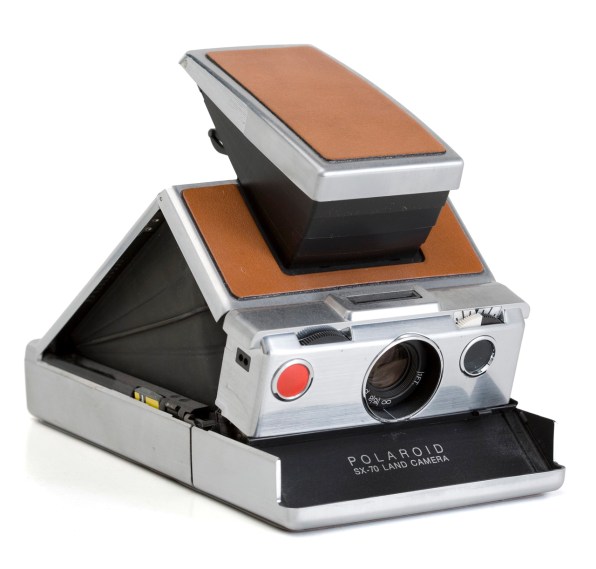
The good news for Instagram: After a mere two weeks on the App Store, Apple wanted to feature the app on its homepage.
The bad: Apple recognized that the logo was an obvious breach of Polaroid’s IP, and gave Systrom and company a tight deadline to fix it. Systrom called his friend Cole Rise and asked if Instagram could purchase a logo Rise had made based on a vintage Bell+Howell camera, complete with its multiple lenses. Rise told him the design was being used for a different project, but he offered to take a stab at something new.
Less than an hour later, Instagram had its first official logo.

2010: THE SKEUOMORPHIC EARLY DAYS
In the first true iteration of the Instagram logo, Rise took his streamlined Bell+Howell tile and streamlined it even further, centrally locating the lens and jettisoning the second one in favor of a viewfinder. He then carried the Polaroid rainbow tag over, added an “INST,” and the design hit the App Store, rocketing up the charts.
The team would revise the logo slightly over the next year—adding a vintage leather texture to the top, brightening and beefing up the rainbow colorway, dropping the red button, and (perhaps most critically for the pop culture lexicon) adding an “a” to “Inst.” (Rise also designed the “back” of the app, in case you were ever curious.)
Though the logo may feel alien to newer users and today is more evocative of a wood-paneled library with one of those bourbon bars hidden inside a globe, early adopters built a deep connection with the logo and the app’s film-mimicking vintage filters.
2016: INSTAGRAM GOES GRADIENT
After acquiring Instagram for $1 billion in 2012, Facebook was largely hands-off. But then 2016 rolled around.
As Fast Company reported at the time, “While almost every app-maker has embraced flat design, Instagram has remained firmly stuck in iOS circa 2007. . . . You knew a redesign had to be coming.”
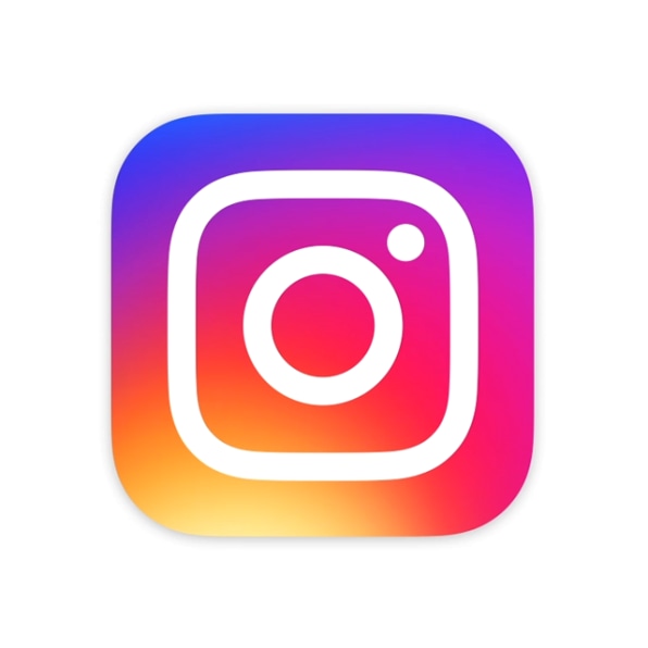
In May 2016, Instagram unveiled a new logo that was a complete departure from its skeuomorphic past. In place of the vintage camera was a sunset-hued square, designed to be instantly memorable.
Users panicked and piled on, as they tend to do when a logo gets an overhaul.
Ian Spalter, Instagram’s head of design at the time, broke down the controversial modern remix on Medium, noting that the app had evolved from a simple photo-sharing service to a robust community comprising an ecosystem of video, as well as Boomerang, Layout, and more. So his team had spent a year analyzing how they could reflect that evolution visually—starting with ditching the ornamentation and flattening the icon, as the times dictated.
But is it better? he wondered. Will we feel the need to do this again in a year?
Spalter next asked everyone at the company to draw the Instagram logo from memory in five seconds. “Almost all of them drew the rainbow, lens, and viewfinder”—the critical raw materials of what was to come. The camera’s signature rainbow became a gradient, a resurrected trend Instagram simultaneously played into as it helped define and fuel it.
The challenge: “How far do we go?” Spalter wrote. “If you abstract too much, the glyph doesn’t feel tied to the history and soul of Instagram. If you make it too literal, it’s hard to justify changing from what we currently have.”
Ultimately, the team wound up with a simple mark that evokes a camera and light sensor, and a unified design across the app that brought its secondary elements into the brand fold. While it caused outrage when it dropped, like the skeuomorph before it, today it has firmly wedged itself into our minds as the most elemental visage of the brand—perhaps a testament to how fleeting our graphic loyalty truly is.
2022: THE CURRENT LOGO
Almost exactly six years later, in 2022 Instagram unveiled a new logo—kind of.
It was a change bundled into a larger identity refresh. As one of Instagram’s creative directors wrote at the time, “We kept the best of the brand, while infusing it with new energy and powers of expression.” The best of the brand, apparently: the logo . . . minus a few subtle patches of gradient. To this day, many users would likely be surprised to learn that the gradient in the Instagram logo has morphed the tiniest bit—a change that supposedly amplified it with “new dimensionality and vibrancy.”
While the logo escaped largely unscathed, Instagram’s design overhauls have tended to arrive alongside thoughtful revamps that don’t bank on aesthetics alone. In this case: the development of the brand’s first custom typeface, Instagram Sans, inclusive of different global scripts, and a modular branding system that applies the gradient even further across the board.
How long will Instagram keep living that gradient life? Time will tell.
Given the (disturbing!) number of times we tap the Instagram icon every day (hour?), it might seem like we essentially fail to see it anymore, that in its ubiquity, it has become nothing more than an anonymous gateway. But try to change that logo, and you quickly find out how powerful it remains—which is perhaps the most pure test of any mark.


