- | 9:00 am
How Open AI designed the ChatGPT app to be addictively simple
Open AI’s design team reveals how it made a complicated piece of technology so easy to use.
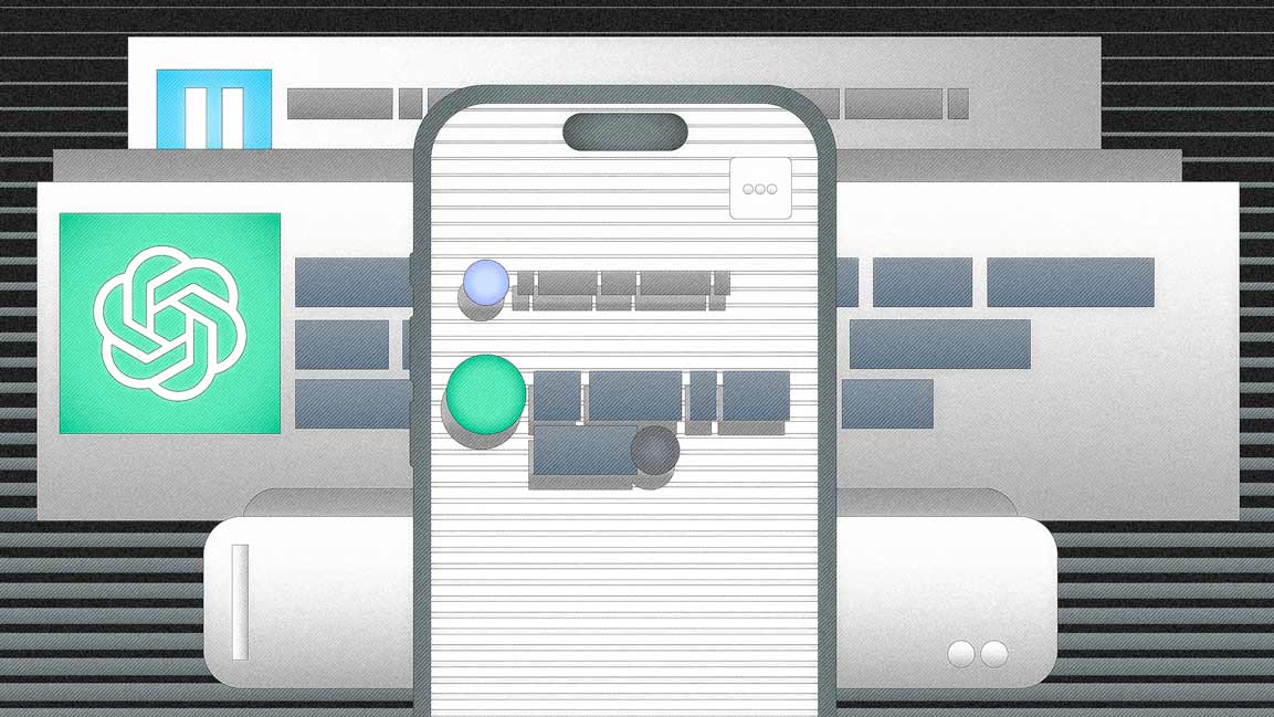
There was one single, quasi-religious mantra that guided Patrik Goethe and the rest of OpenAI’s user experience team as they worked through hundreds of interface iterations of the ChatGPT app for iOS: Kill any complications, avoid distractions, and keep it simple.
Last month, when Open AI launched the app, it was met with excitement, but also a few expressions of disappointment. Despite being the vehicle for a revolutionary piece of technology, the interface for ChatGPT’s app is strikingly simple. It looks like a chat app—no bells, no whistles. Users can write in a text field or upload a prompt with their voice and click send. The chatbot responds with lines of text, not dissimilar to the interface you’d see in an ancient version of AOL Instant Messenger.
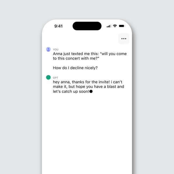
Over email, Goethe tells me that he and his colleagues consider text to be the most powerful form of communication a human can have with a computer, right now, thanks to artificial intelligence. This observation led the team to embrace a stark simplicity for the app that, frankly, few other companies could pull off.
The company’s iOS design team played with a clear advantage from the beginning: It already had empirical evidence that the command line worked beautifully for AI systems. The web version of ChatGPT is framed around a simple action that asks people to type, in their own words, any prompt they can think of. In return, users receive all kinds of information, from text to images to statistical graphics. This simple UX made ChatGPT the fastest-growing platform in history, reaching 100 million monthly active users just two months after its November 2022 launch.
This raging success makes sense. After all, Homo sapiens have been using language for more than 150,000 years, so it’s only logical that we find it to be one of the most natural forms of communication. If a computing device can read and write just like a human, Why complicate the UX unnecessarily, Goethe thought. Let humans and computers communicate through a command line. Let them prompt.
FROM TEXT TO GUI TO TEXT AGAIN
Using text to communicate with a computer used to be anything but natural. The concept of text “prompting” was born in the 1960s as an evolution of the teleprinter machine—a typewriter-style device that allowed users to send characters through a telex network. The text prompt made its debut in the command line interface (CLI). The CLI was a revolution on its own, allowing for the use of a language to control a computer after years of using punched cards that were an even taller barrier to use computers. Still, the CLI was too hard to navigate for most, keeping the power of these machines in the hands of IT professionals, enthusiasts, and people who took classes to learn code that resembled English but felt alien to everyone else.
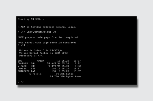
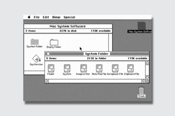
That changed in 1984 when Apple unveiled the Macintosh. In computing, text was the Berlin Wall separating people from the freedom brought by the power of computers—not a conduit for fluent communication. The mouse-based graphical user interface (GUI) demolished that barrier, opening computing to a larger mass through the abstraction of point-and-click representations of files, folders, and different tools that emulated real-world objects so they could be easy(ish) to understand.
Finally, smartphones made the GUI completely accessible to all, thanks to the direct manipulation of fingers and the specialization of having one app for each task. But even this computing power, albeit omnipresent and universal, was limited by barriers, from our own lack of time to process information to the way apps can represent data on-screen.
Then, just a few months ago, AI entered the chat room.
With AI, the prompt became all anyone needed to make computing magic like never before seen in the history of humanity. As Goethe points out, AI-driven text input and output has put humans and machines in the same communication channel. He believes that AI technology enables us to communicate with computers in ways that are basically more human.
“We’re seeing this already with ChatGPT, where you mostly communicate in plain English like you would if you were writing to another person,” he says. “You’re no longer formatting your text like you would in, for example, a classical search engine where you’re trying to hit all the right keywords. There’s just less of a learning curve than you typically see with advanced technology. We’re finally entering the era where computer commands are not preprogrammed and learned but intuitive and magical.”
Alex Khmelevsky, director of user experience at design firm Clay, agrees. Over an email interview he tells me, “The primal and potent nature of writing as a means of human communication is clear; a tool with roots as deep as our civilization.” Khmelevsky points at how this organic way of exchanging thoughts and ideas has been adapted so effectively into the digital space through messaging apps, making it the natural choice for designing interfaces for text-based AI systems.
“Platforms like Facebook Messenger and Slack owe much of their massive success to their intuitive text-based interfaces,” he says. “These platforms embody the concept that communication tools should mirror our natural, daily interactions, a principle also evident in the design of the ChatGPT web app.”
A CHATBOT APP IS BORN
But the design of ChatGPT for iOS was not as simple as just shrinking the web app to fit a tiny screen. Goethe told me that his team was very aware of how easy it is to overdesign. With that in mind, the designers took on the challenge of making ChatGPT efficient and accessible in handheld form. They started by letting go of certain features that they loved but that were designed with expert users in mind—at the cost of confusing the majority of users who are just learning to navigate the technology.
“I’ll echo the wisdom of design giants here,” Goethe says. “It’s hard to add things elegantly, but it’s even harder to remove things, and the more we love them, the harder it gets. It’s especially hard for us, because the people who are most excited about creating all of these magical AI experiences are probably in the room here at OpenAI.”
One of the first UI challenges was how to represent AI in the app. “AI is usually depicted with holograms, shimmering blobs of light, and particle systems,” Goethe tells me. While maybe they will do that one day too, he says, for the first version they quickly zeroed in on the history of the user interface. Since text was the primary tool, it seemed natural to revisit the original block cursor from the original CLI. “[We took the first cursor] for text typed by humans and gave it a slightly warmer flare for AI, turning the square into a circle,” he says. “It was actually one of the first ideas that just felt good and stuck with us.”
The team then thought about other ways to boost this AI identity: It started to play with haptic elements as a nod to the presence of an intelligence. As you wait for answers from this intelligence, the phone vibrates, which feels like the rustling of a living being behind the glass wall. For Goethe and the UX team, “It felt like all the elements we needed to tell the story we wanted to tell; and while the main parts of the app are pretty scaled back visually, it does feel like someone’s home,” he says.
Emily Wengert, head of experience innovation at Huge, believes that this use of haptics is clever, though it can feel a bit fatiguing: “[Sometimes] you feel like, “Give me the answer already and stop vibrating my hand to do it.” However, she says, “It’s been exciting to finally get easy access to ChatGPT on the go. Getting ChatGPT collaboration in the moment is something we’ve been itching for since ChatGPT first launched.” Wengert says the desktop version of ChatGPT was clearly work oriented, but the app enables people to “discover answers to complex needs in the moment anywhere, anytime, at a party or concert or store or sidewalk.”
She appreciates that the first mobile experience is hyper-simple. “The best products ever built home in on what they’re good at, and OpenAI did just that with the ChatGPT app,” she says.
LIFE BEYOND THE PROMPT
Wengert, Khmelevsky, and Goethe all believe that the simplicity of the command line is not the apex of the AI user experience. It’s crucial and fundamental, yes, but there’s more to come. Goethe says OpenAI is already working on the next interface evolution. They are all big sci-fi nerds at OpenAI, he says, so they have a lot of dreams and ideas to move ChatGPT forward: “We’re excited to keep iterating with our users from here to build a product we can all grow with.”
Khmelevsky says that right now there is a dominance of engineers in the AI space, but it’s worth remembering that most technological revolutions start this way. “The internet, during its inception, was primarily a technologists’ domain, only later evolving into a more design-centric landscape,” he says. “I believe AI technologies are set to embark on a similar journey, with designers poised to step in and refine these technologies, making them more intuitive and user-oriented.”
Indeed, it seems reasonable to predict that as AI technology continues to evolve, so too will the ways in which we interact with it. Wengert envisions a future in which voice commands become an integral part of AI interfaces, thanks to the open-ended and flexible natural language intelligence of systems like ChatGPT. “There’s a chance that this finally becomes the moment for voice-driven UI to find its value,” she tells me. “Historically, voice interfaces like Siri or Alexa were constrained by the tasks they were best trained to do and the human’s ability to correctly predict which specific words would unlock those actions.”
Large language models have turned this into an open-ended and flexible natural language that will allow people to engage in ways designers can’t yet anticipate. “ChatGPT already includes voice input, but we believe there’s a bigger application beyond this one tool that will be fine-tuned to support people in the context they’re in,” Wengert says. “Just imagine: You could have an idea in the shower and verbally brief a generative agent in real time who then formulates a plan for execution and shows you the result by the time you’re stepping foot on the bath mat.”
The challenge for UX designers will be to create interfaces in a way that feels intuitive and natural to the user.
MERGING CLI AND GUI
Beyond these generic UX challenges, however, there are practical problems that need to be solved without the prompt. “Text is very convenient for multiple reasons,” Goethe says, “but it’s also a human invention, and often a lossy abstraction of what we’re trying to convey.” It’s absurd to think that voice and text can be the only way to interact with AI, at least in the short and medium term.
The need for other interaction modes will likely be brought about by professional use, in tools like generative AI-based CAD software or image editing. One example comes from Xingang Pan, an assistant professor at Nanyang Technological University in Singapore who recently finished his postdoc research at Max Planck Institute for Informatics.
In collaboration with Google, MIT, and other research institutions, Pan created DragGAN, an interactive AI app that, like Photoshop, lets users load an image and manipulate the subjects contained in it. Unlike Adobe’s image editor, DragGAN doesn’t edit things like levels or let you airbrush a dog until it looks to your liking. Instead, it allows you to manipulate the very digital existence of the dog itself: change its expression, its physiognomy, and even its perspective in space with incredible precision and realism.
As the research paper highlights, “Synthesizing visual content that meets users’ needs often requires flexible and precise controllability of the pose, shape, expression, and layout of the generated objects.” The existing approaches, it continues, often lack flexibility and precision.
Rather than using text to tell the software to “move the head of the dog slightly to the left, make it smile, and raise its eyebrows,” DragGAN feels more like a highly precise version of the Liquify filter in Adobe Photoshop. With this AI, the user sets points on an image and then pushes or pulls them around to get precisely the wanted effect. Arrows indicate the movement, and the app responds to your interactions by regenerating the image so it always looks realistic, not a deformed mess like Liquify does. The results are so incredible that it truly feels like magic, as you can see in the videos.
Pan tells me that while he thinks text and voice commands are extremely powerful, he envisions the future of the artificial intelligence UX as combining voice, text, and direct object manipulation with your own hands, using mice or gestures (something that I really wish we saw when Apple demonstrated the Vision Pro, instead of the inane “spatial computing” demos). After all, touch might be an even more fundamental and human mode of interaction than language.
It seems inevitable that the merging of these approaches is where AI is heading. How everything will converge is still an open question, but by having something like the purely text-based ChatGPT in the palm of our hand, we are off to a great start.


