- | 9:00 am
How the humble cube took over the skyline
Perfectly symmetrical and pleasingly simple, the cube has become the artistic flex of the architecture world.
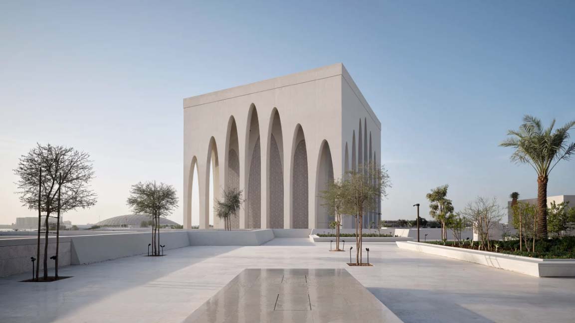
It is the year of the cube building: The World Trade Center has gained a dazzling new performing arts center in the shape of a glowing marble cube. London is getting a glassy “Paddington Cube” by Renzo Piano. Tirana has Stefano Boeri’s Blloku. And Abu Dhabi now sports not one, but three cube buildings at the Adjaye-designed Abrahamic Family House.
In all fairness, the cube has long been a powerful symbol in architecture—from the Kaaba in Mecca to Aldo Rossi’s ossuary cube in Modena—and it will continue to fascinate architects long after 2023 ends. If the Mukaab in Riyadh is ever finished, for example, it will become the biggest cube ever built; so big it could fit an entire city inside a cube that is big enough to hold 20 Empire State Buildings.
But what’s this obsession with cubes really about? Does the cube beat the sphere as the most efficient architectural form, or is it pure artistic flex?
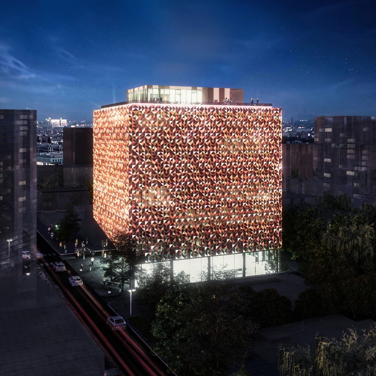
Blloku. [Photo: Stefano Boeri]
THE PERFECT CONTAINER
According to Ron Witte, a professor of architecture at Harvard University’s Graduate School of Design, the beauty of a cube—versus a pyramid, a dome, or any other pronounced shape—is that it’s not about the form but what it’s inside it. “When you look at a [Zaha] Hadid building, you become engaged by the image of the building, why it’s round and why it swoops and why it has a hole in the middle,” says Witte. “When you look at a box, you are invariably drawn to what’s inside it.”
In a way, that is how Joshua Ramus of Rex architects describes his firm’s design of the Perelman Performing Arts Center (PAC NYC) at the World Trade Center in Manhattan. “From the first month of the competition, we started calling it the mystery box,” he told me.
There’s only so many shapes that this particular building could have been. The architects inherited the elevator core from a previous design by Frank Gehry and had to arrange the three performance spaces inside in an L-shape around it. From there, the shape of a cube presented itself as the only logical solution. “And if the pure cube felt a bit standoffish in its own right, the stone does the opposite,” says Ramus. “It softens it, it makes it human and accessible.”
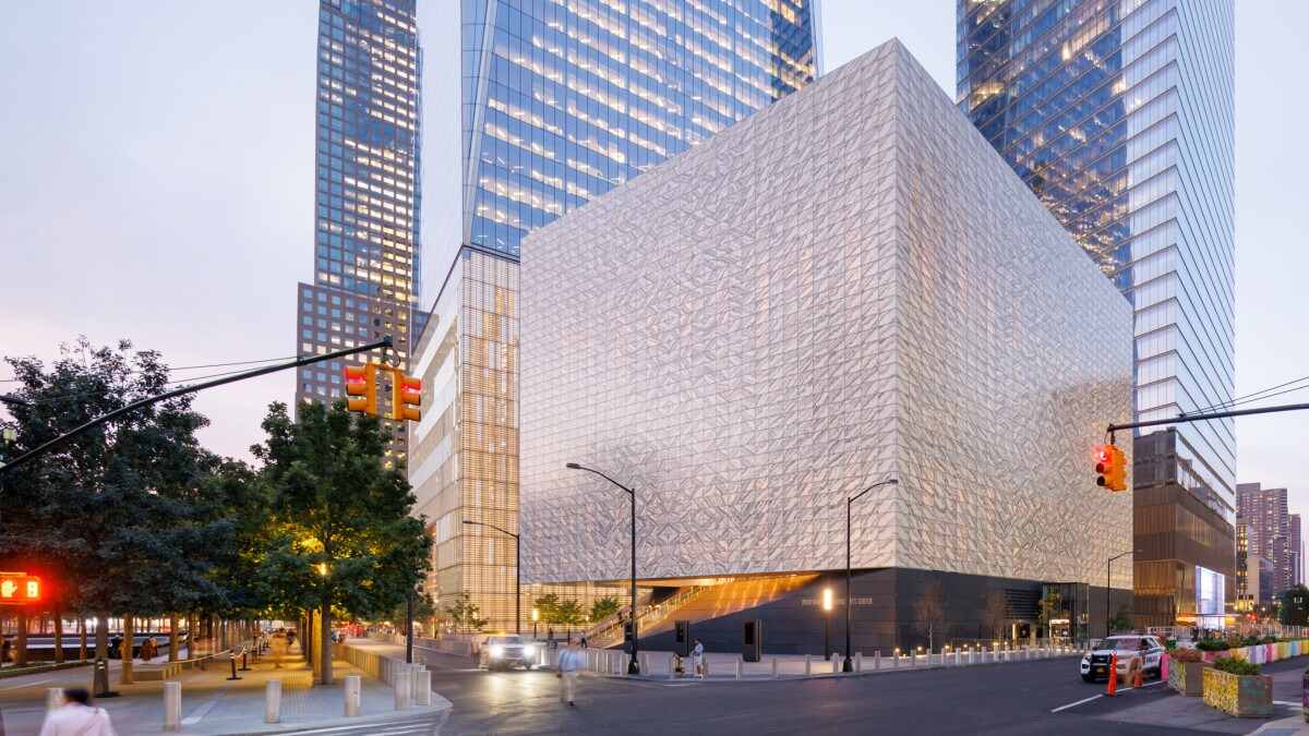
The Perelman Performing Arts Center [Photo: Iwan Baan/PAC NYC]
THE PERFECT CANVAS
Today, the cube has become a palette cleanser from the kind of wild, amorphous architecture that has dominated over the past few decades. With forever-improving digital tools and construction methods, there are few shapes that architects can’t turn into reality. “In response to the relative ease with which complex form can be achieved today, I think many architects have found a new interest in formal simplicity and restraint,” says Adam Dayem, an assistant professor at the Rensselaer Polytechnic School of Architecture.
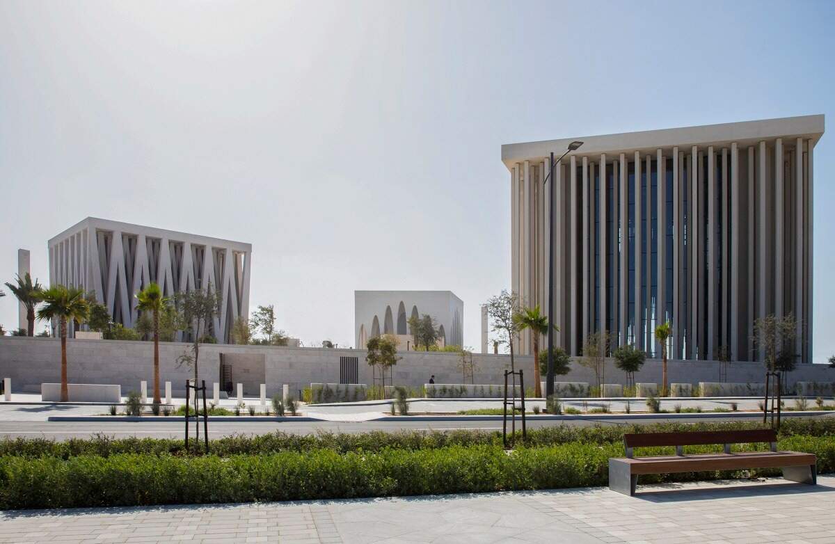
Abrahamic Family House [Photo: Adjaye Associates]
THE NOT-SO-PERFECT HUMAN EXPERIENCE
But what about the human experience? Several studies have shown that humans prefer round, natural shapes, like the curve of a leaf or the hollow of a cave. By contrast, the cube is a three-dimensional aggregation of straight lines, an unabashedly man-made piece of architecture that, perhaps, is not so inviting after all. Michal Matlon is an architectural psychologist who studies how the built environment affects the way we think, feel, and behave. He says that cube-shaped buildings lack human scale because they’re often missing the kinds of features that could help us relate to our own bodies—think windows that could give us clues as to the height of a building, or architectural elements indicating how many floors a building has.
He even describes some of these buildings as selfish. “They are buildings that are designed to attract attention, but they contribute very little to the street on which they are built,” he says. “The Mukaab [in Riyadh] takes this to an extreme where it tries to replace the actual urban fabric and contain all of its life within it, much like today’s shopping malls.”
The Mukaab is indeed an extreme example. The developers behind the project didn’t respond to a request for comment, but the project is an obvious attempt at producing something striking, earning a few superlatives and getting some media attention.
This isn’t the intent behind PAC NYC, or the Abrahamic Family House, or even Renzo Piano’s Paddington Cube (which started out as a 72-story tower then lost 54 floors after residents complained it would stick out like a sore thumb amid the neighborhood’s low-rise buildings).
Every architect has their own reasons (pragmatic, poetic, economic), but perhaps there is a simpler, fundamental argument at the root of them all—namely that the cube is symmetrical, and symmetry is synonymous with canonical beauty. “Cubes provide identity,” says David Martin, design director at Stantec. “Because they are symmetrical, they have a sense of permanence, immovability, and center, which for many, equates to a version of beauty.”
The cube, after all, is one of Plato’s five Platonic solids—the other four being the tetrahedron (or pyramid), the octahedron, the dodecahedron, and icosahedron. It is therefore considered a symbol of sacred geometry, and as Martin puts it: “There is a purity here which architects are attracted to, in realizing an ideal, with or without religious connotations.”


