- | 8:00 am
Inside Meta’s long-term vision to make its Orion glasses the Airpods of augmented reality
Meta’s heads of design for wearables tell the exclusive design story behind their upcoming Orion AR glasses.
Meta knows exactly what it doesn’t want to do.
Back in 2016, five years before Mark Zuckerberg would rebrand Facebook as Meta, a designer named Keiichi Matsuda released a short film called Hyper Reality. The plot is simple enough: A young gig economy worker rides a bus to the store to buy some groceries. But as the story is told through the lens of augmented reality glasses from the future, this simple task becomes graphic horror.
Every surface of the world is covered in ads, each its own intelligent app vying for her attention. A Godzilla-sized cat blocks out the sky, while a life coach urges her to run for efficiency, and a virtual puppy whimpers in her cart to buy more and more. Eventually, her identity is stolen, all of her XP (experience points) are lost. As the character stands on church steps, she signs the cross to join Catholicism, her life is reborn—with a new suite of thirsty apps.
“We’re all haunted by the Hyper Reality video,” says Joshua To, VP of product design, AR, AI and wearables at Meta as Michelle Pujals, product design director, gives a supportive nod. “And I think that we see it as a huge responsibility. Every pixel that we light up should be worth its weight in gold,” he says.
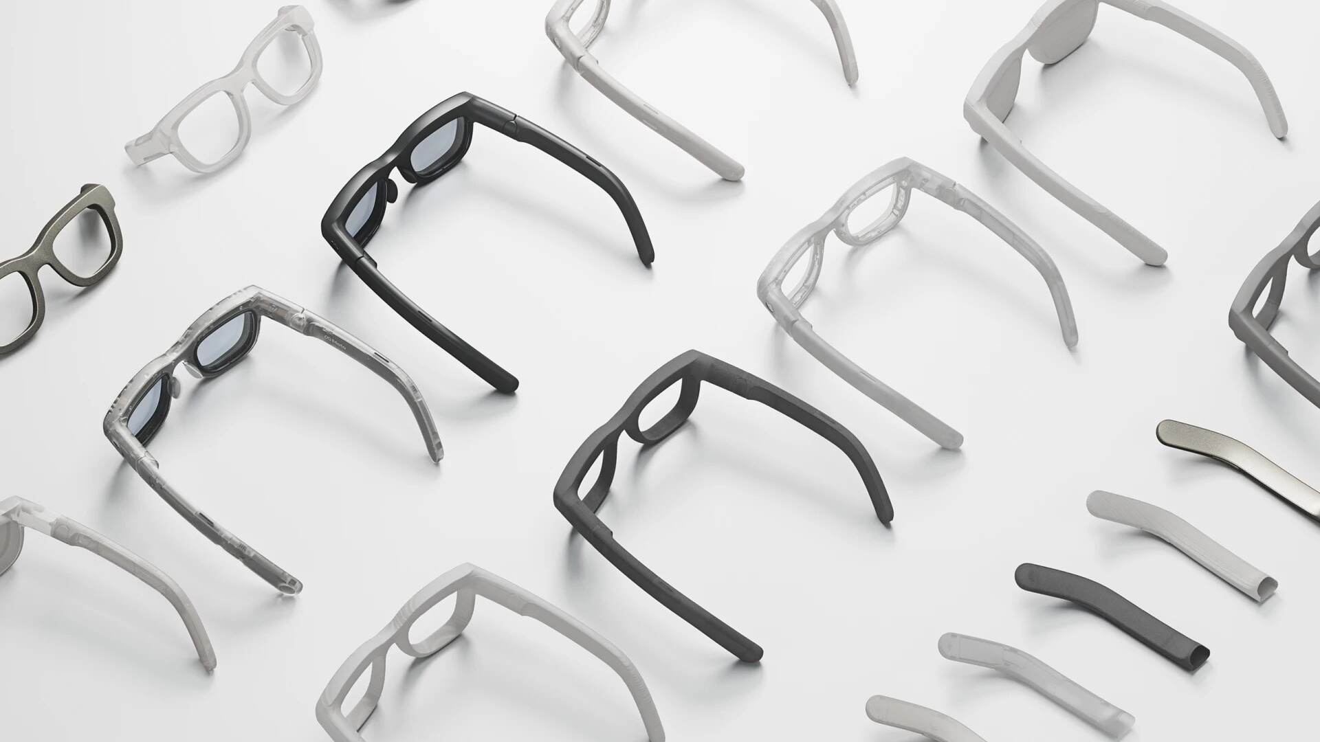
We sit together in another invented reality: a living room built in a box inside Meta’s Menlo Park HQ. Atop the coffee table in front of us stands a slab of Silicon Carbide, what looks like a rainbow meteor freshly landed from space (in all actuality, it was grown in a lab). Next to it is Meta’s raison d’être: a pair of chunky Wayfarer-like glasses it has dubbed Orion. To doesn’t imagine Orion will be a place you are sucked into reality 2.0, but a quieter computer you can easily don and doff. “A bit how you think about Airpods,” he says.

In the coming years—11+ after Facebook made its purchase of Oculus—some permutation(s) of Orion will come to market as a full consumer product. It will likely compete against Apple’s next generation of the Vision Pro, perhaps years before Apple’s rumored AR glasses (if those come to market at all). All of these projects imagine the next era of interaction beyond the smartphone. By leveraging a combination of advanced imaging technologies alongside the new era of AI, they want to distribute computing from your hand into your environment. But the fact that Meta is even listed in the same sentence as Apple in this endeavor was once unthinkable—perhaps even to the gleeful Mark Zuckerberg himself.
Following two hours of demo and discussion with Meta’s leads on Orion, I was left with the distinct impression: Meta gets it, and they might just pull this whole thing off. If only they can demonstrate some restraint.
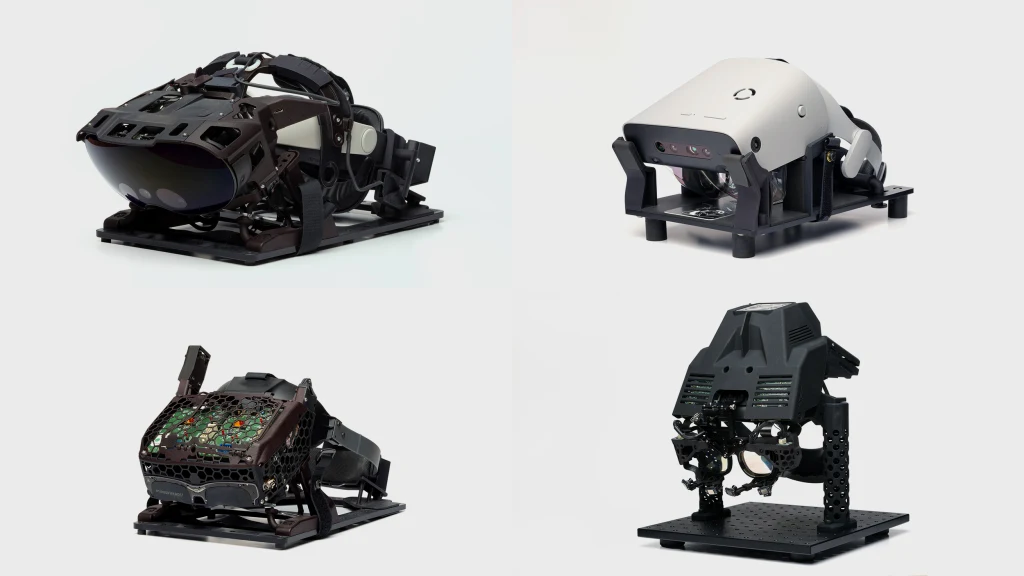
Building big glasses
Meta’s Orion glasses look like a Rayban before it went on Ozempic. Meta has been working toward this form factor for years now, building all manner of head-melting, hacked together contraptions from its Quest headsets to simulate the experience of AR without the miniaturization. I’m told by the time Orion ships, some dimensions will scale anywhere from 33% to 50% thinner than what they’re demonstrating today.
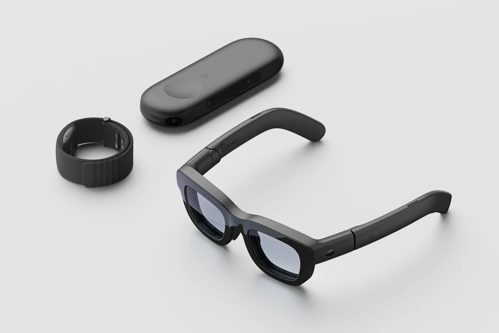
Orion is stuffed with a daunting amount of technology, balanced to distribute the weight across your head. It has about everything your cellphone does, plus seven cameras (four are for positioning, two are for tracking your eyes, and one is simply for AI queries), four batteries snuck into the temples around speakers, and two micro LED projectors that fire images onto the lenses. The reason Meta was able to shrink these components so small was that it’s almost all custom silicon, much of which is still proprietary enough that Meta hasn’t shared photos of the internals.
While you wear the glasses publicly, their contents are covert. You can’t actually see what someone else is seeing when they wear Orion, and that’s because the projector doesn’t reflect against the lens for anyone to see. Instead, its lenses encase the thinnest film of silicon carbide. Twice as refractive as glass, light doesn’t just bounce off the silicon, but actually flows through micro etched channels in the material to ultimately be viewable only to the wearer. It also means that wearing Orion gives the outside world the faintest iridescent glow.
This glow isn’t enough to transform someone’s face (IRL or on a call) into a confetti cake, but it is an aesthetic that the UX team leaned into across the entire interface. Or as Pujals puts it, “We embraced the boundaries.” The app icons themselves use jewel-like color gradients. And its “Aero” UI was inspired by aerogel—the world’s lightest, semi-opaque material—with panels that shimmer with color. Think of Orion as the Miller Extra Light of hyper reality.
While there are no wires to speak of, two accessories accompany Orion at all times. The first is what Meta calls the Puck, which handles a majority of processing for the device. The second—and far more exciting—is a Neural Band.
The band is essentially a slap bracelet (tragically without the slap), that can measure and interpret electrical signals from your body. In practice, that means while Orion’s cameras can often see your hands, the band can feel some of the most finite movements even when they can’t. In this case, the tapping and flicking of your fingers, which it confirms with the slightest haptic buzz.
The core UX behind Orion is quite similar to the Apple Vision Pro. You are greeted with a panel of apps floating in front of you, and your eyes work as a mouse and icons enlarge ever so slightly when you look. To open apps, you tap your index finger against your thumb. To go back, you tap your middle finger instead. (Technically Meta advises you to flip your hand upside down to distinguish this gesture, but that’s for you, the user, to keep things straight, not the system.) A flick of your thumb scrolls down a page. A double tapped thumbs up calls an AI assistant on demand. And a grabber bar sits below each window, which you only need to look at and pinch to reposition—with the UI responding to your touch with the slightest, Gumby-like bend.
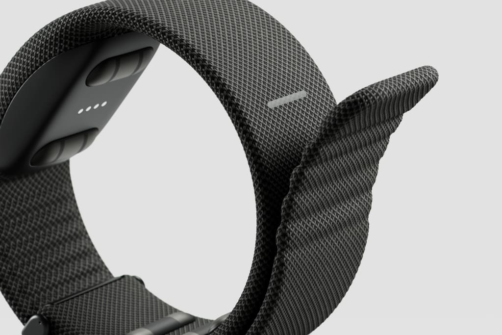
Meta has all sorts of unshared plans for future Neural Band style devices—and in the year or so before a finished Orion ships, the team is working out more complex interactions like typing (they imagine any surface can become a keyboard in a pinch). But a big reason Orion feels so quickly comfortable to use has nothing to do with vibrating future-tech; it’s that the core gesture of tapping your fingers together creates a “click” you wouldn’t get swinging your hands at icons in midair. The actual vibrations from the device only reinforce what you already feel physically.
“You basically get haptics when your fingers touch with each other; there’s feedback,” says To. “Especially paired with some sound effects and visual effects, it’s really satisfying. If you get haptics right, that helps . . . to reinforce how you reason about the interface.”
What it’s like to wear Orion
Wearing Orion is quite comfortable despite its oversized proportions. A lot of that is due, not just to the form of the device, but its relatively wide field of view (70 degrees)—which, in real world terms, is nearly as wide as the frame of your glasses, making its cutoff point more natural compared to the tiny window effect of the early Hololens.
This field of view means that you can have a social media feed, video call, and web browser open a few feet in front of you. You can drag in a window close, to simulate a computer monitor, or push it farther into the room.
The most impressive moment demonstrating the benefits of the field of view is playing Meta’s 3D Pong demo. Sitting on a table like an aquarium from Tron, I stood on one end, while To stood on the other. As our glasses invisibly synced, and effortlessly batted the ball back and forth, I stopped thinking about the product’s technical limitations altogether. All of a sudden, I could imagine my family wearing these glasses to play a zany board game, or collaborating with someone on a shared model. Hololens and Magic Leap have both touched on some of these ideas already, but let me say, it’s different when it’s just a pair of glasses, when I can look across the table and actually see into To’s eyes.
“I think the thing that feels counterintuitive is that what we’re all working at is human connection,” says Pujals. “Getting you out of [your phone] or laptop screen and looking at the person.”
Can Orion be quiet?
In all actuality, shared holograms and gaming are the easier sells of AR. What’s tricker is absolutely everything else.
For instance, in one demo, I walked up to a kitchen, looked at a bunch of ingredients, including bags of chia seeds, matcha, and oats, and asked what I could make. Each ingredient was labeled by glowing text, and a recipe generated by AI popped up overhead. It was only a static proof of concept, and what Meta admitted as a deck-stacked demo without a messy fridge or pantry to tease what could come. Even still, it all was a bit odd—the glowing labels for each item felt anachronistic in a domestic context.
“Philosophically, I think we want to get to a place where AR is more out of your way—in a more natural extension of your world around you than it being clearly this, like, artificial thing that’s lighting it up,” To concedes. “If we were trying to turn these ingredients into a game, I think we want the UI elements to feel a bit more distinct. But in a cooking flow, I think, it’d be kind of amazing if we could take a color sample and font [of the package], and it all feels like it was meant to be.”

In AR, subtle is trickier than overt. While Orion’s rainbow world is something of a punchdrunk buzz, a year ago, it was more like drunk goggles. Much of Pujals’s UX work has been technical in nature. Simply to make the screen legible, she’s worked alongside hardware and software engineers to render pixels properly in silicon carbide, smoothing out rough edges, eliminating strange aberrations. (The company is also working on a new version of its sans serif typeface, Optimistic, with fewer curves and deeper ink pools to be more legible in the product.)
One of the biggest decisions Meta needs to make before shipping the product is around a technical tradeoff of its own screen: Will they prioritize field of view or resolution?
Meta already has a version of Orion running with twice the resolution of the demo I tested. But much like a projector works in your home, the bigger the image, the fuzzier it gets. And Meta is still mulling just how to tune their technology to consumers, to balance image expansion with clarity. (Technically, they call this measurement “pixels per degree.”)
It’s a valid debate, as the world inside Orion is more than a little soft. No one wants to play a Gameboy on a 65 inch screen. But at the same time, Orion verges back toward the confines of your phone if your image is small and sharp.
Backing into ambient computing
If rendering subtlety is hard, choreographing it through UX is even harder. It’s an idea that To recalls from when he first applied for his position at Meta, and he was asked what the killer use case for AR would be.
“My answer is still the same. It’s, make notifications suck less, right?” he says. “If you’re a president, you’re going from meeting to meeting, it’s like what your chief of staff whispers to you.”
Many of Meta’s ideals trace back to the 1990s, when a researcher named Mark Weiser worked at Xerox PARC (the birthplace of the mouse), imagining a future where people wouldn’t need to sit at a computer all day, but through “ambient computing” the computer would be all around them. He sometimes called this “quiet computing,” and suggested that standing in a forest, we could absorb all sorts of information, but never feel overwhelmed. That’s the computer he wanted to create for humanity by weaving electronics into our world.
Meta’s designers want to back into this idea through a personal electronic device. They (somewhat paradoxically) argue that by using AR glasses—a screen in front of your face—they can create a more subtle computer than your phone. Pujals talks about their goal to “bust out of the rectangles” that define our user interfaces today, even though Orion still relies on these panes for its apps and other information.
“I am a little sad that our home screen is a grid of apps. And I have high hopes that when we eventually launch a product, we can evolve that a bit more,” says To. “But it’s kind of like skeuomorphic icons early on [fake woodgrain and other analog veneer added to the early iPhone to make novel interactions more familiar]. It really did help people get a sense for what’s possible.”
The biggest challenge will be Meta’s own restraint
Meta’s optimistic approach to AR might make you roll your eyes, especially given the company’s foundation in the advertising business, and its oft-lax approach to privacy. Much of Orion’s long-term promise is in seeing what you see, with an AI who knows who you are, nudging you along a path to do what it thinks you’ll most want to do next. And ultimately, it’s the design choices Meta makes that will determine if this technology is a hyper-ad-distraction device, or something that can enable the human pursuit of happiness rather than merely extracting value.
“I think in many, in most cases, we’re gonna sort of show things in, like a, ‘Hey we have something for you if you want to see it,’ as opposed to, ‘here’s something for you’ way,” says To of Orion’s approach to discovery. “[Imagine] a sort of explore mode, I can see things like I glance at lighting like, ‘Are you interested in that?’ And then only if you’re interested that we kind of give you a bit more.’”
In terms of privacy, Orion both encrypts and abstracts data, and it will store most information locally. Designers believe they can mitigate the worst possibilities of internet-connected eyesight, like instant-doxxing anyone in your view. (Two Harvard students recently hacked a pair of Meta’s Ray-bans to work with face recognition software.) But the Orion team still isn’t shying away from their foundation as a social network.
Meta has built internal prototypes of its own to name-tag people you see with Orion, and as To describes, “it’s freaking awesome” to know everyone in a room. He floats the idea of a small conference, where you show up and opt-in, like sharing your contact on your phone, allowing your name to be displayed to other people. If you don’t, Orion leaves you anonymous.
“I think if we can thoughtfully do name tags in a very privacy-respectful and thoughtful way, that’s something we’re super interested in doing,” says To.
Augmented reality has been a dream for decades, and we’re only now on the cusp of it being a technical feasibility. After trying Orion, I’m more confident that AR glasses can be useful in our lives or appealing enough to wear. But making them beneficial to humanity on the whole will be a lot more challenging than simply redirecting someone’s gaze from their phone screen to the world around them. We need to continually ask, not simply what’s possible, but what’s essential? What’s joyful? What’s actually worth it? What is the bare minimum touch of UI in every moment that can enrich someone’s life without compromising the experience of living?
As AIs enter our ears and pixels touch our world, the stakes only grow. And it will be impossibly tempting to pollute the next chapter of computing as much as we did the last.


