• | 10:00 am

Inside the tradition-bucking branding of the Paris 2024 Olympics

The team behind the Paris 2024 branding explains the visual world of this year’s Olympics.

Inside the tradition-bucking branding of the Paris 2024 Olympics
[Source photo: courtesy Conran Design Group]

“I’m in love with Paris, but it’s really uptight, in a way.”

That’s Anaïs Guillemané Mootoosamy. Parisian, designer, and Strategy Director at Conran Design Group—the firm that created the branding for the Paris 2024 Olympic and Paralympic Games.

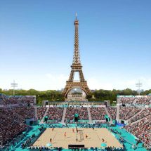
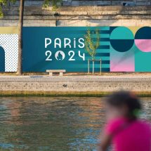
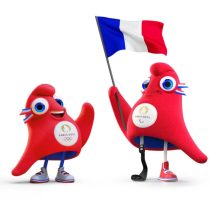
While Conran didn’t create the Paris 2024 logo, it built everything else you’ll see at the Games. The work includes everything from the colorful backdrops of events, to banners displayed across the city, to the red cap mascots “the Phryges.” Rallying under the mantra “Games Wide Open,” the brand’s intent is to bring a sense of play to the city, while creating a sense of inclusion at the Games.

The Olympics branding bucks tradition by depicting sports outside the silhouette of the human body, unifying the depiction of Olympic and Paralympic events for the first time. “Paris is a bit old school, maybe [seen as] looking down on the world a bit,” says Mootoosamy. “We wanted to shift the perception; we wanted to make sure that these games were the most inclusive games ever.”

Inside the tradition-bucking branding of the Paris 2024 Olympics

[Image: courtesy Conran Design Group]

OLYMPICS BRANDING INSPIRED BY FRENCH HISTORY

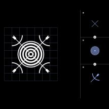
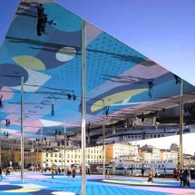
The 2024 Games is the first Olympics that Paris has hosted in 100 years. This led the team to build a brand foundation by looking at the trends from a century ago. That led them to orphism, a Parisian art movement from the early 20th century that spun out of cubism. While cubists depicted real scenes from several angles at the same time, orphism celebrated the abstraction inherent to this kaleidoscopic technique. It embraced a more expressionist approach to light and color meant to inspire the viewer.

Inside the tradition-bucking branding of the Paris 2024 Olympics

[Image: courtesy Conran Design Group]

Inspired by orphism, Conran created a component-based brand system that could work first and foremost as the backdrop to events like diving. These are the most visible bits of Olympics branding, given they are the banners and signs you see in stadiums during broadcast.
Inside the tradition-bucking branding of the Paris 2024 Olympics

[Image: courtesy Conran Design Group]

This system includes a variety of patterns, including dots, hearts, and prominent stripes borrowed from France’s Marinière striped textiles. Some shapes are subtly pulled from Paris architecture, but without going so far as re-creating the Paris skyline. “Paris is already well known, and we need to break free from what is expected,” says Mootoosamy. “[Though] we couldn’t turn our back on the Eiffel Tower; you need to portray it in a way.”
Inside the tradition-bucking branding of the Paris 2024 Olympics

[Image: courtesy Conran Design Group]

Meanwhile, the colors of this system are a direct response to Paris’s architecture. “It’s really all about the sandstone,” says Mootoosamy, alluding to the dozen different varieties of this stone that render Paris’s formal hue. “We wanted to have a colorful palette that was playing with this attribute, and adding some festivity to the city.”Paris already had blue water and green gardens. What could stand out? The team went with pink as the hero color for the brand and its signage, supported by a wider palette that it grounded in Paris by incorporating an almost mustardy sandstone.

Inside the tradition-bucking branding of the Paris 2024 Olympics

[Image: courtesy Conran Design Group]

Atop these abstract colors and shapes, Conran layers a typeface developed by Julie Soudanne, which is also seen in the official logo.
Inside the tradition-bucking branding of the Paris 2024 Olympics

[Image: courtesy Conran Design Group]

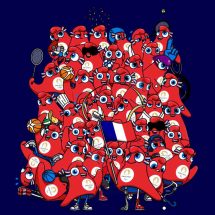
UNIFYING OLYMPIANS AND PARALYMPIANS

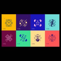
Since Tokyo first introduced the idea at the 1964 Olympics, pictograms have depicted each sporting event. The icons served as a universal language to navigate international visitors to the right events, while celebrating the human body in motion. Each Olympics now includes its rendition of dozens of unique pictograms for the Olympics, and then a whole other set for the Paralympics. But Conran argues that this accessible design system is less inclusive than it might appear.

Inside the tradition-bucking branding of the Paris 2024 Olympics

[Image: courtesy Conran Design Group]

“We wanted to depart ourselves from the norm, which is basically to have a male doing the perfect gesture from the sport,” says Mootoosamy. “We wanted to go away from that to create something that was uniting people.”
Inside the tradition-bucking branding of the Paris 2024 Olympics

[Image: courtesy Conran Design Group]

In turn, Paris 2024 will ditch pictograms and instead depict sports each as their own coat of arms—presented in a symmetry meant to mirror France’s garden culture. By removing the silhouette from these activities, not only do they erase boundaries of gender; they eliminate physical distinctions between Olympics and Paralympic athletes. So for the first time, one set of iconography will work for both events.This unification of the Olympics and Paralympics continues into the official mascot, the Phryges, which is a sentient red hat inspired by the caps donned during the French revolution, and at important cultural events since.

Inside the tradition-bucking branding of the Paris 2024 Olympics

[Image: courtesy Conran Design Group]

“We wanted to say that everyone can emancipate himself or herself, thanks to sports,” says Mootoosamy. Much like the coat of arms, this single mascot will serve both Olympics and Paralympic athletes for the first time, who formerly had separate mascots. So the hat might appear in a karate gis, and other times in a racing chair. Notably, the Phryges weren’t designed to just be happy or enthusiastic. They are a bit mischievous, hinting at a certain desire to win at any cost while sidestepping a more generic personality.
Inside the tradition-bucking branding of the Paris 2024 Olympics

[Image: courtesy Conran Design Group]

“[French] people don’t like the perfect person that much,” says Mootoosamy. “It’s about being imperfect—and perfectly imperfect.”In an era when DEI initiatives are under fire, the inclusive approach to the Phryges could be seen as a gamble. Official mascots account for as much as 25% of the revenue of the Olympics and Paralympics, meaning their desirability is essential for the financial success of the Games.

“Displaying a disability can be something where people are keen to ask, ‘are parents going to buy it, or are they going to pick the ones that is with no disability?’” says Mootoosamy. “And we were really happy to see that the first [Phryge] that sold out was one with the prosthetic leg.”

  Be in the Know. Subscribe to our Newsletters.

ABOUT THE AUTHOR

Mark Wilson is a senior writer at Fast Company who has written about design, technology, and culture for almost 15 years. His work has appeared at Gizmodo, Kotaku, PopMech, PopSci, Esquire, American Photo and Lucky Peach. More

More Top Stories:

FROM OUR PARTNERS