- | 8:00 am
OpenAI’s logo scare, Duolingo makes a piano, and Mozilla gets a rebrand
Here’s the top branding news we’re tracking this week.


This week in branding news, OpenAI’s employees were shocked by a proposed logo change, Duolingo co-branded its own musical instrument, and Mozilla introduced all-new branding. Here’s everything you need to know about the latest in branding.
OpenAI’s black hole
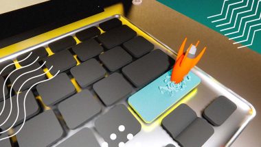
The news: What says “trustworthy tech company” better than an empty black circle? Pretty much anything else, according to the staff at OpenAI. In a report broken by Fortune, an internal team has been working on redesigning the company’s logo for about a year now, and sources with the company shared that the most recent draft appears to be a plain-old black “O.” After the logo was shared at a company-wide meeting, several employees openly expressed their dislike of the potential new branding. The internet broadly appears to be in agreement.
Big picture: OpenAI’s current logo is a hexagonal flower shape meant to evoke “precision, potential, and optimism”—so the proposed new look would be a pretty extreme vibe shift. The controversial branding concept comes just weeks after CEO Sam Altman informed staff that the company would be shifting its notoriously convoluted corporate structure toward a more traditional for-profit model in 2025.
Why it matters: While there’s been a lot of hype around AI, OpenAI has its fair share of naysayers and doomsdayers, too. The company’s upcoming restructuring into a more profit-driven setup is bound to open more extensive dialogues about the ethics of AI tech. That’s why branding is especially critical if OpenAI wants to be perceived as a source of positive possibility rather than a dystopian villain. Here, the company’s employees are probably on the right track: rebranding from a colorful flower to a featureless black void is not going to help the brand’s case.
Duolingo’s music moment
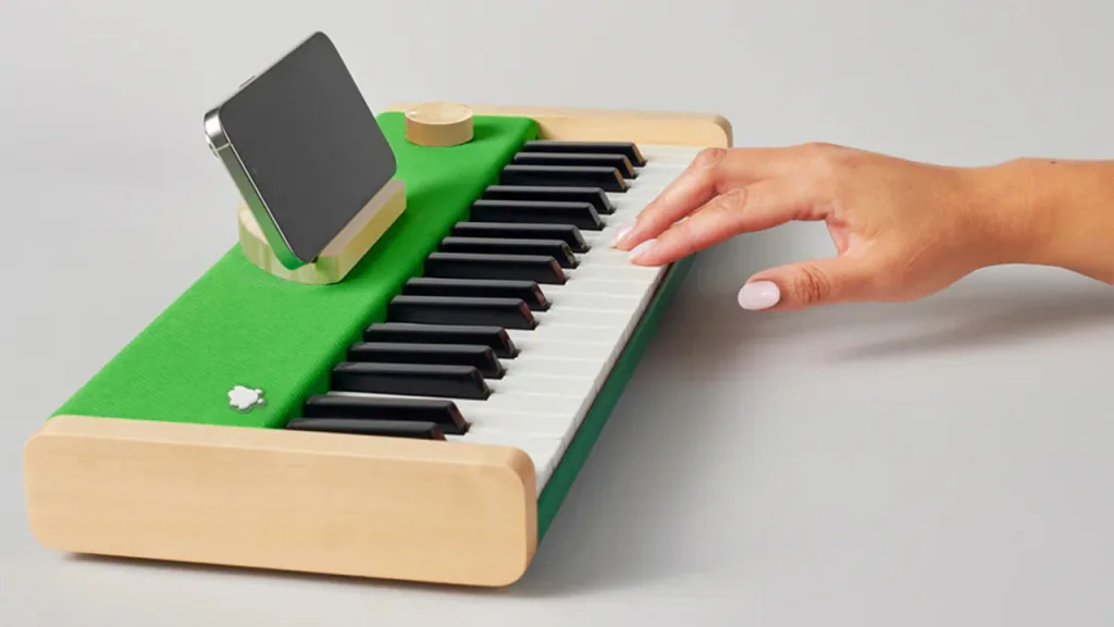
The news: Duolingo just teamed up with Loog, a music company for kids, to launch a $250 luxe piano for learning the instrument’s basics. The Duo-green device is outfitted with light wood accents and keys that produce volume based on how hard they’re pressed—and, unlike the app’s mascot, it won’t guilt-trip you if you leave it alone for a few days.
Big picture: The co-branded device is a companion piece to Duolingo’s music learning course, announced last year. Like its language modules, the music course is taught through simple, gamelike activities. And, of course, the notorious Duolingo streak (which encourages players to complete tasks every day to maintain their “score”) keeps users coming back for more.
Why it matters: Before expanding into music, Duolingo also introduced math courses in 2022. It seems that the company may be aiming to shift gears from a language learning app to simply a learning app, full stop. Whatever its future goals may be, Duolingo is currently enjoying massive financial success: The company reported 44% year-over-year revenue growth in 2023, attributing some of the growth to a new AI subscription tier.
In this episode, Williams executive Chad Zamarin unpacks the impact of AI on our energy infrastructure, and the innovations we’ll need to sustain it going forward.
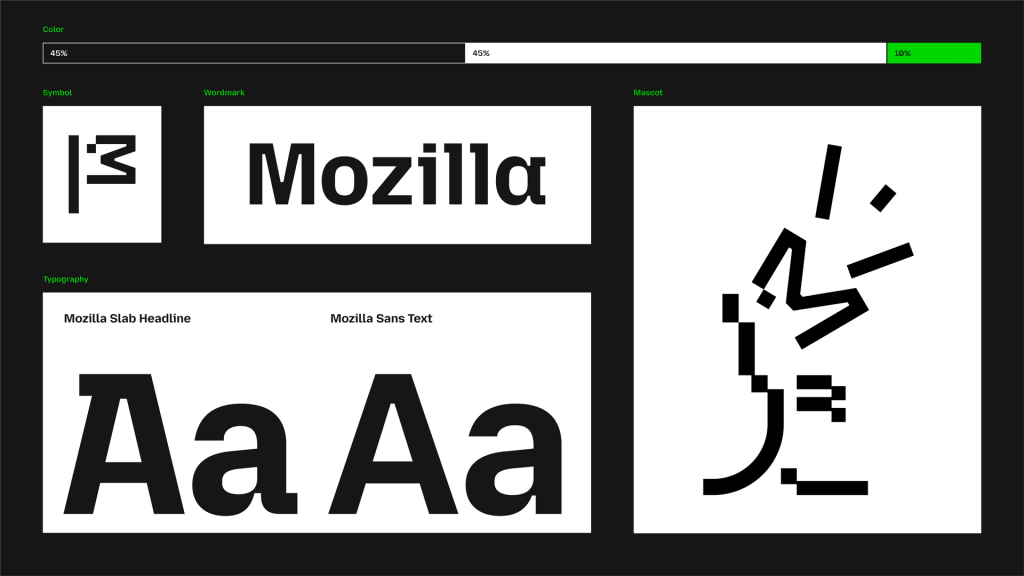
Mozilla’s anti-big-tech branding
The news: Mozilla, the nonprofit behind the browser Firefox, is aiming to “reclaim the internet” with all-new branding that distances it from its big tech competitors.
Big picture: As a brand, Mozilla creates guides to privacy, publishes open-source standards, organizes the community event Mozfest, operates its own ventures arm, and recently acquired an advertising platform called Anonym. Of course, it’s most known for running the privacy-centric browser Firefox. To bring all of those seemingly disparate endeavors together under one visual umbrella, Mozilla needed a more cohesive set of branding guidelines. The new look, designed by JKR, includes a clever reference to a former T-rex logo and a clean custom font, accented with bright pops of green.
Why it matters: Mozilla’s goal as a nonprofit is to create a “healthy internet” through their products—and it has many different ventures to achieve that end. This new branding had to walk a fine line between being ubiquitous enough to unite Mozilla’s various arms and detailed enough to stand out from big tech companies like Apple and Microsoft. They found that balance by keeping a core black-and-white color scheme and seemingly simple typeface, but adding plenty of smaller flares to draw the eye (like unique flourishes in the font, 2D bitmaps, and wireframe illustrations).
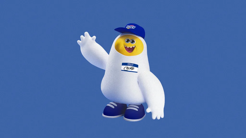
Hi-Chew gets a mascot
The news: Hi-Chew, the fruity Japanese candy brand that’s now also beloved in the U.S., just announced its first official mascot—and, we have to hand it to them, he’s kinda adorable.
Big picture: Chewbie is a white-and-yellow, blob-ish type of guy who wears giant sneakers and speaks his own language called “Chewlish.” He’ll start helping to spread the word about Hi-Chew with his minion-esque energy on Jimmy Kimmel Live! next month. According to a press release, “Chewbie is the embodiment of Hi-Chew—a plump, carefree chew whose mission is to make the world around them a bit more fun and extraordinary.”
Why it matters: Mascots, especially ones with a distinct personality and look, have proven to be a particularly effective marketing strategy in getting younger consumers to engage with a brand online. This idea proves out across a range of brands: Take Duo, Duolingo’s threatening bird who’s constantly going viral for some new antics, for example; or the Geico gecko; or Gritty, the Philadelphia Flyers’ fuzzy orange creature who has almost 500,000 Instagram followers.
Featured Videos
Today's Top Stories:
More Top Stories:


FROM OUR PARTNERS