- | 8:00 am
OpenAI’s rebrand tries to tap into the emotional side of AI
The maker of ChatGPT has a new brand system that’s just robotic enough.


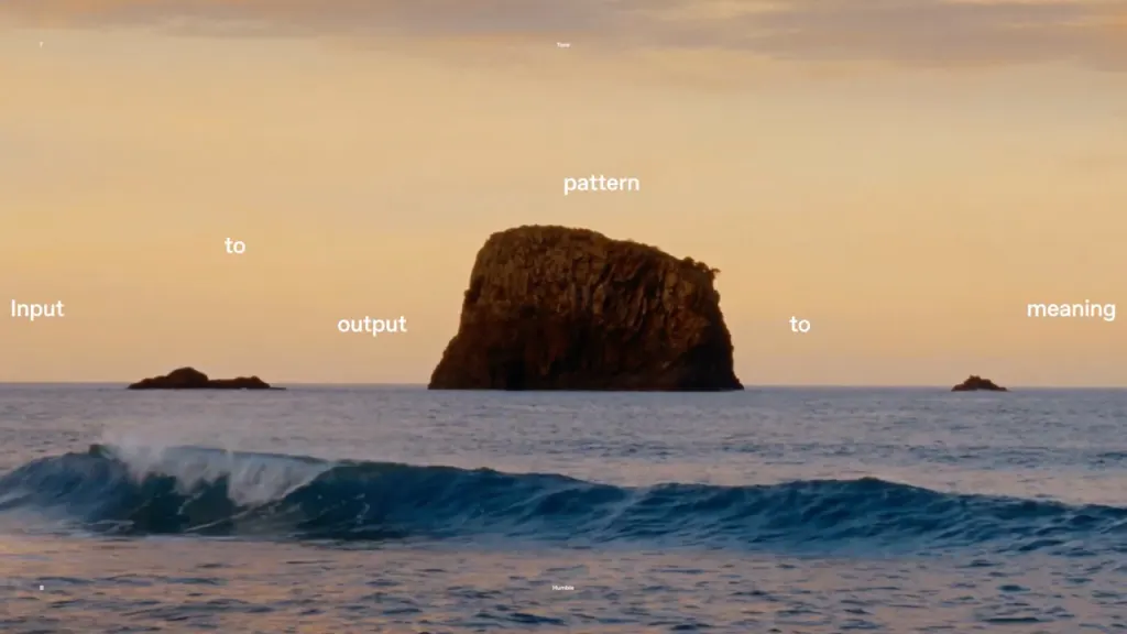
When you think about ChatGPT, what do you see? A box. A prompt. A lot of text. OpenAI’s flagship product is defined by typography—it’s the way users communicate their queries, and the way the model responds in kind.
Typography is “the first thing people interact with when meeting AI for the first time,” says OpenAI design director Shannon Jager.

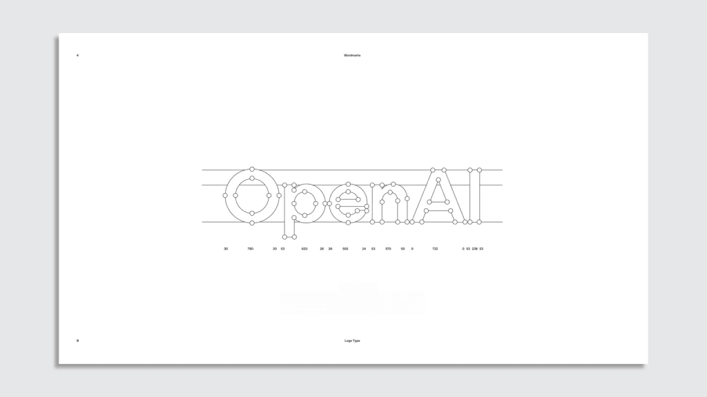
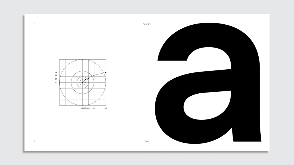
Which is why for its first rebrand ever, OpenAI put typography squarely at the center of its new look. OpenAI’s refreshed brand includes a tweaked “blossom” logo with lines that are thicker and all the same width, a new “point” mark, and a fresh wordmark set in its new typeface OpenAI Sans.
Designed for cohesiveness
Before the brand refresh, OpenAI’s visual identity was a collection of various fonts and marks. It was a symptom of the company’s rapid growth. In the three years since the launch of ChatGPT, “nobody really had time to work on a unified identity system,” Veit Moeller, OpenAI’s head of design, says of the company’s design team, which was three people at the time. “Sam [Altman, OpenAI’s CEO,] asked us to create one system, one identity.”
The rebrand was completed over the course of nine months as a collaboration between OpenAI’s in-house design team, Berlin type studio Dinamo, and the Netherlands-based graphic design agency Studio Dumbar.
Dinamo’s font plays off of the idea of the circular cursor ChatGPT uses when responding to queries. It’s designed with curved letterform and circular dots above the lowercase j and i. “We wanted something that was both friendly and technical,” Jager says of the font. “We’re always looking back at our mission, which is creating AI for humanity.”
Balancing the technical and emotional
The brand refresh comes as the company expands its product suite and makes plans for a new corporate structure for its for-profit division to become a public benefit corporation.
OpenAI released its newest reasoning model last week, o3-mini, on the heels of the low-cost model from China, DeepSeek. And this week, OpenAI announced Deep Research, a tool that it promises will be able to analyze and synthesize research and spit out “a comprehensive report at the level of a research analyst.”
It’s never been more important for OpenAI to imbue a sense of humanity into its technology, as concern around AI’s rapid acceleration continue to grow. And indeed, the rebrand attempts to do that through supplemental brand images featuring gauzy shots of sunsets, landscapes, and bird flying through the air (some of which were, unsurprisingly, generated with AI, according to Wallpaper).
Last year, OpenAI came under fire when leaked images of the rebrand revealed an empty black circle. Many assumed it would replace the company’s oft-copied blossom logo—a sign, no doubt, of its sinister intentions. It turns out the dot was real, only instead of replacing the logo, it’s simply an element in the brand system. In a video showcasing the rebrand, a large black dot transforms into pastel dots before bursting into a array of confetti.
The rebrand is both restrained and playful. Clearly, OpenAI has done is work on countering its robotic undertones without extinguishing them altogether. After years of Silicon Valley trying to convince us that they had our best interests at heart with their goofy, amorphous figures and “corporate Memphis” style, it’s refreshing to see a company embrace the honesty of a more technically minded brand.

Featured Videos
Today's Top Stories:
More Top Stories:
FROM OUR PARTNERS