- | 8:00 am
Pantone’s 2025 color of the year is a delicious flavor of brown
Dubbed Mocha Mousse, the milk-chocolaty color evokes the comfort of coffee, but will mix with just about anything.
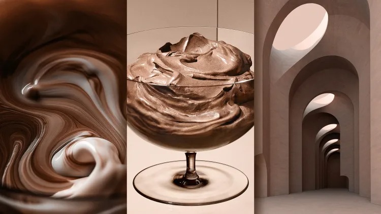
When Pantone shows me its 2025 Color of the Year, the first thing I see is Skims. Then Fear of God sweatsuits. Yeezy. All flavor of taupe-adjacent Nike. The new Beats by Dre.
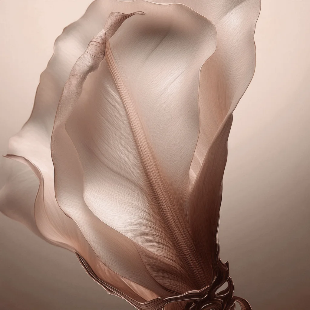
But the official name? That’s Mocha Mousse, also known as Pantone 17-1230. It’s brown without being heavy or overbearing—as easy on your eye as cacao whipped with egg whites.
Mocha Mousse isn’t significant simply because it’s a new statement color. “It’s a foundational shade. It’s a fashion shade, but also a neutral shade rolled into one,” says Laurie Pressman, VP of the Pantone Color Institute. “And that’s what makes it so versatile.”
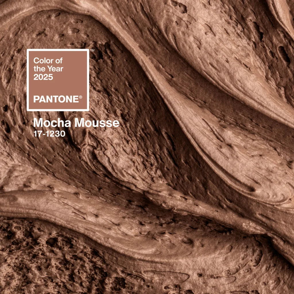
Mocha Mousse goes with anything
This brown sings as a supporting character: an organic, seasonless, gender-neutral bridge between all sorts of popular color palettes. It works as well with vibrant pastels as it does with rich colors like deep rose, mahogany, and a pure purple. It’s also striking against white—you get that high-contrast pop of black and white, but with a touch more warmth.
“Here’s a color that can not only be humble and grounded, but can also express luxe in a very understated way,” says Pressman. “So it can cross through so many different areas of design.”
However, anyone who closely follows design may feel that Mocha Mousse was named a year or more late. Pantone quietly picked this color back in March, after all. And Pressman points to other significant trends she’s seeing in color, like aerogel-inspired vaporized pastels you can actually see in Meta’s new AR glasses.
In part, the Color of the Year is meant to capture a psychological mindset. And we’re in a post-COVID mindset, rethinking work life balance and finding space for ourselves. “I wouldn’t use ‘mindful’ to describe this. I would really say it’s more holistic,” says Pressman. “It’s thoughtful indulgence. It’s wholeness to me, more than well-being.” Instead of yoga pants and reminders to drink water, it symbolizes a cup of coffee or bite of chocolate for your eyes.
“It’s the taste it imbues that appeals to our desire for comfort,” says Leatrice Eiseman, director of the Pantone Color Institute.
While these earthy, soft-textured minks have been in the zeitgeist for a few years, what I can appreciate about the pick now is how well Mocha Mousse can serve as an anchor for the sea of microtrend colors that arise in the TikTok era. It works with a lot of other colorways we’re seeing out there, and it has the versatility to continue doing so.
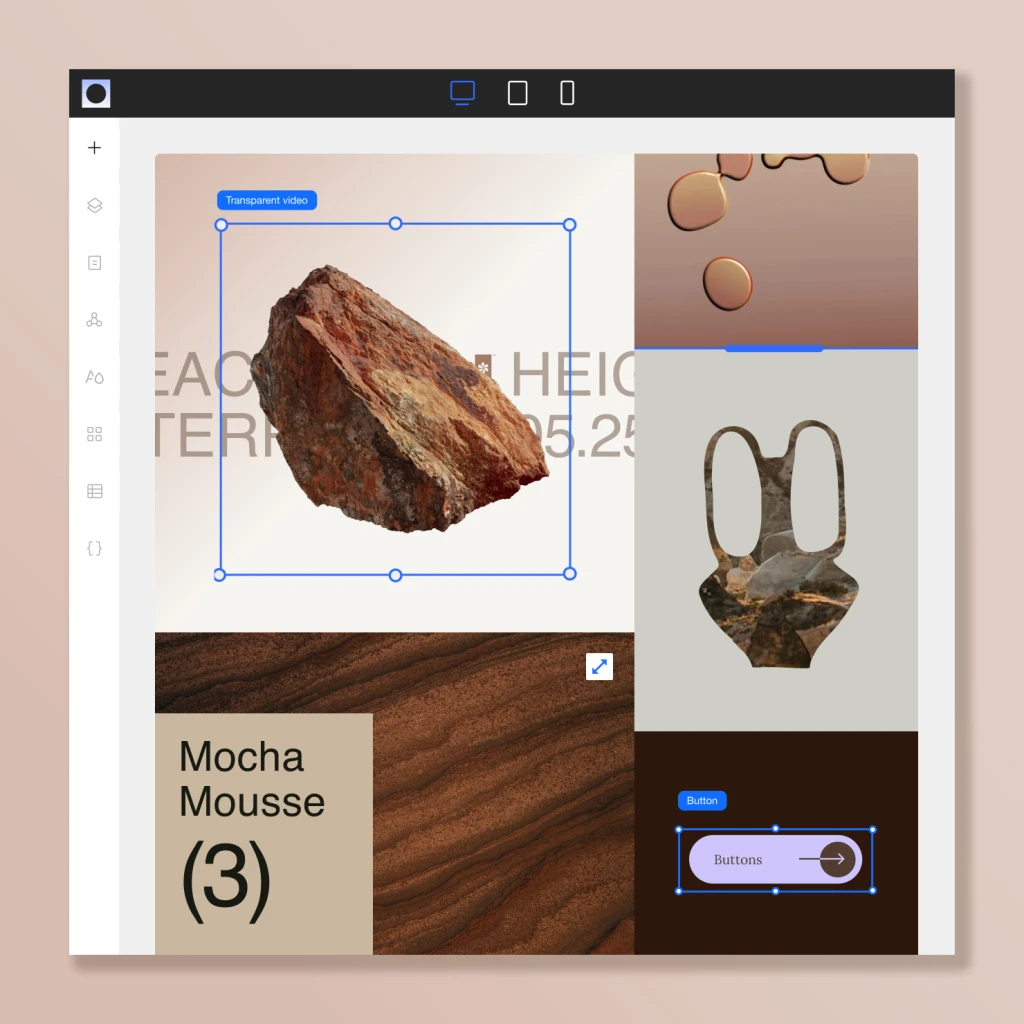
It’s this versatility, ultimately, that makes Pantone believe Mocha Mousse will be a color that sticks around for a while still, making its way across more industries and serving as a sensible investment to companies planning future releases. It’s a visual flavor, if you will, that’s speaking to the culture today. (Pantone partnered with the website builder Wix, for instance, to introduce the color into its digital products.) And in this sense, the Color of the Year, for as intoxicatingly irresistible as its hot take branding will forever be, functionally means something more like “one of the most important colors of a period.”
“I look at Charlie XCX, which everybody’s talked about a billion times with Brat Green. But if I really look at our role in Brat Green, I go back to 2017 in [our Color of the Year pick] Greenery,” says Pressman. “We talked about these brash yellow-greens being outlier shades that we were seeing getting picked up in fashion, for people who are wanting to make a bold statement to burst through. So to me, my first reaction to seeing Brat, I’m saying, she got it exactly right! That’s exactly what we were talking about seven years ago. But what she did was brought this out to a huge worldwide culture in a very different way, and helped us to redefine the perception of what we think about the word “brat,” which is great.”


