- | 8:00 am
Pantone’s 2026 Color of the Year is visual tofu
In an era when every color is in all the time, where do you even go next? Pantone has a suggestion.


Since Pantone began naming its Color of the Year in 2000, we’ve seen two flavors of both brown and yellow, three variations of purple, blue, and turquoise, and four distinct takes on orange.
But for the first time ever, Pantone’s color is essentially a non-color. Or you could call it every color.
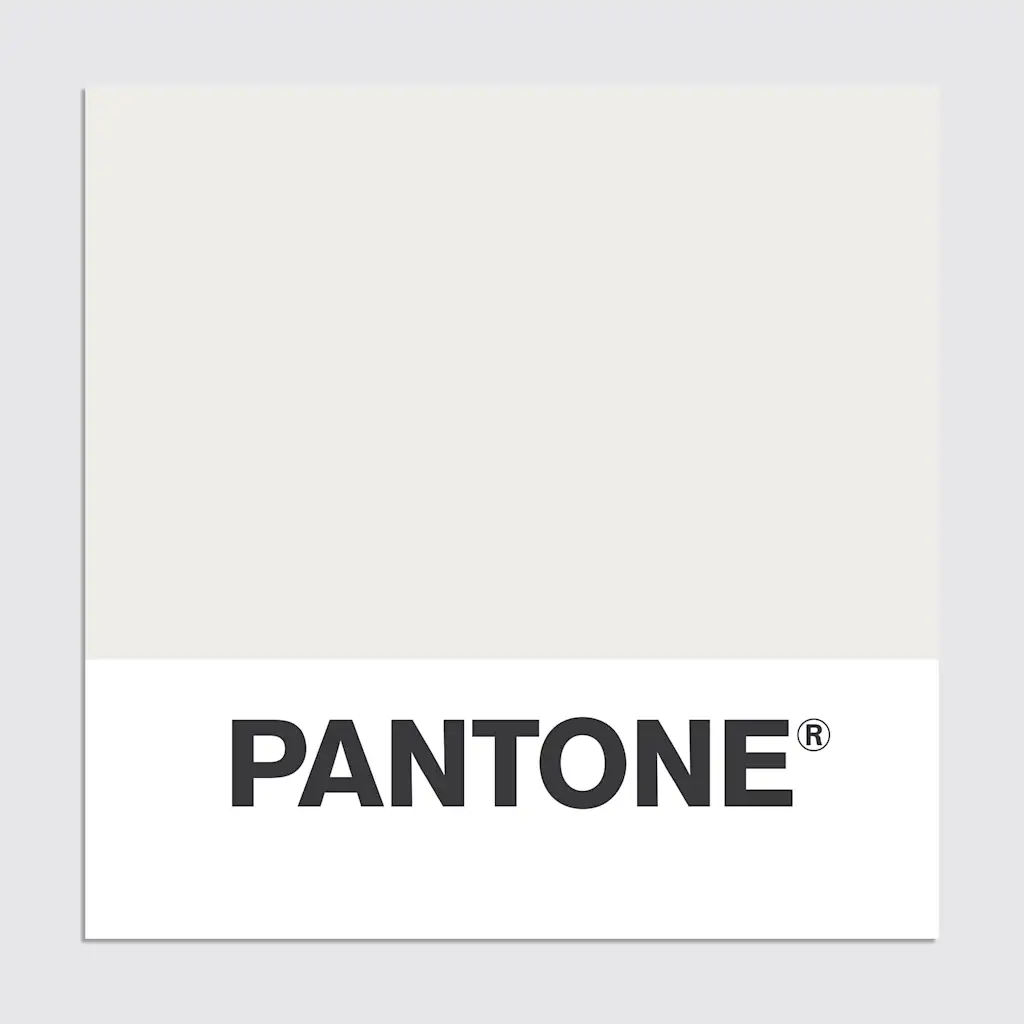
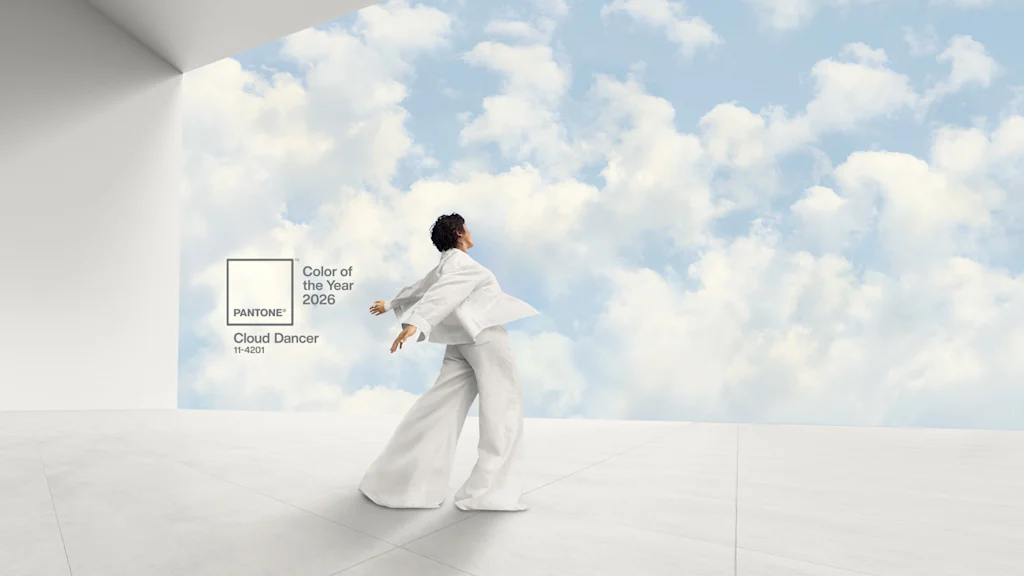
Pantone’s 2026 Color of the Year is a white. In Pantone language, that’s code 11-4201—aka Cloud Dancer.
Pantone—which operates somewhere between a trend forecaster and social psychologist—argues that Cloud Dancer is part of a great cultural reboot. In the era of AI, everything feels like it’s changing on a daily basis, and the overstimulation of the internet is only increasing as we go. Cloud Dancer is a liminal space as we enter an unforeseeable new era. Savoring the physical world, it’s intentionally closer to the white of a piece of paper than an impossibly glowing, AI prompt box.
“We’re trying to frame this [era] in a more positive way, looking at this as a transitional time, because it really is,” says Laurie Pressman, VP at the Pantone Color Institute, who notes the color is “a blank slate opening the door to creativity and innovation.”
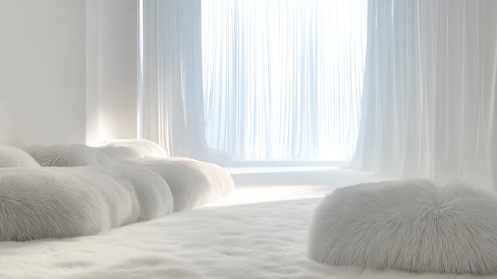
The word “cloud” refers to not just Cloud Dancer’s color, but also its real world texture. Often presented in voluminous textiles, on the runway and in living rooms, it’s literally meant to nod to a puffy cloud in the sky. It’s an almost synaesthetic sensation that’s a counterpoint to the other cloud: dead, unseen data centers answering our intangible queries.
Take the psychology for what you will. Functionally, though, Cloud Dancer also serves a practical purpose within design aesthetics.
Pressman points out that it’s timeless and genderless, and that it works blown out all on its own or with a wider array of colors beside it. On one hand, of course that’s all true! It’s white! On the other, Cloud Dancer is a very specific white: One that balances warm and cool tones in equal measure. (Note: in many real world examples that Pantone shared, Cloud Dancer appears less gray than it does on the swatch.) That means Cloud Dancer can fit with about any color palette you toss at it. It’s not a white that will leave you squinting, guessing, and regretting. It’s visual tofu, there to absorb the colors around it.
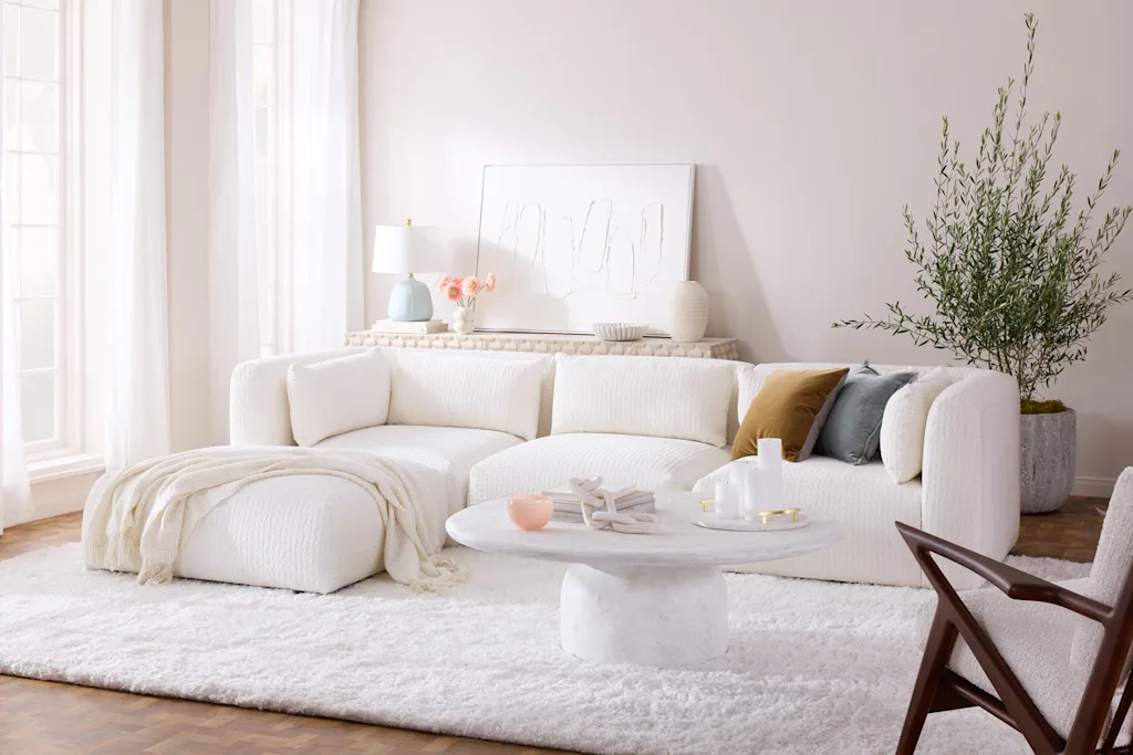
In an internet-driven cultural ticker where all tastes live side-by-side at once, and no single color is really in or out anymore for all that long, Cloud Dancer serves as a universal binder. It’s the mortar for wider color expression, as effective on a blinding sneaker collab as a tranquil bedroom set.
But is white even a color?
Critics may complain that, of all colors, Pantone chose white. It’s a non-color. Is that a cop out?
You might also have noticed some thematic overlap with the quiet luxury movement. Peaking some time circa 2023, fashion brands embraced neutrals, like Cloud Dancer and Pantone’s previous color of the year, Mocha Mousse, equating simplicity with style.
When I point this out, Pressman nods along, noting that its synergy with quiet luxury was a point of discussion on the team. The difference, she says, is not so much the use of such a white, but the intent underlying it. Quiet luxury masked affluence behind understated hues. (Or, perhaps you might say it performatively masked affluence—offering a wink and nod to those in the know.) Instead, Pressman argues that Cloud Dancer is more about creating a tabula rasa in an era of uncertainty.
Indeed, the white has been on trend on runways—but not in some subdued apologetic way. From Jennifer Lawrence’s Dior at the Governor’s Ball, to Rosalía claiming white like a cleansing counterpoint to Charlie XCX’s Brat green, it’s been used as a celebratory statement. A new collaboration between Moncler and Jil Sander “makes a strong case for winter white,” according to W.
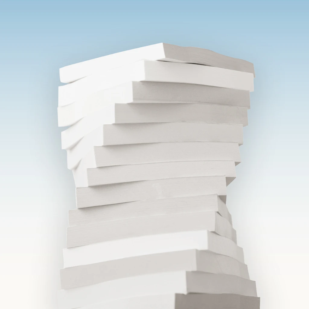
No doubt it helps that white has long been a shortcut, like black, to casually bolstered taste. We see that in how white button-downs and court shoes (along with every iteration of low white sneaker) has become a staple in wardrobes for years. White—and specifically puffy, textured bouclé—refuses to leave high end living rooms.
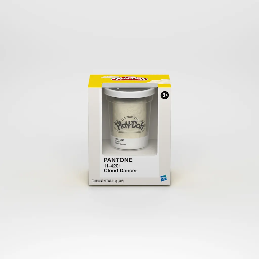
Likewise, Pantone is announcing new collabs with both Post-it and Play-Doh that feel like a cheat code to elevating taste. Each respective product will be offered in Cloud Dancer. Seeing these colorful, iconic products stripped of their hues is actually arresting. They get a sudden modernist makeover, feeling at-home next to a foam board architecture model. (Huh, maybe white is a color after all!)
I think the white works in these creative contexts because it’s being presented as a blank construction material, offering an invitation to craft in an era of automation.
“The color name . . . speaks to this whole feeling of gazing into the clouds,” says Pressman, “and wondering what are the possibilities of what’s out there?”

Featured Videos
Today's Top Stories:
More Top Stories:


FROM OUR PARTNERS