- | 8:00 am
People shop on Google a billion times a day. Here’s how AI is changing the experience
Google Shopping is getting a new logo and its biggest redesign in history following the introduction of new artificial intelligence tools. Here’s a look at the changes.
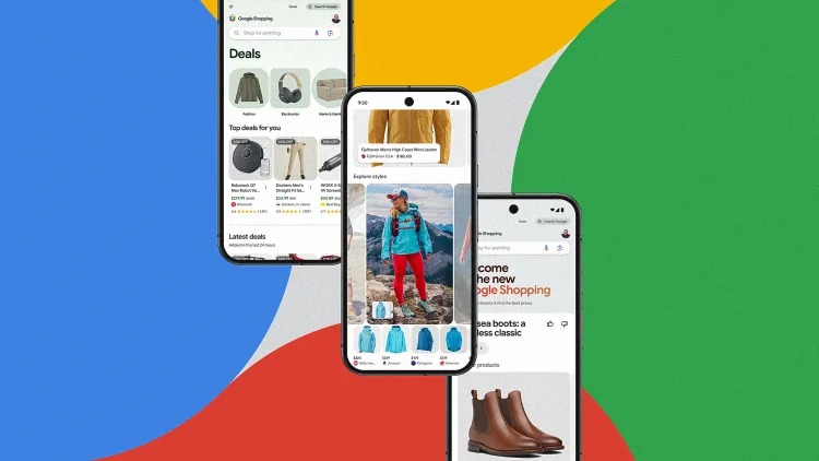
Forty-five billion products with listings updated 2 billion times an hour. This is the preposterous scale of Google Shopping—what you may otherwise know as that little tab just off the side of Google Search. And now, it’s getting a makeover with AI.
Following a significant update to Search that makes googling look a bit more like browsing a magazine, Google Shopping is also getting a rich, visually-forward makeover in the coming weeks. Before, it was basically a big grid of product thumbnails. Now, it’s anchored in AI, and will present reasoning behind its recommendations, track deals, and supply more supplementary research like videos and articles to help guide your research. And everything from the items it recommends, to the types of media it shares with you, will change over time as it ever-adjusts to your preferences.
“Imagine a store based just on your interest,” says Sean Scott, GM of Google Shopping. “That’s what we set out to create.”
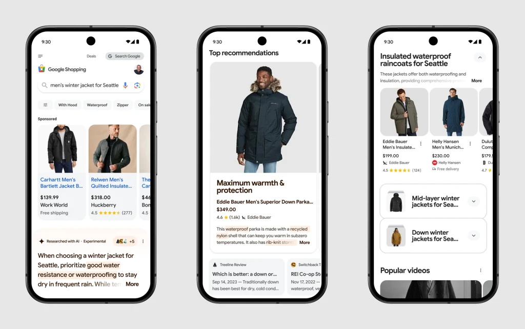
The new design of Google Shopping
The experience kicks off with a search in the Shopping tab, which Scott demonstrated by searching for “men’s winter jacket in Seattle.”
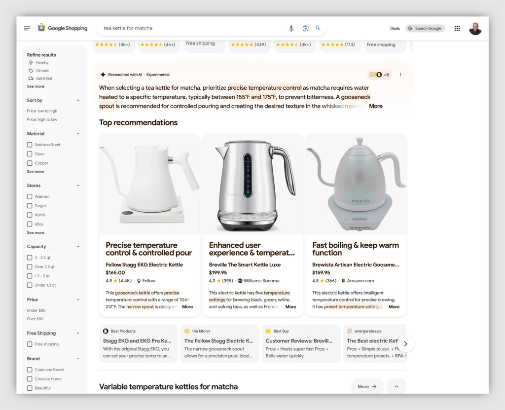
The first thing you get is a written answer with Google’s Gemini AI. It reasoned that Seattle’s winter was mild and wet, and so a waterproof jacket was the way to go. Right below that summary lives a “top recommendations” section. These three options are presented in a carousel, each with a hero photo that takes up about half a phone’s screen. The jackets all have their own quippy header, along with price, a link to buy, and a brief AI description explaining the choice.
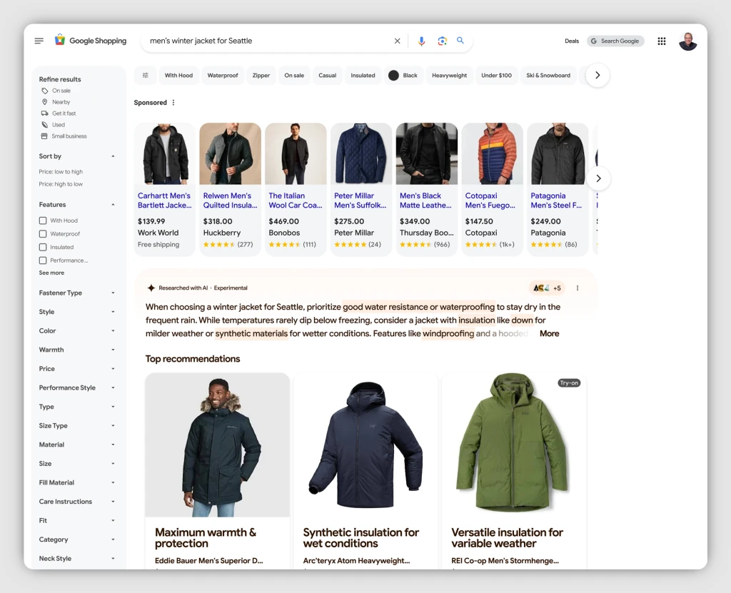
“It’s always three [recommendations],” notes Scott. “We found more than three is overwhelming and with less than three, people need more choice.”
Now, you can tap into these listings to change the color, or try the items on virtual models. Or you can keep going.
As you scroll down the page, AI tries more approaches—and with much more info density. It’ll offer up product categories, like down jackets or insulated jackets. It’ll populate video reviews (and the more you click these, the more you’ll see over time). It’ll show where you can buy what you’re looking for in Google Maps. And you’ll be prompted to specify the price or brands you’re looking for.
“Our intent is to get it right on the top half of the page so you do less work,” says Scott. But the bottom half of the page is built for a deep dive.
The entire experience can shape around you, Scott explains, because Google doesn’t have a horse in this race. Unlike your favorite food blogger always ready to promote their go-to spatula, Google doesn’t make affiliate revenue off referrals. (Instead, it makes money through ad links placed and promoted within this feed—which were absent in the demo I saw.) It seems like Google’s play with the redesign isn’t so much to sell you but, much like we see in its Search redesign, to engage you. To serve as both a quick shopping utility and vast repository of research.
Google wants to be the place for bargain-hunting
A Deals feed is where Google takes shopping to its logical conclusion, presenting a feed of things it assumes you might like, at the best prices Google can find. (Notably, Google is assuming all of your tastes from interest in brands and browsing history, but it’s not performing visual analysis on aesthetics you like.) Individual products will include prices as advertised by a number of stores, along with a graph that charts the average price over time.
“I want it to be financially irresponsible to not shop Google,” says Scott, noting that internal research finds 70% of shoppers view saving money as their top priority.
The entire experience is encapsulated in the new Google Shopping logo that will appear across the company’s services. Whereas Google Shopping was formerly a shopping tag, now it’s a vibrant shopping bag, filled with the four Google colors we see on logos for its services like Chrome, Google Photos, and Google Maps. It’s an apt symbol: Google doesn’t just want to list a price, it wants to be the thing stuffing your tote.
“[Our most important metric is] are we seeing more shopping going on Google?” notes Scott. “Maybe you get inspired on TikTok and come to Google to check the price. That’s great. We want to educate.”


