- | 9:00 am
PepsiCo just got its first new logo in almost 30 years, and it looks nothing like Pepsi
PepsiCo wants you to know it’s more than just a sugary cola.


PepsiCo, the food and bev giant behind childhood favorites like 7UP, Mountain Dew, Lay’s, and Doritos, just got new branding, and it looks nothing like its namesake product.
The new PepsiCo brand identity, which includes a fresh wordmark, logo, and tagline, is the company’s first rebrand since 2001. The company has had three different corporate identities since its inception in 1965, and all of them have taken their most prominent design cues from Pepsi, the soda brand that started it all—until now.
![[Image: PepsiCo]](https://images.fastcompany.com/image/upload/f_webp,q_auto,c_fit,w_1024/wp-cms-2/2025/10/i-3-91432245-pepsico-corporate-rebrand_44b9e4.jpg)
[Image: PepsiCo]
When PepsiCo designed its last identity in 2001, it owned 13 consumer brands. Today, it owns more than 500. And, over the past several months, PepsiCo has signaled that it intends to focus on more price-conscious serving sizes and a healthier product line-up amidst low consumer spending and an increased cultural focus on wellness. Now, PepsiCo wants customers to know that it’s more than just one sugary cola, and it’s signaling that shift by ditching the former blue and red color palette and Pepsi-coded fonts in favor of a totally new look.
Inside PepsiCo’s colorful new brand
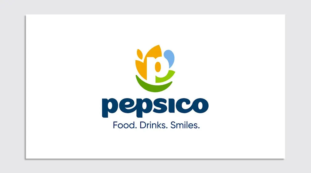
At first glance, PepsiCo’s new brand mostly looks like a few different abstract colorful shapes stitched together. But, according to a blog post on the rebrand, each visual element is intended as a nod to a different part of PepsiCo’s business, from its snacks and drinks to its growing focus on health and nutrition.
The new PepsiCo logo is a white lowercase “p” surrounded by several different forms. On the left is a burnt yellow motif, which, according to PepsiCo’s description, represents food and grains, a concept “rooted in agriculture.” To the right is a light blue blob, signifying drinks and water, as well as a light green leaf, denoting “positive impact for people and planet.”
![[Image: PepsiCo]](https://images.fastcompany.com/image/upload/f_webp,q_auto,c_fit,w_1024/wp-cms-2/2025/10/i-2-91432245-pepsico-corporate-rebrand_82b626.jpg)
[Image: PepsiCo]
And on the bottom of the “p” is a forest green smile, which stands for “consumer-centricity.” Paired with the logo is a new, all-lowercase font with modern, curvy letterforms and the tagline, “Food. Drinks. Smile.”
“Our color palette draws from the real world—the rich soils that nourish our foods, our refreshing drinks, and the vibrant hues that reflect our commitment to people and the planet,” the blog post reads. “The new custom typeface, featuring lowercase letters, conveys a sense of approachability that mirrors the bold, consumer-centric spirit of our brands.”
![[Image: PepsiCo]](https://images.fastcompany.com/image/upload/f_webp,q_auto,c_fit,w_1024/wp-cms-2/2025/10/i-4-91432245-pepsico-corporate-rebrand.jpg)
[Image: PepsiCo]
From a branding standpoint, the new identity is nothing groundbreaking. Its amalgamation of different symbols—which, on first look, don’t resemble much of anything—feels like an inevitable result of the near-impossible effort to encapsulate 500 brands in one identity.
Still, the rebrand is a good barometer for where PepsiCo sees itself in the future. This update is designed to establish PepsiCo as a company that’s not defined by just one brand, but rather the sum of them. As the blog post explains, it’s “a significant opportunity to highlight the depth and diversity of our portfolio,” considering that just 21% of consumers are able to name a PepsiCo brand aside from Pepsi.
Why PepsiCo might be distancing itself from Pepsi
For PepsiCo, expanding consumer awareness beyond just Pepsi is clearly a key goal. Since 2001, PepsiCo has acquired big names including SodaStream, Quaker foods, and Rockstar, while also pouring major investments into its own brands like Gatorade and Lay’s.
More recently, the company has also begun to focus on bringing in more health-conscious brands with lower sodium, saturated fat, and sugar contents. In January, it acquired the grain-free, “healthy” tortilla chip brand Siete Foods for $1.2 billion, and in March, it shelled out $1.65 billion to acquire the prebiotic soda brand Poppi. PepsiCo is also preparing to launch its own prebiotic cola brand this fall, as well as introducing Lay’s and Tostitos with no artificial colors or flavors by the end of the year.
During PepsiCo’s Q4 2024 earnings call in February 2025, CEO Ramon Laguarta explained that the company has seen “a higher level of awareness in general of American consumers toward health and wellness,” which he said was driving shifts in how consumers approach snacking. He shared that the company plans to focus more on building out its healthy options (including by pursuing protein beverages with “a sense of urgency”), as well as on developing products and packages that are more budget-friendly for customers with limited discretionary spending.
In a letter posted to LinkedIn on October 28, Laguarta wrote of the new branding, “This new identity boldly reflects who we are in 2025: a company with expansive reach, aiming for positive impact across the globe, and an unmatched family of beloved food and drink brands, made with high-quality ingredients and including functional benefits like protein and superior hydration.”
PepsiCo’s new identity looks less like a bottle of soda and more like a health foods brand, and that’s very much by design. The company wants to be known not only for its bevy of salty chips and sugary drinks, but also for its expanding category of better-for-you options.
Featured Videos
Today's Top Stories:
More Top Stories:
FROM OUR PARTNERS