- | 8:00 am
Shopping Prime Day is hell, but Amazon knows exactly what it’s doing
Why is it so dang hard to find what you need on Prime Day? It’s actually a brilliant use of bad design.

I just wanted to buy a toaster. I’ve been without one for the longest time, so I headed to Amazon thinking I could get a good deal on Prime Day. Instead, I got an instant headache thanks to the overwhelming user experience.
Navigating Amazon on Prime Day is like reading one of those old printed supermarket advertising spreads that’s overloaded with tiny coupons and offers. There’s visual clutter everywhere: repetitive category boxes, tiny images, discount red tags, and buttons.
Under the usual Amazon.com top menu, there’s a matrix of boxes organized by category. These categories include “Deals inspired by your recent history” and “Deals related to your views”—isn’t that the same as my recent history? Amazon offers “Recommended deals for you” (aren’t the other deals recommended too?) and “Deals related to your wishlists” (which I guess do not form part of my history or my views). The matrix appears to go on forever.
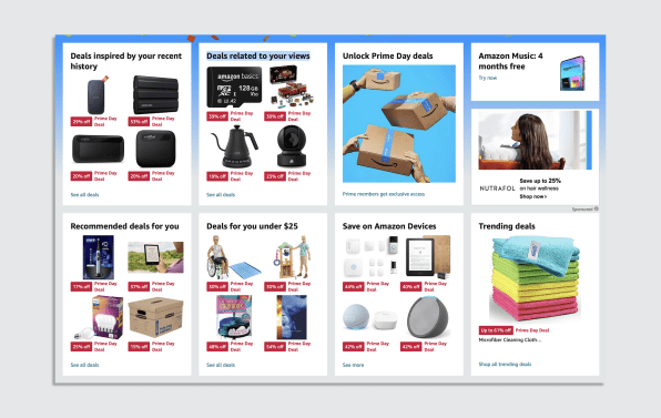
“Prime Day can seem like information overload, but I think it’s intentional,” Alex Khmelevsky, director of user experience at UX/UI design and branding agency Clay. He says the interface is designed to immerse consumers in a sea of potential deals. ”They try to recreate that joy of stumbling onto a great find. It’s a digital treasure hunt! It can also induce a sense of FOMO, nudging people to explore more for the fear of possibly missing a great deal.”
Indeed, that’s exactly the feeling I got. Beyond the instant anxiety attack triggered by that front page, my brain started to race to think what I needed that might be discounted. So, I started to dig. I clicked and clicked and clicked in search of my toaster first, only to get lost in a labyrinth of recommendations and “what about this?” As my headache intensified, I started to wonder if they sold Advil by the pound.

Fura Johannesdottir, global chief creative officer at Huge Inc., tells me over email that this is not a surprise: “Amazon is by no means a design or experience-led company. Their flywheel has traditionally been driven by convenience and competitive pricing over design and user experience.” She says Amazon’s reliance on external sources for discovery—influencers, press engagement, and, in some cases, even owned events like the Rihanna Fenty show—coupled with serving shoppers who know exactly what they want, has produced a poor browsing experience for users. “It’s not a commercial priority,” she says.
Instead, the company makes up for this poor experience with the “fast, free shipping and a highly functional app that utilizes every square inch of your screen to help you make your next purchase in as few clicks as possible.” That’s what keeps us getting back to it.
Amazon Prime is a Drudge Report-like shopping experience designed to trap you like a spiderweb. Khmelevsky believes that this is a page created with sales as the top priority, even if it makes the user experience worse. “I believe it’s the product of endless hours of research, testing, and data crunching. There’s always room to tweak and improve, but we should also recognize the strategy and work that goes into what we see today,” he says.
THE STRATEGY WORKS
An Amazon spokesperson flaunted the company’s prowess when I asked about what drives the UX design in Prime Day. “We’re offering over 40 personalized deal features—more than ever before—including personalized suggestions within “Recommended deals for you,” “Top deals for you,” and “Customers’ Most-Loved” features, to make it easier for members to find products they may be interested in based on their shopping habits,” she said pointing to a blog post in which Amazon talks about the millions of deals available in this year’s Prime Day.

In that article, Amazon says that they increased their personalized deal offerings by more than 400% in the last holiday shopping season compared to the previous year. “Those recommendations drove customer engagement that was six-times higher than non-personalized offerings.” For Prime Day, they are doubling down on the overload. Clearly, it is working for them even while many people (myself included) hate the experience.
According to Johannesdottir, the Prime Day ordeal may cause a reckoning at one point. “Big splashy sales have become common, with other major retailers such as Target, Walmart, Best Buy, Macy’s, and Nordstrom joining the competition. With others throwing their hat into the ring, it makes it harder for Amazon to stand out, especially with outlets guiding buyers to shop for the best deals across various platforms,” she says.

And it gives a warning to Amazon: “As the moats of convenience and price become less durable, Amazon needs to reevaluate its user experience. The poor UX that has never been a problem in the past will become a risk in the future,” she says. Amazon created many of the conventions of e-commerce today, but nothing lasts forever. “It may feel now that there is no real business need for it, but neither was it for Nokia before the iPhone disrupted the market, and we all know what happened there.” For her, Amazon’s UX is messy and unfocused. “This suggests a certain level of comfort, and it’s a risky place to be.”
As I keep flipping through endless lines of deals that are supposedly great according to what the algorithm thinks about me, her thoughts seem like an accurate diagnosis. Prime Day is about to end, and I still have no goddamn toaster. But I do have a new cheese grater, three pairs of Star Wars socks, and a box of shameful guilt for buying crap I don’t really need.
Perhaps Amazon may know what it is doing after all.


