• | 9:00 am

The Best Picture posters just got a brilliant redesign

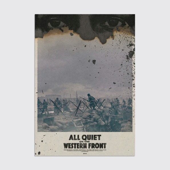
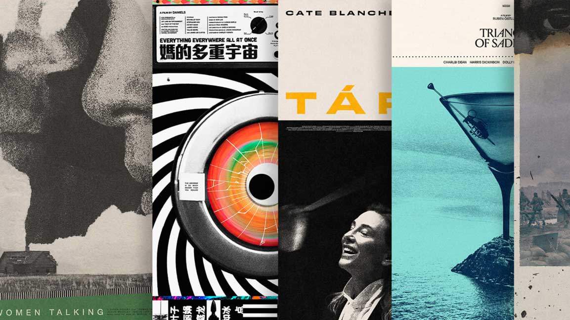
For the last decade, Matt Needle has redesigned the poster for every Best Picture Academy Awards nominee, transforming them from big budget bores to works of art.
The Best Picture posters just got a brilliant redesign
[Source photo: Matt Needle]

Ever since he was a child, Matt Needle has been obsessed with film—and not just the tapes of ’80s mainstays like E.T., Raiders of the Lost Ark, and The Goonies that occupied his earliest screensThe Cardiff, UK-based illustrator and designer was also keenly interested in the world of visuals celebrating his favorite movies.

“All the posters you loved as a kid were so enigmatic and instantly iconic,” he says.
[Image: courtesy Matt Needle]
On summer vacation from studying design and fine arts at the University of South Wales around the mid-aughts, Needle found himself in search of a creative outlet. He had just gotten his hands on a Hitchcock boxset—so he decided to create a series of minimalist modern posters based upon the films in it. He shared them and made more—and, well, it eventually turned into a career. Needle credits many of his big breaks to his affiliation with the Poster Posse, which he has been a part of for over a decade, leading to work for the likes of Disney, Pixar, Star Wars, and Marvel.

[Image: courtesy Matt Needle]

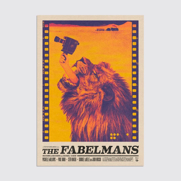
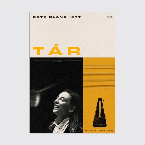
Today, he balances his commercial key artwork with his self-generated output, which has taken the form of his James Bond series—for which he designed a poster for every single film in the canon—and his Oscars Best Picture series, which he has been doing for a decade.
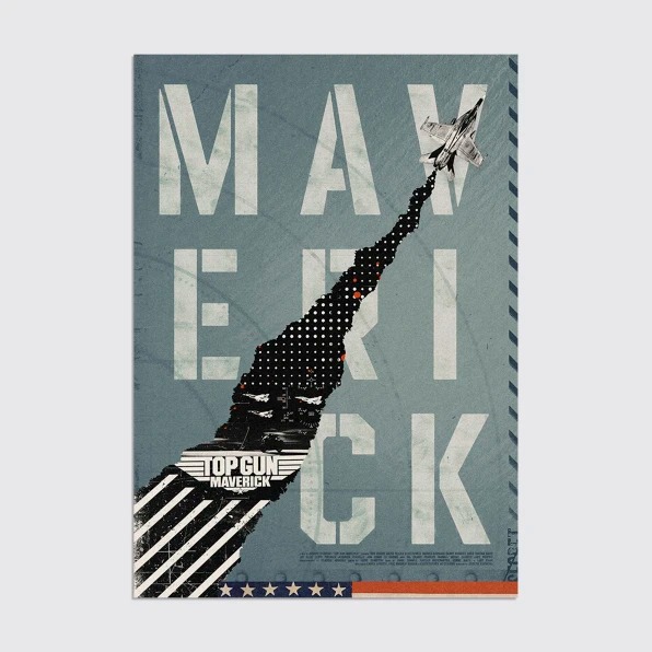
[Image: courtesy Matt Needle]
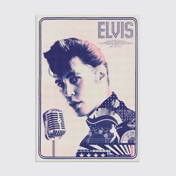
He says he loves the dichotomy between the commercial and creative aspects of the same medium, and ultimately the watered-down nature of many mainstream studio posters is one reason he started creating his own Oscars posters. He attributes the lackluster aesthetics to stars’ contracts—some stipulating that said celebrities must appear in approved poses, in a certain order and certain size, down to the percentage—marketing algorithms, and established genre formulas and frameworks (“superhero clusterfucks, red text/white background for comedy, etc.”). Needle says it’s indeed possible to work within these parameters—but ultimately posters often suffer death by committee in the boardroom.

[Image: courtesy Matt Needle]

“This, in turn, leads to a homogenized output, which cultivates a sense of familiarity for the general public, so they instantly know what they are getting . . . but at the same time, it’s so painfully dull,” he says.

[Image: courtesy Matt Needle]

Needle acknowledges that rarely would the main key art for a film be something as abstract and conceptual as his self-generated style, but he has found a sweet spot between the two. He also works on supplementary projects to a film’s core key art, such as imagery tied to home releases, collectible posters (often maligned as “fan art”), social media marketing, and so on. “These are a bit more creatively open and let me work in my style a bit more without the constraints of We need a massive Brad Pitt head front and center!” he notes.
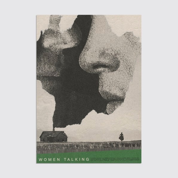
[Image: courtesy Matt Needle]

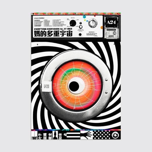
In Needle’s work, he aims for a strong typographic approach, combined with clever graphic/iconographic imagery, delivered in a way that bucks the norm. To that end, he says the best posters every year tend to be not for the biggest releases, but rather for smaller films more willing to take creative risks, thus making a project more memorable via great marketing. Right now, he says A24 is “killing everything at the moment—best films, posters and merch.” (Fast Company’s straw poll earlier this week, which Needle took part in, supports that opinion, with A24’s Everything Everywhere All at Once claiming four of the five designers’ votes for best poster, out of a pool of 60 candidates.)

[Image: courtesy Matt Needle]

Despite working on major campaigns, why does Needle continue to create his Oscars posters?

[Image: courtesy Matt Needle]

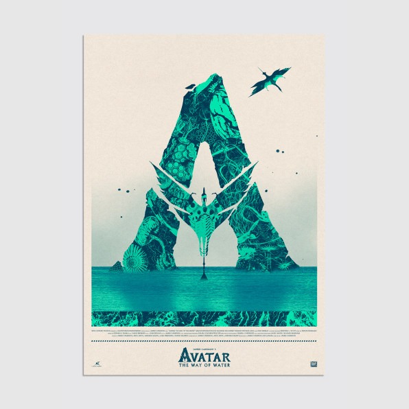
For one, he loves that it presents him with eight to 10 films in different genres and styles—though some are easier than others to execute. He created the poster for Banshees of Inisherin immediately after he got home from the theater. Avatar: The Way of Water, meanwhile, has been a slog that’s coming down to the wire.

[Image: courtesy Matt Needle]
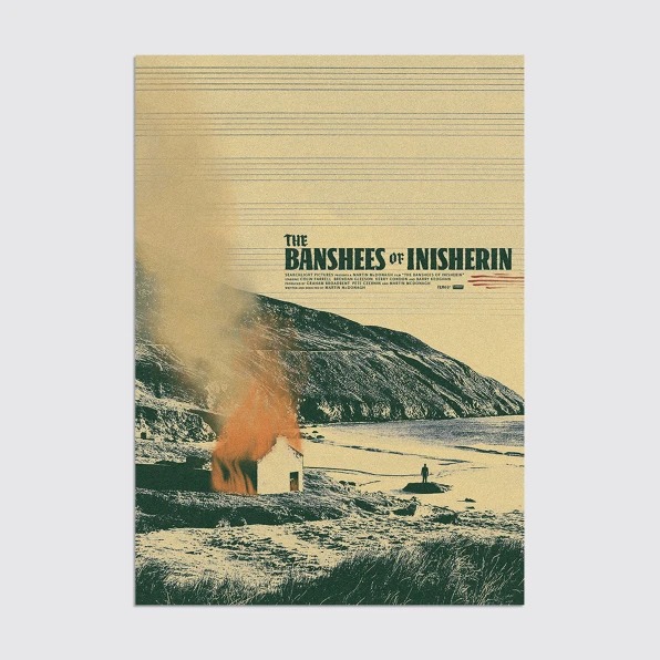
But perhaps most of all: When he sits down to work on them (most of them, anyway), it’s for pure love of the form, and that which it celebrates.“I can be truly free to experiment and create whatever I want,” he says. “This is what I live for.”

  Be in the Know. Subscribe to our Newsletters.

ABOUT THE AUTHOR

More

More Top Stories:

FROM OUR PARTNERS