- | 9:00 am
This fantastical pop-up book tells the mind-bending history of typography
‘Alphabet in Motion,’ a new book from designer Kelli Anderson, uses pop-ups to show how letters got their shapes.
Have you ever wondered how the letter “A” got its shape? Or why some fonts instantly look “psychedelic”? Or where the word “text” even came from in the first place?
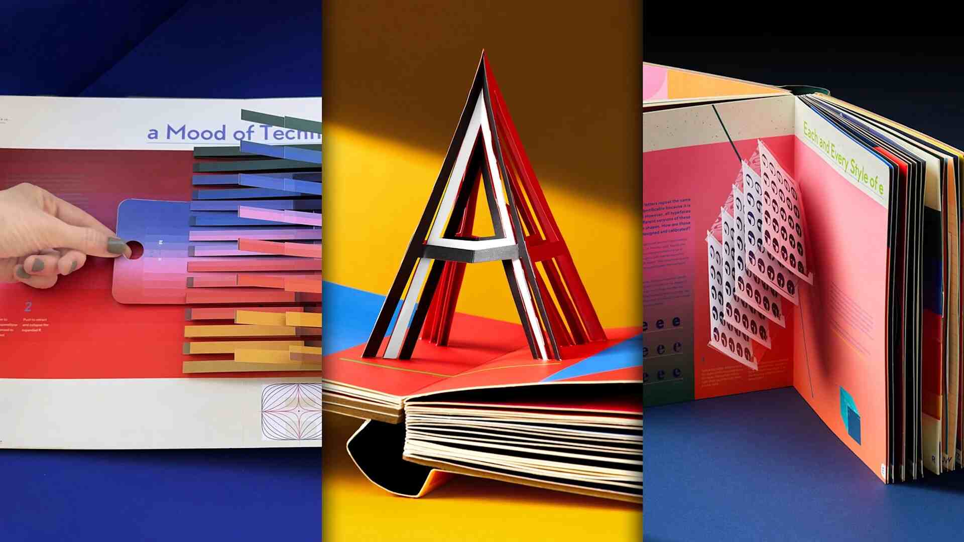
Kelli Anderson, a graphic artist, author, and master of all things paper, has asked all of those questions—and she’s answering them with a massive new pop-up book called Alphabet in Motion.
The book takes readers through an interactive journey about the history of typography from A to Z, starting in ancient Egypt and moving all the way into the digital age. But it’s no ordinary history tome. Anderson hand-designed 17 different pop-ups, including light projections to colorful sliders and mind-bending illusions, that demonstrate how humans have painstakingly developed type technologies over time better than a stand-alone blurb ever could.

With that artful addition in mind, Alphabet in Motion is really a set of books, including the two-inch-thick pop-up book and an accompanying 120-page-long, coffee-table ready book of essays, each corresponding to one of the pop-up’s chapters. (There’s one chapter for each letter of the alphabet.) The book retails for $85 and is currently available for preorder on bookshop.org and Amazon. It will also be available at local bookstores across the country upon its release on November 18.
How ‘Alphabet in Motion’ dives into the fascinating history of letters
Anderson released her last pop-up book, This Book is a Camera, back in 2015, and she’d been dreaming up a new concept ever since—but it wasn’t until she started researching the history of typography and the craft behind it, she says, that something clicked. She began work on Alphabet in Motion, with that catalyst, in 2019.

“We inhabit this typographic reality where letters make us feel things, and providing some kind of satisfying explanation helps bring more meaning to why people are feeling those things,” Anderson says. “When you see psychedelic blobby letters, why does it remind you of the 1960s, Andy Warhol, and Development Underground? When you see different kinds of mod letters, why does that remind you of the space race era?”

These questions, Anderson says, led her to some “really unexpected places.” After combing through historical type collections from sources like London’s St. Bride Foundation, books, and academic articles on the subject, she began to build a massive wall, held together by masking tape, full of all the examples she’d discovered. At the same time, she spent thousands of hours experimenting with different cut paper pop-up mechanisms to demonstrate each concept.

“I had certain pop-up mechanisms where I was like, Oh, this is so cool. I have to include this just for the razzmatazz element,” Anderson says. “And then it was a matter of figuring out where, with any integrity, I could place it to support a concept—because I didn’t want it to just be dancing bologna for dancing bologna’s sake. I wanted people to, once they read the text, understand, ‘Oh, this is actually a demonstration of a concept that will help me understand this particular era of typographic technology.’”
And how psychedelic fonts got their shapes
One typographic era that most fascinated Anderson was the early ‘60s, which is explored in-depth through Alphabet in Motion‘s chapters on the letter “J.” Anderson was curious why this period produced so many whimsically blobby, puffy, and even flared-looking letters. During her research, she discovered that these iconic hallmarks of the era were all thanks to a new technology called phototypesetting.

Phototypesetting allowed type designers to set type by shooting light through pieces of film, then projecting it on a photo paper and arranging it like a magazine layout. This breakthrough made typesetting vastly easier, quicker, and cheaper, since the most common earlier method was to use molten lead.

“You had all of this experimentation, which is in line with the psychedelic experimentation of the era,” Anderson says. “There was all of this interest in bending and projection of light. And so if you went to a concert at the Fillmore or with Andy Warhol’s Exploding Plastic Inevitable, you might see go-go dancers with light images projected on them warping space. People were actually doing that when they were setting type, too.”

With Alphabet in Motion, readers can experience a taste of that process for themselves. On the book’s page dedicated to the letter “J,” a paper cut-out pops up to become a projector for your iPhone, allowing you to use your flashlight to create a ‘60s-style typographic light show.

That’s just one example of how Alphabet in Motion uses tactile experiences to place typographic innovations in context. Other pages in the book include a 3D model that explains the development of uppercase and lowercase letters in the Roman Empire and European Middle Ages, respectively; a mini pop-up that describes the creation of early video game bitmap fonts; and an interactive page that shows how the early practice of weaving actually shaped our modern letters—and served as the basis for the word “text” itself.
For Anderson, her biggest goal is that this six-year passion project will help introduce a new generation to the world of type design.
“I hope some people buy it for their little kids thinking it’s just an A through Z pop-up book, and enjoy it on that level,” Anderson says. “Then stick it back on the shelf and have their kid in 12 years open it up and actually realize that design and typography are interesting and tie in with the larger world and culture—that they’re not a separate thing.”


