- | 1:00 pm
This unreal website embraces the most notorious UX design trend
Skeuomorphic design is back with a new purpose: borrowing from the real world to instill trust in the digital realm.
At a time when an AI can redesign a living room at the click of a button, the lines between what’s real and what isn’t are getting blurrier every day. And with the rise of augmented and virtual reality, the physical and digital worlds are melding into one blob at hurtling speeds. That blurring of lines can be unsettling at times, and completely frivolous at others, but for one designer, it has become the essence of a fascinating new brand identity.
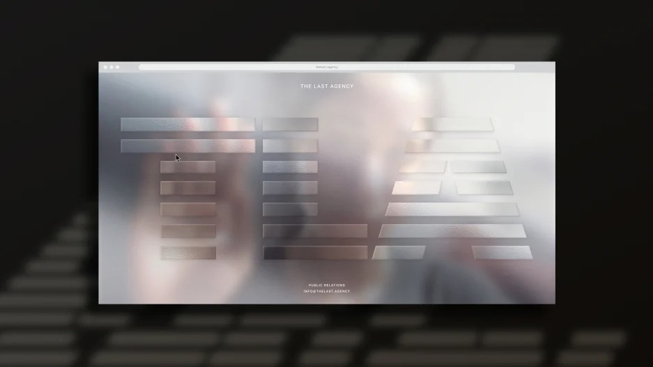
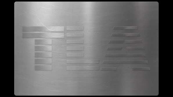
In a masterful move that blends interactive design with hyperrealism, New York-based designer Talia Cotton, who’s one of the leading graphic designers of the moment to embrace the possibilities of code, has dreamed up an intriguing website that reacts to a user moving a cursor around the page. Designed for a new public relations agency called The Last Agency, the website (and accompanying brand identity) consists of a single landing page and a full-screen wallpaper of a scratched-up steel surface that looks eerily real. As you move your cursor, the light appears to bounce off the steel, like tilting a piece of metal in the sun. The underlying design principles harken back to 1980s skeuomorphic design but with one important differentiator: it doesn’t sacrifice behavior for style. Think of it as skeuomorphic design 2.0 with a clear purpose: to borrow from the real world to make a new company appear trustworthy in the digital space.
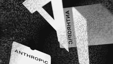
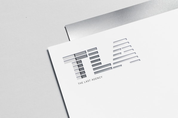
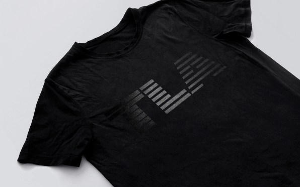
It all starts with a brief that called for a brand identity that is both nostalgic and forward-thinking. “It’s IBM meets TWA,” says Cotton. (The original logo was designed by graphic designer Hannah Nathans and is closer to IBM, but Cotton gave it a “TWA” twist by tweaking it so that the thickness of each stripe decreases with each letter, suggesting an evolution.)
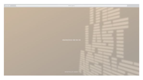
Once the logo was in place, Cotton went through a dozen wildly contrasting iterations of the website, always experimenting with those blurred boundaries between the physical and the digital realms. In one version, she played with Moiré, where two ruled patterns are superimposed over each other to create a sense of motion. In another, she was inspired by the kind of shadows that blinds might cast on a wall, except in this case, the shadows spelled “The Last Agency” and the angle of the shadow varied based on the time and day you would visit the website. “I really liked the idea to bring that to the digital realm,” she says.
[Image: TLA]
Eventually, the team landed on the substance of steel, which is meant to evoke resilience and the idea that this is “the last agency you’re going to need,” says Cotton. Here again, grounding the website in real-life materiality was key. “It became less about a nod to the past and more about the physical qualities of something everlasting,” she says.
Cotton started with a scratched-up steel surface that looks like it has been through a lot. But the real magic comes in when you move the cursor around the page, which makes the light shift ever so gently across the typeface on the screen. “The whole site is an illusion,” says Cotton. “It looks 3D and it’s not.”
[Image: TLA]
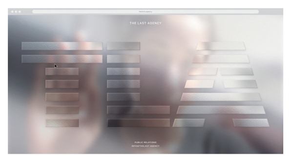
For an added layer of interaction, Cotton has hidden a fun “easter egg” on the landing page. If you press the letter “c”, a camera icon pops up in the bottom-right corner. Click to allow the site to use your front camera, and you will find a highly blurred version of your face reflected against the steel backdrop. As the light on the screen shifts based on your head movement, the physical quality of the digital image becomes even more convincing.
[Image: TLA]
The experience is reminiscent of skeuomorphic design for a reason. The original purpose of skeuomorphism was to paint scary technology as a more familiar, approachable object, and Cotton is arguably doing that by covering the website’s landing page with a hyperrealistic steel texture. But Cotton isn’t just reviving skeuomorphic design in a more modern way, she’s leveraging it for a whole other purpose—to instill trust. You could call it skeuomorphic design 2.0.
[Image: TLA]
To be fair, Cotton is a bit reticent about the skeuomorphic design label. “It’s hard to take it at face value without imposing any historical connotation regarding its trends in interface design,” she says of a movement that introduced digital page flips that mimic the way a page would flip in real life, or a camera phone making the shutter sound of an analog camera. But she agrees with an updated definition of the term, where skeuomorphic design illustrates something that appears realistic (the scratched steel glinting in the sun) but crucially, lets you interact with it in a realistic way as well.
It’s a fun user experience, but it’s functional, too. “I find that in design, the more real something looks, the more trustworthy it feels,” she says, comparing a color photograph to an illustration. “And I think it was necessary to set the tone of The Last Agency as trustworthy since they’re so new.”
[Image: TLA]
Ironically, Cotton doesn’t think that the same principle applies to the brand’s physical assets like their business card or letterhead, both of which use a different, black-and-white version of the logo. “I think it only works as an application on the web,” says Cotton. “As soon as you replicate that web experience in the physical world, it loses half of its meaning.”


