- | 8:00 am
We’re not even close to the BlackBerry of AI yet, let alone the iPhone of AI
We’re likely years from a unifying vision for AI hardware. Smartphones offer an interesting case study as to why.
Tab’s stoic white pendant. Rabbit’s nostalgic orange walkie-talkie. Humane’s Star Trek lapel pin. While 2022 and 2023 brought us the rise of ChatGPT and other AI software, 2024 is shaping up to be the year of AI hardware. Or as I’ve begun to think of it more reasonably, year one of AI hardware.
It’s the year when everyone is trying to launch the next big thing—the “iPhone of AI,” as has become the preferred shorthand. But no one is going to launch the iPhone of AI this year. Or next year. Or even the year after that.
I don’t mean that to be spitting hot takes (though I suspect a legion of crypto-bros-gone-AI-bros on X will find what I’m saying quite incendiary). But if we’re going to frame our future inside imperfect metaphors, then allow me to explain: We haven’t even created the BlackBerry of AI yet. And until that happens, nobody has any clue what the iPhone of AI could be. We’re not even close.
This is not me throwing shade on any of the AI hardware startups we’ve seen thus far; it’s simply acknowledging that we’re in a time of immense experimentation. At the moment, untold amounts of money are being transformed into a pile of silicon-meets-consumer-electronics stuff. We’re back in the gadget era of the late aughts, when a dopamine drip of the shiny and new is glimmering in our eyes.
Except unlike in 2005, these days polished design is table stakes. Whether it’s their typography or CMF, the baseline AI hardware products you’ll see will be wonderfully executed to a point. But they won’t prove to be actually good design unless they fit into our lives—unless their UX transforms the magic of AI into a tangible handy function.

I know this simply by looking back to our not-so-distant history of smartphones. As I’ve written before, the modern design of the touchscreen smartphone—ushered in by Apple’s iPhone in 2007—was far from a foregone conclusion. It’s obvious in retrospect, and only in retrospect. Because if you lived through that era, you know that touchscreens were the snoozy technology behind ATMs. Nothing more.
Mobile chips brought us a Cambrian explosion of tiny telecommunications equipment. Over the course of two decades, cellphones received an increasing set of capabilities (from calling, to emoji, to T9 texting, to browsing the web, to sending pictures) that necessitated an industry-wide experimentation in form. We had CandyBars and flip phones, stylus-loving PDAs and QWERTY keyboard sliders.
The phone you chose became a form of self-expression, in part to showcase your blingy or subdued style, and in part because the UX of your chosen phone was often tailored to a particular market that used certain features in unique ways. The utilitarian Nokia 1100/1110 was cheap and durable, with a straightforward Scandinavian design sensibility that made it kind to Luddites and normies on a tight budget.
The impossibly sleek Motorola Razrs slipped seamlessly into purses and pockets, and in their initial release they were placed into the gift bags of Oscar attendees (Middle America, in turn, gobbled them up). Sidekicks, with slide-out keyboards, were perfect for a young generation of chronic texters who also wanted to play with their phone like a fidget spinner.

RIM’s BlackBerry—oft-dubbed a “Crackberry”—with its large fixed keyboard and enterprise email support, was the Fortune 500 go-to in an era before Zoom. (Upon becoming president, Barack Obama won an argument with the National Security Agency to keep his BlackBerry because he couldn’t imagine running the free world without it.)
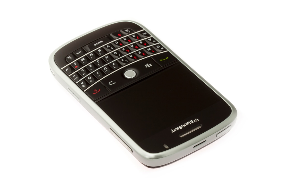
The BlackBerry became the dominant force in smartphones in the late aughts because it appeared to have everything figured out. Easy QWERTY typing. A wide screen that made emails and news easier to read. A middle button/trackball/touchpad to allow you to point and click through websites. It even had its own messaging protocol, BlackBerry Messenger, which allowed breakthroughs like real-time group chats. In 2006, nobody knew how the form of a BlackBerry could ever evolve. With a screen, keyboard, and cursor, it was not all that different from having a tiny PC that fit into your pocket. And isn’t that what we wanted?
Even after 2007, contrary to how we might remember, the iPhone didn’t erase the BlackBerry overnight. The iPhone took years to ramp up, stymied in part by IT managers of the era who were skeptical of Apple products. Meanwhile BlackBerry, with so much momentum and corporate support, wouldn’t peak in sales until 2010, when it dominated 43% of the U.S. smartphone market. (Though by 2013, it had less than 6%.)
So why did the BlackBerry fail? You can read countless arguments about that. From a UX perspective, however, the iPhone was just obvious and intuitive from the moment you saw it. Multi-touch made digital information tactile in a way that even a mouse could not, and the first time you tried pinching to zoom into a map, it demonstrated that Apple hadn’t just built a keyboardless phone; the company created a computer to manipulate software with your fingers. The idea was so foundationally powerful that it was destined to become universal.
At last we could just touch the pixels! And so the need for abstraction of physical buttons, balls, and sliders was largely erased (and even when it wasn’t, the iPhone allowed these objects to be simulated on the screen more flexibly as needed). I’d argue that the second, perhaps smaller part of this whole story is that Apple killing the physical keyboard maximized its screen size. And once you see a bigger screen in about any context, it’s just very, very difficult to settle for a smaller one.
Research in Motion (RIM), BlackBerry’s parent company, tried to adapt, of course. By 2008, it released the Storm, which had a big touchscreen and a slide-out QWERTY keyboard. What you can’t know without experiencing the tech of this era is that while every company attempted to copy the iPhone—and in photos, it might look like they did—it took about half a decade for competitors to get anywhere close to the quality, tactility, and overall experience that Apple had developed and kept improving upon. (Samsung would close the gap with Apple only by copying its designs—which became the legal design battle of a century.)
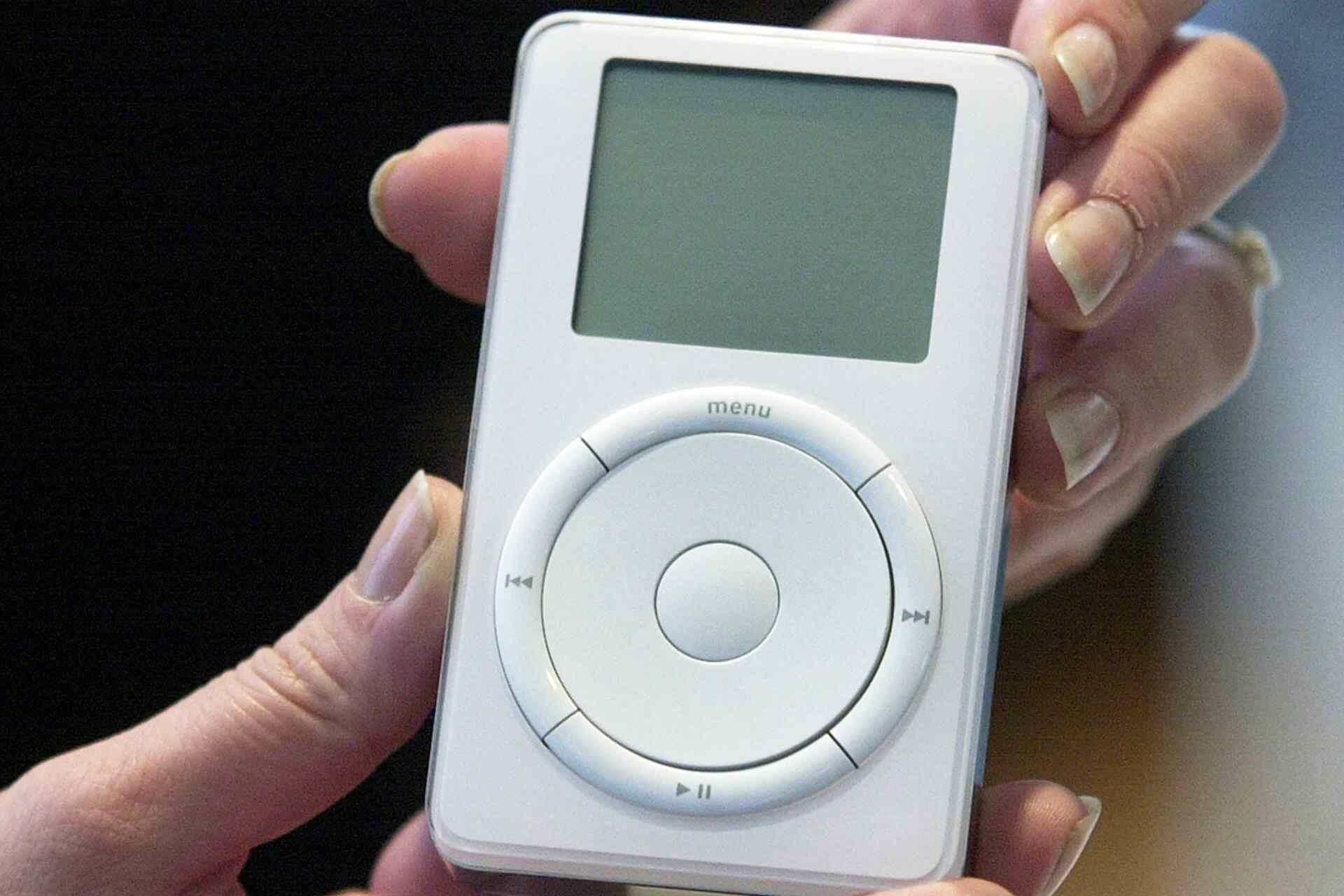
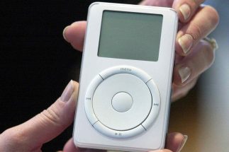
My point in this entire retrospective is simply to say that no one imagined the iPhone before it happened. And to a large extent, that includes Apple itself, which for a time pictured the iPhone form as an iPod Mini with a rotary dial on its click wheel. Decades of chip advancement, design understanding, novel invention, cultural evolution, and just loads and loads of mistakes happened before we got the iPhone—and before we got what we thought the iPhone would be . . . the BlackBerry.
We’re on the precipice of a true AI revolution, in which LLMs and related models will serve as the new foundation for much of our digital experience. Talk to anyone working in this space, and they will admit that even they don’t know what these models can really do yet, largely because research moves the bar every day. Until we understand the capabilities of modern AI, and what we will begin to do with it, there certainly won’t be some universal hardware standard that unites us to control it.
It’s going to be an amusing time to watch new startups. We’re going to see a range of fresh designs that, like old phones of yore, might even be tied to very specific use cases that indirectly express our identity. These products will exist not because anyone has the answer but because we’re beginning to piece together the questions.
And yet I simultaneously shudder to consider the ecological impact this era, however long it lasts, will have, as gen AI burns invisible energy and cutting-edge failure only ends as some form of landfill. Bad products are more than bad business; they all cost the world something, be it attention, opportunity, investment, or carbon emissions. We can only hope that whatever the iPhone of AI adds up to be, it’s worthy of its true price—and maybe that we get a Nokia 1100, a Razr, a Sidekick, or a BlackBerry to tide us over along the way.


