- | 6:41 pm
Which Oscar film should win the unofficial Best Poster award?
Shocker: Graphic designers have opinions.


Greta Gerwig.
Leonardo DiCaprio.
. . . Graphic Design?
When the list of Oscar nominations debuts every year, one thing overshadows all the celebratory nods: the snubs. And we’d be remiss if we didn’t once again shake a digital fist at the cinematic powers-that-be and lament that, for nearly a century, the Academy has done design dirty by ignoring movie posters as a veritable art form in its own right. (Come on! At least shove the category into those not-televised Scientific and Technical Awards.)
Like movies at large, the posters promoting them generally adhere to formula and genre convention. But every so often, a film comes along that brilliantly breaks out of it all not just on screen, but in rectangular marquee, too. Truly great movie posters don’t just brand a film—they expound and expand it.
We felt that was particularly the case with some of this year’s Best Picture nominations. So we again turned to a panel of poster-world pros to select their favorites from among the 10 honorees. They are: Eric Garza, creative director of Mutant (formerly of Mondo); Kenny Gravillis, co-owner and creative director of Gravillis Inc.; Mitch Putnam, creative director of Mutant; and Eileen Steinbach of SG Posters. While Everything Everywhere All at Once and James Jean dominated the 2023 selections, this year’s picks proved a powerful mix across a rich variety of styles—just like the films they represent.
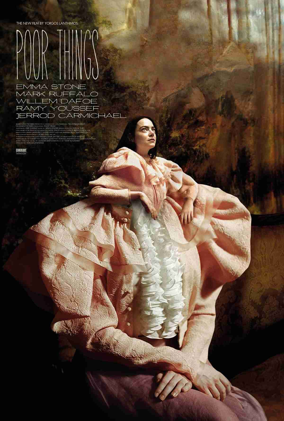
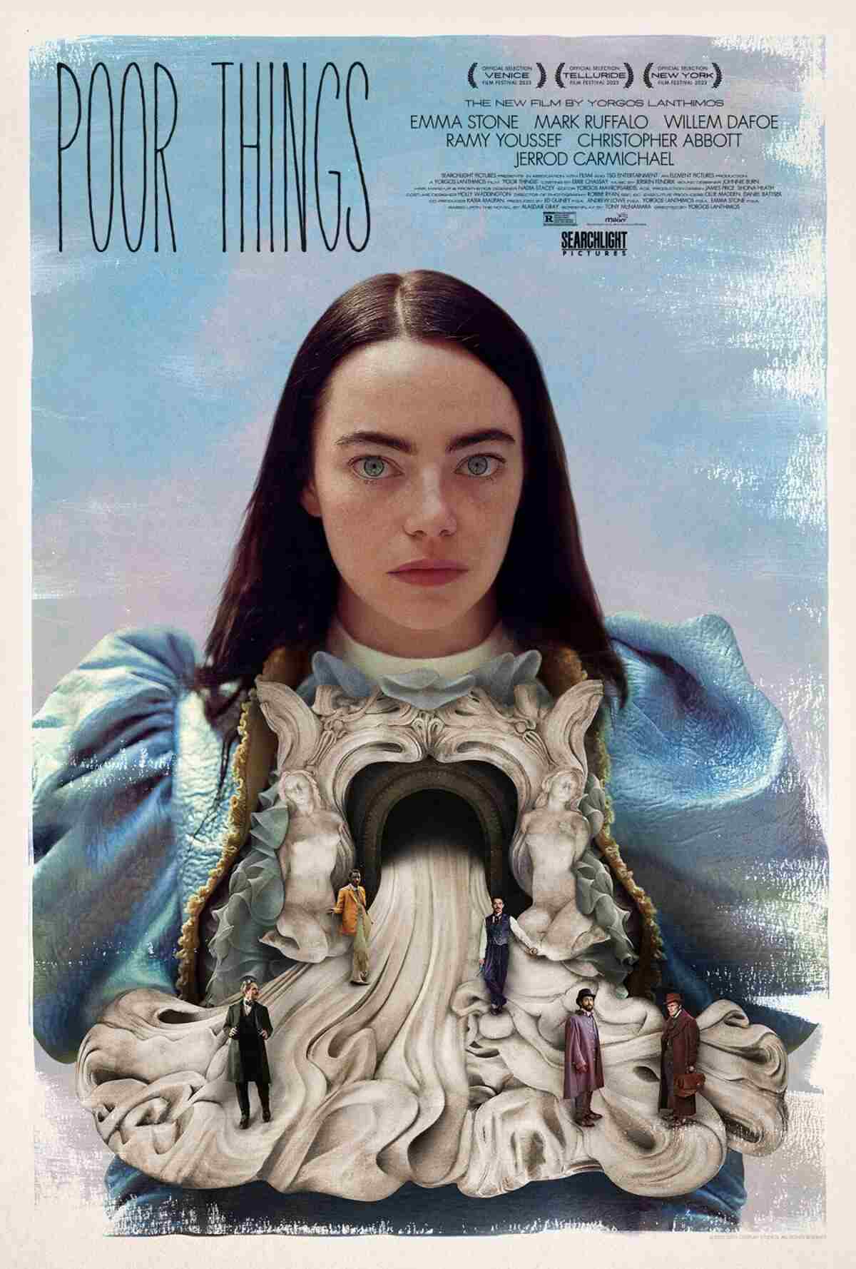
[Photo: Searchlight Pictures]
Poor Things
“One of my favorite films of 2023 is director Yorgos Lanthimos’ Poor Things. The adoration began as soon as I saw graphic designer Vasilis Marmatakis‘ gorgeous posters he created for the film. By way of photo collage, hand-painted elements, and very strong typography (which Marmatakis also designed and which was used in the chapter breaks within the film), each poster acutely establishes the film’s very strong visual identity while introducing us to the iconic Bella Baxter and her world. My favorite of the three is the one with smaller Bella emerging from larger Bella, but extra points to the blink-and-you’ll-miss-it hidden imagery in the smudged makeup comp, and Bella’s spilled, marble emotion guts. Oh, who am I kidding? They’re all winners.” —Eric Garza
[Photo: Searchlight Pictures]
“All the posters for Poor Things were absolutely amazing, so I’ll have to go with those. Greek graphic designer Vasilis Marmatakis, one of my favorite creatives working today, did an absolutely breathtaking job with these conceptual and more surrealist posters for the steampunk-y dark comedy that not only capture the film’s essence in a very artistic way, but also catch people’s attention because of how unusual they are. They make you look. And that’s what a good poster should do in the end, right? Get your attention, and tease the story in a clever way while looking absolutely stunning and frameable. He did that in his very own style. He really did all of that.” —Eileen Steinbach
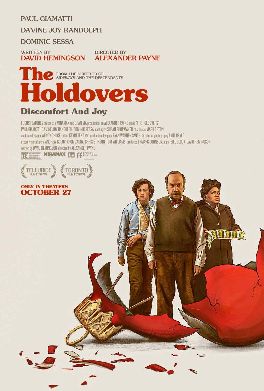
[Photo: Focus Features]
The Holdovers
“I love the nostalgic feeling I get from this poster [designed by AV Print]—the metaphor of the broken Christmas ornament feels like a perfect depiction of the journey of three people unintentionally stuck together for the holidays. The illustration and typography are styled nicely and hit the ’70s/early-’80s mark. Not to mention, the expressions of the characters in the illustration tie in perfectly to the tagline, ‘Discomfort and Joy,’ all while still feeling fun and lighthearted. Even though there are some heavy themes in the film, this poster definitely projects more of a comedic fun ride, which I think serves the film very well.” —Kenny Gravillis
[Ed. note: The throwback vibes didn’t stop at the poster—director Alexander Payne went all in with Eigil Bryld’s retro cinematography and Nate Carlson’s design and logo work.]
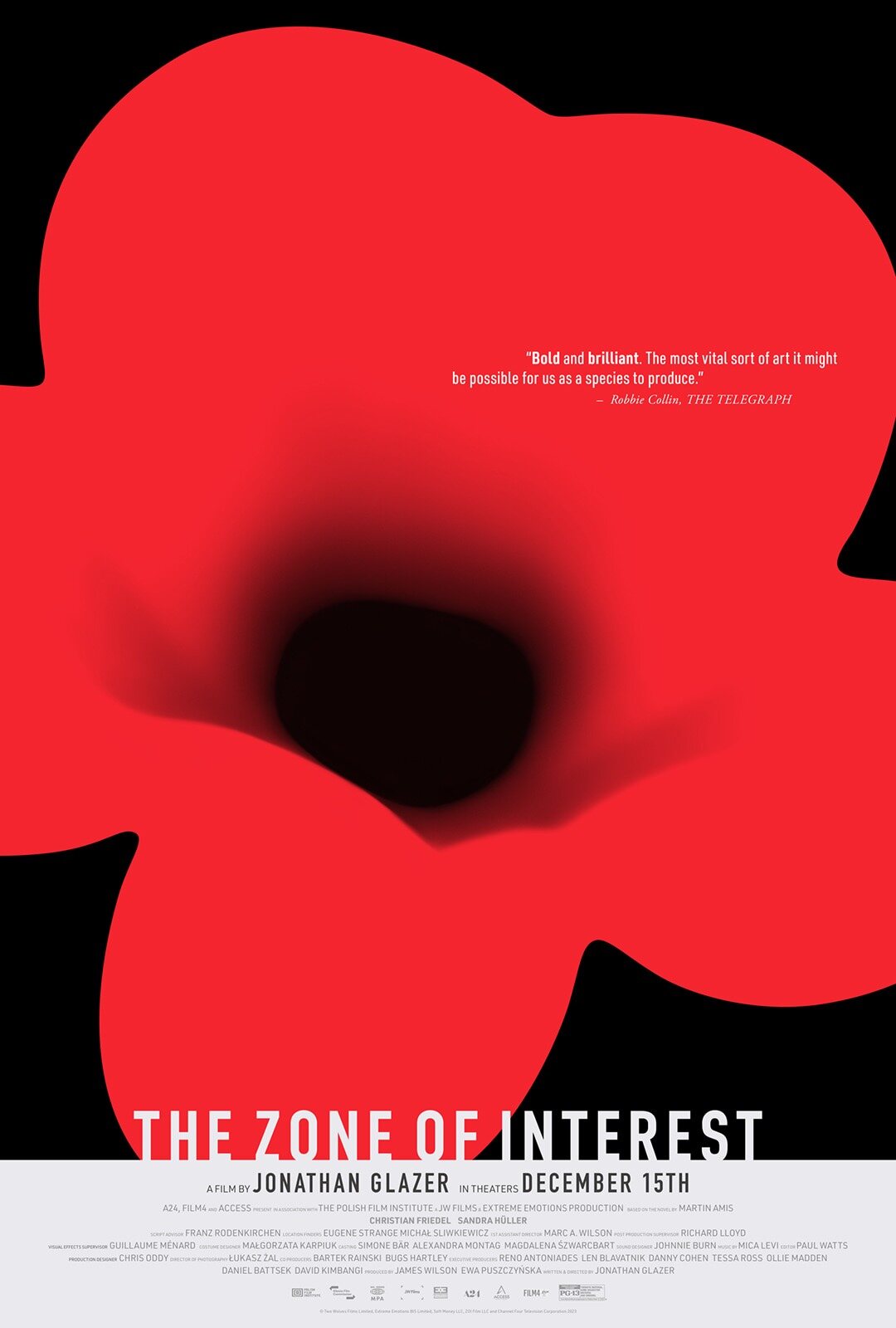
[Photo: A24]
The Zone of Interest
Featured Videos
Today's Top Stories:
More Top Stories:

FROM OUR PARTNERS