- | 9:00 am
Google Maps vs. Apple Maps: Which is the better app in 2024?
We rank Apple Maps and Google Maps against each other in four categories: user interface, map design, directions, and establishment information. Here’s our winner

This week Apple brought Apple Maps to the web in beta, bringing it one step closer to parity with Google Maps, which has long been available via web browsers.
Of course, iPhone owners will still turn to the app versions of their preferred mapping service when away from the desktop. Both the Apple Maps app and Google Maps app have always had their strengths and weaknesses, but in recent years the two apps have continued to borrow the best features and elements from each other.
So the question is, in 2024, is one mapping app on the iPhone better than the other? Let’s explore this based on the four critical elements of any mapping app: user interface, map design, directions, and establishment information.
APPLE MAPS VS. GOOGLE MAPS: USER INTERFACE
First up is the user interface of both apps. The UI consists of all the elements on the screen that are not the map—so, the search field, current location button, and more. Generally, the less cluttered the UI, the easier it is to use an app.
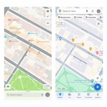
By this metric, Apple Maps wins by a long shot. Launch Apple Maps and you’ll see that the screen is largely free of any extraneous UI elements. There’s the search field, the current location button, the map type toggle button, and a small weather box. But launch Google Maps, and you’ll see the UI is more cluttered. In addition to the above, Google Maps displays a hovering row of horizontal category buttons at the top of the screen and multiple toolbar buttons at the bottom of the screen.

Left: Apple Maps. Right: Google Maps. [Photos: Apple Maps; ©Google Maps Data]
APPLE MAPS VS. GOOGLE MAPS: MAP DESIGN
Map design refers to the design of the map itself, which includes everything from how roads are displayed to the look of icons on the map.
When it comes to Apple Maps and Google Maps, it’s hard to decide who wins here because both maps now look so similar. Last year, Google Maps rolled out an entirely new color scheme for its maps—one that mirrored the color scheme of Apple Maps nearly identically.
Now, in both apps, major roads are gray, and the lighter gray a road is, the more minor it is. For example, highways appear the darkest gray on a map while major streets and avenues appear a bit lighter, while even smaller streets appear even lighter. Apple Maps and Google Maps also highlight busy areas of a city in a golden-yellow, so it’s easy to tell what parts of a city have a lot of attractions based on just a glance.
But when it comes to the way icons for points of interest are displayed on the map, Apple again pulls ahead. That’s because Apple’s icons are less intrusive— the company doesn’t flood the map with sponsored pins that may be completely irrelevant to you (like pins for hotels in the city you already live in). So, yes, when it comes to comparing the maps portion of Apple Maps and Google Maps, Google Maps is still a bit of an eyesore.
Winner: Apple Maps
APPLE MAPS VS. GOOGLE MAPS: DIRECTIONS
When it comes to actual directions, you’d be hard-pressed to find much of a difference between Apple Maps and Google Maps––at least in a large city like New York. Both apps perform exceptionally well when it comes to telling you how to get from point A to point B, whether you are looking for directions via car, foot, or public transit.
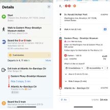
But if you live in a place where you almost exclusively use public transport, it’s fairly obvious that Google Maps has the edge. This is because Google Maps’s manner of displaying public transit details—including the steps you need to take between interchanges—is just easier to read and follow than Apple Maps’. Depending on the type of public transportation you’re taking, Google Maps will even tell you if the service is crowded or less busy than usual—helpful when you are in a rush or hoping for a seat.
It’s these little touches of added details that make the directions experience in Google Maps better than in Apple Maps.
Winner: Google Maps.

Google Maps (right) has nice little touches like live crowd density on public transit. [Photos: Apple Maps; ©Google Maps Data]
APPLE MAPS VS. GOOGLE MAPS: ESTABLISHMENT INFORMATION
Now we come to establishment information (also known as point-of-interest, or POI, information). This is the information each app lists about an establishment, whether it be a restaurant, gym, school, or hospital.
And here there is no question: Google Maps still blows Apple Maps away when it comes to information about establishments. Tap on the same establishment in Apple Maps and Google Maps and you will see that the information Apple Maps provides is far inferior to what Google Maps provides.
Apple Maps will give you the basics: address, phone number, hours of operation, a description, and some photos. But Google Maps? It gives you nearly everything you could ever want to know, including all of the above plus popular times, live foot traffic, commonly asked questions about the establishment with answers, a wealth of up-to-date reviews, and, in the case of food purveyors, even photos of the menus and the individual dishes on the menu.
Google Maps can offer all this because it isn’t just a mapping service—it’s a social network of sorts, powered by tens of millions of users who constantly contribute pictures, answers, reviews, and other information. Apple Maps does not have this type of engaged user base, nor is it designed to be any type of social platform like Google Maps. And because of that, Google Maps will always offer superior establishment information.
Winner: Google Maps.
APPLE MAPS VS. GOOGLE MAPS: THE WINNER IS . . .
So who wins—Apple Maps or Google Maps? Based on the four metrics above, it’s technically a draw.
But I’m going to call it in Google’s favor for one primary reason: in 2024, mapping apps are no longer just about getting directions. Nine times out of ten, when I open a mapping app, I already know how to get to the place I want to go.
I’m not opening the app to get directions to my destination, I’m opening the app to get information about my destination. I turn to a maps app to find out how much admission is to a tourist attraction, how busy a local cafe is, or whether the restaurant has something I like on the menu.
And because of that, I most often turn to Google Maps. Until Apple Maps’ can offer the wealth of establishment information that Google Maps can, Google Maps will remain the map app king.


