- | 8:00 am
Google’s first folding phone is inspired by a Moleskine notebook
6 ways Google’s Pixel line doubles down on tactility.
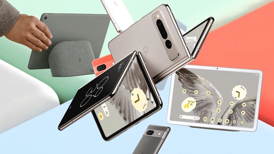
Today, Google announced three new products at its yearly I/O festival: The Pixel Fold ($1,800, ships in June), the world’s thinnest folding phone; the Pixel Tablet ($499, ships in June), which snaps to a speaker dock to sit almost like a mini iMac; and the Pixel 7a ($499, ships now), the company’s low-cost, high-glam smartphone.
If you find the products tempting, you’re not alone. After years of quiet market presence, Google’s Pixel hardware is growing globally—its market share nearly doubled in many markets over the past year, even if it still lags well behind Apple and Samsung. (Pixel phones currently command 12% of Android sales in the U.S.) About five years after opening a dedicated hardware studio, Google has also cemented its point-of-view in industrial design: creating high-touch tactile products that would be as comfortable on a shelf at Hay as in a Sephora.
“You feel like you’ve made a distinction, and you lean into it more,” says VP of design Ivy Ross. “Because it’s working and because it’s our differentiation.”
Here are some of the distinguishing, tactile design features of the 2023 Pixel line.

THE MOLESKINE PHONE
At first glance, the Pixel Fold looks almost identical to any other Pixel. It has a screen on the front, and a prominent camera bar on the back. But you can actually open the entire device to unfold a second, larger screen.
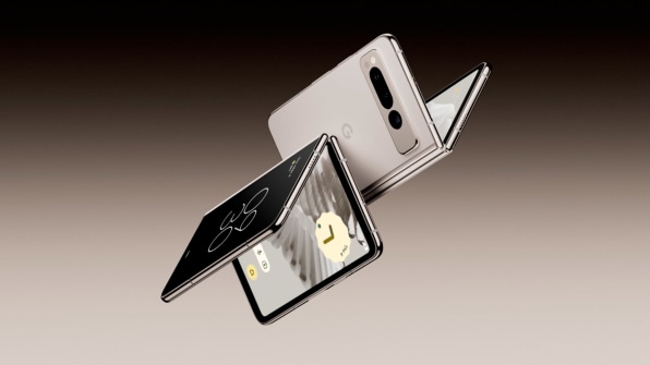
Google is casually late to the foldable phone party—Motorola and Samsung have both released folding products in the past several years. The main reason why is that Google had a foldable phone in the past that the team determined wasn’t good enough to be released, according to Ross.
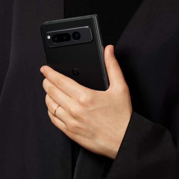
Their bar? To be as thin as any other phone. (In this case, the Pixel Fold a mere 5.7mm when unfolded—which is 2mm thinner than an iPhone 14 and the thinnest foldable in the world. It’s a bulkier 12.7mm when folded up). It also just needed to feel right in someone’s hand. The goal was not to remake a flip phone.
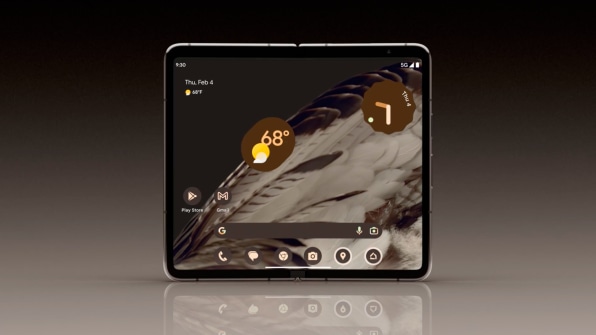
“I would say the inspiration behind it was the Moleskine notebook,” says Claude Zellweger, director of design at Google, who leads phones. “There’s a real satisfaction in opening and closing it, so we spent a lot of time studying how books closed, doors closed, stuff like that.”
A CAR-DOOR CLOSURE
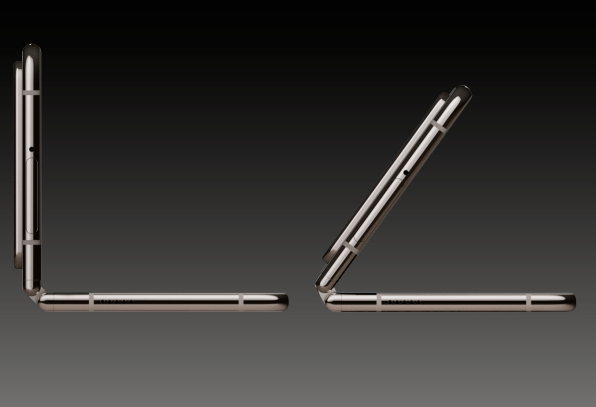
That hinge is a key point of the Fold’s design, and Google claims that its hinge can open the Pixel screen completely flat, rather than leaving a bit of an angle as Samsung’s offerings do. And yet it still closes with a fantastic sound and sensation, like that of a (tiny) premium car door or perhaps a classic art deco cigarette case, according to the team.
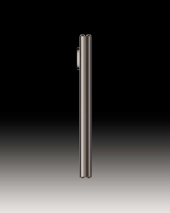
While Google didn’t get into great detail about how its hinge works, Zellweger notes that he was inspired by the construction of modern mountain bikes. Instead of the frame moving on a single pivot point (like those big shocks you see in front suspension), the mechanism has a “virtual pivot point” (allowing the hinge to flex, shift, and bend with more freedom). If you want a peek at just how complicated these tiny hinge systems get, take a look at our feature on Motorola’s folding Razr from 2019.

CAMERA OR MIRROR OR BOTH?
Both the hinge and the camera bar shine to get your attention, thanks to their mirrored aluminum finish. That fully glam camera bar has been a surprising design motif within the Pixel line, which had originally favored a more muted two-tone approach that made the camera disappear into the body.
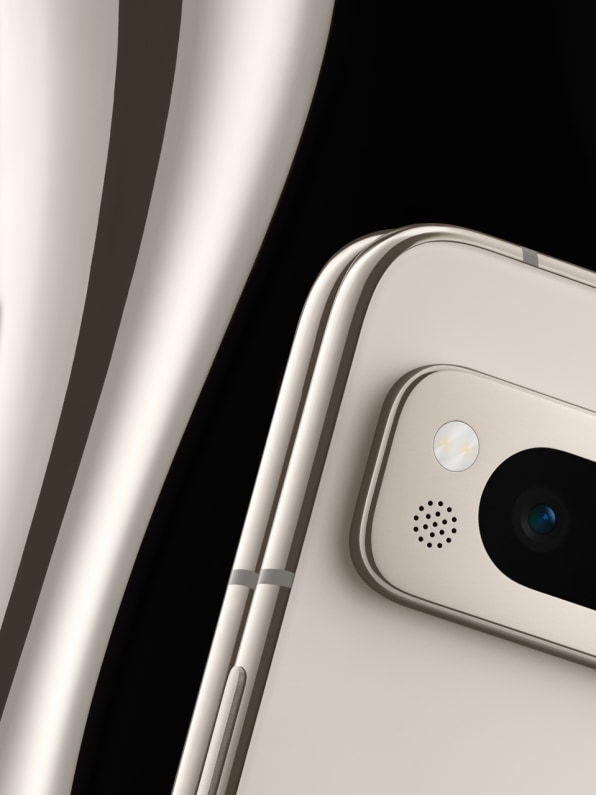
“The horizontal bar is so distinctive, and we want to own that,” says Ross. Indeed, it’s a smartphone design feature that can actually read from 15-plus feet away, advertising itself in a crowd in a way most smartphones prefer not to.

That camera bar has also made its way to the budget Pixel 7a, which makes the cheaper devices look a bit more premium—and specifically, a bit more like jewelry. Beyond the shine, Google promises that this metal bar will increase the 7a’s camera durability, too.
FEELING PORCELAIN INSTEAD OF METAL
Tablets are a category that Google has played in since 2012, but the Pixel tablet may be its first attempt of note. Isabelle Olsson, design director for home, wearables, and CMF at Google, explains that they began the product development with a simple insight: 80% of tablets are never taken out of the home.
“If we know it’ll live in the home . . . how do you create a tablet that feels at home in the home?” she asks.

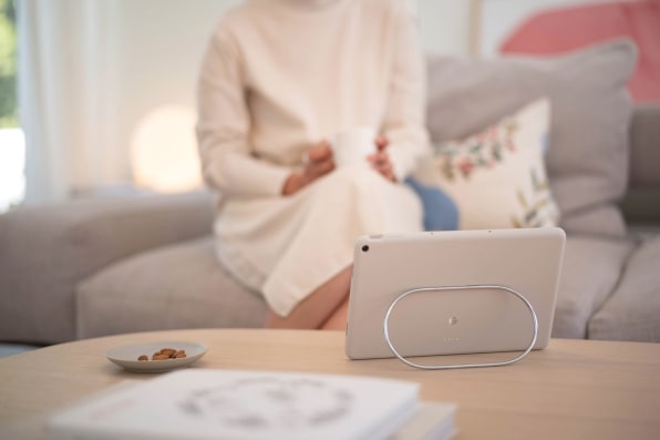
That answer was ceramic. Specifically, Google developed a nano-ceramic coating for aluminum, which transforms the feel of a metal gadget into the sensation of touching a porcelain dish.
“If you do a blind test and feel it, it has the same surface friction [as real ceramic],” says Olsson.
A TABLET STAND LOADED WITH MAGNETS
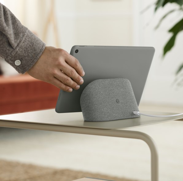
Creating a tablet for home meant more than just thinking about material, however. How would you actually use a tablet that was meant for a domestic space? Another insight the team had was that, for many people, tablets are dead when you actually go to use them because they’re not something you recharge all the time like your phone.
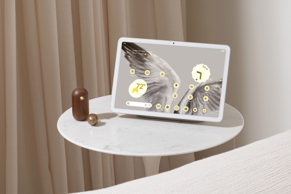
In turn, the team created a charging speaker dock. When not in use, the tablet sticks via magnetism, stays charged, and serves as a smart display. (The dock is also a good angle for video calling, and I can’t help but wonder how it’d feel as a tiny computer with a bluetooth keyboard attached.)
Getting the weight of the dock and the magnetism exactly right took months of fine tuning—and the team mentions the “car door” again when describing the sound the tablet makes during its moment of attachment, which required a unique flavor of polyurethane on the base to get it just right and not sound too plasticky.
FLEXING THE INFINITE HINGE
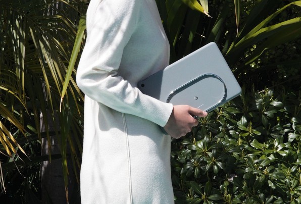
For anyone who prefers the additional safety of a case to the ceramic feel, Google designed a special case for its Pixel Tablet. Its point of note is what the team calls an “infinite hinge,” which is a diminutive stainless-steel ring that attaches to the back of the case, and props up the tablet at any angle you like because its adjustment is entirely fluid. That ring doesn’t look any more complicated than a paper clip, but the design adds a lot of ergonomic flexibility.
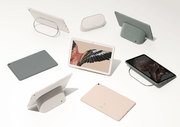
“Cases can feel flimsy or prescriptive,” says Olsson, whereas the Pixel Tablet can tilt with all of the fine control of a laptop screen. As an added bonus, that steel ring slips perfectly into the back seat pocket on an airplane, so the tablet can float in front of your eyes. No touching necessary.


