- | 8:00 am
Google’s Pixels are simpler than the iPhone now
iOS keeps adding new layers of feature bloat, while Android is more refined than ever.
Here’s a confession: Over the past week, I’ve been mostly neglecting the AI features on Google’s Pixel 9 series.
As before, those features range from marginally useful to superfluous to just plain awkward. In day-to-day use, it’s easy to forget that they even exist. Instead, I’ve been marveling at how great the Pixels 9 are in every other way—in particular how refreshingly simple Google’s Android software has become.
By comparison, the iPhone has become bloated, with new layers of complexity that Apple seems to add with every iOS update. Android has a reputation for being the more complicated operating system, one that caters to hypernerds who obsess over customization, but over the years the roles have reversed. If you’re looking for the simplest smartphone operating system, you’ll find it on a Pixel phone.
The Pixel’s refreshing simplicity
Remember when the iPhone home screen was just a grid of app icons, with a swipe down for notifications and a swipe up for quick controls? Those days are long gone as Apple has layered on a complex array of conflicting features.
For instance, the iPhone now has three separate widget systems to manage. There are lock screen widgets, home screen widgets, and the “Today View” widgets that appear in two places (left of the home screen, and left of the Notification Center). The selection of lock screen widgets also differs from the home screen and Today View options, so you may not be able to add the same controls in each place.
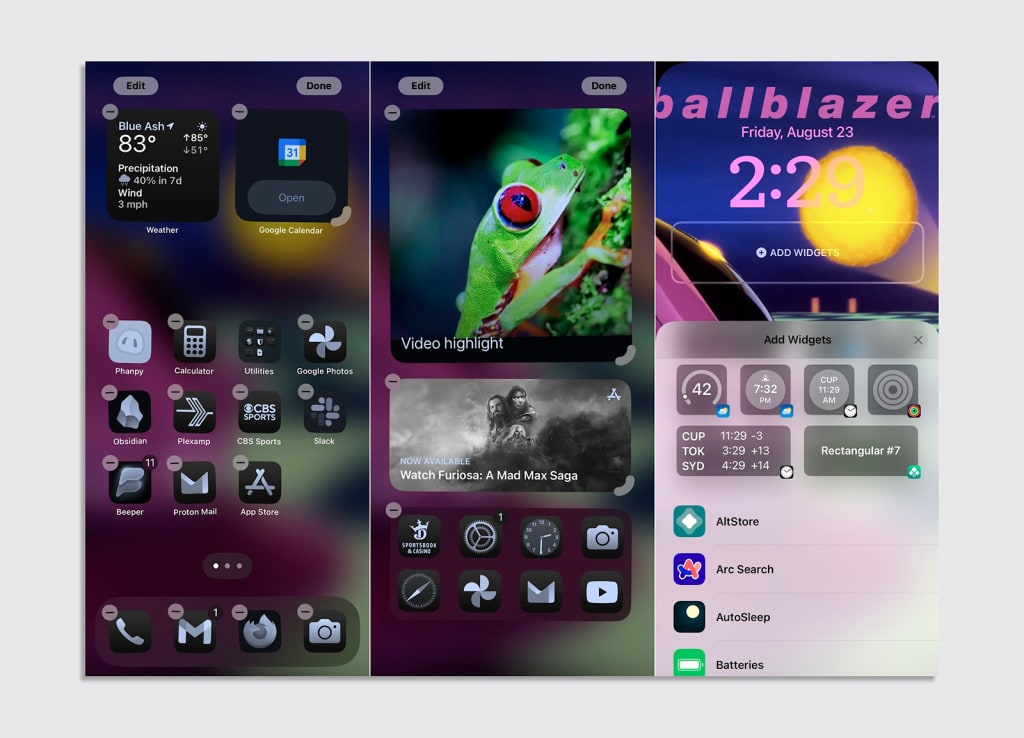
Google’s Pixel phones have home screen widgets, and that’s it.
With iOS, swiping down on the home screen does three or four different things. A top-right swipe leads to the Control Center, but swiping anywhere else on the top edge leads to the Notification Center—except on the iPad, where a swipe at dead center brings up a split-screen app selector (which looks like the home screen, but isn’t). Swiping from anywhere below the top edge on the home screen leads to Spotlight search instead.
It’s so much simpler on Android, where swiping down on any part of the top edge leads to a consolidated view of notifications and quick commands. Swiping down from the middle of the home screen accomplishes the same exact thing, so you can avoid stretching your thumbs to the very top of your phone.
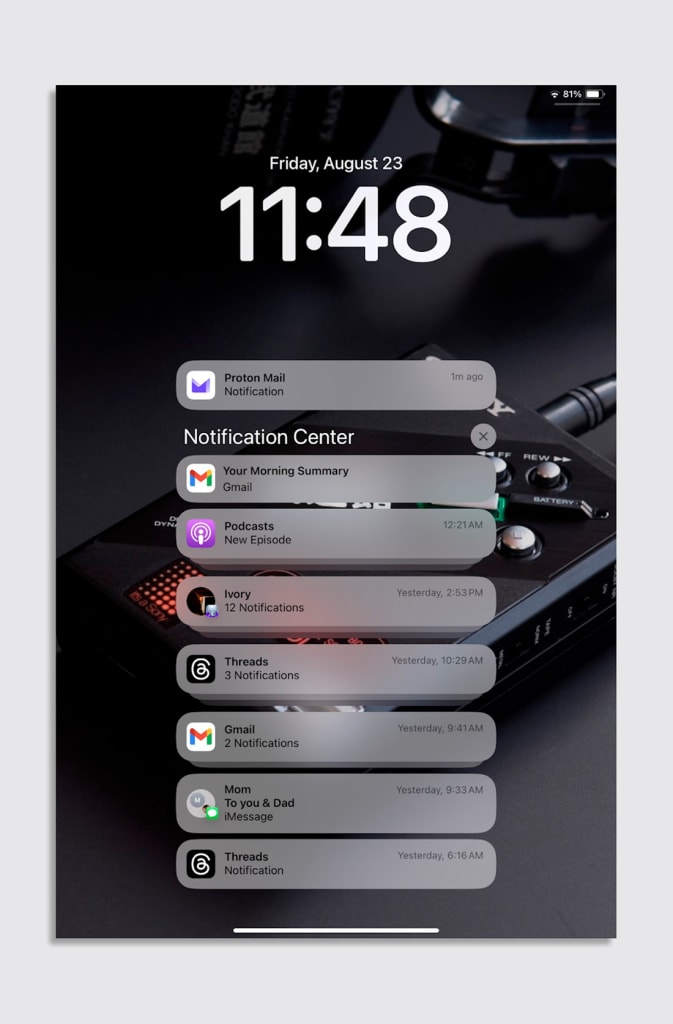
Notifications are a mess unto themselves on iOS, with a two-tiered notification system that I still struggle to wrap my head around. Why does the same app sometimes show notifications on two separate lines? Why does the button to clear all notifications apply only to the bottom segment? Again, Android just handles it in a cleaner way, with a single list of notifications and a button at the bottom for clearing them away.
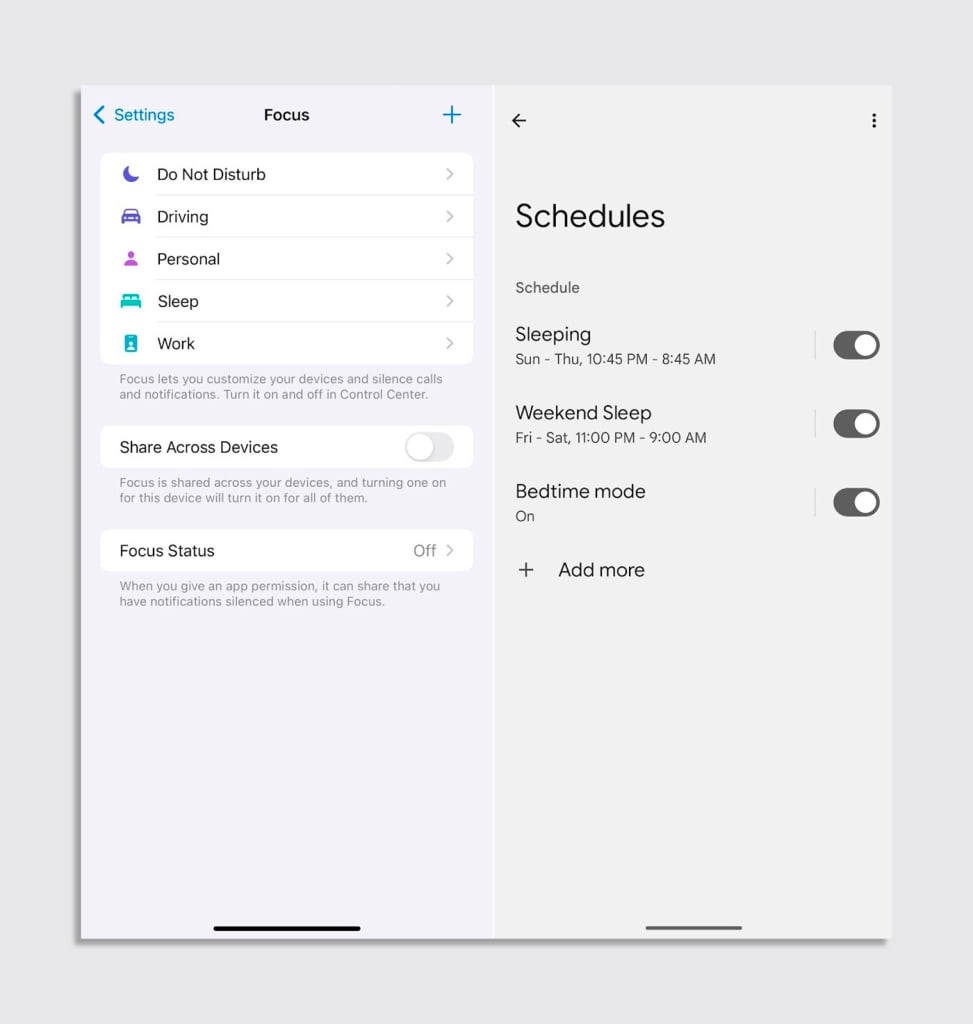
It gets worse: Out of the box, iOS presents you with five different Do Not Disturb modes, four of which are associated with specific activities like sleeping or working. You’re supposed to set up each of these “Focus” modes individually, with their own lists of apps and contacts that are allowed to ring your phone. You can set up more modes for activities like gaming and exercise. You can even have multiple lock screens associated with different Do Not Disturb modes, each with their own wallpapers and widgets.
Google rightly recognizes that most of us just want to keep our phones from ringing in the middle of the night. Instead of overwhelming people with granular notification controls for every possible life scenario, the Pixel line offers a singular Do Not Disturb mode that you can run at scheduled days and times, with an optional set of extra rules to apply at bedtime.
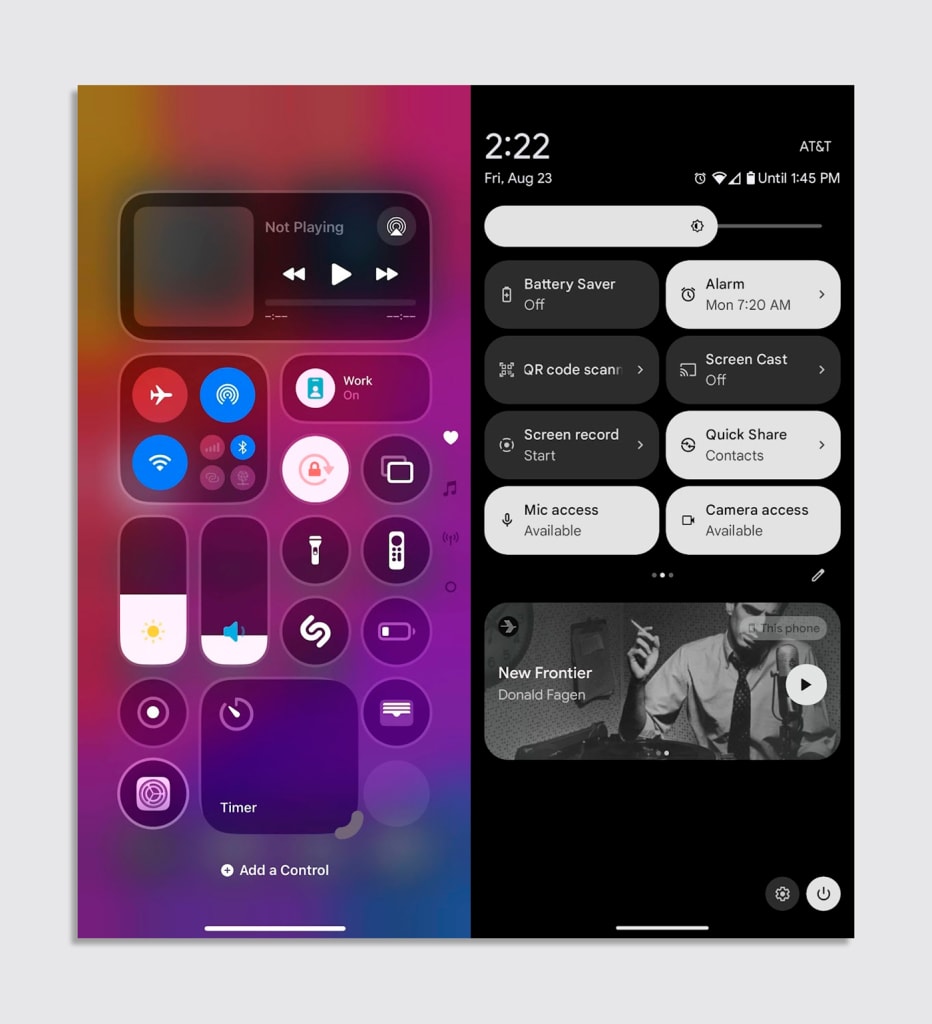
Things won’t get any simpler with iOS 18, which spreads the Control Center across multiple screens. The default layout includes a new full-screen music control pane and a separate panel for quick settings toggles, both of which were already available on the old Control Center in a more compact way; and it introduces a new concept of resizable buttons and widgets.
It’s a lot to take in compared to the Pixel’s quick settings menu, which makes music and brightness controls immovable, and otherwise offers a simple set of uniformly sized toggles to rearrange.
How did the iPhone get so complicated?
Now, you could certainly argue that iOS is more powerful than Android. Those who enjoy tinkering with their phones could easily sink hours into the iPhone’s various widget systems and Focus modes—and that’s before you even get into automation with iOS Shortcuts.
I’m also not going to adjudicate things like app selection, voice control (which is suddenly a weak spot for Google), or the exclusive features that Apple uses to create lock-in, such as iMessage and FaceTime.
But ease-of-use is what made the iPhone such a hit in its early years. It was a breath of fresh air for personal computing because of what it didn’t do, and Apple took its time adding highly requested features such as copy-and-paste and a multitasking menu because it was wary of creating too much complexity. Now every major iOS update seems to introduce new interaction models that complicate what came before.
Conventional wisdom says that iOS is simpler because it doesn’t have all of Android’s nerdier features. Only now it does, and in a way that’s often more complicated and confusing. With iOS 18, you’ll be able to arrange apps anywhere on the home screen—something Apple long avoided in favor of straightforward top-to-bottom arrangements—and change the color of your icons. The high ground that iOS once held on simplicity no longer exists.
At the same time, the Pixel 9 series is the most iPhone-like line of hardware that Google has ever released. The screens are bright, the cameras are top of the line, and the new hardware design—with flat-edged, polished aluminum trim—is indistinguishable from an iPhone when I’m looking at both devices on my desk.
Flagship hardware is just table stakes now. What really matters is software, and while Apple’s been adding new layers of interface cruft with every big iOS release, Google’s quietly been polishing what it has. Spending time with the Pixel 9 just clarifies how those efforts have finally paid off—with or without AI.


