- | 8:00 am
These tweaks will make your iPhone simpler to use
How to hide or disable iOS’s increasingly complex features.
This story first appeared in Advisorator, Jared’s weekly tech advice newsletter. Sign up for free to get more tips every Tuesday.
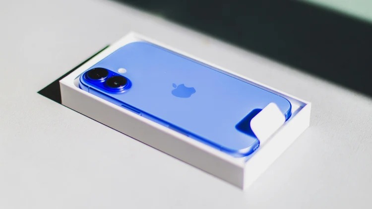
When my new iPhone 16 Pro Max arrived last month, I saw it not just as another gadget to play with, but as motivation to clean house.
My iOS installation has gotten so cluttered over the years that I’ve grown to loathe it. The home screen is littered with apps I seldom use, and as I’ve experimented with features like widgets, Focus modes, and multiple lock screens, navigating through everything has become tiresome. It doesn’t help that Apple keeps adding new interaction models that make iOS even more complicated.
With the new iPhone, I wanted to bring iOS back to a simpler state, so I endeavored to strip away superfluous features and unnecessary apps. Here’s how I did it:
Consider a clean install (or an app cleanse)
With proper backup mechanisms in place, it’s possible to set up an iPhone from scratch without losing any important data. This was the only way I could bring myself to let go of all my seldom-used apps. (Although Apple’s “offload unused apps” feature can reclaim space without having to delete any apps, I wanted the clutter entirely gone from my app library.)
If you’d rather not go that far, here’s the easier way to remove unwanted apps: Head to Settings > General > iPhone Storage. Hit the “Size” button above the app list and switch to “Last Used Date,” then start deleting unwanted apps from the bottom up.
Try a minimalist home screen
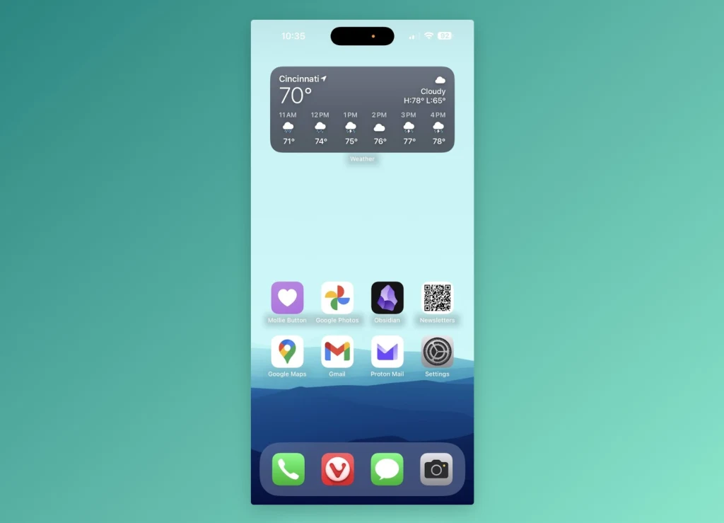
Having spent the last year primarily on an Android phone, I’ve grown accustomed to minimalist home screen apps such as Niagara, which replaces the standard app grid with a basic list of your most important apps along with a quick way to search other apps by name.
To bring that same simplicity to iOS, I got rid of all my home screen pages except one, which contains my dozen most-used apps and Shortcuts aligned to the bottom of the screen. For everything else, I just swipe down from the middle of the screen and type the first letter or two of the app name—just enough to either tap the icon at the top or hit “go” on the keyboard. It’s faster and easier than swiping around and digging into folders, it results in fewer temptations to distraction.

To remove home screen pages, long-press on the screen, hit “Edit,” then select “Edit Pages.” Uncheck pages to hide them—useful if you’re on the fence about the minimalist setup—or hit the minus button to delete them outright.
Move your widgets to the left
Instead of putting lots of widgets on your home screen—which may necessitate additional pages—consider adding them to the Today View panel to the left of the home screen. You can put as many widgets as you want on this screen and scroll through them vertically.

As somewhat of a widget minimalist, I’m using this space as a kind of secondary home screen, with just a widget from the Shortcuts app that displays a folder of common apps, web bookmarks, and commands.
Cut down on Focus modes
While Apple once offered a singular “Do Not Disturb” mode that silenced unimportant notifications, it now encourages you to set up multiple “Focus” modes for different contexts such as sleep, work, and personal time. It’s an interesting idea, but it’s led to a lot of menu clutter that I don’t really need. Here’s how I stripped things down:
- Under Settings > Focus, I deleted the Work and Personal modes, but kept the ones for Driving and Sleep. (The latter conveniently syncs to a bedtime alarm you can set in the Health app.)
- In Control Center, you can tap the “Focus” button, then tap “…” next to Do Not Disturb, it provides a menu of quick options. This is all I really need for ad-hoc quiet time.
- I also got rid of all the extra lock screens that I’d previously associated with different Focus modes. (You can do this by long-pressing the lock screen, then swiping up and hitting the Delete button.) Now I just have one wallpaper and widget set to manage.

Recompress Control Center
In iOS 18, Control Center has multiple panes that you can swipe through, including full-screen Now Playing and Connectivity widgets added by default. While I appreciate the customization potential, I’d rather fit everything onto a single screen, so banish those extra widgets and add smaller versions back to the main panel.
A fresh start
None of this is to say that I’ll never reintroduce these ideas to my phone, or that I don’t appreciate the customization that Apple’s introduced over time. But by getting a fresh start, I can more easily think about what’s actually necessary versus what’s just gimmick. In a few years, don’t be surprised if I’m cleaning house all over again.
Get more tech tips like this every Tuesday with Jared’s Advisorator newsletter.


