- | 8:00 am
The inside story of how Facebook designed the like button—and made social media into a popularity contest
In terms of sheer impact, the like button was one of the most successful pieces of code ever shipped. But when you examine the quality of that impact, its flaws become glaring.
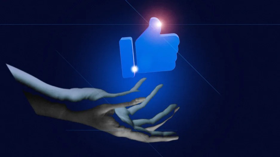
It was summer 2007. Facebook was three years old and growing at a heady pace. Originally for college students, it had opened to the public the previous fall. Now it had 30 million users. What it didn’t have was a simple way for them to show interest in each other’s posts. The only way to acknowledge a post was to comment on it.
Leah Pearlman, one of Facebook’s three product managers at the time, found that inefficient. Popular posts would receive long strings of comments, many just one or two words (such as “awesome” or “congrats”), with no way to locate the interesting ones in a sea of noise. That might not seem like a big problem, but it chafed Pearlman and her coworkers, almost all of whom were in their early twenties and active Facebook users themselves. To Pearlman, the comment chains felt like something you would see on Facebook’s more established rival, MySpace, with its anything-goes customizability. That clashed with Facebook’s clean design and straightforward functionality.
She and a few other Facebookers—engineering managers Akhil Wable and Andrew Bosworth, designer Justin Rosenstein, and internal communications manager Ezra Callahan—set out to build a universal, seamless way to express approval on the social network. They code-named the project “Props.”
What they ended up developing, with help from a succession of other designers and engineers, was a button that became an iconic symbol of Facebook, reshaped the internet, reconfigured the media, and altered the course of world politics. If they’d known the “like” button would do all that, its creators say now, they might have thought about it rather differently than they did at the time. The same virtues that made it such an elegant user-interface solution for a fast-growing software startup in 2007—its simplicity, its ease of use, its universality, its convenience as a metric of value—eventually came to look like vices when applied on a grand, societal scale by a globally dominant online platform.
“I felt like I was cleaning the garage by adding the like button,” Pearlman told me. “I never expected what happened. . . . We were working on other things at the time that felt like a bigger deal by far.”
One obvious question is whether the Facebook like button’s creators should have anticipated those long-term consequences. A more interesting, haunting question lurks behind that one: Would they, or could they, have done anything differently even if they’d known?
That Facebook would eventually give users an easy way to express affirmation was perhaps overdetermined. By 2007, a handful of smaller platforms had already launched approval buttons of various sorts. And Pearlman wasn’t the only one at Facebook thinking along those lines. Rosenstein told The Ringer in 2017 that he had been looking for “a way to increase positivity in the system” to help Facebook create “a world in which people uplift each other rather than tear each other down.”
But just what shape Facebook’s version of “props” should take, and how it should work, proved contentious. Pearlman added the “awesome button,” as the group initially called it, to Facebook’s internal ideas board, and it got enough votes from their coworkers to spur a “hackathon”—an all-night coding session in which engineers and designers cobble together prototypes of potential new features. On July 17, 2007, a team consisting of Bosworth, Rebekah Cox, Ola Okelola, Rosenstein, and Tom Whitnah coded the first awesome button, according to a detailed account that Bosworth posted to the question-and-answer site Quora in 2010. It was well-received and got the green light for development.
As Bosworth recalled it, the button generated excitement across the company. The ads team thought it could be used to show people better ads. The platform team thought it could be used to filter out bad apps. The news feed team, which Bosworth led, reckoned it could help them decide which posts to show in people’s feeds. (At that point, the main factor in feed ranking was the number of comments a post received.) The button’s seemingly universal applicability meant that it had to be versatile and appropriate across all sorts of contexts. And so seemingly trivial design decisions took on crushing weight. Was “awesome” the right name? Should there be a corresponding minus sign or thumbs down? Should it come with a counter?
Designing a button that would be both visually simple and instantly understandable was “a really interesting problem,” Pearlman said. “Because remember, there weren’t really buttons on the Internet” back then. (Digg’s thumbs-up icon and Vimeo’s like button were among the few precursors; the smaller social network Friendfeed launched a like button in 2007, though the Facebookers who were working on the awesome button at the time insist they hadn’t noticed it.
After delays, the team presented the awesome button to CEO Mark Zuckerberg for final approval in November 2007. Zuckerberg surprised them by rejecting it. In Bosworth’s version of the story, Zuckerberg saw potential conflicts with Facebook’s privacy defaults (would likes be public or private?), a forthcoming ad platform (the ill-conceived and ill-fated Facebook Beacon), and the share button that Wable’s team was working on. He also dissented on the name, preferring “like” to “awesome.”
Callahan remembers at least a couple people inside Facebook raising a concern that would prove prescient: they worried, he told me, that “low-effort directional feedback,” in the form of a “like” or “awesome” button, would “eliminate thoughtful engagement, because people were lazy and would take the lazy way out” if given the option.
That might sound like a very post-2017 critique: the notion that mindless clicks ought to be eschewed in favor of meaningful interactions for the sake of democratic discourse and our own well-being. But it’s not clear that anyone at Facebook back then was laboring under the assumption that their product design decisions would have world-historical implications. Rather, they were focused squarely on building a better and more engaging product than MySpace, and the crucial question was whether replacing comments with clicks would aid or inhibit that quest. The implicit assumption, according to Pearlman, was that what was good for Facebook’s users was good for Facebook’s business, and probably good for the world.
That set of assumptions—that tech startups were underdogs, that they were forces for good, and that their success in business would naturally coincide with bettering the world—was common in Silicon Valley at the time. Think of Google’s erstwhile unofficial motto: “Don’t be evil.” But that blithe moral confidence bred moral complacency. When you assume your good intentions will entail good outcomes, provided only that you succeed in outmaneuvering and outhustling your rivals, then stopping to think too hard about what could go wrong is not only unnecessary, it’s potentially ruinous, because it could prevent the good guys—that is, you—from succeeding. (Google removed “Don’t be evil” from its code of conduct in 2018.)
For a time, it looked as though inertia might defeat Facebook’s “props” initiative. By late 2008, people started joking about the “curse of the awesome button,” said Soleio Cuervo, a former Facebook designer who worked on it. “There was a lot of concern internally that ‘liking’ was going to cannibalize engagement.”
What saved the like button was, in true Silicon Valley fashion, an appeal to data. In a test, Facebook data analysts found that popular posts with the button actually prompted more interactions than those without. Bosworth has suggested that this may have been at least partly because likes on a post became a signal for the news feed algorithm to show that post to more people. That finding turned out to be decisive. By February 2009, Zuckerberg had approved a final version of the like button, drawn as a thumbs-up by Cuervo in Photoshop.
But coding the like button involved much more than just drawing it. Each like had to be stored in databases that linked it to both the post itself and the person doing the liking. Much of the coding was done by engineer Jonathan Pines, with contributions from another engineer, Tom Whitnah, and product manager Jared Morgenstern.
On February 9, 2009, Pearlman announced the like button’s launch with a Facebook Note—the company’s version of a blog post—titled “I like this.” She encouraged users to deploy it liberally, and users complied. The like button was an instant hit, and Facebook soon found ways to ingratiate it into the fabric of not just its platform, but the internet beyond. By the following year, you could like people’s comments as well as their posts. The like button also became the default way to follow publishers and brands on Facebook—and when you did, Facebook would use your like to advertise those same pages to your friends. In April 2010, Facebook unveiled a suite of “social plug-ins”— including the like button—that allowed people to “like” pages outside of Facebook itself. Those plug-ins became ad-tracking beacons, telling Facebook whenever a logged-in user visited a site that sported a like button, so that Facebook could use that information to target ads.
The like button quickly became far bigger than even its biggest-thinking creators had envisioned. Likes became expressions of taste and identity. They became the driving force in an increasingly potent and complex news-feed ranking algorithm: the more likes a post got, the more people Facebook would show it to. They became an asset for brands and advertisers. They became a rich source of data for Facebook itself, telling the company about each user’s preferences and browsing habits.
Perhaps most transformatively, likes became a powerful incentive for users of Facebook—a group that grew over the years to nearly three billion. The like counter on each post became an explicit measure of its popularity, and an implicit measure of its value. Consciously or otherwise, users learned what sorts of posts would rack up likes and wrote more like that, while learning to avoid those that garnered only a few. Those users included not just ordinary individuals, but public figures, corporate brands, and media companies. Facebook’s news feed algorithm became the single most influential distributor of information in many societies, and it spawned imitators, from Instagram to Twitter to TikTok, until likes were everywhere.
In terms of sheer impact, the like button was one of the most successful pieces of code ever shipped. But when you examine the quality of that impact, its flaws become glaring. In building a feature whose primary function was to simplify the terms of interaction with online content, Facebook understood that it risked cheapening engagement. What it failed to anticipate was how it might lead to a cheapening of the content itself. The posts that thrived uniquely in Facebook’s feed, fueled by quick-twitch likes, were the ones that offered simple solutions to complex problems, that offered scapegoats, that played on people’s biases and manipulated their emotions. Those that addressed the same problems with nuance, with ambivalence, withered. If failing to generate likes just meant losing a popularity contest on Facebook, likes might have been tolerable.
But the starring role that the company gave likes in the news feed algorithm meant that the popularity contest was not one you could opt out of. If your posts didn’t generate likes, they would be hidden from people’s feeds—even your own followers’ feeds—and replaced by the posts of others who were all too willing to play the manipulation game. Media companies laid off journalists or even went out of business because they couldn’t compete on Facebook, or because they refused to change their coverage in the ways needed to do so. Facebook likely played a role in the demise of local newspapers across the country, the rise and fall of manipulative clickbait sites across the Web, and the shifting of the entire media toward pandering, manipulative discourse. And that discourse, in turn, likely played a role in facilitating the rise of populist politicians expert at pandering to people’s biases, fears, and base instincts. Their messaging, like Facebook’s like button, works best when you don’t think too hard.
Facebook and other social networks are now experimenting with removing like counters, or hiding them from public view. Whether that will undo any of the damage is not yet clear. Pearlman, for one, believes the real mistake was the counter; the button on its own, she told me, would have been more benign. So do she and the like button’s other creators regret developing it? Not exactly. It seems that most have come to believe, or at least tell themselves, that it was more or less inevitable. Pearlman believes the harmful effects reflect human nature: “It’s my belief we needed to play this out all the way, to see it and decide to choose something else.” Callahan, similarly, suggested that if Facebook hadn’t popularized the like button, someone else would have. He acknowledged in the same breath that it feels like a weak excuse.
Still, there’s probably some truth in it. Facebook wasn’t the only company building social tools with the single-minded goal of connecting as many users as possible and keeping them engaged. Let’s say some 2007 company was building social networks around the idea that friction is necessary, that nuance is a priority, that supporting democratic discourse was part of their role, or that doing so might require them to eschew features that would help them grow faster or become more addictive. Presumably, it would have quickly been outcompeted by the others in an industry where scale and network effects are critical to funding, ad revenue, and ultimately survival. It probably wouldn’t be the dominant social network today. And the engineers who designed its key features all those years ago, never thinking that their products might have world-historical implications, would have been correct.
From the book You Are Not Expected to Understand This: How 26 Lines of Code Changed the World, edited by Torie Bosch. Copyright © 2022 by Princeton University Press. Reprinted by permission of Princeton University Press.


