- | 8:00 am
Uber unveils a new redesigned app that’s personalized to you
Uber adds new bells and whistles for iPhone users—as well as personalized suggestions based on how you use the app.
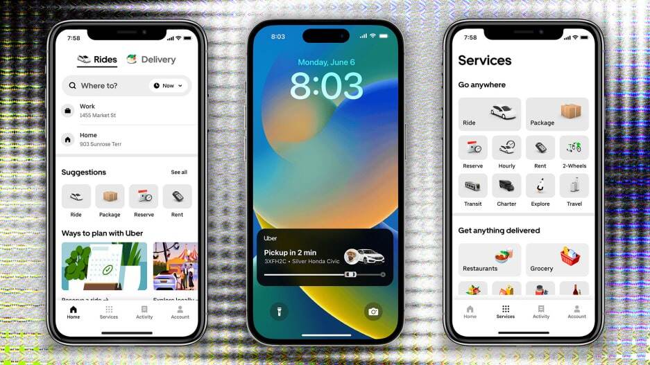
Customers hailing a ride or looking to have some food delivered via Uber are seeing a new look starting today.
For the first time in more than six years, Uber has given its app a broad overhaul, incorporating all of its services—including Uber Eats, grocery delivery, and e-bike rental—and letting passengers track their ride. It’s the first in a series of improvements, the company says, that aim to make the service more personalized.
“The business has really changed from one key product to now, where we have over 20 products developed,” Jen You, Uber’s head of product for rides, told Fast Company. “We’re redefining what it means, as a verb, to Uber. It can mean getting a ride or getting dinner or getting flowers or pet food delivered. It means something different to everyone.”
The changes come just weeks after the company reported its “strongest quarter ever” and will largely benefit customers who use Apple products. For instance, updates on the proximity of drivers as well as notifications when they arrive are now incorporated into the iPhone 14 Pro’s Dynamic Island and will be reflected in the live activities feed, a feature first showcased last year at Apple’s Worldwide Developers Conference.
(Work is underway to offer similar functionality to Android users, but there’s no specific timeline on when it will be available, says You.)
The new app design has two categories—rides and delivery—which the user can toggle between at the top of the screen.

Riders will enter their destination at the top and be presented with several options, such as adding a destination, hiring a driver as a chauffeur, reserving a future ride, and finding a scooter or electric bike, if they’d prefer an alternate means of transportation.
The rides option also shows how many drivers are in the immediate area, which can give you an at-a-glance idea of how quickly you might be able to catch a ride.
Work on the update has been underway for over a year, says You. And Wednesday’s rollout will reach tens of millions of users in more than 1,200 cities worldwide. (Some users got a sneak preview of the app in the past few days, as Uber updated a limited number of accounts to test the rollout.)
“Part of our platform strategy is to make it really easy to discover and engage across a wide variety of products, but we also want to make sure it was personalized to you and to the products you use the most,” said You.
In other words, if you typically order an Uber Green or premium vehicle like the BMW 7-Series, Audi A6, or a Tesla Model X, the app will now remember that and offer those as the default option.
The app will also be situationally aware, says You. For instance, if you get a ride to the airport, it might suggest getting a rental car at your destination or advance scheduling your ride home when you return. It might also suggest preferred Uber Eats options at your destination.
Different users will have different experiences with the app, with different Uber services highlighted, depending on their past usage. But the redesign is also meant to future-proof the app, giving Uber the ability to prominently feature any new services it offers down the road.
“It makes the app flexible to showcase different products to different users, and also as we’re introducing new products over time,” says You.


