- | 8:00 am
The hidden meaning behind Bitcoin’s leaning logo is part of a growing trend in design
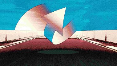
Designers are jamming as much meaning as possible into today’s logos, including hidden Easter eggs related to the tilt of letters and shapes.
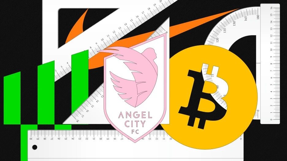
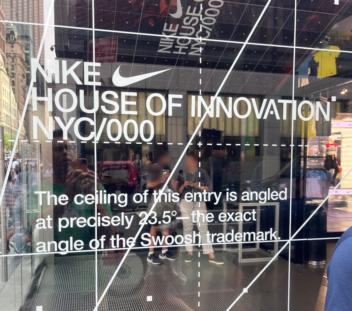
Visitors to Nike’s six-story flagship retail location on Fifth Avenue in New York City are greeted by a sign on the front window helpfully informing them that, “The ceiling of this entry is angled at precisely 23.5 degrees—the exact angle of the Swoosh trademark.” You might think that such a fixation on the details of a logo’s construction would be limited to cult-y brands like Nike, but angles in logos have taken on a wider significance of late: The top of the crest of Angel City FC is set at 22 degrees to reflect the soccer team’s 2022 debut. The World Trade Center’s logo is slanted at a patriotic 17.76 degrees. And Bitcoin’s logo is supposedly rotated 13.88 degrees because it represents the blockchain in some arcane mathematical way—very much on-brand for crypto.
The rise of these symbolic angles seems to be a rather recent development. Angles in logos traditionally were meant to communicate visually, not numerically. The italicization of the 1984 Sears logo was supposed to signal the company’s forward motion, while the 1992 Dell logo’s tilted “E” represented the company “turning the computer industry on its ear.”
Such angling can add verve to a design: Consider that without its unintentional four-degree lean, Pisa’s tower would be unremarkable. So it was that Yahoo CEO Marissa Mayer’s infamous direction of her company’s weekend-long 2013 logo redesign resulted in an exclamation point skewed nine degrees “just to add a bit of whimsy.” Pentagram’s subsequent 2019 Yahoo rebrand upped the slant ante to 22.5 degrees, “a forward tilt that suggests a sense of momentum and excitement.”
Then again, too much tilt can be a problem. Filmmakers employ the “Dutch angle” to make audiences uneasy, which might explain why some are bothered by Spotify’s logo being slightly off-kilter. And logo design deity Paul Rand’s final work, the 1996 Enron mark, borrowed Dell’s tilted-E concept but was ignominiously branded the “Crooked E” amidst the company’s scandalous demise.
Today’s new symbolic logo angles have emerged from two larger contemporary design trends. The first is a tendency of design and branding agencies to justify their work in terms of almost scientific precision in an attempt to assure their clients that their deliverables are not just the result of some flighty artistic vagaries. So exact angle measurements go hand-in-hand with elaborate logo construction grids, references to the Golden Ratio, and demonstrations of how a symbol can be created entirely from circles.
Secondly, designers seem to be cramming as much meaning as possible into today’s logos, perhaps to convince clients that they’re getting their money’s worth. With logo unveilings now come diagram-laden press releases that detail the symbolism of each tiny nuance of the design. Such a description of FC Cincinnati’s 2018 crest noted that, “The lion’s crown pays homage to the ‘Queen City,’ while the seven points of its mane are a nod to the seven hills of Cincinnati. The three-feathered wing represents the club’s three-year journey to MLS and, perhaps most noticeably, its tail takes a ‘c’ shape.”
Imbuing an angle with numeric significance, then, is an easy contrivance to make a logo more meaningful to its intended audience. It’s a sort of “Easter egg,” an obscure detail that gives people a chance to feel like they’re “in the know” about a logo and the organization or brand it represents. So it’s not surprising that Cornell Tech’s logo sits at a 29-degree angle like New York City’s street grid, or that the Portland Trail Blazers’ symbol is rotated 45 degrees to recognize the 45th parallel passing through Oregon, or that the International Institute for Sustainable Development’s mark is tilted at the same angle as the Earth’s axis, 23.5 degrees (although perhaps Nike’s lawyers would like a word).
At some point, though, this sort of symbolism can descend into arbitrariness when connections between angle numbers and their meanings are stretched to ridiculous lengths. The whole trend threatened to jump the shark with the recent rebrand of Lamar Advertising; the company’s 1902 founding was reflected in the 21-degree angle of the new wordmark, because, you know, 19 plus 2 equals 21.
Perhaps more worrisome is that if the trend spreads too far, its effect will be diluted. Once everyone has a special symbolic logo angle, they might not seem so special anymore. A suggestion to brands: keep your cool logo angle number on the down low. Don’t plaster it on your storefront window or trumpet it in a press release. Easter eggs are meant to be hidden; when you stick one out in the middle of the lawn, it takes the joy out of finding it.


