- | 8:00 am
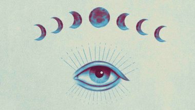
How the sparkles emoji took over AI
Companies from Google to Adobe are using the icon as shorthand for the fuzzy magic of their AI tools.


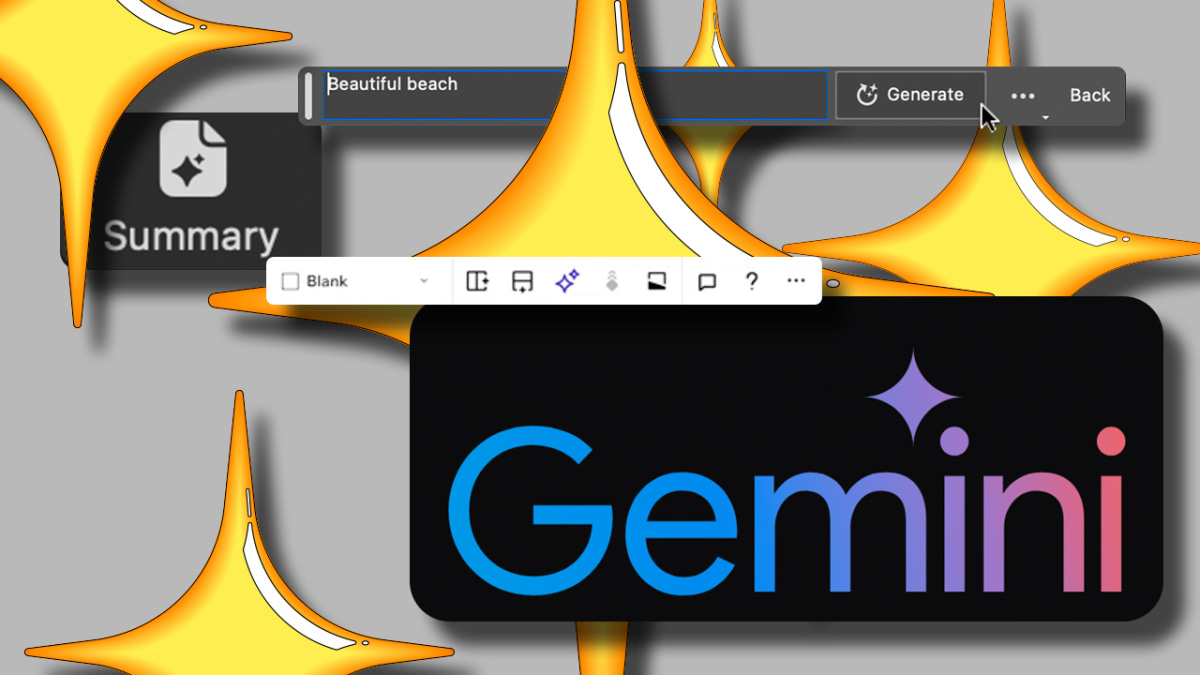
What do OpenAI’s latest GPT-4 model, Google’s Gemini chatbot, Adobe Photoshop’s generative image filler, Grammarly’s language fixer, and Wix’s auto website maker have in common, apart from artificial intelligence itself? They all sparkle.
Over the past year, tech companies have raced to add generative AI to their products. Some have built bots capable of conversing like humans, some have used it to write emails for you, and others want to help you streamline your design process. But while each has its own idea for putting AI’s far-reaching capabilities to work, all of them seem to agree on what visual best represents it: the sparkles emoji, a graphic often associated with sarcastic TikToks, anime, and the 1960s sitcom The Jetsons.
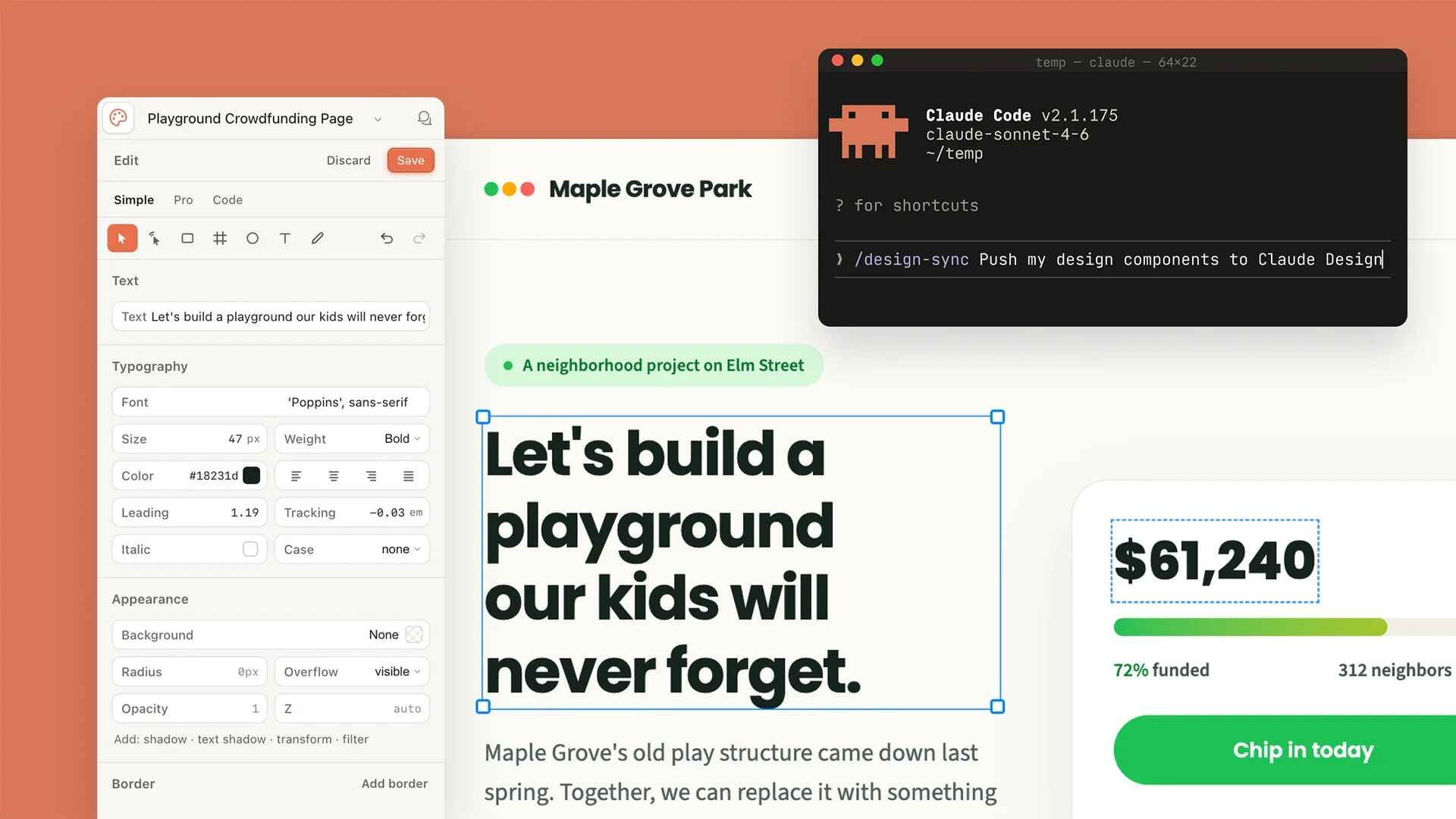
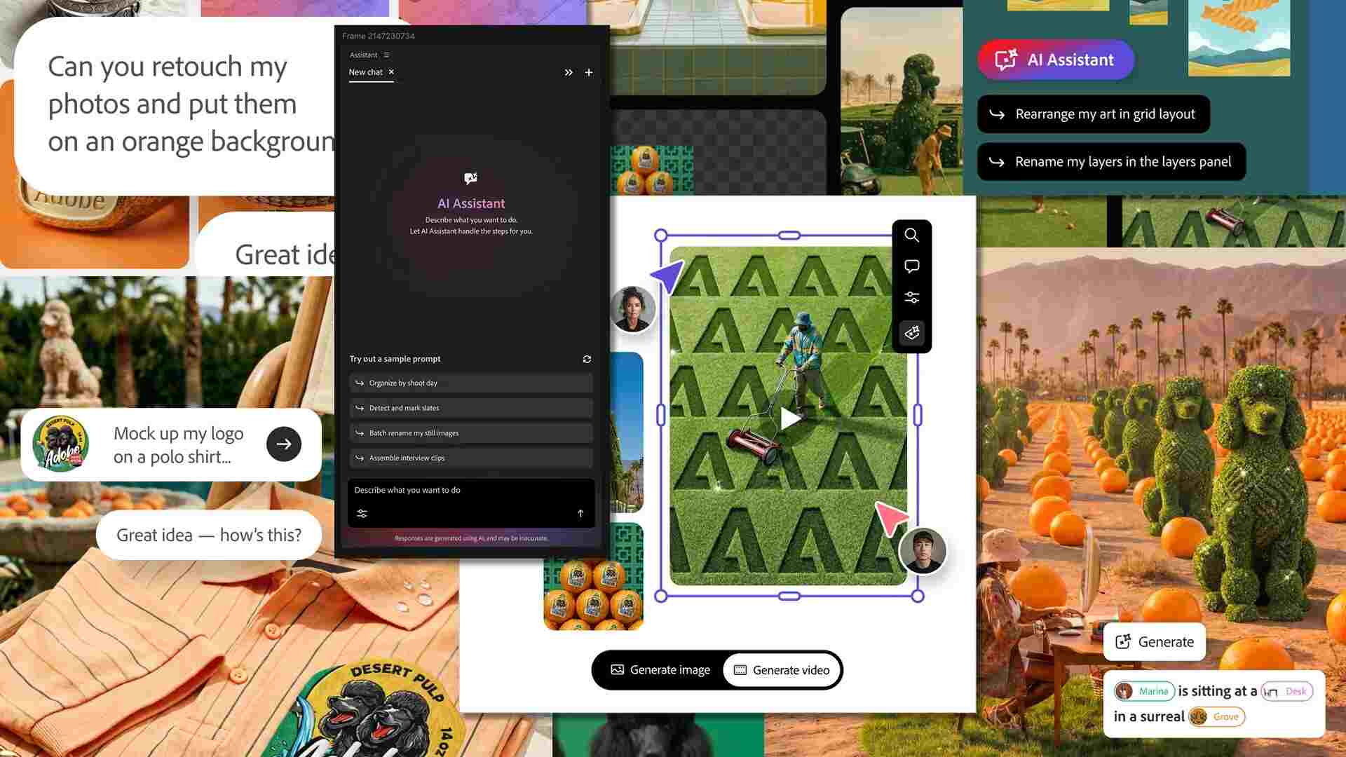
It’s hard to miss. Across most of the mainstream AI tools, you’ll find the four-pointed sparkle icon dominating marketing materials and user interfaces. On Zoom, a pair of blue, cartoonish sparkles denote AI features that help you produce video call summaries and email responses. A solo blue sparkle headlines Google’s Gemini chatbot. On Adobe Photoshop, a couple of sparkles sit next to the buttons to generate machine-composed pictures and remove existing unwanted objects. Similarly, three glittering stars feature alongside Grammarly’s options to improve, shorten, and simplify your text using AI.
The sparkles emoji’s rise as AI’s mascot is about more than catching your eye. Zoom chose the icon because it “carries a sense of wonder and delight,” says Madison Holbrook, the communications firm’s lead product designer. But it also signifies a “spark of innovation” and captures the “almost magical quality of AI in a single, universally understood symbol.”
That sense of “AI magic” is also what drew Gali Erez, head of Wix Studio, to the sparkles symbol. She says using a more literal, technical icon to represent AI features would have made the tools feel “unclear, less approachable, and less expected.”
Dan Saffer, a human-computer interaction professor at Carnegie Mellon University, begs to differ. He believes companies adopted the sparkles emoji despite AI’s mysterious, “magical” nature. He says its ubiquity is likely a case of FOMO (fear of missing out): The sparkle has become a visual norm in the way other icons have become standard across the industry.
THE SPARKLE LIVES ON
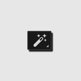
You might assume brands only recently picked up the sparkles emoji, but it’s been the mascot of automated functions throughout tech history. For decades, Adobe offered a “Magic Wand tool” on Photoshop, which featured a magic wand icon with a handful of sparkles on its end. Paul Hunt, a typeface designer at Adobe, says the use of sparkles in the company’s AI tools is a “simple evolution of the graphic language that [Adobe has] been using now for some time.”
More recently, Saffer, who was a designer at Twitter (now X), says the social media site first used sparkles on its interface as a joke. In 2019, it appointed a blue sparkles icon to the menu that allowed people to switch algorithmic and chronological timelines. While prototyping, the design team settled on sparkles after discovering that other universal icons were either already taken, like the star, or were too literal, like a robot.
As AI makes its way into more apps, though, the sparkle may pose a UX challenge. Typically, buttons in design are deterministic, performing one clear action like “save” or “send.” But since hitting the vague sparkles leads to a different action on each service, Saffar wonders whether it could prevent users from creating a mental model of how the product works, set unrealistic expectations, and leave them confused and annoyed. While on most platforms, the sparkles now demonstrate the presence of AI, it’s deployed in other forms as well. On Medium, for example, it denotes a premium membership.
So how do you depict a feature that always produces a unique outcome? One potential route could be to pair sparkles with a more tool-specific emoticon: the magnifying glass for smart search, say. A handful of companies have already adopted that approach. The icon of Gmail’s “Help Me Write” tool features a pen and a sparkle. Similarly, Adobe’s smart removal function partners a sparkle and a Band-Aid.
Eventually, once AI becomes the norm, there’s a decent chance that brands may revert to traditional icons and phase out sparkles altogether, says Alex Savard, an independent designer who has worked with several tech companies, including OpenAI and Lyft. It’s likely that someday AI will make the very interfaces designers are now scrambling to create obsolete. Soon enough, we might not need the screens, buttons, and sparkles we’re so accustomed to today.
“Seen this way,” he says, “the sparkles may be the last major symbol we create before the visual interfaces they’re displayed on are rendered obsolete like the floppy discs of the ’90s.”
Featured Videos
Today's Top Stories:
More Top Stories:


FROM OUR PARTNERS