
- | 8:00 am
Paula Scher’s new playing cards double as abstract art
The Pentagram partner designed two sets of boldly typographic playing cards for Art of Play.


As someone who used to play a lot of poker, Pentagram partner Paula Scher has opinions on card deck design.
Scher, the designer behind brand identities for the likes of Microsoft Windows, MoMA, and The Public Theater, isn’t a fan of goofy illustrations. What she does like, however, is type, graphical numbers, and flat color. So when the boutique playing card purveyor Art of Play called the firm and gave Scher and her team total creative freedom to design two decks, the last thing she wanted to do was sit around drawing face cards and whimsical jester caps.
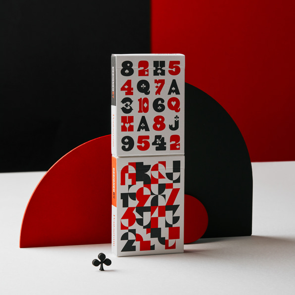
Instead, Scher and her project team of Kirstin Huber and Jeff Close quickly homed in on typographic solutions. After presenting a number of concepts to Art of Play, two favorites emerged, resulting in the brand’s brilliantly clashing and complementing Just Type cards, which deconstruct the traditional French form and sharpen it to its most elemental and essential.
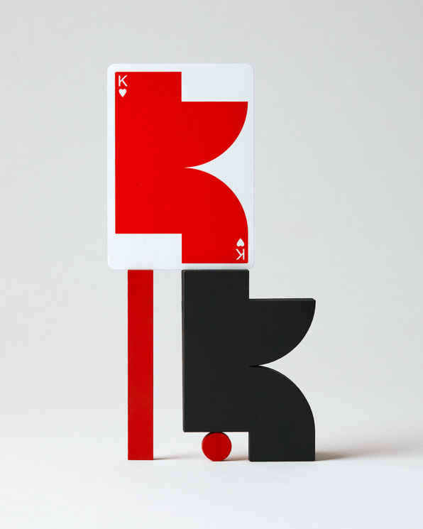
The first edition goes all in on the abstract.
“For a designer, this is a little dream job because it’s a game,” Scher says. “It’s a game of how much do you have to do to make something visible and understandable? And how little can you do and get away with it? [The first deck] is about as pure as you can get in something that you first recognize as a form of design—these massive swathes of color—and then realize they’re making these shapes that are numbers.”
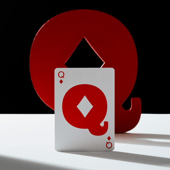
Instead of breaking out a font, the team let basic geometric shapes do the heavy lifting, resulting in a bold look that balances scale, abstraction, and readability.
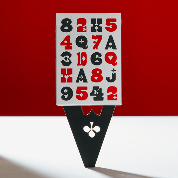
For the second set, Scher and Co. utilized wood type and a delightful design solution in which they cut the suits directly into the slab serifs, or molded them into defining elements of the letterforms. (As for whether Scher has a favorite card of the bunch, “I don’t tend to judge things like that,” she says. “One alone is not as interesting as all of them because they’re designed to function together.”)
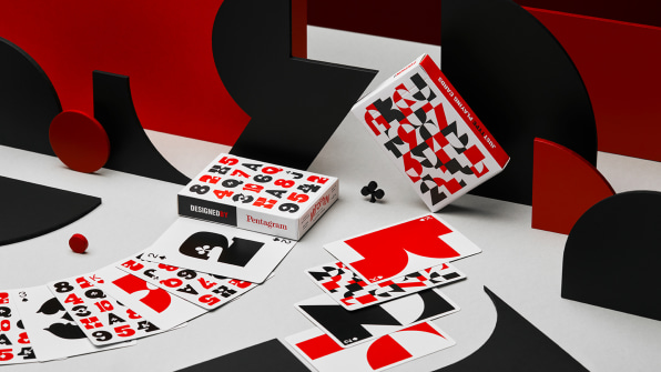
Ultimately, the two decks represent totally different—yet harmonious—design approaches that radiate joy and play.
One wonders: Given how massive in scale and scope so many of Scher’s projects are, does she still enjoy doing small jobs like this?
“When they’re fun,” she says with a laugh.
And that’s perhaps the key to it all.

Featured Videos
Today's Top Stories:
More Top Stories:


FROM OUR PARTNERS