
- | 8:00 am
Pepsi’s new logo is a subliminal war on sugar
Pepsi launched a new logo and brand system that uses high contrast visuals to sell Zero Sugar products.


It’s the best Pepsi has looked in decades.
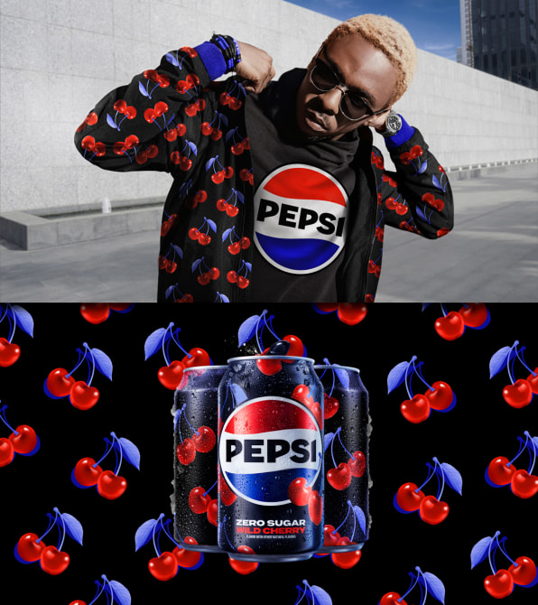
Today, the soda brand is sharing its first significant rebrand in 15 years. Rolling out in North America this fall and the rest of the world in 2024, the biggest update is that the “Pepsi” wordmark has been placed back into the company’s patriotic yin-yang “globe”—right where it lived for any child of the ’80s or ’90s.
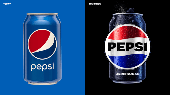
Yet the new brand is anything but a simple nostalgia play. Instead, it’s built to distance Pepsi’s association with sugar, as black—the same color from Pepsi Zero Sugar—cuts through the red, white, and blue palette to bind the brand together. The black starts with the wordmark, then it outlines the globe, and it even spills out into what Pepsi’s design team refers to as the “pulse,” a digital pattern that ripples out from the logo and animates to any background beat.
“A lot of people don’t even notice the black is there,” says Todd Kaplan, CMO of Pepsi. “It’s an intentional color we added in with [Pepsi] Zero Sugar, which will be the lead brand we use marketing. [Black] can act as a master brand statement.”
Sugar is a topic on Pepsi’s mind. PepsiCo’s revenue is growing, but that growth is mostly due to the company increasing its price on soda rather than extending its reach. Meanwhile, Pepsi has started something of a war on sugar as consumers are looking to drink less of it—30% of Gen Z in particular claim to avoid it altogether. In recent years, the company’s move away from sugar has represented billions of dollars in investment and divestment for Pepsi, as the company sold off its juice brands Tropicana and Naked in 2021, while pumping more resources into its concentrate-based SodaStream platform, which it first acquired in 2018.
A strategy that was obvious in retrospect was far from obvious during the design process. Of half a dozen logo concepts that Mauro Porcini, SVP and chief design officer at Pepsi, had been considering for the new branding, all but one used a blue wordmark.
“We developed can prototypes, and I put them on my desk. Every meeting for months and months I had them in front of me,” says Porcini. As he showed them to more people inside the company, the black iteration always stood out, even though no one loved the design itself. “We realized people loved the concept because of the contrast,” he says, and so the company refined the logo in black for launch.
Indeed, adding black significantly increased the pop of Pepsi’s visuals, allowing the brand to cut through the noise of social media and other digital environments that are defined by eye-sizzling over-saturation. Even Pepsi’s blue has gotten richer along the way. Now dubbed “electric blue,” it skews closer to midnight than Pepsi’s blues of the past, even verging close to purple.
“Pepsi is always a brand that’s of the times and reflecting the next generation of consumers,” says Kaplan.
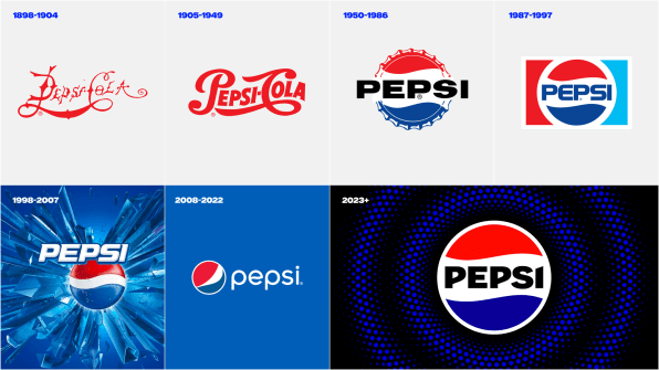
Kaplan isn’t wrong. Retrospectively, Pepsi logo redesigns do tend to capture the essence of their era’s cultural zeitgeist. 1998 embraced the glitzy, gaudy optimism of Y2K. 2008 embraced the flat, muted colors beloved by millennials. And now 2023 brings us the full onslaught of whatever the internet has transformed culture into today: a bold, digital animation that mixes graphics and photography, literality and abstraction, and turns just about any added element into an instant brand collab alongside Pepsi’s logo—a logo which sits atop of it all like an effortlessly slapped-on sticker.
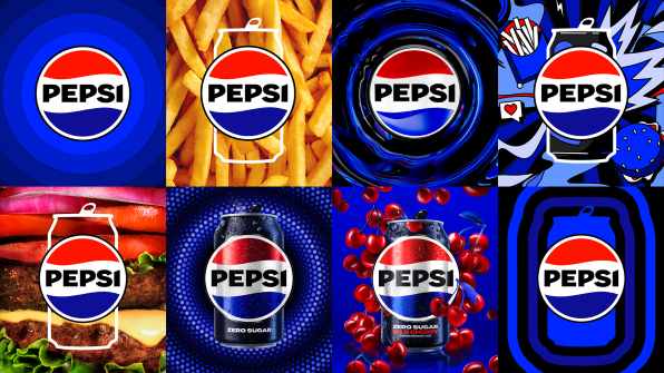
Expect that black and blue “pulse” to change its design based upon its context. For instance, at a baseball game, those swirls may become stitched seams to mimic the ball—and Porcini expects you’ll see all sorts of fresh animations along these lines for the next decade of Pepsi ads. But in other contexts like food service, Pepsi will be using real photographic backdrops instead of animations. These sharply detailed, macro food photos are another defining visual trend of the moment. To frame the logo in this context, the brand system uses various silhouettes like cans and cups that almost feel like a subtle “OK, boomer” dig at Coca-Cola’s vintage glass bottle—an easter egg throwback to the cola wars.
All-in-all, Pepsi’s new brand system is logical, flexible, and of the times. It’s designed to work as well on Instagram, as a can, as an NFL broadcast, or as hoodies and other branded merchandise.
And for anyone who follows trends? Apparently aspartame is the new black.
Featured Videos
Today's Top Stories:
More Top Stories:


FROM OUR PARTNERS