
- | 9:30 am
Pink Floyd’s ‘Dark Side of the Moon’ just got an iconic redesign
Hipgnosis designed the famous Pink Floyd album cover in 1973. Fifty years on, Pentagram is reimagining it.


Opening the 50th anniversary box set for Pink Floyd’s The Dark Side Of The Moon feels like accessing the secrets of an ancient artifact. A perfect black box opens to reveal layers of nested treasures that feel as if they’ve been miraculously found in some unknown Egyptian city, long lost under the sand of the Saqqara Desert.
“When Howard Carter knocked through Tutankhamun’s tomb wall someone asked him if he could see anything. His answer was ‘Yes, wonderful things! Wonderful things!’ I had that in my head when I was doing the original sketch for this box set,” says Harry Pearce, a Pentagram partner and lifelong Pink Floyd fan. Pearce created the box set with Jon Marshall, another partner at Pentagram’s London office and also a Floyd fan since his teen years, when he tried to learn the famous bass line for “Money,” the first song of the album’s B-side.
When Aubrey ‘Po’ Powell of Hipgnosis, the design group responsible for Dark Side of the Moon’s iconic 1973 album cover, approached Pearce with the assignment for the 50th anniversary box set, his only ask was that “the design had to hark back to something of the original idea.” Pearce and Marshall took the directive to heart. “Harry very strongly felt that we shouldn’t create anything new; we should draw on the inspiration that was already there,” Marshall says.
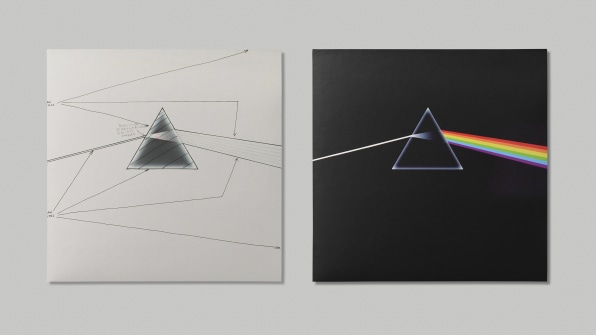
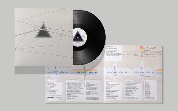
Designed by Hipgnosis’ co-founder Storm Thorgerson with illustrations by George Hardie, the original cover was so striking that it instantly became part of rock’s visual history. Set against a black background, a ray of white light entered the glowing outline of triangle from the left, spreading into a rainbow on the other. The shaft of white light continued on the back of the album, where you could discover its origin: a rainbow being concentrated by a larger inverted prism. There was no mention of Pink Floyd or anything else except for a small Quadraphonic mark on its bottom right corner, indicating that the album had been mastered in four-channel surround sound, one of the signature qualities of the innovative British band.
“The idea was cunningly cobbled from a standard physics textbook,” Thorgerson recalled in a 2003 interview. He and Powell had stumbled upon a photo of a glass prism diffracting a sunlight beam into a rainbow over a sheet of music. Inside the album, the concept of the prism got expanded into a larger theme: Egyptian pyramids.
The cover of the 50th anniversary box set features an all black version of the original. From there, the box set dives deeper into the story of the album. The initial sketch for the box set was built on the idea of the Egyptian sarcophagus, Marshall says, where there’s one casing inside another casing inside another casing. “As you go through the casings, you get towards the central casing, which is made of gold. And gold sort of seemed to chime very nicely for us with the idea of 50, because gold is the 50th anniversary.”

A SARCOPHAGUS OF WONDER
In the age of digital media, the physical album experience has been relegated to novelty, but the concept of a sarcophagus works on so many levels for the Pink Floyd project. There’s the link to the pyramids and Egyptian mythos, yes, but opening the first layer really does make one feel like Indiana Jones, discovering ‘wonderful things.’ The simple act of uncovering the layers is a trip for any Pink Floyd fan, like myself—it conjures the excitement of opening the original album for the first time. Marshall points out that the multi-layered concept also works on a practical level. “It’s a way of organizing a lot of content into a box set,” he says.
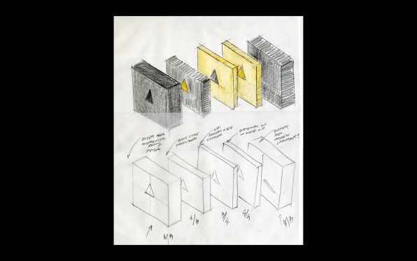
It all starts with a perfectly square black box that features a simple graphic element: an equilateral triangle perfectly die-cut on its center. The triangle condenses the original glass prism into its most basic essence, a distillation process that part of the project’s ethos, Pearce says. “We’ve been very careful not to invent anything new but kind of reuse lost things and extend the idea of the original prism into a whole concept,” he tells me. “Every idea that we’ve brought to it has been taken from a little something that was in the design of the original album. So it’s very respectful, honoring all that wonderful Hipgnosis work back from 1973. It was a very reverential piece of work; we were very careful to do it that way.”

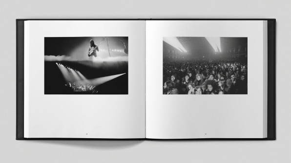
Opening the first box, a 160-page hardcover book of revelations appears. Designed by Pearce, it’s full of photographs of the band taken by rock-star photographer Jill Furmanovsky, as well as Hipgnosis’s Thorgerson and Powell. The book itself is another extension of the original work. “The Dark Side of the Moon came with a poster of the pyramids that had the words ‘Pink Floyd’ all dotted around in the corners. We took the same font, the same idea, and made a new structure with that for the book cover. Which, again, just sort of reimagined Hipgnosis’s original work,” Pearce says.
After removing the book, another black nested box appears showing the same triangle, this time in gold. This layer contains all the extra materials including a number of mixes and remastered versions of the album, as well as memorabilia. This layer leads to the final layer of the set, which features a golden cardboard box swathed in a special gold paper—the product of more than 50 material tests to get it just right.
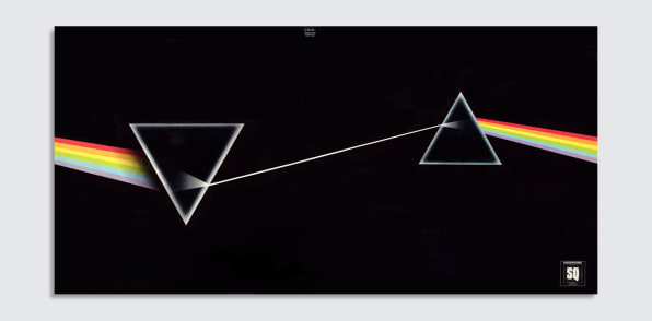
Inside this box is the crown jewel: the original remastered vinyl of The Dark Side Of The Moon — Live At Wembley Empire Pool, London, 1974. Because this version of the album is a first, Pentagram decided to go to the original source material. “To create the cover of the live album, we went back to Hipgnosis and got the original markup sketch for the original studio album,” Pears recalls. “So, you can see how we didn’t create anything new. We just used beautiful things.”

Featured Videos
Today's Top Stories:
More Top Stories:


FROM OUR PARTNERS