- | 8:00 am
Take a peek behind the process of redesigning Wikipedia’s desktop interface
Alex Hollender led the redesign that launched in January. Here, he walks readers through the entire process.
For the past few years I led the redesign of the Wikipedia desktop interface, which launched this past January. Below are some notes on the project and process.
2004-2019
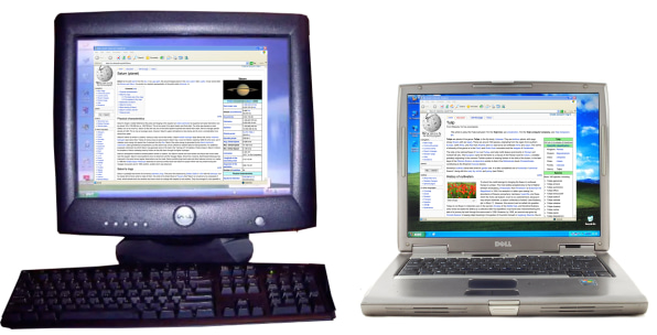
We have to go back in time a little to properly frame this story. Back to 2004, which was the last time Wikipedia’s interface changed significantly. Mark Zuckerberg had just launched TheFacebook, Gmail had just come out, and there were no smartphones (the first iPhone would come out three years later). Also, CSS was much more limited, so websites were simpler. Two popular computers were Dell’s Dimension 2400 desktop, and its Latitude D505 laptop. For almost everyone using it, Wikipedia looked like this:
In 2010, a bunch of changes were made to increase the usability of Wikipedia for new editors (notes), and in 2015 the editing experience was again significantly improved with the introduction of the VisualEditor project. However, the general layout, and specifically the reading experience, stayed largely the same between the 2004 update and 2019, when my team’s involvement begins (the Readers Web Team at the Wikimedia Foundation—an organization of paid staff members who work on things like the Wikipedia apps, search, languages and translations, editing software, community wish list, machine learning, and more).
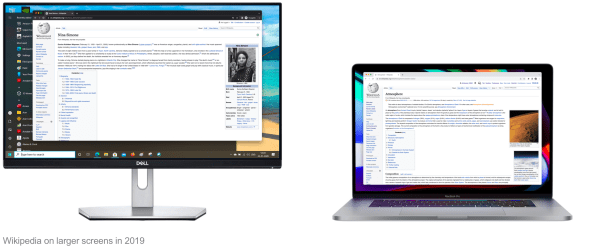
However, computers changed a lot between 2004 and 2019. Namely, screens got a lot smaller, and a lot larger. And while our team had built a mobile site to accommodate smaller screens, we hadn’t really done anything to improve the website for the growing desktop and laptop screens:
In other words, Wikipedia—a major legacy website (top 10 ranked for 10-plus years)—had an interface that hadn’t been changed for 15 years. And then one day the chief product officer came to our team (one product manager, six or so engineers, one quality assurance person, half a scrum master, half a data analyst, half a community liaison, and me) and tasked us with making significant improvements. It might honestly be a once-in-the-history-of-the-internet kind of situation. Exciting, but rather difficult.
There wasn’t one specific reason why this all came about in 2019 (though there is arguably one person who got the ball rolling—sup Nirzar). Instead there were a variety of reasons: The line length had no limit, the search box was small and in an unfamiliar place, the table of contents was only available at the top of the page, language switching was hidden, the hierarchy and organization of elements was confusing to some, the front end was brittle, it was becoming difficult to find places for new features, etc. But perhaps above all was the fact that we had been neglecting the interface (due to other priorities and limited resources), and we felt confident that if we gave it some overdue attention we could make it better for both readers and editors.
Meanwhile, between 2004 and 2019, the Wikipedia volunteer community had been busy making localized improvements to specific versions of Wikipedia. This is possible because Wikipedia is a democratically run, open-source website, with an interface (and back end) that can be changed by anyone. And change it they do.
But while these changes were real improvements, the majority of them were geared toward logged-in editors. Also, the improvements had not been centralized, so they weren’t available on most Wikipedias. A slight tangent: Unbeknownst to many people, the many versions of Wikipedia are not centralized. The Wikipedia you read (whether) it’s English, Bangla, Telugu, Kyrgyz, Korean, Persian, or any of the 300 other versions), is actually a separate website from all the other Wikipedias that exist. Sure, they share a lot of code, use the same servers, and generally have the same interface. But changes volunteers make to the interface (and the content too, of course) are made locally. This meant that the improvement Korean Wikipedia made to have a collapsible sidebar didn’t carry over to English Wikipedia (or anywhere else); the changes Hebrew Wikipedia made to have a sticky header didn’t carry over to Burmese Wikipedia, and on and on.
Sometimes the lack of centralization makes sense: For example, the language variant switcher on Serbian and Chinese versions isn’t needed on other Wikipedias. But overall, the lack of centralization meant that a bunch of good interface changes between 2004 and 2019 were localized to smaller Wikipedias, and the majority of Wikipedia readers were not benefiting from them. Like anything else, there are pros and cons to decentralization.
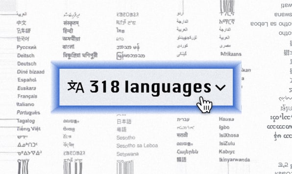
Before we go any further, let’s pause and think about the situation our team was in. The general layout for readers hadn’t changed much since 2004, but the interface (or interfaces) had changed in hundreds of little, decentralized ways, spread across 300 different language versions of Wikipedia that were each democratically controlled by their own community of volunteers. And we, a team of roughly 12 people, wanted to make a bunch of centralized changes to it.
Also, we didn’t (and still don’t) have comprehensive and detailed analytics for the interface, so we didn’t have much data about how people were using it. Neither did/do we have the ability to easily run A/B tests with logged-out people. The sheer task of learning about all the different local modifications of Wikipedias across various languages was daunting, not to mention the prospect of deeply engaging with thousands of volunteers spread across these communities to learn more about their workflows and why they had made certain modifications. All the while, ultimately we were beholden to the democratic system, within which we had to represent the needs of billions of readers who are inconveniently absent from the conversation. But we had unlimited credits on usertesting.com, so that was something.
GETTING STARTED
Olga, the product manager, and I started by articulating a few goals (which are interconnected and overlapping, as most sets of goals are):
- Make the website familiar and welcoming to anyone who visits (thinking especially about younger people in other parts of the world who have not yet discovered Wikipedia).
- Improve the experience of reading, navigating long articles, and knowledge discovery.
- Better accommodate divergent needs (reading versus editing).
- Develop a more flexible interface, with an eye toward future features.
Olga also picked key metrics to monitor: page views, edit rates, account creation, and session length.
With a mix of intuition, interviews, research, team meetings, looking at all the stuff volunteers had modified (including proposals that never got built, and cool Wikipedia plugins), and reading tarot cards, we started to establish a sense of priorities for the interface:
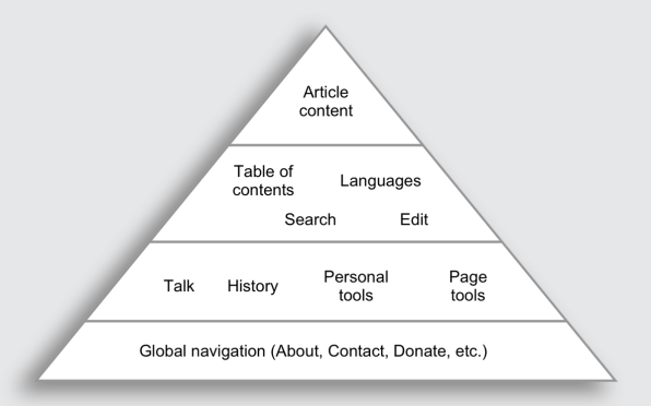
Over the years the interface had become geared more and more toward the needs of editors. In some ways this made sense. Editors are the most critical part of the Wikipedia ecosystem; without them there would be no encyclopedia. At the same time, more than 99% of people using the website don’t edit. Balancing the divergent needs of readers and editors is difficult, especially given that we wanted to maintain a path for readers to become editors.
The sidebar menu, which sat to the left of the content, is a good example of this tension. For editors it contains critical tools, some of which they use multiple times in a given session. For readers it was clutter—a menu of links that they very rarely interacted with (data). And yet some of the links might serve as paths to “behind the scenes” parts of Wikipedia, little trails into the fray that the curious few might follow to learn more about how Wikipedia works.
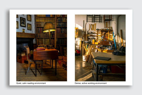
We could make those links less prominent for readers, allowing them to more easily focus on the content. But what if, as a result, those curious few were no longer able to find their way behind the scenes (and eventually become editors)? Our perspective was that organizing and minimizing the clutter would allow us to accentuate things in a more intentional manner. It’s better to provide people with a few clear pathways behind the scenes (like the Talk, Edit, and History links) than to have a scattershot approach, which might catch a random curious person here or there. I started to use these two images as a metaphor for the different needs we were trying to support:
Many details of the design work from that point onward honestly aren’t very interesting or unique. Mockups, best practices and accessibility guidelines, prototypes, design reviews, user testing, and the like. Month by month we plodded along, with the help of all the volunteers (thanks TheDJ, Theklan, Sdkb, and so many others). I spent a lot of time looking at all the different language versions of Wikipedia, reaching out to specific communities, and figuring out how to design things in a way that conflicted as little as possible with their local modifications.
The rough pyramid/prioritization of needs guided the placement of the main elements and grounded all future explorations. The result was more or less this:
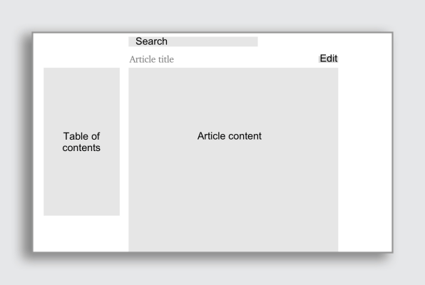
The sequence of what we worked on was:
- Limiting the line length, making the sidebar collapsible, and reformatting the logo/site header
- Moving and improving search
- Moving the language switcher
- Reformatting the personal tools (i.e., Your account)
- Introducing a sticky header (logged-in only, currently)
- Moving and improving the table of contents
- Moving the page tools menu
- Reformatting the global navigation menu
There were, however, a few unique aspects to the design process, which more or less reflect the unique constraints that we deal with as an organization and movement more broadly.
CHALLENGE NO. 1: PROTOTYPE EVERYTHING IN CODE
How do you get to a good design? Some people have the luxury of starting with a semi-good design, releasing it (in some limited way), then using real data and feedback to refine it. Since we don’t have that luxury (either in terms of infrastructure or engineering resources), the process of getting to a good design needs to happen much more up front, before releasing anything. This ends up putting emphasis on how effectively you communicate designs, and communicate about designs. You need to have many high quality, inclusive conversations about the designs before you build anything. And remember, in our case, inclusive of volunteers/stakeholders across many languages.
So then the question becomes: How do you most effectively communicate designs to facilitate the best discussions about those designs? My answer is: lots of little prototypes built with HTML, CSS, and JavaScript. Because the things I was designing were interactive (scrolling, clicking, typing, etc.), needed to be available in many languages, and relied significantly on dynamic data (e.g., each article is different and has a different table of contents, each search query returns different results, etc.), the best way I found to effectively evaluate and communicate such designs, that lead to clear, concrete conversations about them, was through prototypes.
When the project started I built a base prototype (code), which was the Wikipedia interface hooked up to a few APIs so I could load any article (with its table of contents), in any language, as well as use the search box and get live search suggestions. I then added the ability to switch the interface itself (all the buttons, links, etc.) to various languages. For each feature/design decision I would build a new prototype on top of that base, exploring the question(s) at hand. The prototypes often included a little settings panel in the bottom corner that allowed you to toggle among the various options being explored. Here is a relatively simple one that explores various ways of indicating the active section in the table of contents (link):
Coming out on the other side of this project, I strongly believe that fully interactive prototypes (versus mockups, or even click-through prototypes), communicate designs significantly more clearly, and facilitate higher-quality discussions and feedback.
CHALLENGE NO. 2: VISUAL DESIGN
If you look at past versions of the Wikipedia interface, you’ll notice that each version has a personality of sorts. A unique color, border style, subtle background image, tab style, or other such eccentricities. At first I felt a bit of pressure to keep with this tradition and come up with a new personality. But the more Kieran, Roy, Angy, and I played around with borders, buttons, gradients, icons, typography, and other things, the more we questioned the function/utility of these stylistic changes and the more we felt the need to ground our explorations in some logic.
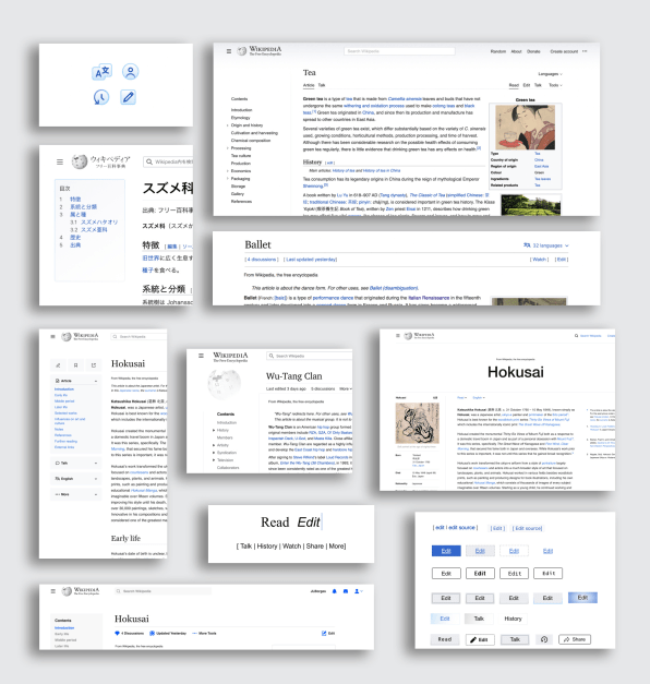
Visual design can be used to evoke a feeling or communicate a conceptual idea. But given that the interpretation of the design is personal/subjective, how do you communicate the idea of free, collaborative knowledge to a global audience, across a wide age range?
Visual design can also be used to signify a specific brand. For Wikipedia, however, this signal is already established via the content itself (infoboxes, blue links, etc.). So rather than trying to evoke a feeling, or reinforce the brand, we fell back to focusing on functionality. We looked at past versions of the website through this perspective and found that visual design was being used functionally, to help separate different parts of the interface (article, menu, user tools, etc.). Looking at our redesigned interface, we felt that the spatial hierarchy and positioning of elements was already doing most of the heavy lifting to create these separations:
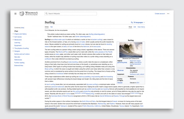
We brought this thinking, as well as a prototype with various options for separating the parts of the interface, to the community. Some people felt that the reading experience, as well as the general comprehension of the interface, would benefit from more clear visual separation between the various regions. We have not yet reached a conclusion about this, but there’s a great discussion you can read through, and participate in, here.
CHALLENGE NO. 3: WIKIPEDIA ARTICLES ARE OFTEN VERY LONG
The length of Wikipedia articles makes the table of contents a particularly important part of the reading experience. It allows readers to get an overview of the content and structure of the article, it helps them locate what they are looking for, and (because it now dynamically tracks your position within the article) it serves as a map that helps you maintain a sense of where you are and where you have been. Previously the table of contents was available only at the top of the page. So if you were on a long article, clicked a link in the table of contents, then wanted to get back to it, you had to scroll all the way back up. Our inclination was that it should be always available.
One big question was: Should we make the table of contents a fixed sidebar (which is a common pattern), or keep the table of contents inline (a long-standing Wikipedia thing), and then add a supplemental table of contents that appears once you’ve scrolled past the inline one?
With an inline table of contents you get as much space as you need to display it. Long section headings, and many levels of nested subheadings, don’t present an issue, so you can display the fully expanded table of contents (though on long articles it often takes up your entire screen, or more).
However, inline means putting it below the lead section, so sometimes when you land on the page you can’t see the table of contents at all without scrolling (depending on the length of the lead section and the width of your screen). When the table of contents is in a sidebar, it’s much more spatially constrained. However, the big upside is that it’s immediately visible when you land on the page, and always remains in the same place. We ran extensive user testing on five different options (1, 2, 3, 4, 5), in three countries, and thankfully the results were clear: Make it a fixed sidebar.
Another fairly big decision we made was to collapse subsections in the table of contents for longer articles. Sometimes, when an article has many sections and subsections, the table of contents is very tall, and you are unable to see all of it without scrolling the page. This makes it difficult to quickly get an overview of the entire article. By collapsing subsections for articles with more than 28 sections total, you can see all top-level sections within the table of contents without scrolling. This allows you to quickly learn the contents of the entire page.
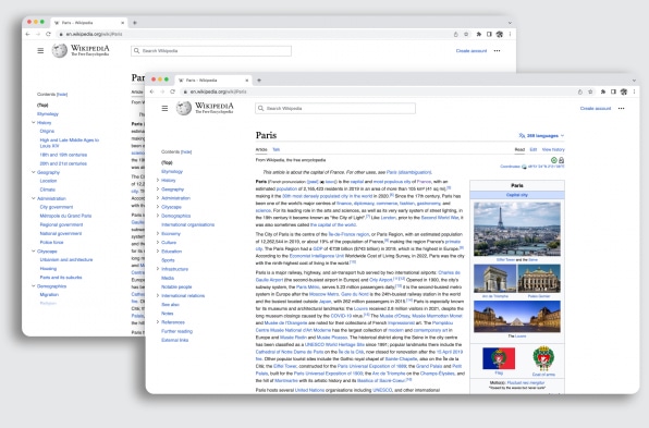
There were also lots of smaller decisions that were fun to think through, like:
- When you scroll to a section that has collapsed subsections, should the parent section automatically expand? (prototype link)
- When you click on a link in the table of contents should the scroll be animated or instant? (prototype link)
- Should we have an “expand all” button for articles with collapsed subsections? (prototype link)
- Should we continue hiding the table of contents on articles with fewer than four sections? (task link)
You can read about more of the details and rationales here.
CHALLENGE NO. 4: DEVELOPMENT, THE DEMOCRATIC PROCESS, AND RFCS
As I mentioned before, Wikipedia is a democratically run project. Many decisions are made through a consensus process. Exactly who has what power, and how to move forward amid disagreement, is unfortunately unclear. And processes designed for resolving editorial disputes don’t necessarily work well for making design decisions. Because the billions of readers whose needs we were trying to represent do not participate in Wikipedia’s democratic process, we worried that the discussions might be lopsided and continue to prioritize the needs of logged-in editors over logged-out readers.
At the beginning of the project we asked a few Wikipedias to be early adopters of our changes (Basque, French, Hebrew, Persian, and others). That meant that for those “pilot” Wikipedias all changes we made were released by default to all logged-in and logged-out people (though logged-in people, who are typically editors, could opt-out if they wanted). So if you were using one of those Wikipedias, you would have seen the changes happen gradually over the past couple of years. This gave us usability feedback and also served as a quasi-A/B test. Our hope was, if we could develop an interface that worked for thousands of editors and millions of readers and prove it through data, including (hopefully) low editor opt-out rates, we could get the rest of the Wikipedia communities on board.
For all the other Wikipedia communities, while they were involved all along—more than 2,000 volunteers participated in the development process, reviewing prototypes, helping us design features, giving feedback, etc.—the new interface was available to them as an opt-in feature.
Almost every day I would interact with volunteers from various Wikipedia communities, big and small, on our project’s message board, publicly available Phabricator tasks, in chat rooms, and occationally at hackathons and other Wikipedia events. We also had five formal, asynchronous feedback collection events throughout the project (link). Since their feedback on each of the changes along the way was largely positive, and all of our data from our test Wikipedias looked great (only about 13% of editors on our pilot Wikipedias opted out), we hoped that when we eventually asked the other communities, they too would each adopt the redesigned interface. Alas, English Wikipedia (by far the largest), wanted to hold an RfC (Request for Comment), which is a long-standing Wikipedia process that is somewhere in between a vote and a discussion (link to the RfC).
Below is a rough map of all interactions we had with volunteers before the vote on English Wikipedia began. Of course not all of these interactions were about design, but many of them were.
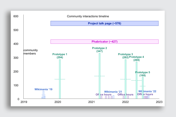
As the comments/votes started coming in, I became frustrated at how unrepresentative of the general public the people voting were. It was a very small group of editors, potentially making a decision for billions of readers. It was also unclear if the people who were voting had participated in past discussions, and/or had taken the time to read through the project documentation, research results, data, etc. It seemed like we were getting a lot of first reactions (as it turned out, only some 28 of the 159 people opposing the new interface had previously engaged in discussions, feedback, etc.). There was a lot of arguing about white space and icons, and people saying they simply didn’t like it, rather than discussions of user needs and/or key metrics.
The discussion/vote lasted a month, was nearly tied in the end (154 supporting, 165 opposing), but thankfully the final judgment (which is called a “closing” and is done by a volunteer) approved the redesign. Compared with other RfCs this was a big success. The volunteer communities are generally very change-averse (in some ways for good reason), and changes developed by the Wikimedia Foundation can be particularly challenging to get acceptance for. However, I was still left feeling a bit weirdly about the vote. Did we just get lucky? Did all the previous interactions we had with volunteers actually build support? Did all the feedback we incorporated lead to a better design? And why do people think white space is an indication of a failed design (like, holy shit, why do some people hate it so much)?
The positive outcome of the RfC was probably a mix of all of those things, but we won’t really ever know how/why we arrived there, which is bothersome to me. I was happy to see some small discussions within the RfC regarding the validity of the RfC process for making such large decisions, as well as some people commenting on the lack of reader participation. In general I think it also highlighted both the lack of alignment in terms of development priorities between some of the community members and the Wikimedia Foundation, and the need for more analytics and data. I have many more thoughts on ways we might evolve the RfC process, and the systems of governance on Wikipedia in general, which I’ll save for another time.
(Addendum: After the launch some people on English Wikipedia started another RfC, about rolling back the redesign. Two months later it was closed with no consensus to roll back. You can read all 238,758 words of it here. For context: Moby Dick is 209,117 words.)
THE DATA WE HAVE SO FAR
While somewhat limited compared with what other websites are able to collect, the data we have so far paints a picture of positive change:
- The new table of contents increases deeper exploration of articles. Our A/B test showed 53% more clicks for logged-in people, and 45.5% more clicks for logged-out people.
- The new search bar increased the number of searches started by 28.9%.
- Nine months after the deployment, 87% of active logged-in users on the early-adopter communities (averaged, including French Wikipedia) did not opt out of the new interface.
- The sticky header makes it quicker to access tools that editors use often. It decreases scrolling to the top of the page by 15%.
- The skin does not negatively affect page views, edit rates, or account creation. There is observational evidence of increases in page views and account creation across partner communities.
EXPOSING THE SYSTEM
Have you ever wondered whether a Wikipedia article was accurate, or more generally if you can trust Wikipedia? What many people don’t understand is that Wikipedia articles don’t contain original thoughts or opinions. In a sense they aren’t even really “written,” or at least not in the way that someone might write an essay or a poem. Instead, Wikipedia articles are collages of facts that credible researchers have published about a given topic elsewhere. Think of an article like a puzzle, or a quilt, with each piece being a fact about the topic that was previously published by a credible institution.
With this in mind it becomes clear that any Wikipedia article is only as accurate as the sources from which the facts were gathered. You can of course question the motives or skill level of the editors, who are the ones going out, gathering the facts, and then weaving them together into coherent articles. But ultimately Wikipedia is a container filled with facts, rather than a blank page upon which people have written whatever they want about a topic.
During the project we became interested in how the interface could better communicate this meta-information about Wikipedia articles. How might we help people understand that editors are more fact-gatherers than authors, that they have long, involved disputes over whether or not a source is credible, and that they actively watch articles in order to ensure that any information added to them comes from a credible source?
How could we expose this dynamic, living system, that is currently nearly invisible to most readers, in a way that would empower them to better evaluate the credibility of a given article and ultimately position them to be participants rather than consumers? What if the “reading experience” of Wikipedia wasn’t just about reading the content but also about being able to read an article in this meta way? Could we help people grow from being content readers to more informed readers?
Partly inspired by the Winter prototype, I made some sketches of Wikipedia articles that included various pieces of metadata, which might serve as little clues as to what was going on. I then thought about some kind of article activity and metadata summary that would quickly give people a sense of the state of an article with regard to editor activity, as well as completeness and credibility.
Ultimately these ideas were out of scope, but I’m excited about them, and I hope they get tested out sooner or later.
This article originally appeared on Alex Hollender’s website and is reprinted with permission.


