- | 8:00 am
To reach incarcerated individuals, this book had to bend the rules of design
‘Redaction’ is a beautiful art book, but it’s more than eye candy.


Artist’s books tend to be precious objects treated, well, preciously. They’re often handmade or printed in small runs. They are almost certainly not designed to be torn apart.
But Redaction was.
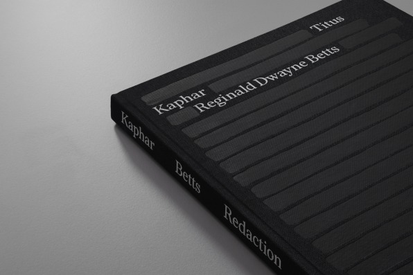
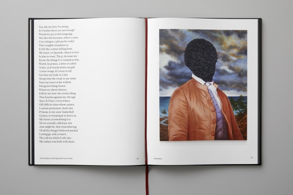
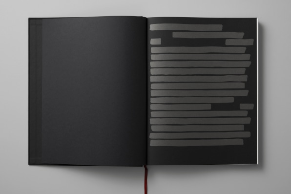
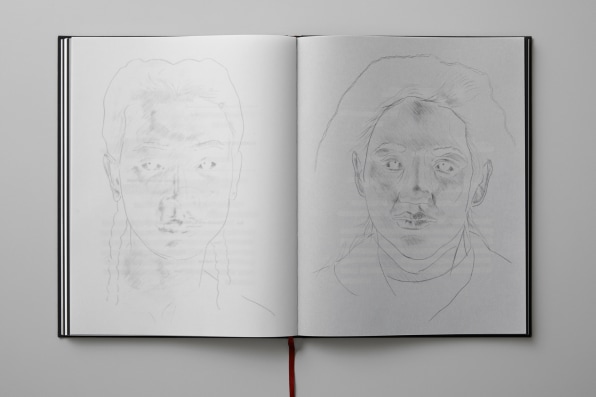
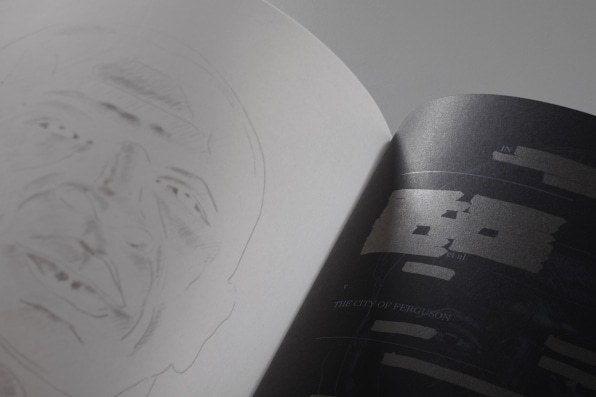
The book is the product of poet Reginald Dwayne Betts and painter Titus Kaphar, who collaborated on a 2019 exhibition of the same name at MoMA PS1. In the show, the duo explore the human cost of mass incarceration though a series of etched portraits that feature the visage of incarcerated individuals overlaid by legal documents that Betts redacted to create poetic verse. The poetry was silk-screened onto the portraits using the Redaction font—which designer Forest Young and type designer Jeremy Mickel created specifically for the project, drawing inspiration from text damaged by photocopying and other administrative processes.
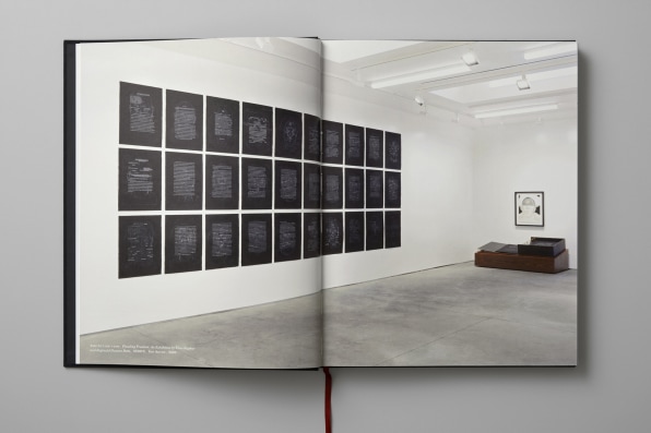
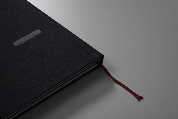
The striking images address the exploitation of people who have been marginalized by a legal system hinging on money, where those who can’t afford bail can remain jailed before ever seeing a trial. Redaction the book is an outgrowth of that original concept. Between a foil-stamped cloth and board cover and striking work printed on black paper using a medley of outside-the-box production techniques, it’s essentially a timeline of Betts and Kaphar’s work.
“There are a lot of things to process in these deceptively simple pieces,” says James Goggin, who designed the book with Young and Amanda Barrow.
Right off the bat, the book team focused not on distribution—the scattering of objects—but rather circulation. Young says their first goal was to get the book into the hands of people who are incarcerated, which dictated a soft cover, since hardcovers are banned in many prisons.
“The book had to straddle functionally and all of the high production value that one would have as a keepsake artifact,” Young says. “The idea of circulation actually being an ambition from the onset, to me it talks about dimensions of ethical design.”
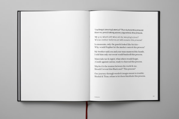
The crucial extension of circulation? Propagation. The Redaction pieces were printed on single-sided sheets—so people can tear pages out and make them their own, which Kaphar advocates.
Goggin admits that the project might have seemed routine at first: Create a catalog for the show, pull the Redaction prints, and feature examples of each artist’s individual work. But he and the team quickly elevated the concept and sought to create a mass-produced artist’s book, one that would seek to replicate the way Kaphar and Betts printed the original work.
“For me as a designer, there’s a real responsibility to provide as best a vicarious experience of an exhibition as possible to everyone who might not be fortunate enough to be in the right place at the right time to see a show for real,” Goggin says. “So that’s the kind of real responsibility that I never underestimate with each project. I want a kid in the library to encounter this book and to encounter the artwork. And maybe that’s their way into something—to a new world for them.”
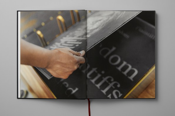
Eschewing the standard four-color CMYK process that is typically used to print books, the team utilized offset printing, black paper, multiple stocks, and white and metallic ink. (“Miraculously, everyone agreed to this,” Goggin says.) Faced with separating the original silk-screen prints for offset, the collaborators grew to include Sebastiaan Hanekroot and Rossella Castello in Europe, who knew the press that would be producing the book (Die Keure Printing in Belgium), the stocks, the way the ink behaves on them, and more.
Following its initial run at PS1 and second showing at NXTHVN in Connecticut, Goggin and Young say the authors view the book as a third exhibition of Redacted. In fact, as Goggin was typesetting, he says Betts was composing new poetry for the book in real time over the phone, testing its cadence, right up until press time.
“The book, which I usually think of as a repository or some type of vessel or documentation, felt alive in terms of it feeling physically tangible in a very remarkable way,” Young says. “But it also felt alive that it was considered to be an exhibition. There’s a sense that it will create some new momentum forward as an exhibition, versus it being a stopping moment, a moment of inert reflection.”
Ultimately: “To me, that gave me a different perspective on what a book could be.”
Featured Videos
Today's Top Stories:
More Top Stories:
FROM OUR PARTNERS